# Course: Studio excellence
https://www.sanity.io/learn/course/studio-excellence
Go beyond the default configuration. Learn what separates an average Sanity Studio from a fully-configured, content creation powerhouse that authors will love.
---
## Navigation
**Track:** [Mastering content operations](https://www.sanity.io/learn/track/sanity-developer-essentials) · [View as markdown](https://www.sanity.io/learn/track/sanity-developer-essentials.md)
## Contents
1. [Excellent editorial experiences](https://www.sanity.io/learn/course/studio-excellence/excellent-editorial-experiences) · [markdown](https://www.sanity.io/learn/course/studio-excellence/excellent-editorial-experiences.md)
2. [Improving the editorial experience](https://www.sanity.io/learn/course/studio-excellence/improving-the-editorial-experience) · [markdown](https://www.sanity.io/learn/course/studio-excellence/improving-the-editorial-experience.md)
3. [Sublime schemas](https://www.sanity.io/learn/course/studio-excellence/sublime-schemas) · [markdown](https://www.sanity.io/learn/course/studio-excellence/sublime-schemas.md)
4. [Structure customization](https://www.sanity.io/learn/course/studio-excellence/structure-customization) · [markdown](https://www.sanity.io/learn/course/studio-excellence/structure-customization.md)
5. [Custom input components](https://www.sanity.io/learn/course/studio-excellence/custom-form-components) · [markdown](https://www.sanity.io/learn/course/studio-excellence/custom-form-components.md)
6. [Member-specific options](https://www.sanity.io/learn/course/studio-excellence/member-mastery) · [markdown](https://www.sanity.io/learn/course/studio-excellence/member-mastery.md)
7. [Interactive previews](https://www.sanity.io/learn/course/studio-excellence/intelligent-integrations) · [markdown](https://www.sanity.io/learn/course/studio-excellence/intelligent-integrations.md)
8. [Extending with plugins](https://www.sanity.io/learn/course/studio-excellence/pleasing-plugins) · [markdown](https://www.sanity.io/learn/course/studio-excellence/pleasing-plugins.md)
9. [Internationalization](https://www.sanity.io/learn/course/studio-excellence/internationalization) · [markdown](https://www.sanity.io/learn/course/studio-excellence/internationalization.md)
10. [Awesome authoring](https://www.sanity.io/learn/course/studio-excellence/awesome-authors) · [markdown](https://www.sanity.io/learn/course/studio-excellence/awesome-authors.md)
---
## Lesson 1: Excellent editorial experiences
https://www.sanity.io/learn/course/studio-excellence/excellent-editorial-experiences
Getting started with Sanity and deploying a Studio for authors can be super fast. Spending extra time on the finer details separates average authoring experiences from excellent ones.
> [Video: Excellent editorial experiences](https://www.sanity.io/learn/course/studio-excellence/excellent-editorial-experiences)
This course assumes you have already started or completed the [Day one content operations](https://www.sanity.io/learn/course/day-one-with-sanity-studio) course. Where you create a very basic Studio that is in need of some deeper configuration.
The following lessons will guide you through much of the [Studio's configuration API](https://www.sanity.io/docs/config-api-reference). Highlighting some areas for improvement and maybe features you didn’t yet know existed!
You might also be interested in reading [An opinionated guide to Sanity Studio](https://www.sanity.io/guides/an-opinionated-guide-to-sanity-studio) which summarizes and follows a lot of the guidance in this course. As well as a set of Cursor Rules so that your IDE can apply those recommendations to your project.
Sanity Studio was created by developers to give them control over the content editing experience, but never lose sight of who **your** audience is—content creators.
Let's ensure that when you deploy and hand over the editing surface it's ready-made for excellent content operations.
---
## Lesson 2: Improving the editorial experience
https://www.sanity.io/learn/course/studio-excellence/improving-the-editorial-experience
Elevate the basic editorial experience with field titles, descriptions, validation, conditional fields, field groups, and document list previews.
> [Video: Improving the editorial experience](https://www.sanity.io/learn/course/studio-excellence/improving-the-editorial-experience)
## Consistency
Helping content creators create content consistently is simpler when they're presented with fewer options and helpful guardrails.
- [ ] Make slug creation simpler by adding a `source` for generating the slug field value
```typescript:apps/studio/schemaTypes/eventType.ts
// Replace "slug" in the array of fields:
defineField({
name: 'slug',
type: 'slug',
options: {source: 'name'},
}),
```
Text input fields can contain any string. Avoid accidental duplicates or misspellings by providing preset options.
- [ ] Limit the `eventType` field to a few options by providing a list of values:
```typescript:apps/studio/schemaTypes/eventType.ts
// Replace "eventType" in the array of fields:
defineField({
name: 'eventType',
type: 'string',
options: {
list: ['in-person', 'virtual'],
layout: 'radio',
},
}),
```
If new documents could benefit from sensible default values which are often correct, an initial value can be set at the field level.
Note that this won't affect existing documents. But every new document will now start with this value.
- [ ] Set an initial value for the `doorsOpen` field to `60`
```typescript:apps/studio/schemaTypes/eventType.ts
// Replace "doorsOpen" in the array of fields:
defineField({
name: 'doorsOpen',
type: 'number',
initialValue: 60,
}),
```
### Adding context
Adding more context and intentionality to fields can be very helpful for content teams.
With only its name to describe it, this field fails to give the author context for its use. Adding descriptions to fields helps clarify their intention and guide the content creation experience.
- [ ] Add a description to the `doorsOpen` field
```typescript:apps/studio/schemaTypes/eventType.ts
// Replace "doorsOpen" in the array of fields:
defineField({
name: 'doorsOpen',
description: 'Number of minutes before the start time for admission',
type: 'number',
initialValue: 60,
}),
```
## Validation
Structured content is more trustworthy when it is validated. Validation rules can also give content creators more confidence to press Publish.
> [!TIP]
> See [Validation](https://www.sanity.io/learn/studio/validation) in the documentation.
- [ ] Make the `slug` field required
```typescript:apps/studio/schemaTypes/eventType.ts
// Replace "slug" in the array of fields:
defineField({
name: 'slug',
type: 'slug',
options: {source: 'name'},
validation: (rule) => rule
.required()
.error(`Required to generate a page on the website`),
}),
```
Note that the error message can be customized so that authors better understand the context of why a warning or error is being displayed.
Custom rules have access to the entire document so that fields may be validated against one another. They should return a `string` in case of an error or `true` once the field is considered valid.
- [ ] Using a custom validation rule, make sure that virtual events do not have a venue
```typescript:apps/studio/schemaTypes/eventType.ts
// Replace "venue" in the array of fields:
defineField({
name: 'venue',
type: 'reference',
to: [{type: 'venue'}],
validation: (rule) =>
rule.custom((value, context) => {
if (value && context?.document?.eventType === 'virtual') {
return 'Only in-person events can have a venue'
}
return true
}),
}),
```
## Conditionally hidden and read-only
It can often be useful to hide less common or more complex fields until they are required. While `hidden` and `readOnly` can be set to `true` or `false` – they can also accept a function to apply some logic.
> [!TIP]
> See [Conditional fields](https://www.sanity.io/learn/studio/conditional-fields) in the documentation.
- [ ] Hide the `slug` field if the `name` field is empty
```typescript:apps/studio/schemaTypes/eventType.ts
// Replace "slug" in the array of fields:
defineField({
name: 'slug',
type: 'slug',
options: {source: 'name'},
validation: (rule) => rule.required().error(`Required to generate a page on the website`),
hidden: ({document}) => !document?.name,
}),
```
- [ ] Set `venue` to `readOnly` if the field does not have a value and the event type is virtual
```typescript:apps/studio/schemaTypes/eventType.ts
// Replace "venue" in the array of fields:
defineField({
name: 'venue',
type: 'reference',
to: [{type: 'venue'}],
readOnly: ({value, document}) => !value && document?.eventType === 'virtual',
validation: (rule) =>
rule.custom((value, context) => {
if (value && context?.document?.eventType === 'virtual') {
return 'Only in-person events can have a venue'
}
return true
}),
}),
```
Note that "hidden" only affects the Studio interface. Fields will still retain their values whether they are visible in the Studio or not.
## Group fields together
The document form is still one long column of fields. Let's introduce a set of field groups (think of them like tabs) to tidy up the form.
> [!TIP]
> See [Field Groups](https://www.sanity.io/learn/studio/field-groups) in the documentation.
- [ ] Create two Groups in the `event` document schema: `details` and `editorial`
```typescript:apps/studio/schemaTypes/eventType.ts
// Above the "fields" array
groups: [
{name: 'details', title: 'Details'},
{name: 'editorial', title: 'Editorial'},
],
```
- [ ] Assign each field to one or more of these Groups
```typescript:schemaTypes/eventType.ts
// Assign each field to one group
group: 'details',
// or several!
group: ['details', 'editorial'],
```
The image and details fields make the most sense in "editorial" and the rest in "details." You could customize further by adding an icon to each group and setting one active by default.
## Document list previews
By default, documents are indicated with a plain icon and a "best guess" at the document's title. The first and simplest thing we can do is give documents of a certain type a unique icon so that every document list and search result will use them by default.
### Icons
- [ ] **Run** the following in the terminal to install the `@sanity/icons` package
```sh
# in apps/studio
pnpm add @sanity/icons
```
- [ ] **Update** your document schema types to give them default icons
```tsx:apps/studio/schemaTypes/eventType.ts
import {CalendarIcon} from '@sanity/icons'
export const eventType = defineType({
name: 'event',
title: 'Event',
icon: CalendarIcon,
// ...all other settings
})
```
```tsx:apps/studio/schemaTypes/venueType.ts
import {PinIcon} from '@sanity/icons'
export const venueType = defineType({
name: 'venue',
title: 'Venue',
icon: PinIcon,
// ...all other settings
})
```
```tsx:apps/studio/schemaTypes/artistType.ts
import {UsersIcon} from '@sanity/icons'
export const artistType = defineType({
name: 'artist',
title: 'Artist',
icon: UsersIcon,
// ...all other settings
})
```
### Title, subtitle and media
Let's go further! So that our documents are even more discoverable, you can update the `preview` property for our document type.
In `preview`, values are "selected" from the document and then fed into the document preview's `title`, `subtitle`, and `media` slots.
> [!TIP]
> See [List previews](https://www.sanity.io/learn/studio/previews-list-views) in the documentation.
- [ ] **Update** the `preview` attribute to render a richer preview
```typescript:apps/studio/schemaTypes/eventType.ts
// After the "fields" array
preview: {
select: {
title: 'name',
subtitle: 'headline.name',
media: 'image',
},
},
```
Take a look at your document list now. It's much easier to discern the document types at a glance.
There are other values in the document that would be useful in list previews. With the `prepare` function, you can modify values before returning them to the preview.
Update your event type’s preview configuration to the below:
```typescript:apps/studio/schemaTypes/eventType.ts
// Update the preview key in the schema
preview: {
select: {
name: 'name',
venue: 'venue.name',
artist: 'headline.name',
date: 'date',
image: 'image',
},
prepare({name, venue, artist, date, image}) {
const nameFormatted = name || 'Untitled event'
const dateFormatted = date
? new Date(date).toLocaleDateString(undefined, {
month: 'short',
day: 'numeric',
year: 'numeric',
hour: 'numeric',
minute: 'numeric',
})
: ''
return {
title: artist ? `${nameFormatted} (${artist})` : nameFormatted,
subtitle: venue ? `${dateFormatted} @ ${venue}` : dateFormatted,
media: image || CalendarIcon,
}
},
},
```
## Review
Take a step back and compare the editorial experience with the simple form you had initially. Content creators can discern the different types of documents and more easily create trustworthy content.
You could go further by adding icons to the `artist` and `venue`-type documents.
This is a much better experience, and it's only the beginning.
---
## Lesson 3: Sublime schemas
https://www.sanity.io/learn/course/studio-excellence/sublime-schemas
> [Video: Sublime schemas](https://www.sanity.io/learn/course/studio-excellence/sublime-schemas)
## Fields
> [!TIP]
> Review [Schemas and Forms](https://www.sanity.io/learn/studio/schemas-and-forms) in the documentation.
The `defineType` and `defineField` helper functions should always be used when creating schema types. Functionally, they're optional. However, they provide autocomplete suggestions thanks to TypeScript and may unlock future functionality.
- [ ] Always use `defineType` and `defineField` helper functions in schema files
### Titles
Defining fields in a schema type only **requires** two keys: `name` and `type`:
```typescript
defineField({ name: 'name', type: 'string' }),
defineField({ name: 'url', type: 'url' }),
defineField({ name: 'linkedin', type: 'url' })
```
When omitted, the `title` value for these fields will be automatically generated. However, it will not account for special casing like acronyms or "PascalCase" brand names.
- `name` becomes **Name**, which is fine
- `url` becomes **Url**, when it should be **URL**
- `linkedin` becomes **Linkedin, **when it should be **LinkedIn**
- [ ] Ensure fields have custom `title` keys where necessary
```typescript
defineField({ name: 'name', type: 'string' }),
defineField({ name: 'url', title: 'URL', type: 'seo' }),
defineField({ name: 'linkedin', title: 'LinkedIn', type: 'url' })
```
### Descriptions
> [!TIP]
> More reading: [Sanity top tip: The grandma test](https://roboto.studio/blog/sanity-top-tip-the-grandma-test)
Another useful key for a schema field is its description. Adding a little context to why this field is required can help authors understand the content’s intention.
```typescript
defineField({
name: 'url',
title: 'URL',
description: 'Canonical URL for the Googlebot crawler to index this content',
type: 'url'
})
```
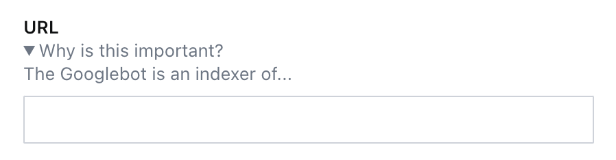
If you need to add basic formatting to your descriptions, this key will accept JSX! Note: You will need to update your schema type's file to use a `.jsx` or `.tsx` file extension for this to work.
```tsx
description: (
Why is this important?
The Googlebot is an indexer of...
)
```
This example code creates a collapsible [``](https://developer.mozilla.org/en-US/docs/Web/HTML/Element/details) element to hide away longer-form descriptions.
- [ ] Where useful, customize your fields with contextual descriptions.
## Validation
> [!TIP]
> Review [Validation](https://www.sanity.io/learn/studio/validation) in the documentation.
### Errors
The simplest way to mark a field as invalid and block the publishing of the document is shown in the example below, implementing the `required` rule.
```typescript
defineField({
name: 'slug',
type: 'slug',
validation: rule => rule.required()
})
```
However, the error message in the Studio will only say "Required" and not give the author any additional information.
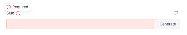
Adding the `error` method will give extra context to the author about **why** it has been marked invalid and what must be done to resolve it.
```typescript
defineField({
name: 'slug',
type: 'slug',
validation: rule =>
rule
.required()
.error(`Required to generate a page on the website`)
})
```
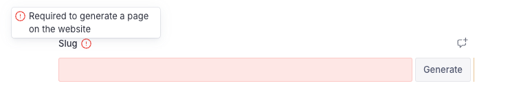
This appears not only on the invalid field but also in the summary of validation errors in the document inspector.
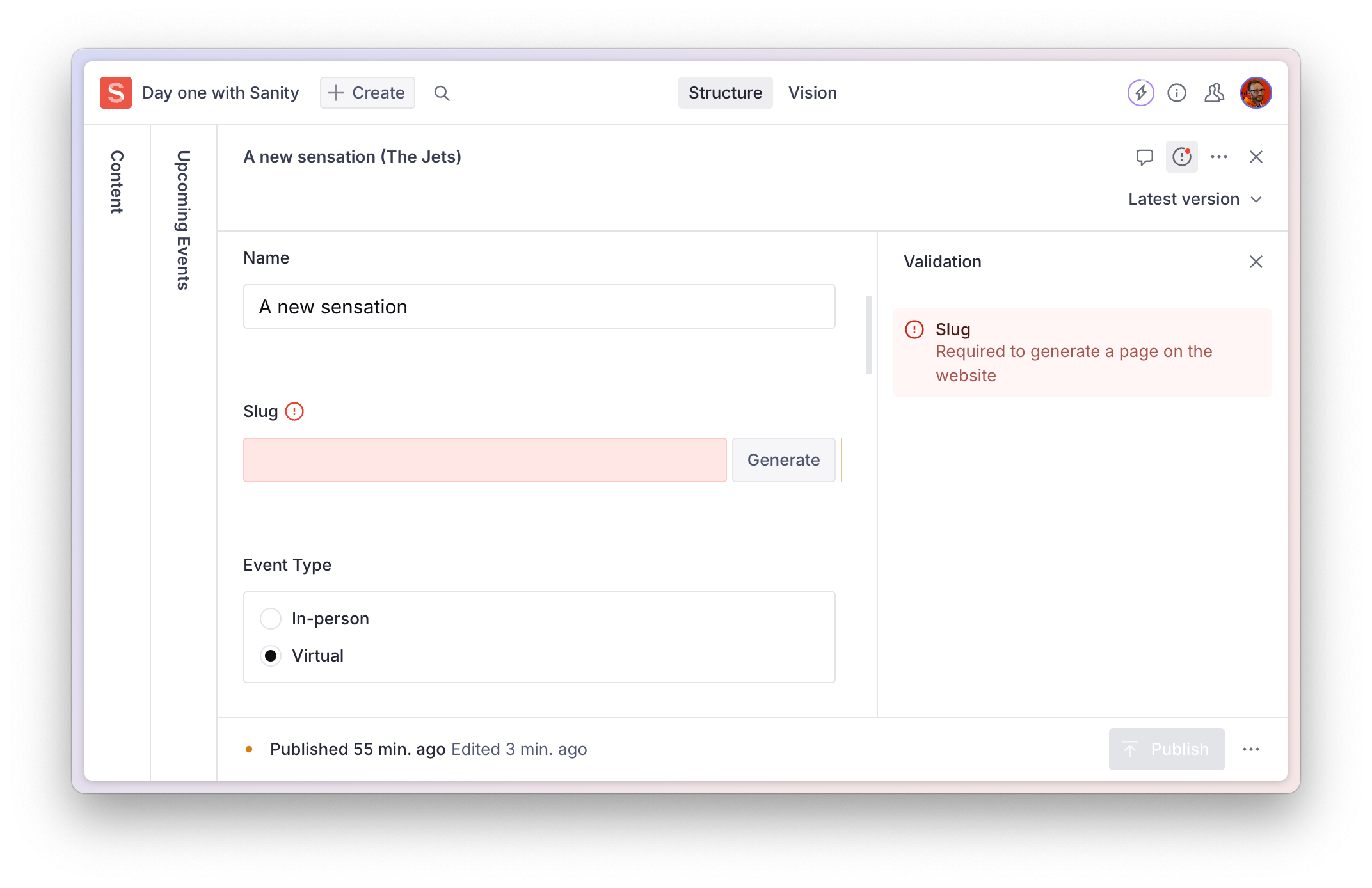
- [ ] Add helpful **error messages** to required validations
### Warnings
Validation warnings are useful to inform the author that while the document **can** be published in its current form – it falls short of a desired editorial standard.
```typescript
defineField({
name: 'summary',
type: 'string',
validation: rule =>
rule
.min(100)
.max(200)
.warning('For consistency, this summary should be between 100-200 characters')
})
```
- [ ] Add helpful validation **warnings** for editorial compliance
### Information
One more validation level is an `info` popup. This is useful for general information about a field, especially when the text is too long to place in the `description` field key.
Note, this currently will only display if `required` is also used.
```typescript
defineField({
name: 'definition',
type: 'string',
validation: rule =>
rule.required().info('This field is important for...')
})
```
## Form Design
### Field ordering
The order of your fields in a schema is important. Good form design usually includes putting the "simplest" fields higher. Followed by, in descending order, less important or more complicated fields.
You might even use the `hidden` attribute to hide these more complex fields entirely until the simpler fields have values.
- [ ] Logically order fields by simplicity and importance
- [ ] Hide complex fields by default and only reveal them when necessary or invalid
### Fieldsets
> [!TIP]
> Review [the documentation on fieldsets](https://www.sanity.io/docs/object-type#AbjN0ykp)
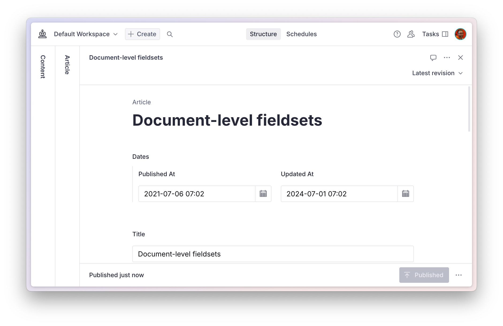
The schema of a `document` can use a `fieldsets` key to **visually** arrange fields together, without effecting how they are nested in the data.
A configuration like this:
```typescript:./schemaTypes/article.ts
export default defineType({
name: 'article',
title: 'Article',
type: 'document',
fieldsets: [
{name: 'dates', title: 'Dates', options: {columns: 2}},
],
fields: [
defineField({name: 'publishedAt', type: 'datetime', fieldset: 'dates'}),
defineField({name: 'updatedAt', type: 'datetime', fieldset: 'dates'}),
// ...and the rest
```
Will render these two fields side-by-side at the root of the document.
`object` schema types can use the same options for fields in the object.
Once grouped, a `fieldset` can be collapsible – and collapsed by default – to tidy up the appearance. It can also declare `columns` so that fields are rendered side-by-side.
---
## Lesson 4: Structure customization
https://www.sanity.io/learn/course/studio-excellence/structure-customization
Learn how to customize how document lists and document views are organized in the Structure tool.
> [Video: Structure customization](https://www.sanity.io/learn/course/studio-excellence/structure-customization)
By default, the Structure tool will list all the unique document schema types registered to your Studio workspace. When you select a document type in the first pane, it will open a list of documents; when you select a document, it will open its form.
This is a good start, but you may want to filter, reorder, and decorate these lists. To do this, you can use the Structure Builder API, a powerful – but at times complex – set of functions and methods that lets you describe how the interface should work.
> [!TIP]
> See: [Structure Builder API Reference](https://www.sanity.io/learn/studio/structure-builder-reference) for details of all the possibilities.
> [!TIP]
> See [Structure Builder cheat sheet](https://www.sanity.io/learn/studio/structure-builder-cheat-sheet) for quick examples of the most commonly used configurations
## Defining a custom structure
You start by giving the `structureTool()` plugin inside `sanity.config.ts` some additional configuration. It takes two parameters:
1. `structure`: defines which document lists are displayed.
2. `defaultDocumentNode`: defines document views for document types, unless overwritten in structure.
Both of these parameters take functions that include the `StructureBuilder` object, commonly shortened to `S`. This object contains all the methods required to create customized lists of documents. It has both **primitive** methods that are fairly low-level, and **convenience **methods that have higher abstractions that do more out of the box.
You will start by making the titles for the document types pluralized. Notice how the **convenience **method `documentTypeListItem(type)` takes a document type name. Based on this one parameter, it defines what will appear in the next document pane when it’s selected, as well as configuration for document pane menus, and so on.
- [ ] **Create** a new file for the tool's `structure`
```typescript:apps/studio/structure/index.ts
import type {StructureResolver} from 'sanity/structure'
export const structure: StructureResolver = (S) =>
S.list()
.id('root')
.title('Content')
.items([
S.documentTypeListItem('event').title('Events'),
S.documentTypeListItem('artist').title('Artists'),
S.documentTypeListItem('venue').title('Venues'),
])
```
- [ ] **Update** `sanity.config.ts` to import `structure` into the `structureTool()` plugin
```typescript:apps/studio/sanity.config.ts
// Add to your imports
import {structure} from './structure'
// Update your plugins array
const config = defineConfig({
// ...all other settings
plugins: [
structureTool({structure}),
// ...all other plugins
],
});
```
The first column in your Structure tool should now show the same three document types as before but with pluralized titles and icons.

The first pane, or root pane, could be even more editor-friendly with titled dividers and filtered lists of documents.
- [ ] **Update** your `structure` to the code example below for filtered lists of events
```typescript:apps/studio/structure/index.ts
import type {StructureResolver} from 'sanity/structure'
export const structure: StructureResolver = (S) =>
S.list()
.id('root')
.title('Content')
.items([
S.divider().title('Events'),
S.listItem()
.title('Upcoming')
.schemaType('event')
.child(S.documentList().title('Upcoming Events').filter('date >= now()')),
S.listItem()
.title('Past')
.schemaType('event')
.child(S.documentList().title('Past Events').filter('date < now()')),
S.divider().title('Artists & Venues'),
S.documentTypeListItem('artist').title('Artists'),
S.documentTypeListItem('venue').title('Venues'),
])
```
Your first column should now look like this, with events helpfully filtered into separate lists.

This is an example of using structured content to power useful and data-driven groupings of documents. You didn't have to make new content types for "upcoming" and "past" events, or compromise your content model in other ways.
## Document view panes
> [!TIP]
> See [Get started with Structure Builder API](https://www.sanity.io/learn/studio/structure-builder-introduction) in the documentation.
The Structure tool can be configured to change document view options in the document editor. Each document type can have a default set of **views**. The document **form** is the default **view**.
Document views help give additional context to the editing experience. You might load in a web preview, text analysis, or analytics alongside the editor so your content creators don't lose context as they create.
Any React component can be loaded into a View Pane. For simplicity today, you'll set up the [Documents Pane plugin](https://www.sanity.io/plugins/documents-pane) to display a list of events an artist is referenced in.
- [ ] **Run** the following command to install the Document Pane plugin into your Studio
```sh
# in apps/studio
pnpm add sanity-plugin-documents-pane
```
- [ ] **Create** a new file to configure the `defaultDocumentNode` of the structure tool
```tsx:apps/studio/structure/defaultDocumentNode.ts
import type {DefaultDocumentNodeResolver} from 'sanity/structure'
import DocumentsPane from 'sanity-plugin-documents-pane'
export const defaultDocumentNode: DefaultDocumentNodeResolver = (S, {schemaType}) => {
switch (schemaType) {
case `artist`:
return S.document().views([
S.view.form(),
S.view
.component(DocumentsPane)
.options({
query: `*[_type == "event" && references($id)]`,
params: {id: `_id`},
})
.title('Events'),
])
default:
return S.document().views([S.view.form()])
}
}
```
- [ ] **Update** your Studio config to import `defaultDocumentNode` into the `structureTool()` plugin
```typescript:apps/studio/sanity.config.ts
// Update your imports
import {structure} from './structure'
import {defaultDocumentNode} from './structure/defaultDocumentNode'
// Update your plugins array
const config = defineConfig({
// ...all other settings
plugins: [
structureTool({ structure, defaultDocumentNode }),
// ...all other plugins
],
});
```
When you open any Artist document, you should now see a list of any Events in which they are referenced.

Your Studio now has customized lists and document view panes.
We have only scratched the surface of what you can do with the Structure Builder API: You can load different structures for different users, update sorting options, and more.
In your structure filters, you may have noticed some GROQ to filter results – it’s time to learn how GROQ works!
---
## Lesson 5: Custom input components
https://www.sanity.io/learn/course/studio-excellence/custom-form-components
Customize input components for Sanity Studio to further enhance the editorial experience for specific use cases.
> [Video: Custom input components](https://www.sanity.io/learn/course/studio-excellence/custom-form-components)
While you can express almost any content model in the Sanity Studio schema, sometimes you can create a better editing experience for a certain field by creating a custom input component.
- You may **decorate** an input by wrapping it in another component to include contextual information besides, above, or below it.
- Or you may **customize** an input by swapping out the default component and handling patch operations to the Content Lake yourself.
A good example of customization for simplification is the [Availability Plugin](https://www.npmjs.com/package/sanity-plugin-availability). Without the custom UI, an author would have to click through three-level-deep nested modals to change the time for each day separately.
Today, you'll focus on **decoration**, as **customization** is a more extensive topic.
> [!TIP]
> See [Form Components](https://www.sanity.io/learn/studio/form-components) in the documentation for full details on the different levels at which components can be customized in the document form.
## Decorating a field with more context
In the document type for events, there is a field to indicate the date and time of the event and another to add when the doors are open. Since `doorsOpen` represents the **minutes** the doors open before the start time, there's a mental overhead required to understand what **time** doors open.
To solve this, you can create a form component that wraps the `doorsOpen` field and reads the `date` field's value to calculate and display the date and time doors are open.
- [ ] **Create** a new file for the custom input component
```tsx:apps/studio/schemaTypes/components/DoorsOpenInput.tsx
import {NumberInputProps} from 'sanity'
export function DoorsOpenInput(props: NumberInputProps) {
return DoorsOpenInput
}
```
- [ ] **Update** the event document schema type to use this component on the `doorsOpen` field
```typescript:apps/studio/schemaTypes/eventType.ts
// Import the component
import {DoorsOpenInput} from './components/DoorsOpenInput'
// Replace "doorsOpen" in the array of fields:
defineField({
name: 'doorsOpen',
description: 'Number of minutes before the start time for admission',
type: 'number',
initialValue: 60,
group: 'details',
components: {
input: DoorsOpenInput
}
}),
```
You should now see your custom input component in place of the default number field UI.
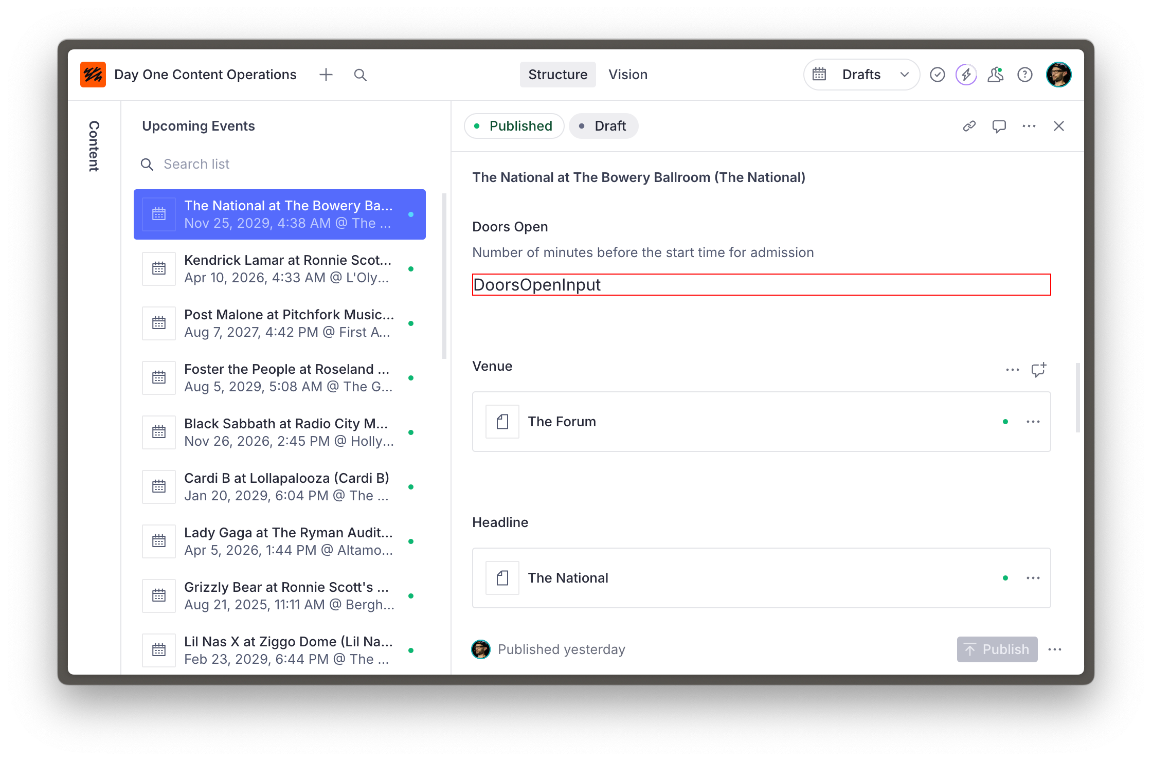
So far so good, but a red-outlined box isn't very useful for authors.
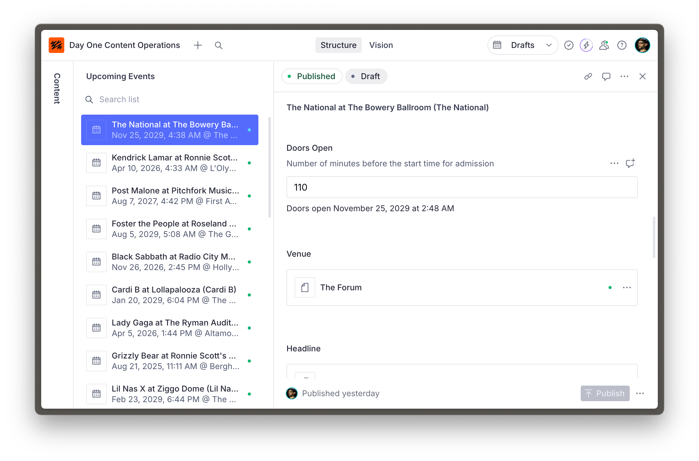
The updated code below has three key features:
1. It uses the `renderDefault` method from the received props to render the default input inside this component.
2. Other components are imported from `@sanity/ui` – the library used for Sanity Studio. Using these ensures the components you create are in visual harmony with the rest of the Studio.
3. It retrieves the date field's value using the `useFormValue` hook, which can access the current state of the document and resolve values using the supplied path.
- [ ] **Run** the following in the terminal to install `@sanity/ui` as a dependency
```sh
# in apps/studio
pnpm install @sanity/ui
```
- [ ] **Update** the `DoorsOpenInput` component to show the date and time that doors open
```tsx:schemaTypes/components/DoorsOpenInput.tsx
import {NumberInputProps, useFormValue} from 'sanity'
import {Stack, Text} from '@sanity/ui'
function subtractMinutesFromDate(date: string, minutes: number) {
return new Date(new Date(date).getTime() - minutes * 60000)
}
export function DoorsOpenInput(props: NumberInputProps) {
const date = useFormValue(['date']) as string | undefined
return (
{props.renderDefault(props)}
{typeof props.value === 'number' && date ? (
Doors open{' '}
{subtractMinutesFromDate(date, props.value).toLocaleDateString(undefined, {
month: 'long',
day: 'numeric',
year: 'numeric',
hour: 'numeric',
minute: 'numeric',
})}
) : null}
)
}
```
Your input is now decorated with useful context which is updated as the value of fields change.
## A word of caution
The relative ease of customization for input components makes it tempting to reach for them regularly. However, consider that each piece of custom functionality you build into your Studio becomes another additional piece of maintenance.
Consult the documentation for schema types and ensure you've exhausted all the built-in options to fine-tune the authoring experience before creating a custom input. And make sure you try out customizations with those who will work with the Studio.
## Need inspiration?
This is just the beginning! There are guides for customizing components for different field types at different levels and even adding components to the root of a document.
It's also possible to intercept fields of a specific type or configuration by loading input components from the `sanity.config.ts` file.
> [!TIP]
> Look through [this series of guides on custom input components](https://www.sanity.io/guides/create-a-coupon-generator-string-field-input) for inspiration
> [!TIP]
> Learn more about [Sanity UI](https://www.sanity.io/ui)
---
## Lesson 6: Member-specific options
https://www.sanity.io/learn/course/studio-excellence/member-mastery
The Studio’s configuration can respond to the current member’s role, offering a more guided experience for content creation.
> [Video: Member-specific options](https://www.sanity.io/learn/course/studio-excellence/member-mastery)
> [!TIP]
> Review [Roles](https://www.sanity.io/learn/user-guides/roles) in the documentation
## Read-only and hidden fields
If members of a specific role should not be able to edit a field, but will benefit from seeing its current value, mark it as read-only by inspecting the current user's roles.
- [ ] **Update** the `event` document type's slug field so only administrators can modify an existing slug
```typescript:apps/studio/schemaTypes/eventType.ts
defineField({
name: 'slug',
type: 'slug',
group: 'details',
options: {source: 'name'},
validation: (rule) => rule.required().error(`Required to generate a page on the website`),
hidden: ({document}) => !document?.name,
readOnly: ({value, currentUser}) => {
// Anyone can set the initial slug
if (!value) {
return false
}
const isAdmin = currentUser?.roles.some((role) => role.name === 'administrator')
// Only admins can change the slug
return !isAdmin
},
}),
```
> [!WARNING]
> This will only protect the field in the Studio and not from an API request
The same function is available in the `hidden` key, so fields are not visible to specific users.
Note that the field's **value** will still appear in the data, and an invalid field can still be hidden – potentially leading to confusion.
## Tools
> [!TIP]
> Review [Studio Tools](https://www.sanity.io/learn/studio/studio-tools) and [Studio tools reference](https://www.sanity.io/learn/studio/tool-api-reference) in the documentation
Tools can be conditionally loaded depending on – among other variables – the current user.
Perhaps you only want Administrators to see the Vision plugin for testing GROQ queries. The code below will return a filtered list to all non-administrator role users.
- [ ] **Update** `sanity.config.ts` so that only administrators can see the Vision tool
```typescript:apps/studio/sanity.config.ts
export default defineConfig({
// ...all other settings
tools: (prev, {currentUser}) => {
const isAdmin = currentUser?.roles.some((role) => role.name === 'administrator')
if (isAdmin) {
return prev
}
return prev.filter((tool) => tool.name !== 'vision')
},
})
```
---
## Lesson 7: Interactive previews
https://www.sanity.io/learn/course/studio-excellence/intelligent-integrations
Give your authors more confidence to press publish by rendering live updating previews of new drafts or other content releases
> [Video: Interactive previews](https://www.sanity.io/learn/course/studio-excellence/intelligent-integrations)
> [!TIP]
> Review [Previewing content in presentation](https://www.sanity.io/docs/preview-content-on-site#68f497772ca7) in the documentation
## Visual editing
Visual editing can be configured for any web front end. There are multiple [templates, guides, and code examples](https://www.sanity.io/docs/presentation#8baf226e0ab4) for Next.js, Astro, Expo and Remix.
> [!TIP]
> See [Visual editing](https://www.sanity.io/learn/visual-editing/introduction-to-visual-editing) in the documentation
Interactive live preview is the ultimate upgrade for authors inside a headless content management system. There is no substitute for having complete confidence in the impact of your content before pressing publish.
This is usually rendered inside the Presentation tool.
Visual editing is especially powerful when paired with Content Releases so that changes across multiple documents can be stacked and previewed before publishing.
> [!TIP]
> See [Content Releases user guide](https://www.sanity.io/learn/user-guides/content-releases) in the documentation

> [!TIP]
> In the [Work-ready Next.js](https://www.sanity.io/learn/track/work-ready-next-js) track, visual editing is configured during the [Integrated Visual Editing with Next.js](https://www.sanity.io/learn/course/visual-editing-with-next-js) course.
## Components preview
You may also display individual components directly from your frontends or applications inside the Studio. View panes accept the current values of the document being edited and so can be passed in as props to that component.
> [!TIP]
> See the [documentation for `getDefaultDocumentNode`](https://www.sanity.io/docs/structure-builder-reference#97e44ce262c9) to see how components can be loaded alongside the editor.
In the example below, an author is presented with a layout preview of what this property will look like in a search result while authoring the document.

---
## Lesson 8: Extending with plugins
https://www.sanity.io/learn/course/studio-excellence/pleasing-plugins
Plugins for Sanity Studio are a bundle of Studio config which can add extra schema types, tools and more
> [Video: Extending with plugins](https://www.sanity.io/learn/course/studio-excellence/pleasing-plugins)
Here are two examples of popular plugins to extend the authoring experience.
## Media browser

The Media browser plugin adds a superset of features to the existing, including tagging, alt text, and reverse-lookup of documents where the image is referenced.
- [ ] **Consider** installing [the media browser plugin](https://www.sanity.io/plugins/sanity-plugin-media)
## Iframe Pane
For instances where there is a direct relationship between a document you are currently editing and an external URL, the Iframe pane is a convenient way to render them side-by-side.
Examples include email preview, website analytics, or an automatically generated Open Graph image.

- [ ] **In future**, consider installing the [Iframe Pane plugin](https://www.sanity.io/plugins/iframe-pane)
---
## Lesson 9: Internationalization
https://www.sanity.io/learn/course/studio-excellence/internationalization
Configuring the Studio for multi-lingual content can be done with plugins to create your ideal workflow for localization.
> [Video: Internationalization](https://www.sanity.io/learn/course/studio-excellence/internationalization)
Authoring content in multiple languages introduces complexity into your content operations.
As with all things Sanity, there is no one-size-fits-all approach to internationalization. Instead, we provide you all the tools to ensure that the way you work is made possible.
You may be interested in completing the course material dedicated to this topic.
> [!TIP]
> Take the [Localization](https://www.sanity.io/learn/course/localization) course
The guide to internationalization in the documentation is brief, comprehensive and shows the different plugins available to power either document or field-level translations.
> [!TIP]
> See [Localization](https://www.sanity.io/learn/studio/localization) in the documentation
Sanity also offers built-in AI-powered translation via Agent Actions.
> [!TIP]
> See the [Translate quick start](https://www.sanity.io/learn/agent-actions/translate-quickstart) in the documentation
---
## Lesson 10: Awesome authoring
https://www.sanity.io/learn/course/studio-excellence/awesome-authors
This is not a technical exercise; it's a social one!
> [Video: Awesome authoring](https://www.sanity.io/learn/course/studio-excellence/awesome-authors)
By completing this course, you have hopefully already made vast improvements to the Studio for those who use it.
However, the greatest improvements you can make in a Studio implementation come from feedback from those who use the Studio day-to-day to author content.
Uncover any friction preventing authors from creating content and confidently publishing it. Check back regularly.
> [!TIP]
> Consider completing the [Implementing Sanity successfully](https://www.sanity.io/learn/course/implementing-sanity-successfully) course for guidance on building the ultimate cross-functional content creation team.
---
## Related Resources
- [Track overview](https://www.sanity.io/learn/track/sanity-developer-essentials.md)
- [All courses and lessons](https://www.sanity.io/learn/sitemap.md)
- [Complete content for LLMs](https://www.sanity.io/learn/llms-full.txt)