# Custom input components
https://www.sanity.io/learn/course/studio-excellence/custom-form-components.md
Customize input components for Sanity Studio to further enhance the editorial experience for specific use cases.
While you can express almost any content model in the Sanity Studio schema, sometimes you can create a better editing experience for a certain field by creating a custom input component.
* You may **decorate** an input by wrapping it in another component to include contextual information besides, above, or below it.
* Or you may **customize** an input by swapping out the default component and handling patch operations to the Content Lake yourself.
A good example of customization for simplification is the [Availability Plugin](https://www.npmjs.com/package/sanity-plugin-availability). Without the custom UI, an author would have to click through three-level-deep nested modals to change the time for each day separately.
Today, you'll focus on **decoration**, as **customization** is a more extensive topic.
1. See [Form Components](https://www.sanity.io/learn/studio/form-components) in the documentation for full details on the different levels at which components can be customized in the document form.
## Decorating a field with more context
In the document type for events, there is a field to indicate the date and time of the event and another to add when the doors are open. Since `doorsOpen` represents the **minutes** the doors open before the start time, there's a mental overhead required to understand what **time** doors open.
To solve this, you can create a form component that wraps the `doorsOpen` field and reads the `date` field's value to calculate and display the date and time doors are open.
1. **Create** a new file for the custom input component
```tsx:apps/studio/schemaTypes/components/DoorsOpenInput.tsx
import {NumberInputProps} from 'sanity'
export function DoorsOpenInput(props: NumberInputProps) {
return DoorsOpenInput
}
```
1. **Update** the event document schema type to use this component on the `doorsOpen` field
```typescript:apps/studio/schemaTypes/eventType.ts
// Import the component
import {DoorsOpenInput} from './components/DoorsOpenInput'
// Replace "doorsOpen" in the array of fields:
defineField({
name: 'doorsOpen',
description: 'Number of minutes before the start time for admission',
type: 'number',
initialValue: 60,
group: 'details',
components: {
input: DoorsOpenInput
}
}),
```
You should now see your custom input component in place of the default number field UI.
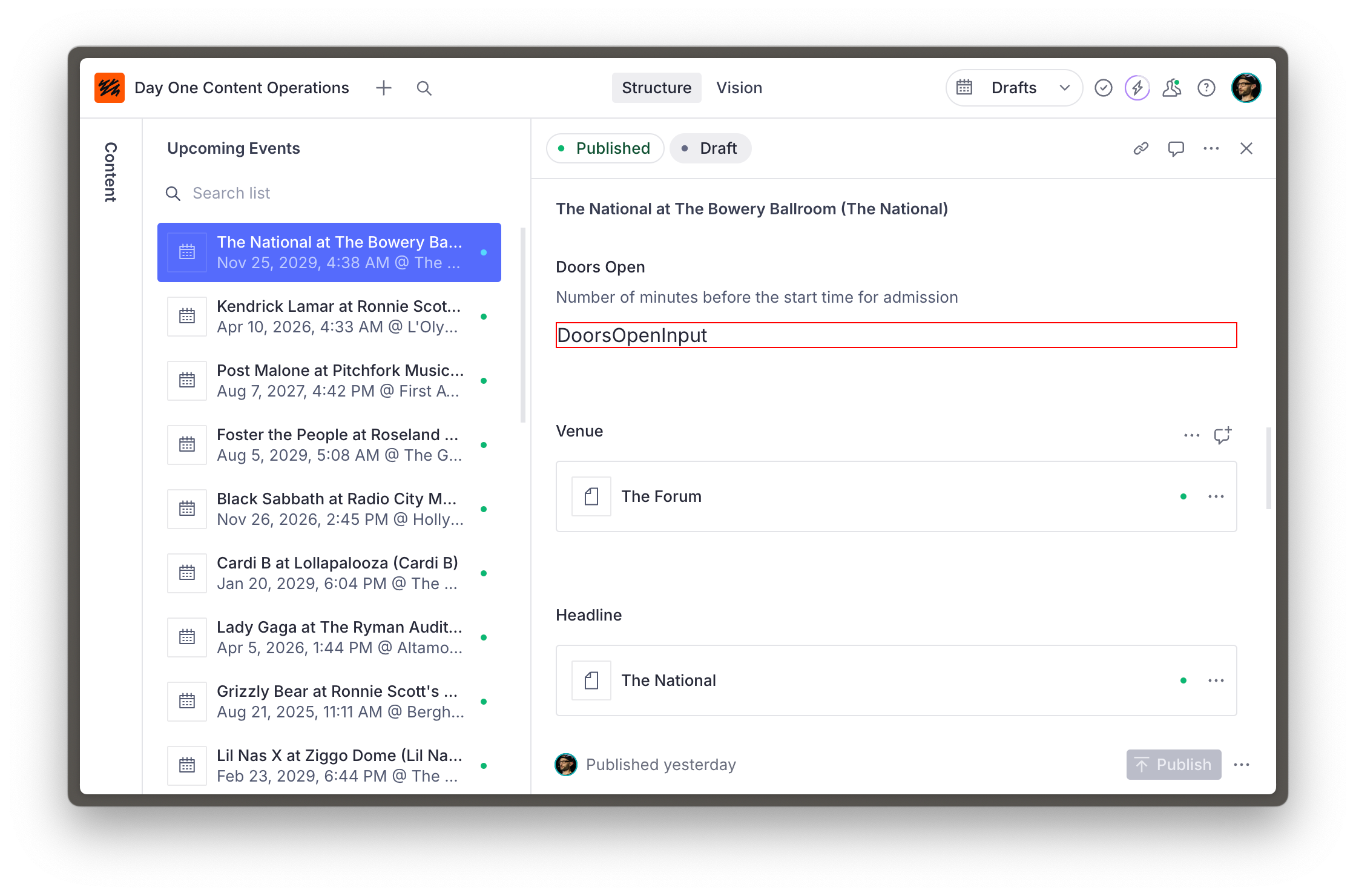
So far so good, but a red-outlined box isn't very useful for authors.
The updated code below has three key features:
1. It uses the `renderDefault` method from the received props to render the default input inside this component.
2. Other components are imported from `@sanity/ui` – the library used for Sanity Studio. Using these ensures the components you create are in visual harmony with the rest of the Studio.
3. It retrieves the date field's value using the `useFormValue` hook, which can access the current state of the document and resolve values using the supplied path.
1. **Run** the following in the terminal to install `@sanity/ui` as a dependency
```sh
# in apps/studio
pnpm install @sanity/ui
```
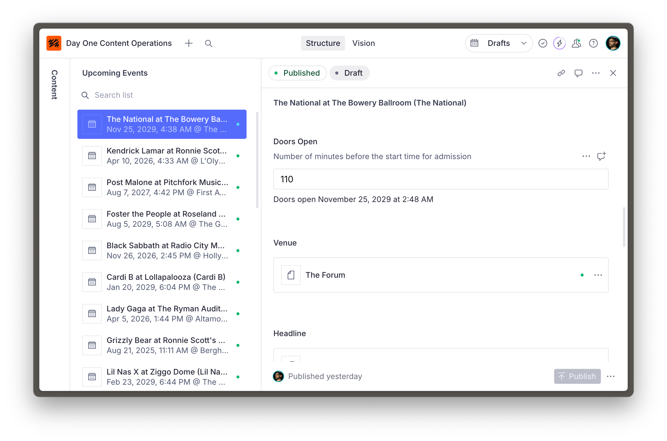
1. **Update** the `DoorsOpenInput` component to show the date and time that doors open
```tsx:schemaTypes/components/DoorsOpenInput.tsx
import {NumberInputProps, useFormValue} from 'sanity'
import {Stack, Text} from '@sanity/ui'
function subtractMinutesFromDate(date: string, minutes: number) {
return new Date(new Date(date).getTime() - minutes * 60000)
}
export function DoorsOpenInput(props: NumberInputProps) {
const date = useFormValue(['date']) as string | undefined
return (
{props.renderDefault(props)}
{typeof props.value === 'number' && date ? (
Doors open{' '}
{subtractMinutesFromDate(date, props.value).toLocaleDateString(undefined, {
month: 'long',
day: 'numeric',
year: 'numeric',
hour: 'numeric',
minute: 'numeric',
})}
) : null}
)
}
```
Your input is now decorated with useful context which is updated as the value of fields change.
## A word of caution
The relative ease of customization for input components makes it tempting to reach for them regularly. However, consider that each piece of custom functionality you build into your Studio becomes another additional piece of maintenance.
Consult the documentation for schema types and ensure you've exhausted all the built-in options to fine-tune the authoring experience before creating a custom input. And make sure you try out customizations with those who will work with the Studio.
## Need inspiration?
This is just the beginning! There are guides for customizing components for different field types at different levels and even adding components to the root of a document.
It's also possible to intercept fields of a specific type or configuration by loading input components from the `sanity.config.ts` file.
1. Look through [this series of guides on custom input components](https://www.sanity.io/guides/create-a-coupon-generator-string-field-input) for inspiration
2. Learn more about [Sanity UI](https://www.sanity.io/ui)