
Elevate the basic editorial experience with field titles, descriptions, validation, conditional fields, field groups, and document list previews.
Helping content creators create content consistently is simpler when they're presented with fewer options and helpful guardrails.
source for generating the slug field value// Replace "slug" in the array of fields:defineField({ name: 'slug', type: 'slug', options: {source: 'name'},}),Text input fields can contain any string. Avoid accidental duplicates or misspellings by providing preset options.
eventType field to a few options by providing a list of values:// Replace "eventType" in the array of fields:defineField({ name: 'eventType', type: 'string', options: { list: ['in-person', 'virtual'], layout: 'radio', },}),If new documents could benefit from sensible default values which are often correct, an initial value can be set at the field level.
Note that this won't affect existing documents. But every new document will now start with this value.
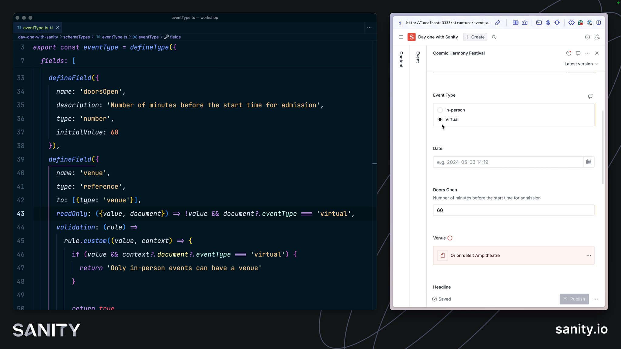
doorsOpen field to 60// Replace "doorsOpen" in the array of fields:defineField({ name: 'doorsOpen', type: 'number', initialValue: 60,}),Adding more context and intentionality to fields can be very helpful for content teams.
With only its name to describe it, this field fails to give the author context for its use. Adding descriptions to fields helps clarify their intention and guide the content creation experience.
doorsOpen field// Replace "doorsOpen" in the array of fields:defineField({ name: 'doorsOpen', description: 'Number of minutes before the start time for admission', type: 'number', initialValue: 60,}),Structured content is more trustworthy when it is validated. Validation rules can also give content creators more confidence to press Publish.
slug field required// Replace "slug" in the array of fields:defineField({ name: 'slug', type: 'slug', options: {source: 'name'}, validation: (rule) => rule .required() .error(`Required to generate a page on the website`),}),Note that the error message can be customized so that authors better understand the context of why a warning or error is being displayed.
Custom rules have access to the entire document so that fields may be validated against one another. They should return a string in case of an error or true once the field is considered valid.
// Replace "venue" in the array of fields:defineField({  name: 'venue',  type: 'reference',  to: [{type: 'venue'}],  validation: (rule) =>    rule.custom((value, context) => {      if (value && context?.document?.eventType === 'virtual') {        return 'Only in-person events can have a venue'      }
return true }),}),It can often be useful to hide less common or more complex fields until they are required. While hidden and readOnly can be set to true or false – they can also accept a function to apply some logic.
slug field if the name field is empty// Replace "slug" in the array of fields:defineField({ name: 'slug', type: 'slug', options: {source: 'name'}, validation: (rule) => rule.required().error(`Required to generate a page on the website`), hidden: ({document}) => !document?.name,}),venue to readOnly if the field does not have a value and the event type is virtual// Replace "venue" in the array of fields:defineField({ name: 'venue', type: 'reference', to: [{type: 'venue'}], readOnly: ({value, document}) => !value && document?.eventType === 'virtual', validation: (rule) => rule.custom((value, context) => { if (value && context?.document?.eventType === 'virtual') { return 'Only in-person events can have a venue' }
return true }),}),Note that "hidden" only effects the Studio interface. Fields will still retain their values whether they are visible in the Studio or not.
The document form is still one long column of fields. Let's introduce a set of field groups (think of them like tabs) to tidy up the form.
event document schema: details and editorial// Above the "fields" arraygroups: [ {name: 'details', title: 'Details'}, {name: 'editorial', title: 'Editorial'},],// Assign each field to one groupgroup: 'details',
// or several!group: ['details', 'editorial'],The image and details fields make the most sense in "editorial" and the rest in "details." You could customize further by adding an icon to each group and setting one active by default.
By default, documents are indicated with a plain icon and a "best guess" at the document's title. The first and simplest thing we can do is give documents of a certain type a unique icon so that every document list and search result will use them by default.
You could install an icon library of your choice. For this lesson you'll use the @sanity/icons package.
import {CalendarIcon} from '@sanity/icons'
export const eventType = defineType({  name: 'event',  title: 'Event',  icon: CalendarIcon,  // ...all other settings})
Let's go further! So that our documents are even more discoverable, you can update the preview property for our document type.
In preview, values are "selected" from the document and then fed into the document preview's title, subtitle, and media slots.
name in title subtitle image in the media // After the "fields" arraypreview: { select: { title: "name", subtitle: "headline.name", media: "image", },},Take a look at your document list now. It's much easier to discern the document types at a glance.
There are other values in the document that would be useful in list previews. With the prepare function, you can modify values before returning them to the preview.
Update your event type’s preview configuration to the below:
// Update the preview key in the schemapreview: {  select: {    name: 'name',    venue: 'venue.name',    artist: 'headline.name',    date: 'date',    image: 'image',  },  prepare({name, venue, artist, date, image}) {    const nameFormatted = name || 'Untitled event'    const dateFormatted = date      ? new Date(date).toLocaleDateString(undefined, {          month: 'short',          day: 'numeric',          year: 'numeric',          hour: 'numeric',          minute: 'numeric',        })      : 'No date'
return { title: artist ? `${nameFormatted} (${artist})` : nameFormatted, subtitle: venue ? `${dateFormatted} at ${venue}` : dateFormatted, media: image || CalendarIcon, } },},Take a step back and compare the editorial experience with the simple form you had initially. Content creators can discern the different types of documents and more easily create trustworthy content.
You could go further by adding icons to the artist and venue-type documents.
This is a much better experience.
Up to now, you have mostly configured the Studio using the built-in options. But you can take it even further and customize the Studio. That is what you will learn in the next lesson!