First-class singletons and document counts, plus faster tool switching, and form and Presentation fixes
Published: September 29, 2026
This release adds a beta singletons API and live document count badges in structure lists, and collapses long arrays in the form. It also improves tool state persistence when switching between tools, fixes the studio navbar on narrow layouts, and keeps URLs and draft content in Presentation previews.
The first-class singletons API is now in beta
It’s always been possible to register singleton documents in Sanity Studio, but until now it’s necessitated tweaking various configuration options or installing a third-party plugin. The pattern is well established, but we think it should be easier to setup and manage. The first-class singletons API makes singletons easier to set up than ever before.
At its most simple, a studio configuration utilising the new singletons API can be reduced to just a handful of lines:
import { visionTool } from '@sanity/vision'
import { defineConfig } from 'sanity'
import { structureTool } from 'sanity/structure'

import { schemaTypes } from './schemaTypes'

export default defineConfig({
  name: 'default',
  title: 'Periwinkle Mind Cavern',
  projectId: 'xxxxxxxx',
  dataset: 'production',
  plugins: [structureTool(), visionTool()],
  schema: {
    types: schemaTypes,
  },
  document: {
    singletons: ['settings'],
  },
})
The API launches in beta today, and we’ll stabilise it in an upcoming Studio release. To make use of the new API:
- Register a singleton definition using the new
document.singletonsStudio configuration option. You can use the newdefineSingletonfactory function to ensure your definition is typed correctly. Once registered, the singleton will be omitted from document creation menus, its actions will be filtered to prevent it being duplicated, it’ll be filtered from default Structure lists, and a new “Singleton” document badge will be shown when viewing it. - If you have a custom Structure Tool resolver, use one of the new Structure Builder methods to make the singleton accessible in Structure Tool.
S.document().singleton(<id>)can be rendered as a list item’s child,S.listItem().singleton(<id>)creates a list item and a child, andS.list().singletons([<id1>, <id2>, ...])creates a list of singletons. These methods compose into different levels of structure, so you might find yourself reaching for a different method depending on what you want to achieve.
If you use agents, we’ve published a skill you can use to create and migrate singletons. It’s able to migrate singletons that have been set up manually or using a third-party plugin to make use of the new API.
This work builds on awesome contributions by folks like Corey Ward, RD Pennell, and RC Maples, who each helped establish patterns and plugins for implementing singletons.
Live document counts in structure lists
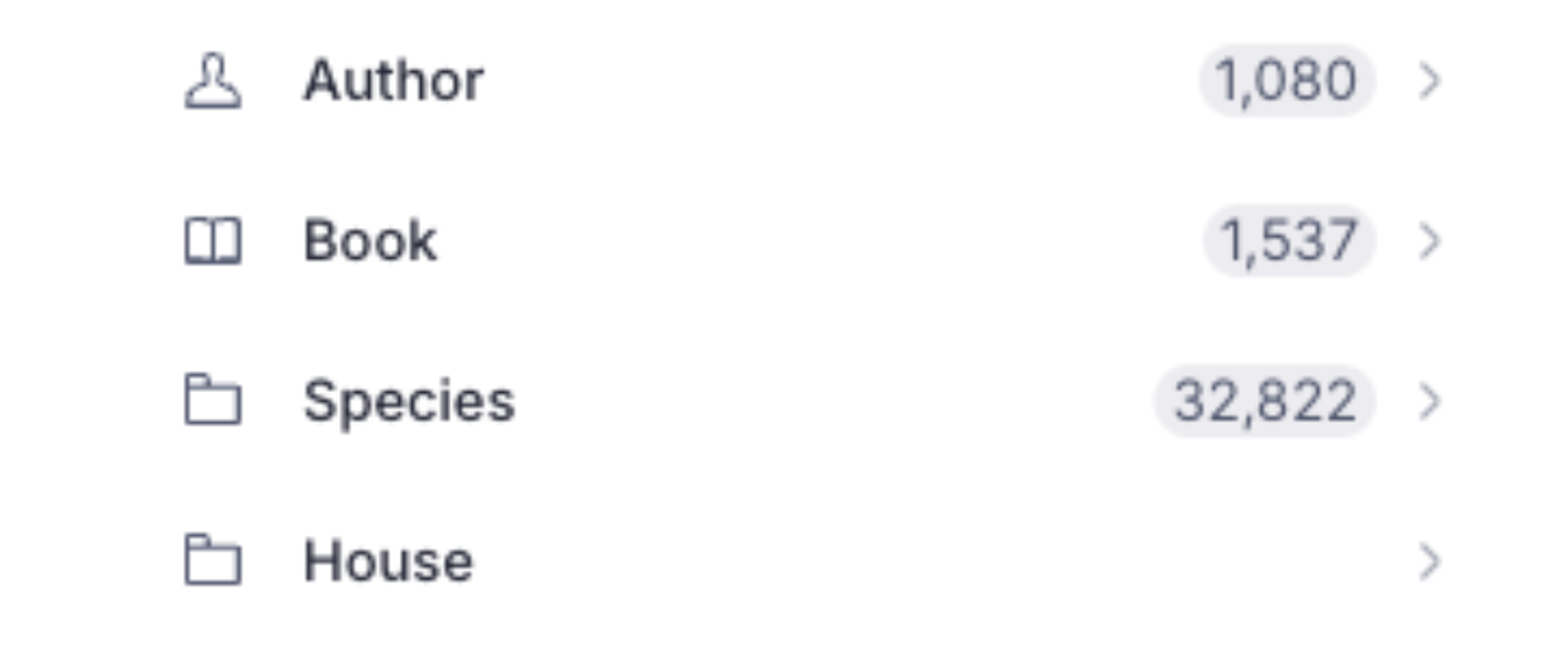
Structure list items can now show a live count of the documents of their type. To turn it on, call showCount() on a list item:
// One type
S.documentTypeListItem('author').showCount()

// The whole content list
S.list()
  .title('Content')
.items(S.documentTypeListItems().map((item) => item.showCount()))showCount() takes an optional boolean, so you can turn it on conditionally, for example item.showCount(types.includes(id)).
The count covers every document of the type in the current perspective and variant. A document with both a draft and a published version counts once.
The badge only appears when the item opens the default document list for its type. If you change that list's filter, parameters, or API version, or use a custom child resolver, the badge is hidden and the studio logs a development warning explaining why. Changing the list's title, ordering, or menu items keeps the badge.
For raw ListItem objects passed to .items(), set displayOptions.showCount. The studio calculates count for you, so setting it by hand has no effect.
For more examples, see Show document counts in the Structure Builder cheat sheet.
Thanks to Kevin Green for suggesting this feature.
Collapsible long arrays
Array fields with many items now show the first few and collapse the rest behind a Show all N items toggle, so long arrays no longer push the rest of the form out of view. This works for arrays of objects in list and grid layouts, and for arrays of strings and numbers.
An expanded array stays open until you reload the page. It also expands when focus moves to a hidden item, for example when you click a validation error, add an item, or upload a text file into the array.
By default, list layouts collapse after 4 items and grid layouts after 8. To turn collapsing off, or to set one limit for both layouts across your studio, use form.arrays.collapseItems:
export default defineConfig({
  // ...
  form: {
    arrays: {
      collapseItems: {
        enabled: true, // default
        limit: 4, // applies to list and grid layouts
      },
    },
  },
})
To override the limit for one field, set collapseItemsAfter in its options. The field setting takes precedence over the studio setting:
defineField({
  name: 'authors',
  type: 'array',
  of: [{type: 'reference', to: [{type: 'author'}]}],
  options: {
    collapseItemsAfter: 10, // or false to always show every item
  },
})
Portable Text, tags-layout arrays, and arrays with predefined options don't collapse. To drag an item past the collapsed boundary, expand the array first.
Keep recent tools mounted when switching (beta)
A new beta flag keeps your three most recently used tools mounted when you switch between them. Returning to a tool restores the URL you left it at, instead of its start page. For example, going from Presentation to Structure and back keeps the preview loaded and your document open, with no loading overlay.
export default defineConfig({
  // ...
  beta: {
    reactActivityMode: {enabled: true},
  },
})
Use in development and staging only
This flag is in beta and not ready for production. Hidden tools run inside a React <Activity> boundary, which pauses their effects. Custom tools and plugins that keep state only in effects may misbehave. For details, see React's Activity troubleshooting guide.
Opening a fourth tool unmounts the one you used least recently.
Loading placeholders for lazy-loaded components
When a component passed to studio.components, document.components, or form.components loads with React.lazy(), the studio now shows a placeholder that fits where it renders. Previously, every one showed the same small gray skeleton.
studio.components.layoutandstudio.components.navbar: The studio keeps its startup loading screen until they're ready, so nothing jumps when they appear.document.components.unstable_layout: The document pane's usual loading state.form.components.preview: The preview's own placeholder, at the preview's size.form.components.input,field, anditem: One loading indicator for the form, instead of a skeleton in every field.form.components.block,inlineBlock, andannotation: A placeholder in the affected Portable Text block only. The rest of the document stays visible and scrollable.
The Presentation plugin no longer wraps the document form in its own spinner, so these placeholders appear there too.
To keep the rest of the form usable while a lazy component loads, wrap it in your own <Suspense> with a fallback sized for it:
import {lazy, Suspense} from 'react'
import {definePlugin} from 'sanity'

const MyInput = lazy(() => import('./MyInput'))

export const myPlugin = definePlugin({
  name: 'my-plugin',
  form: {
    components: {
      input: (props) => (
        <Suspense fallback={<MyInputSkeleton />}>
          <MyInput {...props} />
        </Suspense>
      ),
    },
  },
})
If you render form components without FormBuilder
If you render form components with the alpha FormProvider and useFormBuilder().renderInput or renderField, without FormBuilder, wrap them in your own <Suspense>. These components no longer include a Suspense boundary.
Width options for list panes
List panes now accept the same width options as component panes:
S.list()
  .title('Content')
  .minWidth(200)
  .currentMaxWidth(250)
.items(S.documentTypeListItems())minWidth: How narrow you can drag the pane. Defaults to 320px.currentMaxWidth: The pane's maximum width until you resize it. Defaults to 350px.maxWidth: How wide you can drag the pane. Defaults to 640px.
S.documentTypeList() also accepts these options in its object form:
S.documentTypeList({
  schemaType: 'book',
  minWidth: 200,
  currentMaxWidth: 250,
  maxWidth: 480,
})
For all pane options, see the Structure Builder API reference.
Private Studio internals moved to a "dangerously use" entry point
Symbols that sanity, sanity/structure, and sanity/router export under the @internal release tag are now also available from a dedicated entry point: sanity/_dangerously_use_private_internals_that_do_not_follow_semver. The only exception is the deprecated createAuthStore. Use the auth config key instead.
These symbols are still exported from the public entry points, so existing studios and plugins keep working. If your plugin imports an @internal symbol, you can switch now:
// Before
import {useSource, LoadingBlock} from 'sanity'

// After
import {
  useSource,
  LoadingBlock,
} from 'sanity/_dangerously_use_private_internals_that_do_not_follow_semver'
No semver guarantees
Everything in this entry point is a studio implementation detail. It can change or disappear in any release, including patch releases. If you import from it, pin an exact sanity version.
🐛 Notable bugfixes and improvements
- The studio navbar now lays out based on its own width. When the studio is narrower than the browser window, for example when it's embedded in a page, tools collapse into the Show more menu instead of pushing the workspace, search, and user buttons out of view.
- In Presentation, the Open preview button keeps the preview's URL fragment (for example,
#details). For cross-site previews configured withpreviewMode.enable, it also keeps your draft content when it opens the preview in a new tab. - The Open preview preview secret stays valid while the studio is open, and the button stops using a secret once it expires or preview sharing is turned off.
- When the preview mode enable route is also the preview page, the preview no longer redirects to itself, and it keeps that page's search parameters and fragment.
- The preview location input and share link keep the URL fragment. The Share menu no longer stays hidden after the preview moves from an origin with
shareAccess: falseto one without preview mode. - The Presentation Tool's locations banner now appears at the same time as the document form. Reconnecting visual editing on a page that was already connected no longer shows a loading overlay.
sanity undeploynow accepts an app ID argument.- Focusing a link annotation's URL input no longer scrolls a Portable Text field to the top when the editor grows with its content.
- The Portable Text toolbar now follows the schema of the table cell you're editing. Styles, lists, decorators, and annotations that only the cell allows are now available. Options the cell doesn't allow stay visible but disabled.
- Opening document inspectors in embedded studio layouts no longer logs React and styled-components warnings.
- Structure panes keep their widths when you release a resize divider.
- When you delete a scheduled draft that was edited while its schedule was paused, the studio now detects the edits and offers to copy the scheduled content back. Previously, it reported the draft as up to date and discarded those edits.
- Draft-only documents in document lists show the draft status ring again.