Create richer array item previews
Object types use a preview property to display contextual information about an item when they are inside of an array; customizing the preview component can make them even more useful for content creators.
This developer guide was contributed by Simeon Griggs (Principal Educator).
Object types use a preview property to display contextual information about an item when they are inside of an array; customizing the preview component can make them even more useful for content creators.
What you need to know:
This guide assumes that you know how to set up and configure a Sanity Studio and have basic knowledge about defining a schema with document and field types. Basic knowledge of React and TypeScript is also useful, although you should be able to copy-paste the example code to get a runnable result.
Custom form components by example
One of Sanity Studio’s most powerful features is custom drop-in replacements for form fields. This guide is one in a series of code examples.
You can get more familiar with the Form Components API in the documentation.
- Create a “coupon generator” string field input
- Create a visual string selector field input
- Create a survey rating number field input
- Create a time duration object field
- Create an array input field with selectable templates
- Create interactive array items for featured elements
- Create richer array item previews
- Create a document form progress component
What you’ll be making
Schema preparation
In this guide, you’ll create a document type named campaign which has an array of offer fields.
Each offer has a title, discount and an expiry date.
Create a new object type for the offer, taking note of the detailed preview configuration.
// ./schema/offer/offerType.ts

import {defineField, defineType} from 'sanity'
import {TagIcon} from '@sanity/icons'

export const offerType = defineType({
  name: 'offer',
  title: 'Offer',
  type: 'object',
  icon: TagIcon,
  fields: [
    defineField({
      name: 'title',
      type: 'string',
      validation: (Rule) => Rule.required().min(0).max(100),
    }),
    defineField({
      name: 'discount',
      description: 'Discount percentage',
      type: 'number',
      validation: (Rule) => Rule.required().min(0).max(100),
    }),
    defineField({
      name: 'validUntil',
      type: 'date',
    }),
  ],
  preview: {
    select: {
      title: 'title',
      discount: 'discount',
      validUntil: 'validUntil',
    },
    prepare({title, discount, validUntil}) {
      return {
        title: title,
        subtitle: !discount
          ? 'No discount'
          : validUntil
          ? `${discount}% discount until ${validUntil}`
          : `${discount}% discount`,
      }
    },
  },
})
Also add a new document type for the campaign:
// ./schema/campaign.ts

import {defineField, defineType} from 'sanity'

export const campaignType = defineType({
  name: 'campaign',
  title: 'Campaign',
  type: 'document',
  fields: [
    defineField({
      name: 'title',
      type: 'string',
    }),
    defineField({
      name: 'offers',
      type: 'array',
      of: [
        defineField({
          name: 'offer',
          type: 'offer',
        }),
      ],
    }),
  ],
})
Add both these files to your Studio and remember to import them to the schemas loaded in sanity.config.ts
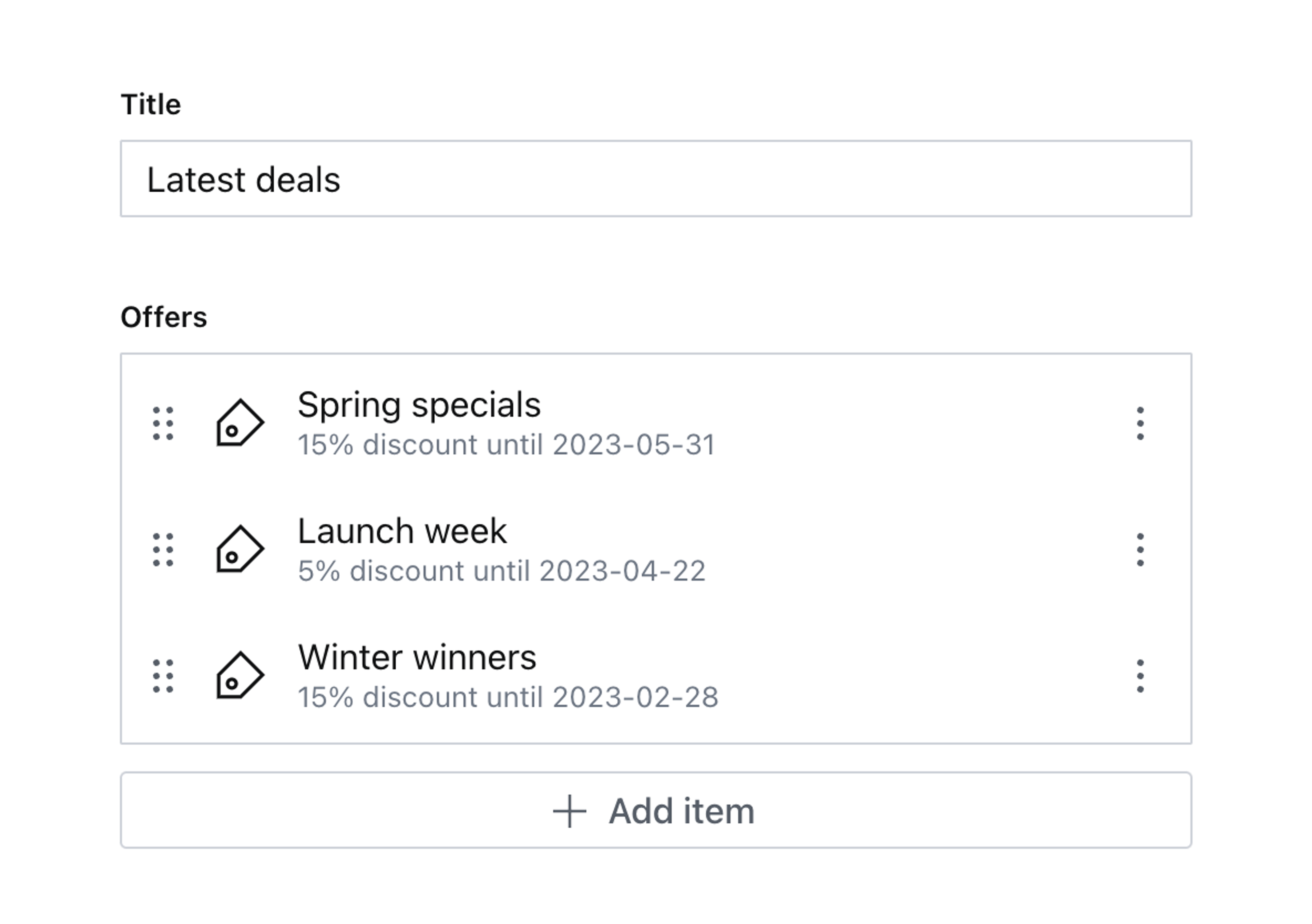
Create a new campaign document, add some offers and your document should look something like this:
The list item previews here are useful, but because dates are hard to read, it’s not immediately clear which dates are expired, soon to expire or far into the future. You could write validation rules to give warnings or errors, but perhaps you don’t want the dates to block publishing.
With some quick edits to the array item preview, these can be much richer.
Create a custom preview component
The preview form component works a little differently from others in the customization API. You cannot add click handlers or any other interactivity because in most cases this component is rendered inside a button. It also does not have access to the value of the field but instead receives the values of the preview property in the schema type definition.
So any customizations will need to be visual, and any extra data required will be deliberately passed down in the schema type definition.
Create a new component file for your item preview:
// ./schema/offer/OfferPreview.tsx

import {Badge, Flex, Box} from '@sanity/ui'
import {PreviewProps} from 'sanity'

export function OfferPreview(props: PreviewProps) {
  return (
    <Flex align="center">
      <Box flex={1}>{props.renderDefault(props)}</Box>
      <Badge tone="positive">Hello!</Badge>
    </Flex>
  )
}
Notice how you can use renderDefault(props) to output the out-of-the-box UI that is defined in the function for the prepare property.
And load it into the offer schema:
// ./schema/offer/offerType.ts
import {OfferPreview} from './OfferPreview'
export const offerType = defineType({
name: 'offer',
// ...other settings
components: {preview: OfferPreview},
preview: {
select: {
title: 'title',
discount: 'discount',
validUntil: 'validUntil',
},
// Remove "prepare" from the preview key!
// You'll handle this in the component soon
},
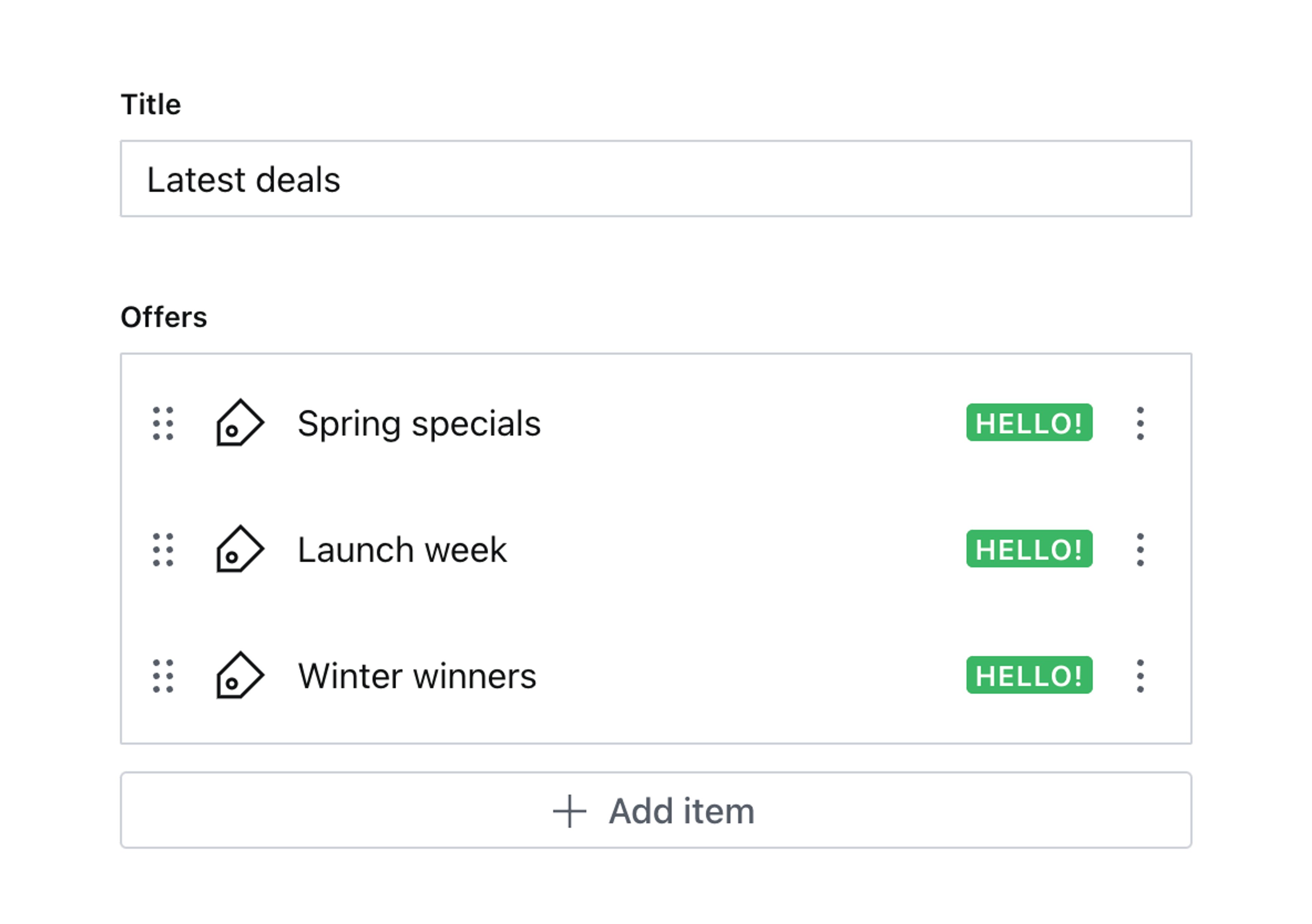
})Return to your documents and look at the offers array. There’s a little green badge alongside each one.
It’s pretty!
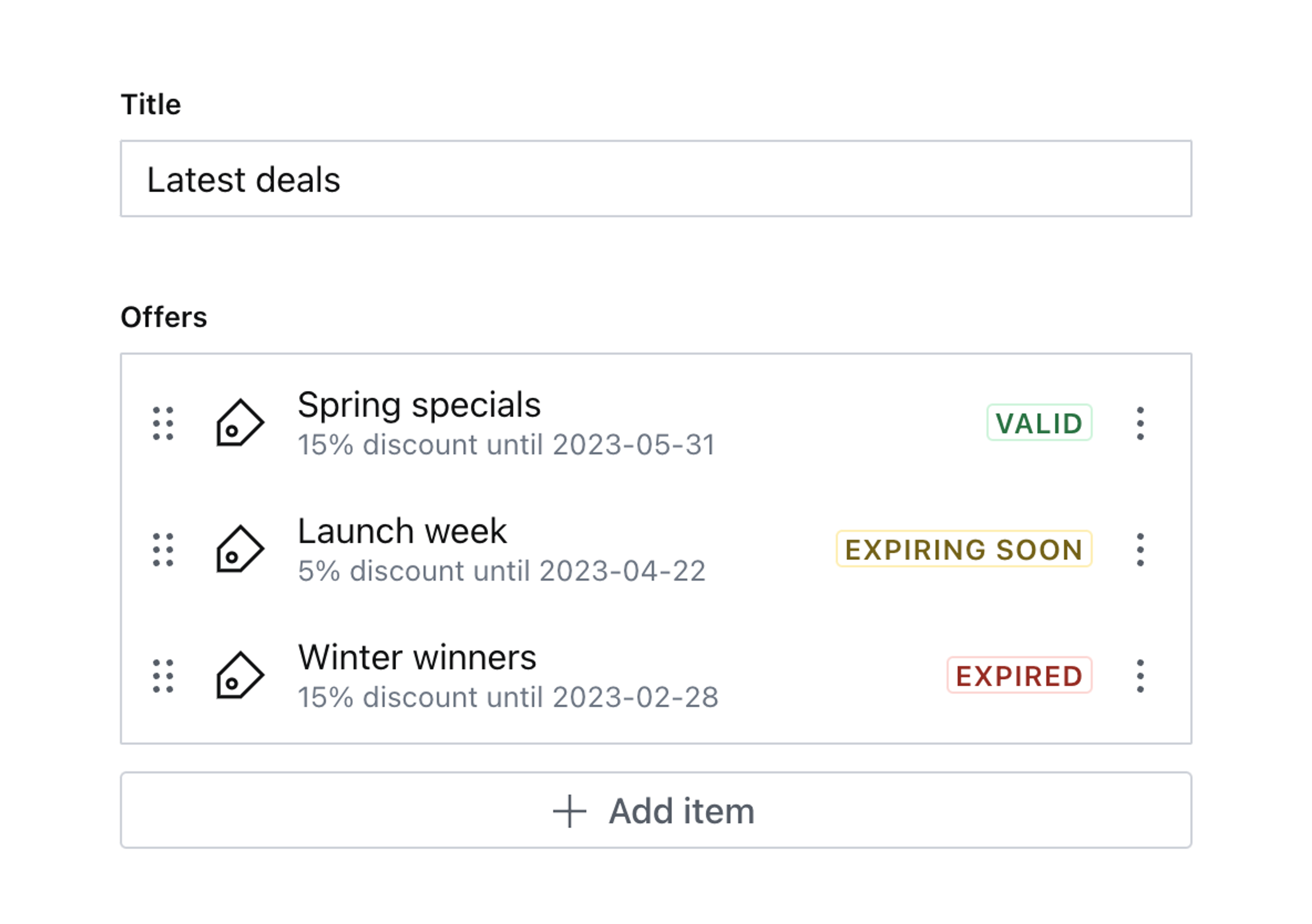
But pretty useless. Since the valid date is available to the component, you can update the component to display a different badge depending on the value of the date.
Customize the component
Update the custom preview component to use the code below.
Because this is TypeScript, you’ll notice the need to recast the props, this is because a component’s PreviewProps type does not receive the field’s value. So instead the the offer schema preview passed down discount and validUntil where usually you would setup title and subtitle.
The component intercepts these values, performs some logic to generate a new subtitle for the props.renderDefault(props) and also displays a relevant Badge alongside the preview.
// ./schema/offer/OfferPreview.tsx

import {useMemo, PropsWithChildren} from 'react'
import {Badge, Flex, Box, BadgeProps} from '@sanity/ui'
import {PreviewProps} from 'sanity'

type CastPreviewProps = PreviewProps & {
  discount?: number
  validUntil?: string
}

export function OfferPreview(props: PreviewProps) {
  // Item previews don't have access to the field's value or path
  // So we are passing in non-standard props in the schema
  // And recasting the type here to match
  const castProps = props as CastPreviewProps
  const {discount, validUntil} = castProps

  const badgeProps: (PropsWithChildren & BadgeProps) | null = useMemo(() => {
    if (!validUntil) {
      return null
    }

    const validUntilDate = new Date(validUntil)

    if (validUntilDate < new Date()) {
      // Offer has expired
      return {
        children: 'Expired',
        tone: 'critical',
      }
    } else if (validUntilDate < new Date(Date.now() + 1000 * 60 * 60 * 24 * 7)) {
      // Offer expires in less than a week
      return {
        children: 'Expiring soon',
        tone: 'caution',
      }
    } else {
      // Offer is still valid
      return {
        children: 'Valid',
        tone: 'positive',
      }
    }
  }, [validUntil])

  const subtitle = !discount
    ? 'No discount'
    : validUntil
    ? `${discount}% discount until ${validUntil}`
    : `${discount}% discount`

  return (
    <Flex align="center">
      {/* Customize the subtitle for the built-in preview */}
      <Box flex={1}>{props.renderDefault({...props, subtitle})}</Box>
      {/* Add our custom badge */}
      {badgeProps?.children ? (
        <Badge mode="outline" tone={badgeProps.tone}>
          {badgeProps.children}
        </Badge>
      ) : null}
    </Flex>
  )
}
Return to your document and take a look at the new contextual badges. It’s now much clearer for authors to understand the status of each item.
Next steps
- Consider also adding validation to display warnings or errors on the object if you require the date value to prevent the document from being published.
- Decorating preview items is just the beginning! You could take a similar approach to render richer previews like images.