Change the height of a Portable Text Editor (PTE) using a custom input component
Ever used a PTE and thought you would like it to take up less space and be focusable without activating it? Now you can!
This developer guide was contributed by Saskia Bobinska (Senior Support Engineer).
Portable Text Editors are a fantastic tool!
Learn how to reduce the height and add a character counter based on the max length set in the field validation.
Sometimes, you need a Portable Text Editor but want it to take up less space in your document form.
In my example, we have a PTE that can only use decorators and annotations, and we need to keep track of the character count. Custom input components make this possible.
The schema
// schemas/portableText/overview.tsx

import { CharacterCountInputPTE } from '@/sanity/components/inputs/CharacterCount'
import { defineArrayMember, defineType, PortableTextBlock } from 'sanity'

/** ## `overview` Type - reduced Portable Text
 *
 * The height of the input is reduced to 2 lines.
 *
 * @name overview
 * @type {PortableTextBlock[]}
 * @validation {Rule} - Required, max 280 characters
 * @description Used both for the <meta> description tag for SEO, and the personal website subheader.
 *
 * ### Blocks
 * - **Decorators**: `em`, `strong`
 * - **Annotations**: none
 * - **Styles**: none
 * - **Lists**: none
 *
 *
 */
export default defineType({
  name: 'overview',
  description: 'Short and on point – max. 280',
  title: 'Meta & SEO Description',
  type: 'array',
  // You can override the max values from the schema by setting a validation on the field
  validation: (Rule) => Rule.required().max(280),
  components: {
    input: CharacterCountInputPTE,
  },
  of: [
    // Paragraphs
    defineArrayMember({
      lists: [],
      marks: {
        annotations: [],
        decorators: [
          {
            title: 'Italic',
            value: 'em',
          },
          {
            title: 'Strong',
            value: 'strong',
          },
        ],
      },
      styles: [],
      type: 'block',
    }),
  ],
})
The field
// * * * Title * * *
defineField({
name: 'title',
type: 'overview',
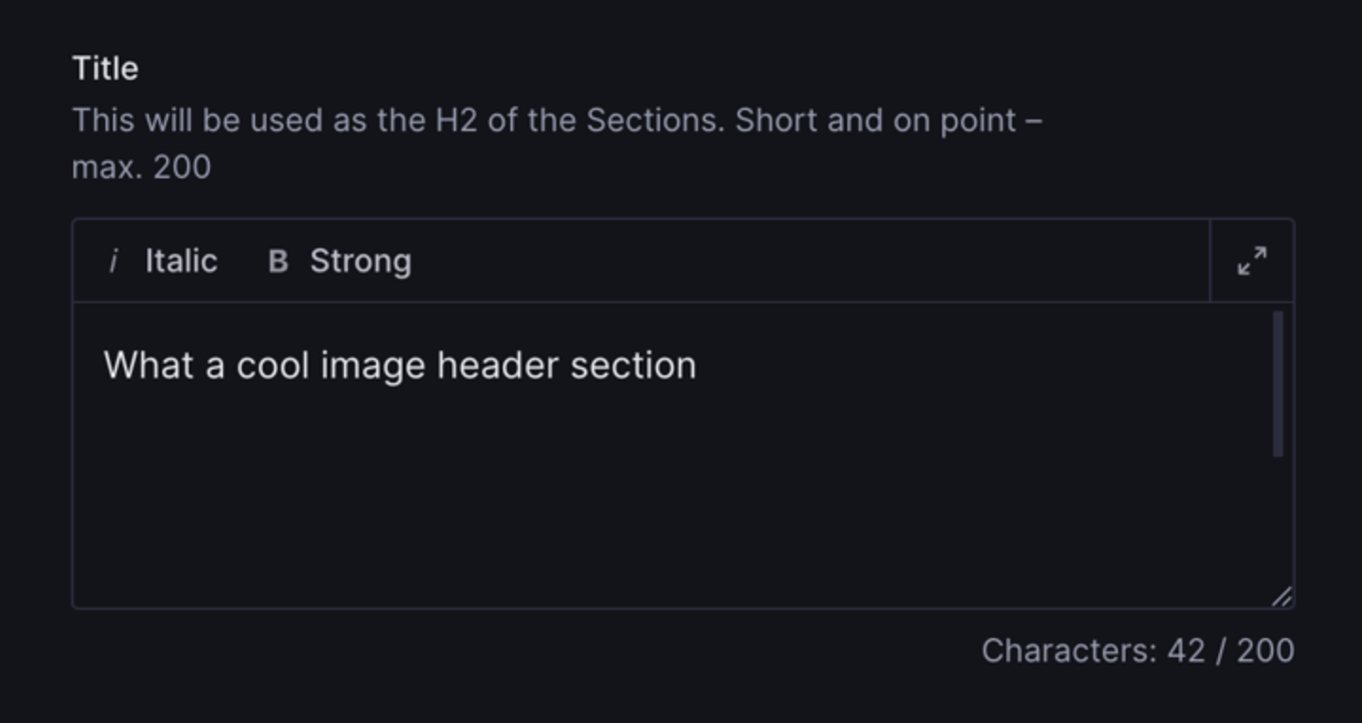
description: 'This will be used as the H2 of the Sections. Short and on point – max. 200',
// setting a validation on the field will override the validation on the overview schema
validation: (Rule) => Rule.required().max(200),
}),The custom input component
We use the max values set on the field schema definition (validation) and then use them in the component to show users how many characters they already used.
Then we also wrap renderDefault in a container that we use to change the height of this specific PTE, making sure it's resizable, using styled-components.
initialActive set to true allows editors to just focus on the PTE and start writing without the need to activate it.
// CharacterCountInputPTE.tsx

import { Stack, Text } from '@sanity/ui'
import { toPlainText } from 'next-sanity'
import { PortableTextInputProps, StringInputProps } from 'sanity'
import styled from 'styled-components'
import { toPlainText } from 'next-sanity'

export function CharacterCountInputPTE(props: PortableTextInputProps) {
  // check if validations exist
  // @ts-ignore
  const validationRules = props.schemaType.validation[0]._rules || []
  const characters = props.value ? toPlainText(props.value).length : 0

  //check if max Character validation exists and get the value
  const max = validationRules
    .filter((rule) => rule.flag === 'max')
    .map((rule) => rule.constraint)[0]

  return (
    <Stack space={3}>
      <Container id={'PTE-height-container'}>
        {props.renderDefault({
          ...props,
          // remove the need to activate the PTE
          initialActive: true,
        })}
      </Container>
      <Text muted align={'right'} size={1}>
        Characters: {characters}
        {max ? ` / ${max}` : ''}
      </Text>
    </Stack>
  )
}
// add a specific height to the PTE without losing the ability to resize it
const Container = styled.div`
  [data-testid='pt-editor'][data-fullscreen='false'] {
    height: 100px;
  }
`
And that's it! 🥳