Adding things to Portable Text - From block content schema to React component
This Guide will lead you through the all the steps you need to level-up your use of Portable Text: from setting up block content, adding custom blocks and renderers for the Portable Text Editor in your studio. But also help you query for everything and render your awesome content in React!
This developer guide was contributed by Saskia Bobinska (Senior Support Engineer).
This guide will lead through the steps you need to level-up your use of block content: setting up a block content schema and adding custom blocks and annotations to it. Then we will configure renderers for the Portable Text Editor in your studio, which will help users see their content enrichment inline. In addition we will also learn how to query the custom image blocks & annotations and set up serialisers so you can render your awesome content in React!
You might also be interested in this guide on adding inline blocks to portable text.
Setting up block content and adding custom blocks in your schemas
The first step in this journey will be setting up block content and adding some custom blocks and annotations for internal and external links. External links (url based annotations of type link) are now part of the default config of the portable text editor (block content).
From now on we will use PT for Portable Text and PTE for Portable Text Editor.
PT and block content can be used exchangeably in most cases, but block content refers more to the schema of an array of blocks, while PT is mostly used to describe the JSON based output created in the PTE.
Step 1: Adding an image block with alt text
import { defineType } from 'sanity'
export default defineType({
name: 'content',
type: 'array',
title: 'Content',
of: [
{
type: 'block'
},
// this is our first custom block which will make it possible to add block images with alt text fields into your portable text
{
type: 'image',
fields: [
{
name: 'alt',
type: 'string',
title: 'Alternative text',
description: 'Important for SEO and accessiblity.',
options: {
isHighlighted: true,
},
},
],
}
]
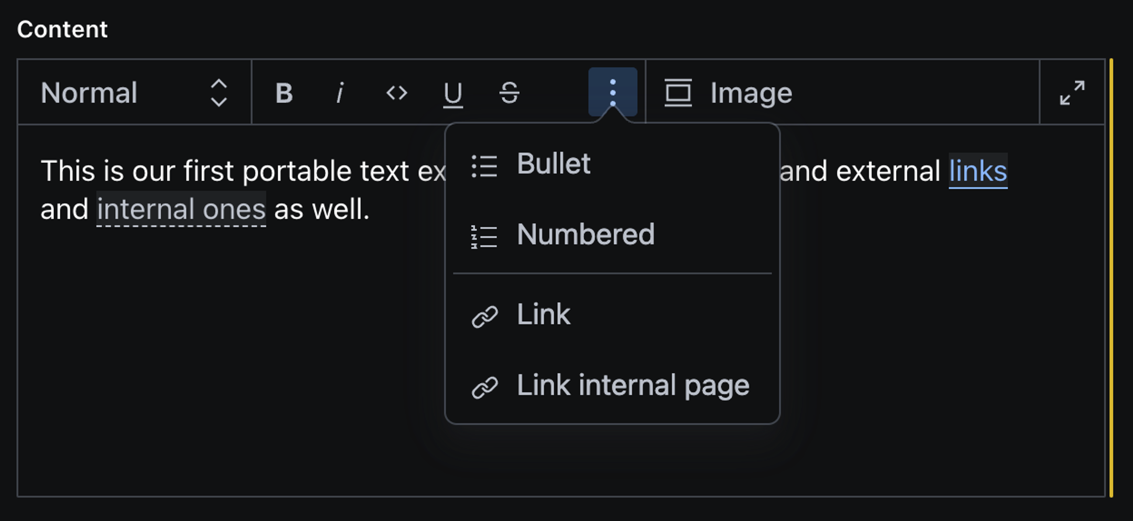
})Our PTE (portable text editor) toolbar will look like this now:
When we add an external link, we are asked to paste in a url. But what if we want to validate for certain url types and more?
we might need to add some logic to the existing link. And since we want to also link to internal pages, we will set this up in the next step as well.
Step 2: Adding external and internal links as annotations
So let's add internal links and some more validation to the annotations.
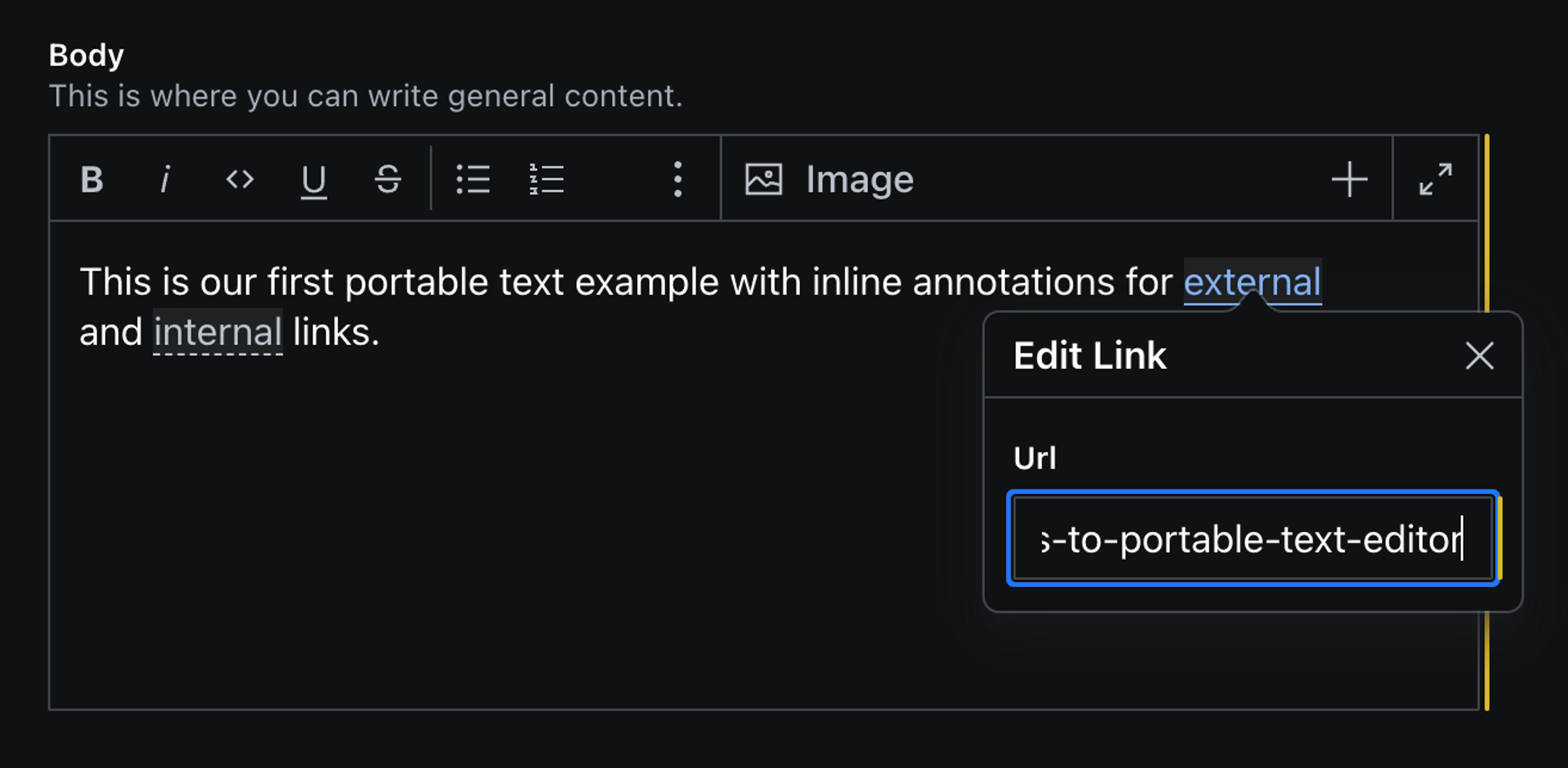
In order to customise the default link annotation, we need to define it in our schema as well as the internal page reference (internalLink).
Customising the block content array
// if you want to have a re-usable blockContent type,
 //you need to create an object and add this as fields.
 // In our case we are using this block content array directly in our page schema as a field.

 defineField({
    name: 'content',
    title: 'Content',
    type: 'array',
    of: [
      {
        type: 'block',

        // INLINE BLOCKS
        // to understand what this does, visit: https://www.sanity.io/guides/add-inline-blocks-to-portable-text-editor
        of: [
          defineField({
            name: 'authorReference',
            type: 'reference',
            to: [{ type: 'author' }],
          }),
        ],

        // Let's add some custom annotations by setting marks.annotations
          marks: {
            annotations: [
            //this is our external link object which we override from the default by defining it
              {
                name: 'link',
                type: 'object',
                title: 'Link',
                fields: [
                  {
                    name: 'href',
                    type: 'url',
                    validation: (Rule) =>
                      Rule.uri({
                        allowRelative: false,
                        scheme: ['http', 'https', 'mailto', 'tel'],
                      }),
                  },
                ],
              },

            // this is our internal link object which is a reference to page documents
              {
                name: 'internalLink',
                type: 'object',
                title: 'Link internal page',
                // we can add the icon which will show in the toolbar by importing an icon from a library or pasting in a react component.
                // we use import { LinkIcon } from '@sanity/icons' in this case
                icon: LinkIcon,
                fields: [
                  {
                    name: 'reference',
                    type: 'reference',
                    title: 'Reference',
                    to: [{ type: 'page' }],
                  },
                ],
              },
            ],
          },
        },
        {
          type: 'image',
          fields: [
            {
              name: 'alt',
              type: 'string',
              title: 'Alternative text',
              description: 'Important for SEO and accessiblity.',
            },
          ],
        },
      ],
    }),
You can override default block types by defining them yourself.
In addition you can deactivate any functionality by setting it to an empty array:
..., styles: [], decorators: [], ...
You can find out more options here but in general: if you can define it, you can deactivate it.
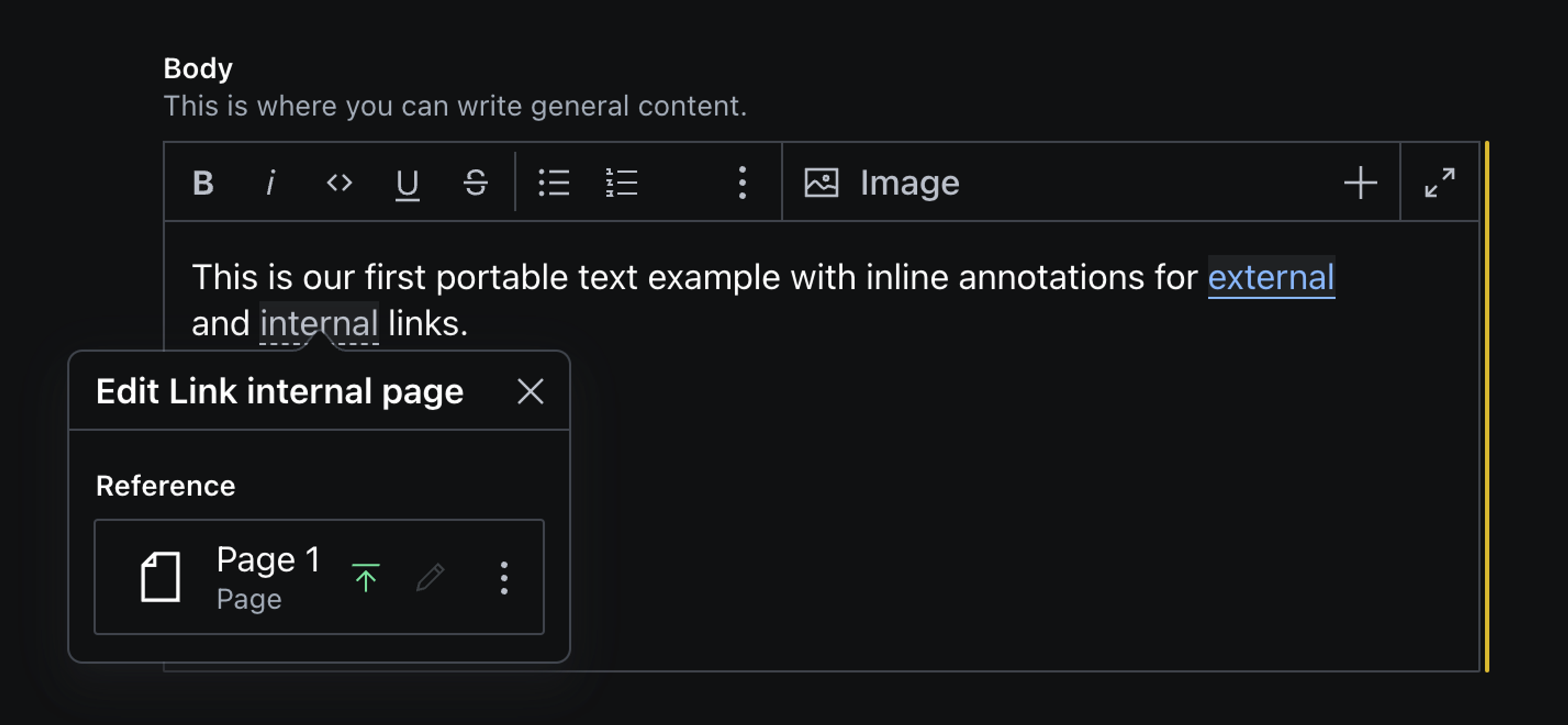
This is what our PTE now looks like: we can add internal and external links as well as block images.
Neat! Let's say you want to make sure users can see which pages are linked to in the PTE directly without having to click on the annotation. We can achieve this by adding a custom renderer for the PTE.
Step 3: Adding custom renderer for the PTE
So let's start with the external link annotation. So we have a way to show the href when needed but not disrupt the flow of reading. A good way to do this is using a ToolTip component from the Sanity UI, which will appear on hover. In addition we will add a LinkIcon in front of the annotated text.
Creating a LinkRenderer component
I would create a components folder in the root of your studio, but you can add this in any other part of your repo.
import { LinkIcon } from '@sanity/icons'
import { Bock, Text, Tooltip } from '@sanity/ui'
import styled from 'styled-components'

const LinkRenderer = (props) => {
  // you don't need to pass down the props yourself, Sanity will handle that for you

  return (
    // the ToolTip component wraps the annotation
    <Tooltip
    //we define the content in a Box, so we can add padding, and Text where we pass the href value in if present
      content={
        <Box padding={3}>
          <Text align="center" size={1}>
            {`${props.value?.href}` || 'No url found'}
          </Box>
        </Stack>
      }
      // then we define the placement and other options
      placement="bottom"
      fallbackPlacements={['right', 'left']}
      portal
    >

    {/* InlineAnnotation is a styled span element, which we use to add padding. */}
      <InlineAnnotation>
        <LinkIcon />
        {/*  renderDefault() is needed to let the studio handle the functionality of the annotation.
          * In V2 you will only pass in props?.children  */}
        <>{props.renderDefault(props?.children)}</>

      </InlineAnnotation>
    </Tooltip>
  )
}

const InlineAnnotation = styled.span`
  padding-left: 0.3em;
  padding-right: 0.2em;
`
export default LinkRenderer
Now we can add the LinkRenderer as a custom component to the link annotation in our block content array.
Setting a custom annotation component for the link object
...,
defineField({
  name: 'link',
  type: 'object',
  title: 'Link',
  fields: [
    {
      name: 'href',
      type: 'url',
      title: 'Url',
      validation: (Rule) =>
        Rule.uri({
          allowRelative: false,
          scheme: ['http', 'https', 'mailto', 'tel'],
          }),
    },
  ],
  components: {
    annotation: LinkRenderer,
  },
}),
...
Defining a renderer and a custom annotation component for internal links
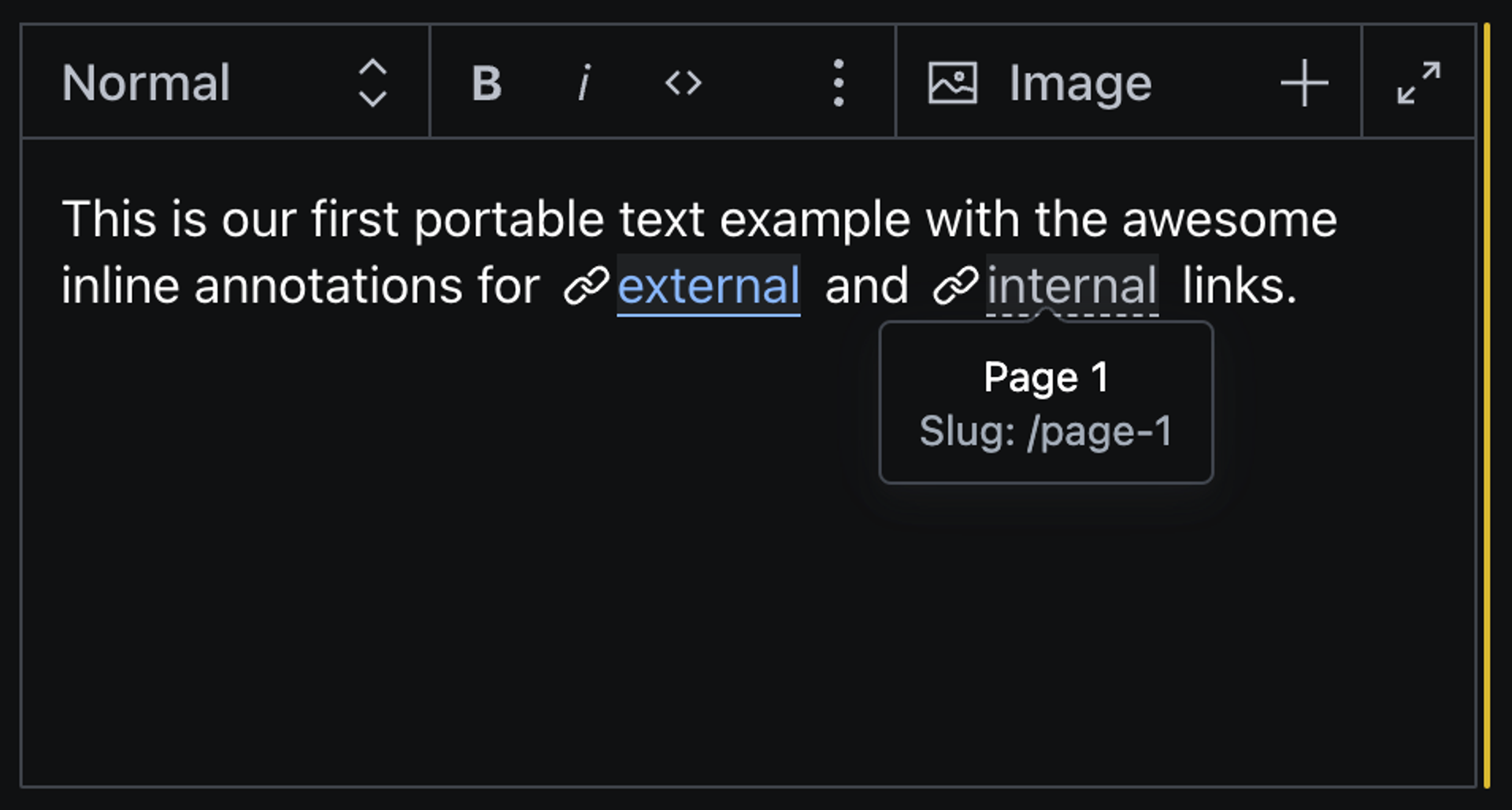
Let's do the same for internal links. A caveat here is, that the internal link is a reference so we need to fetch some of the referenced document data for our ToolTip component. If we don't do that we will only get the _id of the referenced document in reference._ref.
In addition we want to setup a listener and make sure we fetch the data a bit delayed, so we can make sure, our data has been able to be stored in the content lake.
import { LinkIcon } from '@sanity/icons'
import { Stack, Text, Tooltip } from '@sanity/ui'
import { useEffect, useState } from 'react'
import { useClient } from 'sanity'
import styled from 'styled-components'

// This is a basic setTimeout function which we will use later to delay fetching our referenced data
const sleep = (ms) => {
  return new Promise((resolve) => setTimeout(resolve, ms))
}

const InternalLinkRenderer = (props) => {
  // in order to be able to query for data in the studio, you need to setup a client version
  const client = useClient({
    apiVersion: '2022-10-31',
  })

  // we will store the data we queried in a state
  const [reference, setReference] = useState({})

  // we need to initialise the subscription
  let subscription
  // then get the data from the referenced document
  useEffect(() => {
    // so let's setup the query and params to fetch the values we need.
    const query = `*[_id == $rev]{title, 'slug': slug.current}[0]`
    const params = { rev: props.value.reference?._ref }

    const fetchReference = async (listening = false) => {
      listening && (await sleep(1500)) // here we use the sleep timeout function from the beginning of the file

      await client
        .fetch(query, params)
        .then((res) => {
          setReference(res)
        })
        .catch((err) => {
          console.error(err.message)
        })
    }

    // since we store our referenced data in a state we need to make sure, we also get changes
    const listen = () => {
      subscription = client
        .listen(query, params, { visibility: 'query' })
        .subscribe(() => fetchReference(true))
    }
    fetchReference().then(listen)

    // and then we need to cleanup after ourselves, so we don't get any memory leaks
    return function cleanup() {
      if (subscription) {
        subscription.unsubscribe()
      }
    }
  }, [])

  return (
    <Tooltip
      content={
        <Stack space={2} padding={3}>
          <Text align="center" size={1}>
            {`${reference.title}` || 'No title or slug found'}
          </Text>
          <Text align="center" size={1} muted>
            {`Slug: /${reference.slug}` || ''}
          </Text>
        </Stack>
      }
      fallbackPlacements={['right', 'left']}
      placement="bottom"
      portal
    >
      <InlineAnnotation>
        <LinkIcon /> <>{props.renderDefault(props.children)}</>
      </InlineAnnotation>
    </Tooltip>
  )
}
const InlineAnnotation = styled.span`
  padding-left: 0.3em;
  padding-right: 0.2em;
`
export default InternalLinkRenderer
...,
defineField({
name: 'internalLink',
type: 'object',
title: 'Link internal page',
icon: LinkIcon,
components: {
annotation: InternalLinkRenderer,
},
fields: [
{
name: 'reference',
type: 'reference',
title: 'Reference',
to: [{ type: 'page' }],
},
],
}),
...Let's look at the results!
Step 4: Setting up the query for PT and the custom block data
Now that we have everything set up we need to make sure we also query the custom block data not included in the PT output. Annotation data is stored in a markDef array at the end of each block.
...,
"_type": "block",
"children": [...],
"markDefs": [
  {
    "_key": "21647abff82b",
    "_type": "link",
    "href": "https://www.sanity.io/guides/add-inline-blocks-to-portable-text-editor"
  },
  {
    "_key": "c0465b1db68e",
    "_type": "internalLink",
    "reference": {
      "_ref": "abc0397c-ca33-4fba-97bb-1717e86e7261",
      "_type": "reference"
    }
  }
],
...
As you can see reference does not include the referenced data, but the href value for the external link is there.
You can get the data of your portable text editor by using the inspect tool in the document you're working in by pressing crtl + alt + i or the right elipsis ... menu.
In order to get this referenced data for our front-end we need to setup a GROQ query using joins. But since the reference is inside an array (markDefs) inside of an array (blocks) we need to use a special GROQ syntax for dereferencing and accessing certain types in arrays.
A best practice to handle queries like that (which you will need to reuse wherever PT is part of the data) is to define field queries separately and import them into the page queries.
Query parts and exports
With this set up you can import the queries in your pages or components, and can easily add changes when needed.
// lib/sanity.queries.ts

const bodyField = `
  body[]{
    ...,
    // add your custom blocks here (we don't need to do that for images, because we will get the image url from the @sanity/image-url package)

    markDefs[]{
        // so here we make sure to enclude all other data points are included
        ...,
        // then we define that if a child of the markDef array is of the type internalLink, we want to get the referenced doc value of slug and combine that with a /
        _type == "internalLink" => { "href": "/"+ @.reference-> slug.current },
        },
  }
`
const pageFields = `
  _id,
  title,
  description,
  "slug": slug.current,
  ${bodyField}
`

export const pageQuery = `
*[_type == "page" && slug.current == $slug][0] {
  ${pageFields}
}
`
Step 5: Using the data in the PortableText component
Now that we have our data ready we can use them in our front-end. But, we need to define, how the PT data should be rendered. Fortunately there are a couple of packages we can use to serialise PT. In React based Frameworks, we can use @portabletext/react (Repo)
// Body.jsx
import { PortableText } from '@portabletext/react'
import { urlForImage } from 'lib/sanity.image'
import Image from 'next/image'

const Body = (props)=> {
  // we pass the content, width & height of the images into each instance of the Body component
  // content is our array of blocks
  const { content, imgWidth, imgHeight } = props;

  const customBlockComponents = {
  // first we tackle our custom block types
  types: {
    image: ({value}) => {
      // we need to get the image source url, and since @sanity/image-url will give us optimised images for each instance we use it
      const imgUrl = urlForImage(value.assset).height(imgHeight).width(imgWidth).url()

      return <Image
            width={imgWidth}
            height={imgHeight}
            alt={value.alt}
            src={imgUrl}
            sizes="100vw"
            priority={false}
          />
    },
  },

  // then we define how the annotations should be rendered
  marks: {
    link: ({children, value}) => {
      const rel = !value.href.startsWith('/') ? 'noreferrer noopener' : undefined
      return (
        <a href={value.href} target='_blank' rel={rel}>
          {children}
        </a>
      )
    },
    internalLink: ({children, value}) => {
      return (
        <a href={value.href}>
          {children}
        </a>
      )
    },
  },
}

return <PortableText
  value={content}
  components={customBlockComponents}
/>
}
export default Body
Getting image source urls image objects
And last but not least: we add the urlForImage functionality setup.
// lib/sanity.image.ts

import createImageUrlBuilder from '@sanity/image-url'

const projectId = process.env.NEXT_PUBLIC_SANITY_PROJECT_ID
const dataset = process.env.NEXT_PUBLIC_SANITY_DATASET

const imageBuilder = createImageUrlBuilder({ projectId, dataset })

export const urlForImage = (source) =>
  imageBuilder.image(source).auto('format').fit('max')
And we're done 🥳