Block
Schema type for block which provides a rich text editor for block content.
The block type is the basis for Sanity's Portable Text editor. See the BlockDefinition reference for the full type definition.
In order to activate the block content editor for Sanity Studio, you must make an array of blocks. In the schema, it looks like this in its simplest form:
{
  title: 'Content',
  name: 'content',
  type: 'array',
  of: [{type: 'block'}]
}
In other words, rich text is modeled as an array of content following the specification for Portable Text. What is stored in the database is an array of JSON objects describing the rich text content. This JSON data can later be used to produce HTML, React components, or other formats depending on the target requirements. This provides a lot of flexibility if you should later want to re-use your content across the web, apps, print, set-top-boxes, consoles, etc.
The block text type supports block styles, lists, decorators (bold, italic, etc.), custom content types (embedded objects), inline objects, and even marking up text with arbitrary object data (annotations). Learn more about how to configure the rich text editor.
Gotcha
You can't currently use block as a standalone field outside of an array.
Properties
Requiredtype
Value must be set to
block. Also, blocks only make sense as member of an array, see examples below.Requiredname
Required. The field name. This will be the key in the data record.
title
Human readable label for the field.
styles
This defines which styles that applies to blocks. A style is an object with a title (will be displayed in the style dropdown) and a value, e.g.:
styles: [{title: 'Quote', value: 'blockquote'}]. If no styles are given, the default styles are H1 up to H6 and blockquote. A style namednormalis reserved, always included and represents "unstyled" text. If you don't want any styles, set this to an empty array e.g.:styles: [].lists
What list types that can be applied to blocks. Like
stylesabove, this also is an array of "name", "title" pairs, e.g.:{title: 'Bullet', value: 'bullet'}. Default list types arebulletandnumber.marks
An object defining which
.decorators(array) and.annotations(array) are allowed. See example below.of
An array of inline content types that you can place in running text from the Insert menu.
icon
To return an icon that is shown in the menus and the toolbar.
description
Short description to editors how the field is to be used.
If set to
true, this field will be hidden in the studio. You can also return a callback function to use it as a conditional field.readOnly
If set to
true, this field will not be editable in the content studio. You can also return a callback function to use it as a conditional field.components
Lets you provide custom components to override the studio defaults in various contexts. The components available are
field,input,item,preview.deprecated
Marks a field or document type as deprecated in the studio interface and displays a user-defined message defined by the single required
reasonproperty.If you deploy a GraphQL API schema, this property will translated into the
@deprecateddirective.initialValue
The initial value that will be used when creating new items from this type.
Options (BlockOptions)
oneLineboolean
Restricts the Portable Text input to a single line when set to
true. The parent Portable Text array must consist of a single array member of typeblockor this option will not be effective.spellCheckBoolean
Enables or disables spellchecking in the Portable Text Editor. Defaults to
true.
Validation (BlockRule)
required()
Ensures that this field exists.
custom(fn)
Creates a custom validation rule.
error(message)
Sets a custom error message for the preceding validation rule.
warning(message)
Sets a custom warning message for the preceding validation rule. Warnings do not prevent publishing.
info(message)
Sets a custom info message for the preceding validation rule. Info messages are purely informational and do not prevent publishing.
valueOfField(path)
Gets the value of a sibling field to use in validation. Useful for creating validation rules that depend on the value of another field.
Gotcha
A block represents a single paragraph. To make sense, your blocks must live inside an array.
Example schema: Default block array
With no custom configuration, the block editor supports:
- Block styles: Normal, Heading 1 to Heading 6, and blockquotes
- Decorators: Strong, emphasis, code, underline and strikethrough
- Lists: bullet list and ordered list
- Link: An annotation that is an object with a
hrefwith typeurl
Input
{
  title: 'Rich text example',
  name: 'myRichTextExample',
  type: 'array',
  of: [{type: 'block'}]
}
Response
{
  "myRichTextExample": [{
    "style": "normal",
    "_type": "block",
    "markDefs": [],
    "children": [
      {
        "_type": "span",
        "text": "That was ",
        "marks": []
      },
      {
        "_type": "span",
        "text": "bold",
        "marks": [
          "strong"
        ]
      },
      {
        "_type": "span",
        "text": " of you.",
        "marks": []
      }
    ]
  },
  {
    "style": "normal",
    "_type": "block",
    "markDefs": [],
    "children": [
      {
        "_type": "span",
        "text": "Amazing, actually.",
        "marks": []
      }
    ]
  }]
}
Example schema: Block array with custom types
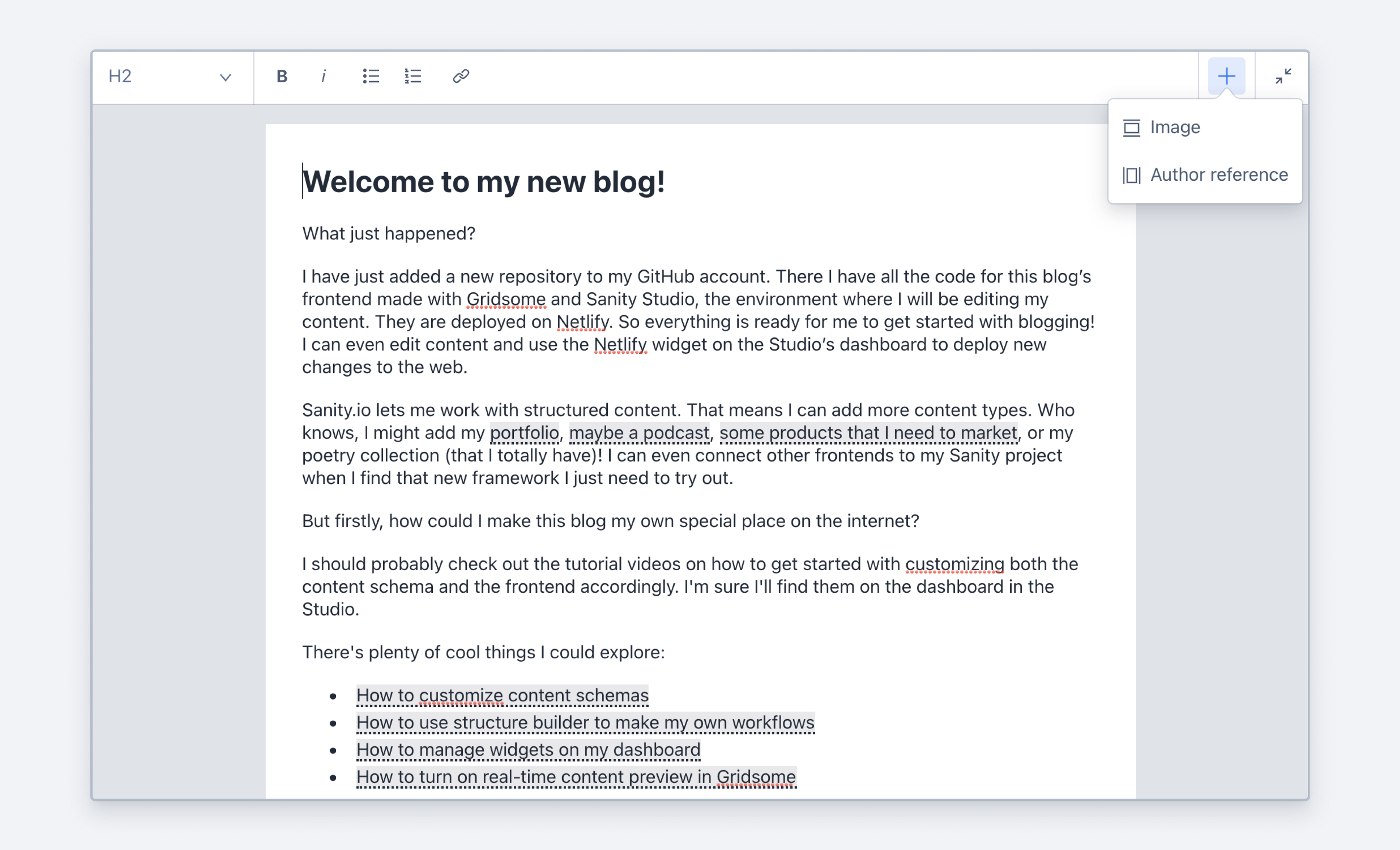
This defines a block array that can include both text, actors, and (inline) images.
{
  title: 'Rich text',
  type: 'array',
  of: [
    {type: 'block'},
    {type: 'actor'},
    {type: 'image', icon: myIcon}
  ]
}
The editor will now get an insertion (+) icon in the text editor that can be used to insert actors or images as content blocks in the text. The data stored in the array for these objects are exactly as if they were in a regular array of objects, because they are.
These objects are embedded on the block level, but you may also need objects that appear inline with text useful for stuff like footnotes, ticker-symbols or sparklines. Add these to an array under the of key in the block type object:
{
  title: 'Rich text',
  type: 'array',
  of: [
    {
      type: 'block',
      of: [
        {type: 'footnote'}
      ]
    }
  ]
}
Customizing
Almost every aspect of the block editor and the content it produces is configurable. You may want to restrict certain types of decorators or add your own, use your own list styles, annotate text with custom data (e.g. a citation or reference), or support highlighted text.
You can add a component property to a block, decorator, or annotation that contains callback functions to control how the content is rendered in the studio, and you can add an icon property to render in the tool bar of the editor.
Gotcha
Note that customizations made in the studio will not affect how content is rendered elsewhere, such as your front end. That gets handled via portable text serialization.
{
  name: 'customized',
  title: 'Customized block type',
  type: 'array',
  of: [
    {
      type: 'block',
      // ...
      marks: {
        decorators: [
          { title: "Strong", value: "strong" },
          { title: "Emphasis", value: "em" },
          {
            title: "Sup",
            value: "sup",
            icon: () => <div>x<sup>2</sup></div>,
            component: ({ children }) => <sup>{children}</sup>
          },
        ],
      },
      // ...
    }
  ]
}
Example schema: Block array with custom types
{
  name: 'customized',
  title: 'Customized block type',
  type: 'array',
  of: [
    {
      type: 'block',
      // Only allow these block styles
      styles: [
        {title: 'Normal', value: 'normal'},
        {title: 'H1', value: 'h1'},
        {title: 'H2', value: 'h2'}
      ],
      // Only allow numbered lists
      lists: [
        {title: 'Numbered', value: 'number'}
      ],
      marks: {
        // Only allow these decorators
        decorators: [
          {title: 'Strong', value: 'strong'},
          {title: 'Emphasis', value: 'em'}
        ],
        // Support annotating text with a reference to an author
        annotations: [
          {name: 'author', title: 'Author', type: 'reference', to: {type: 'author'}}
        ]
      }
    }
  ]
}
Protip
Looking to query for the occurence of a string in an array of blocks? Try *[pt::text(body) match "aliens"] (where body is the name of your array).
Block Content
Block content allows you to create a rich text experience tailored to the needs of your content.
Configure the Portable Text Editor
Set up and configure the Portable Text Editor with decorators, annotations, and block content.
Array
Schema type for arrays of other types.
Schema
A schema describes the types of documents and fields editors may author in a Sanity Studio workspace.