Configure the Portable Text Editor
Configure the Portable Text Editor: styles, lists, decorators, annotations, custom blocks, tables, and the built-in Markdown and typography behaviors.
This page covers how to configure the Portable Text Editor (PTE) in Sanity Studio: which styles, lists, decorators, and annotations editors can apply, which custom blocks they can insert, and how to turn the editor's built-in Markdown, typography, table, and paste-link behaviors on or off.
Portable Text is extensible. Each block can have a style and a set of mark definitions that describe data structures distributed in the child spans. It also enables inserting arbitrary data objects in the array, requiring only a _type key. In a Sanity document, array members also need a _key, which the editor generates for you if it is missing. Portable Text allows custom content objects in the root array, enabling editing and rendering environments to mix rich text with custom content types.
You can create as many versions of the PTE as you want. A frequent pattern is a base configuration with selected decorators and annotations, and a more comprehensive configuration with custom block types.
This is helpful if editors only use emphasis and annotate text as internal links in some settings (for example, a caption) and have a full toolbox available in another (for example, an article body).
Minimal configuration
The following example shows a minimal configuration to implement Portable Text and the editor in Sanity Studio:
export default {
  name: 'content',
  type: 'array',
  title: 'Content',
  of: [
    {
      type: 'block'
    }
  ]
}
The code, an array of blocks, renders the PTE with a default configuration for styles, decorators, and annotations.
Portable Text is markup-agnostic; however, the default configuration maps easily to HTML conventions. Bold and italics set the decorators strong and em (emphasis), and produce a data structure like this:
[
  {
    "_type": "span",
    "_key": "eab9266102e81",
    "text": "strong",
    "marks": [
      "strong"
    ]
  },
  {
    "_type": "span",
    "_key": "eab9266102e82",
    "text": " and ",
    "marks": []
  },
  {
    "_type": "span",
    "_key": "eab9266102e83",
    "text": "emphasis.",
    "marks": [
      "em"
    ]
  }
]
Portable Text isn't designed for direct human authoring or reading, but instead should be parsed by software. The _type key also makes it queryable in Sanity's APIs, and by other JSON tools, such as jq or groq-js.
Default behaviors
Markdown behaviors
The PTE in Studio includes many default Markdown behaviors that may be familiar from other text editors. They map to the standard styles, lists, decorators, and annotations. These include:
# Title: One or more#symbols followed by a space sets the matching heading level.> block quote content: The>character followed by a space and text converts to a block quote.- Backspace at the beginning of a styled block removes its style.
-,*, or1.: At the beginning of a line, these characters start a list.`code`: Wrapping text in single backticks creates inline code.*italic*or_italic_: Wrapping text in single asterisks or underscores creates italic text.**bold**or__bold__: Wrapping text in double asterisks or underscores creates bold text.~~strikethrough~~: Wrapping text in double tildes creates strikethrough text.
You can undo any of these transformations by pressing Backspace immediately after it happens. Moving the cursor first commits the change.
Disable default Markdown behavior
You can disable these Markdown behaviors by modifying the configuration, either in your sanity.config.ts file globally, or on individual schema types.
export default defineConfig({
  // ... rest of config,
  form: {
    components: {
      portableText: {
        plugins: (props) => {
          return props.renderDefault({
            ...props,
            plugins: {
              ...props.plugins,
              markdown: {
                enabled: false
              }
            }
          })
        }
      },
    },
  }
})
export default defineType({
type: 'array',
name: 'noMarkdown',
title: 'No markdown',
description: 'Markdown disabled in this PTE',
of: [
{
type: 'block',
},
],
components: {
portableText: {
plugins: (props) => {
return props.renderDefault({
...props,
plugins: {
...props.plugins,
markdown: {
enabled: false
}
}
})
}
}
}
})If you're already using custom PTE behavior plugins, you can add the contents of props.renderDefault above into the renderDefault call in the behavior plugin.
Typographic behaviors
The editor also includes a set of common typographic helpers, available from Studio v4.16.0 and enabled by default from v5.0.0. These transform the input inline, saving the transformed version to the document.
Each entry below lists the behavior name, the input text, and the output text. Use the behavior name to enable or disable an individual behavior in the configuration. The default behaviors apply to every PTE field unless you turn them off.
Default behaviors:
emDash:--→ —ellipsis:...→ …openingDoubleQuote:"→ “closingDoubleQuote:"→ ”openingSingleQuote:'→ ‘closingSingleQuote:'→ ’leftArrow:<-→ ←rightArrow:->→ →copyright:(c)→ ©trademark:(tm)→ ™servicemark:(sm)→ ℠registeredTrademark:(r)→ ®
The four quote behaviors take the same straight-quote input. The editor chooses the opening or closing form based on the surrounding text.
Optional behaviors:
oneHalf:1/2→ ½plusMinus:+/-→ ±notEqual:!=→ ≠laquo:<<→ «raquo:>>→ »multiplication:*orxbetween numbers → ×superscriptTwo:^2→ ²superscriptThree:^3→ ³oneQuarter:1/4→ ¼threeQuarters:3/4→ ¾
Enable or disable typography behaviors
You can enable or disable typography behaviors at the global level, or directly in the schema definition for the block.
Explicitly disable all typography behaviors:
export default defineConfig({
  // ... rest of config,
  form: {
    components: {
      portableText: {
        plugins: (props) => {
          return props.renderDefault({
            ...props,
            plugins: {
              ...props.plugins,
              typography: {
                enabled: false
              }
            }
          })
        }
      },
    },
  }
})
export default defineType({
type: 'array',
name: 'noTypography',
title: 'No typography',
description: 'Typographic behaviors disabled in this PTE',
of: [
{
type: 'block',
},
],
components: {
portableText: {
plugins: (props) => {
return props.renderDefault({
...props,
plugins: {
...props.plugins,
typography: {
enabled: false
}
}
})
}
}
}
})Set the preset key to one of:
default: Enables the default behaviors, and applies when unset.all: Enables both default and optional behaviors.none: Disables both default and optional behaviors. Use this if you plan to enable only specific behaviors.
export default defineConfig({
  // ... rest of config,
  form: {
    components: {
      portableText: {
        plugins: (props) => {
          return props.renderDefault({
            ...props,
            plugins: {
              ...props.plugins,
              typography: {
                preset: 'all'
              }
            }
          })
        }
      },
    },
  }
})
export default defineType({
type: 'array',
name: 'allTypography',
title: 'All typography',
description: 'Default and optional typographic behaviors enabled in this PTE',
of: [
{
type: 'block',
},
],
components: {
portableText: {
plugins: (props) => {
return props.renderDefault({
...props,
plugins: {
...props.plugins,
typography: {
preset: 'all'
}
}
})
}
}
}
})Enable or disable individual behaviors with the enable or disable key. Each accepts an array of behavior names.
export default defineConfig({
  // ... rest of config,
  form: {
    components: {
      portableText: {
        plugins: (props) => {
          return props.renderDefault({
            ...props,
            plugins: {
              ...props.plugins,
              typography: {
                enable: ['oneQuarter', 'threeQuarters'],
                disable: ['openingDoubleQuote', 'openingSingleQuote', 'closingDoubleQuote', 'closingSingleQuote']
              }
            }
          })
        }
      },
    },
  }
})
export default defineType({
type: 'array',
name: 'customTypography',
title: 'Custom typography',
description: 'Selected typographic behaviors enabled in this PTE',
of: [
{
type: 'block',
},
],
components: {
portableText: {
plugins: (props) => {
return props.renderDefault({
...props,
plugins: {
...props.plugins,
typography: {
enable: ['oneQuarter', 'threeQuarters'],
disable: ['openingDoubleQuote', 'openingSingleQuote', 'closingDoubleQuote', 'closingSingleQuote']
}
}
})
}
}
}
})Map Markdown behaviors to custom styles, lists, and decorators
If you're using non-standard names for your marks and decorators, you can map the default behaviors to the different names.
In this example, the unordered list is remapped to a list named "dot". Note that the schema declares the list with a value key while the callback reads list.name. The editor compiles value into name when it builds its own schema.
export default defineType({
  name: 'customBlock',
  // ... rest of config
  type: 'array',
  of: [
    {
      type: 'block',
      marks: {
        decorators: [/* ... */],
      },
      lists: [{value: 'dot', title: 'Dot'}],
    },
  ],
  components: {
    portableText: {
      plugins: (props) => {
        return props.renderDefault({
          ...props,
          plugins: {
            ...props.plugins,
            markdown: {
              unorderedList: ({context}) =>
                context.schema.lists.find((list) => list.name === 'dot')?.name,
            }
          }
        })
      }
    }
  }
})
Paste link behavior
If your Studio uses the default link annotation, you can select text and paste a URL to annotate the text as a link. To disable this behavior, set the pasteLink.enabled value to false.
export default defineConfig({
  // ... rest of config,
  form: {
    components: {
      portableText: {
        plugins: (props) => {
          return props.renderDefault({
            ...props,
            plugins: {
              ...props.plugins,
              pasteLink: {
                enabled: false
              }
            }
          })
        }
      },
    },
  }
})
export default defineType({
type: 'array',
name: 'noPasteLink',
title: 'No Pasteable links',
description: 'pasteLink disabled in this PTE',
of: [
{
type: 'block',
},
],
components: {
portableText: {
plugins: (props) => {
return props.renderDefault({
...props,
plugins: {
...props.plugins,
pasteLink: {
enabled: false
}
}
})
}
}
}
})By default, the plugin looks for an annotation of name 'link' with an 'href' string field, and if that is present, it uses that to create the link. This behavior can be configured by providing a custom link matcher function (a function that has access to the current editor schema and returns either a typed object or undefined):
// ...rest of config above
pasteLink: {
  link: ({context, value}) => {
    const customLink = context.schema.annotations.find((a) => a.name === 'customLink')
    if (!customLink) return undefined
    return {_type: 'customLink', url: value.href}
  },
}
// ...
Table editing
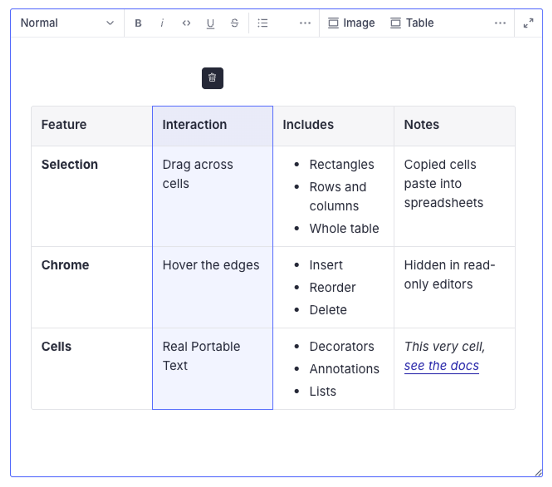
The Portable Text Editor includes built-in table editing, powered by @portabletext/plugin-table. Table editing is available from Studio v6.6.0 and is disabled by default. When enabled, the editor renders table blocks as editable tables with row and column controls, plus a table menu with a header row toggle. Tables inserted from the insert menu start as a 3×3 grid with a header row.
Enabling table editing takes two steps: declare the table schema the plugin binds to, and turn on the plugin.
Define the table schema
By default, the plugin binds to a canonical schema shape: a table object whose rows array holds row objects, each holding a cells array of cell objects, each with a value array of blocks. Declare a headerRows number field on the table as well. (If your dataset already has a table-shaped type under different names, see the "Use your own table type names" section below.)
export const table = defineType({
  type: 'object',
  name: 'table',
  fields: [
    defineField({type: 'number', name: 'headerRows'}),
    defineField({
      type: 'array',
      name: 'rows',
      of: [
        defineArrayMember({
          type: 'object',
          name: 'row',
          fields: [
            defineField({
              type: 'array',
              name: 'cells',
              of: [
                defineArrayMember({
                  type: 'object',
                  name: 'cell',
                  fields: [
                    defineField({
                      type: 'array',
                      name: 'value',
                      of: [defineArrayMember({type: 'block'})],
                    }),
                  ],
                }),
              ],
            }),
          ],
        }),
      ],
    }),
  ],
})
Register the table type in your schema's types array, and add table to the of array of your Portable Text field so editors can insert it (shown in the next section).
Gotcha
Declare headerRows on the table type. The editor strips fields the schema doesn't declare, so without it the insert menu's header-row scaffolding and the table menu's header row toggle silently do nothing: no error, no warning, and the first row never renders as a header.
Cells hold regular block content. You can extend the cell's value array with inline objects, images, or other custom members like any other Portable Text field.
Enable the table plugin
Enable the plugin in your sanity.config.ts file globally, or on individual schema types.
export default defineConfig({
  // ... rest of config,
  form: {
    components: {
      portableText: {
        plugins: (props) => {
          return props.renderDefault({
            ...props,
            plugins: {
              ...props.plugins,
              table: {
                enabled: true
              }
            }
          })
        }
      },
    },
  }
})
export default defineType({
type: 'array',
name: 'bodyWithTables',
of: [
{type: 'block'},
{type: 'table'},
],
components: {
portableText: {
plugins: (props) => {
return props.renderDefault({
...props,
plugins: {
...props.plugins,
table: {
enabled: true
}
}
})
}
}
}
})Use your own table type names
If your dataset already contains a table-shaped type, bind the plugin to it instead of migrating data. The containers option takes defineContainer definitions for the table, row, and cell roles, where the type and array field names are yours. defineContainer comes from @portabletext/editor, which you add as a dependency.
import {defineContainer} from '@portabletext/editor'

// Define the containers at module scope: a new object identity
// re-registers the plugin on every render.
export const tableContainers = {
  table: defineContainer({type: 'richTable', arrayField: 'rows'}),
  row: defineContainer({type: 'row', arrayField: 'cells'}),
  cell: defineContainer({type: 'richTableCell', arrayField: 'content'}),
}
Pass them alongside enabled, in either the global or the individual setup shown above:
plugins: (props) => {
  return props.renderDefault({
    ...props,
    plugins: {
      ...props.plugins,
      table: {
        enabled: true,
        containers: tableContainers
      }
    }
  })
}
Roles you omit fall back to the canonical names, and omitting containers entirely behaves exactly like the canonical setup above. Any fields on your types that table editing doesn't manage persist untouched, as long as your schema declares them. Each container definition also accepts a custom render; note that providing one for the table role replaces the Studio's table UI, including its table menu and header row toggle. If your render still uses the plugin's own table component without supplying a menu, the plugin's built-in menu renders in its place.
Add custom blocks
Since Portable Text defines block content as an array, adding custom content blocks for images, videos, or code embeds means inserting these items between paragraph blocks.
Gotcha
Content blocks for the Portable Text Editor must be object-like types, and not primitive types like string, number, or boolean.
You can also use types that are installed with plugins. Some plugins, such as those for tables, may export an array type. Since it's not possible to store arrays directly within other arrays, you first need to wrap them in an object.
Example: images
To add images to Portable Text, append a new type object to the array:
export default {
  name: 'content',
  type: 'array',
  title: 'Content',
  of: [
    {
      type: 'block'
    },
    {
      type: 'image'
    }
  ]
}
This configuration adds an insert menu with Image as the only option:
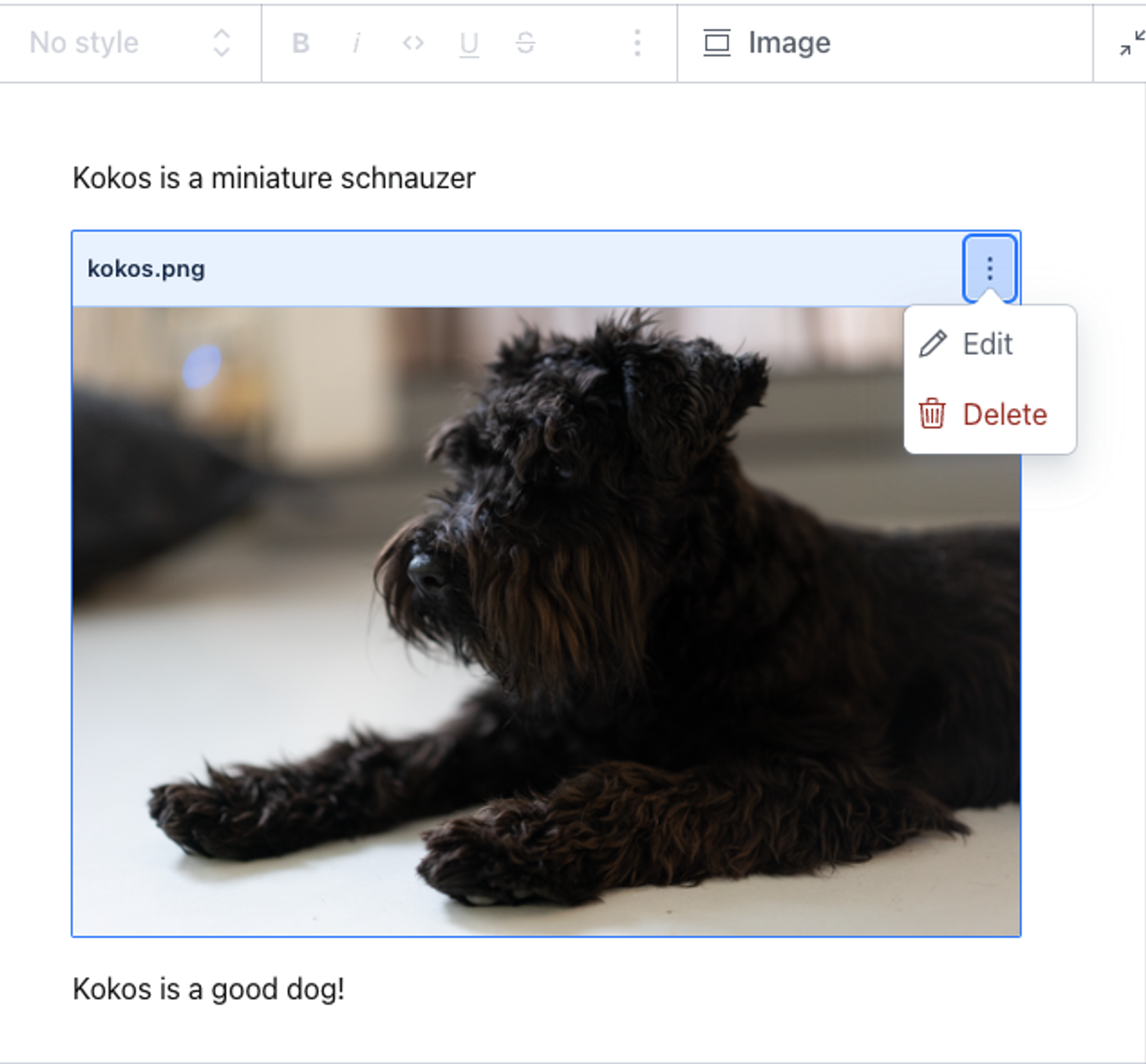
Selecting an image inserts the block with a preview in the Portable Text Editor. You can drag the image and drop it in its designated position; you can also edit it by double-clicking the preview box or by selecting the edit option from the context menu:
The Portable Text data structure for this example looks like the following:
[
  {
    "style": "normal",
    "_type": "block",
    "markDefs": [],
    "_key": "09cc5f099d3b",
    "children": [
      {
        "_type": "span",
        "_key": "09cc5f099d3b0",
        "text": "Kokos is a miniature schnauzer.",
        "marks": []
      }
    ]
  },
  {
    "_type": "image",
    "_key": "a5e9155ee3f5",
    "asset": {
      "_type": "reference",
      "_ref": "image-61991cfbe9182124c18ee1829c07910faadd100e-2048x1366-png"
    }
  },
  {
    "style": "normal",
    "_type": "block",
    "markDefs": [],
    "_key": "54145e9cb006",
    "children": [
      {
        "_type": "span",
        "_key": "54145e9cb0060",
        "text": "Kokos is a good dog!",
        "marks": []
      }
    ]
  }
]
The image is its own object, where asset references the asset document. You can derive the image URL from the asset's _id (which matches the _ref value above), though most projects use the @sanity/image-url builder instead. You can also join the asset document with a conditional projection:
*[_type == "post"]{
  ...,
  content[]{
    ...,
    _type == "image" => {
      ...,
      asset->
    }
  }
}
Example: code input
Our documentation features many code blocks. They are custom blocks that we added to our editor. Install the code input plugin with npm, or with the sanity install CLI command:
npm install @sanity/code-inputpnpm add @sanity/code-inputyarn add @sanity/code-inputbun add @sanity/code-inputOnce installed and configured, you can add the code block to your Portable Text Editor configuration:
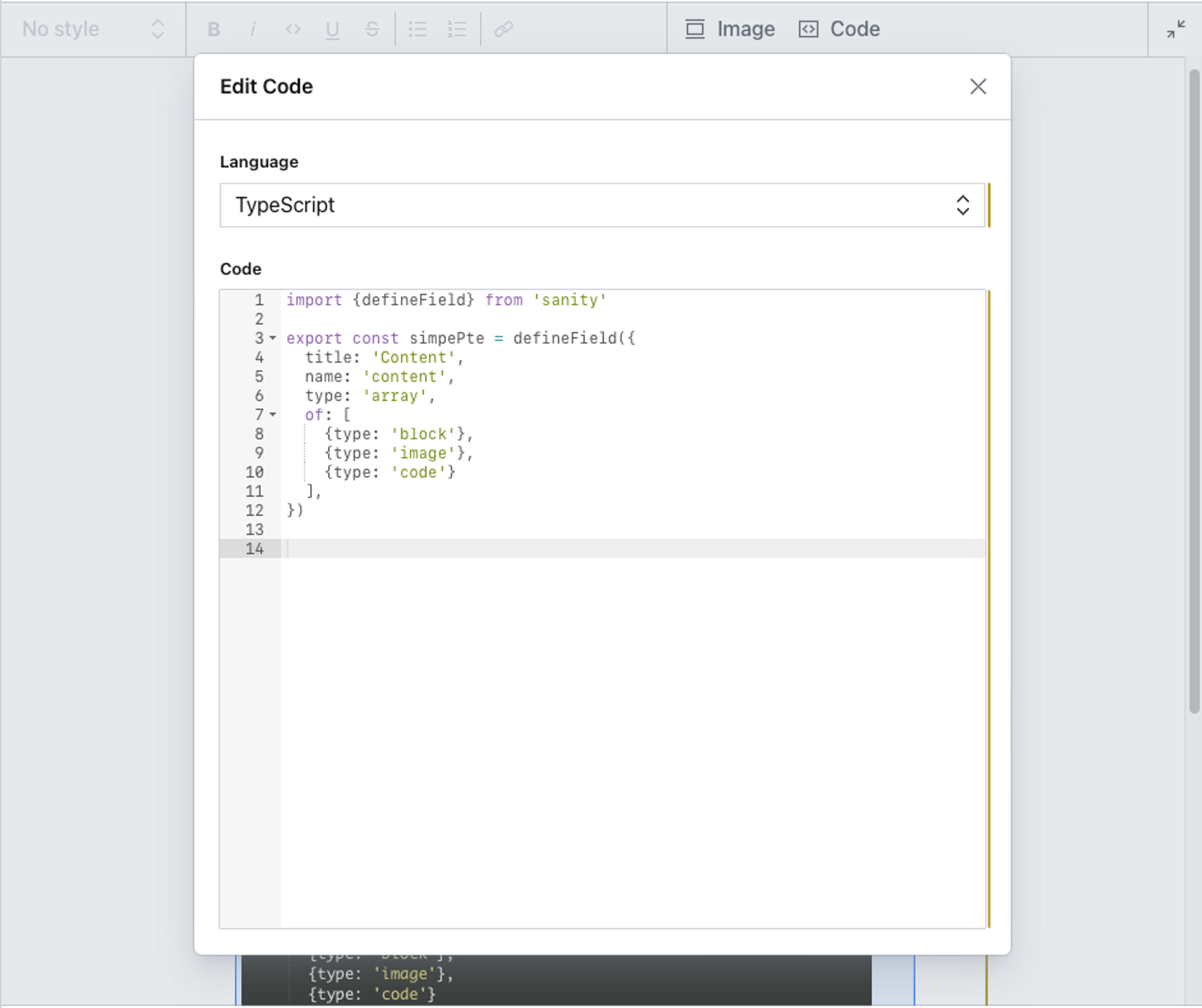
export default {
  name: 'content',
  type: 'array',
  title: 'Content',
  of: [
    {
      type: 'block'
    },
    {
      type: 'image'
    },
    {
      type: 'code'
    }
  ]
}
Code is now available as a selection in the insert menu. To change the label, add title: 'My title' to the same object. Inserting a code block produces a preview and a code editor:
You can set more options for the code input.
Configure styles for text blocks
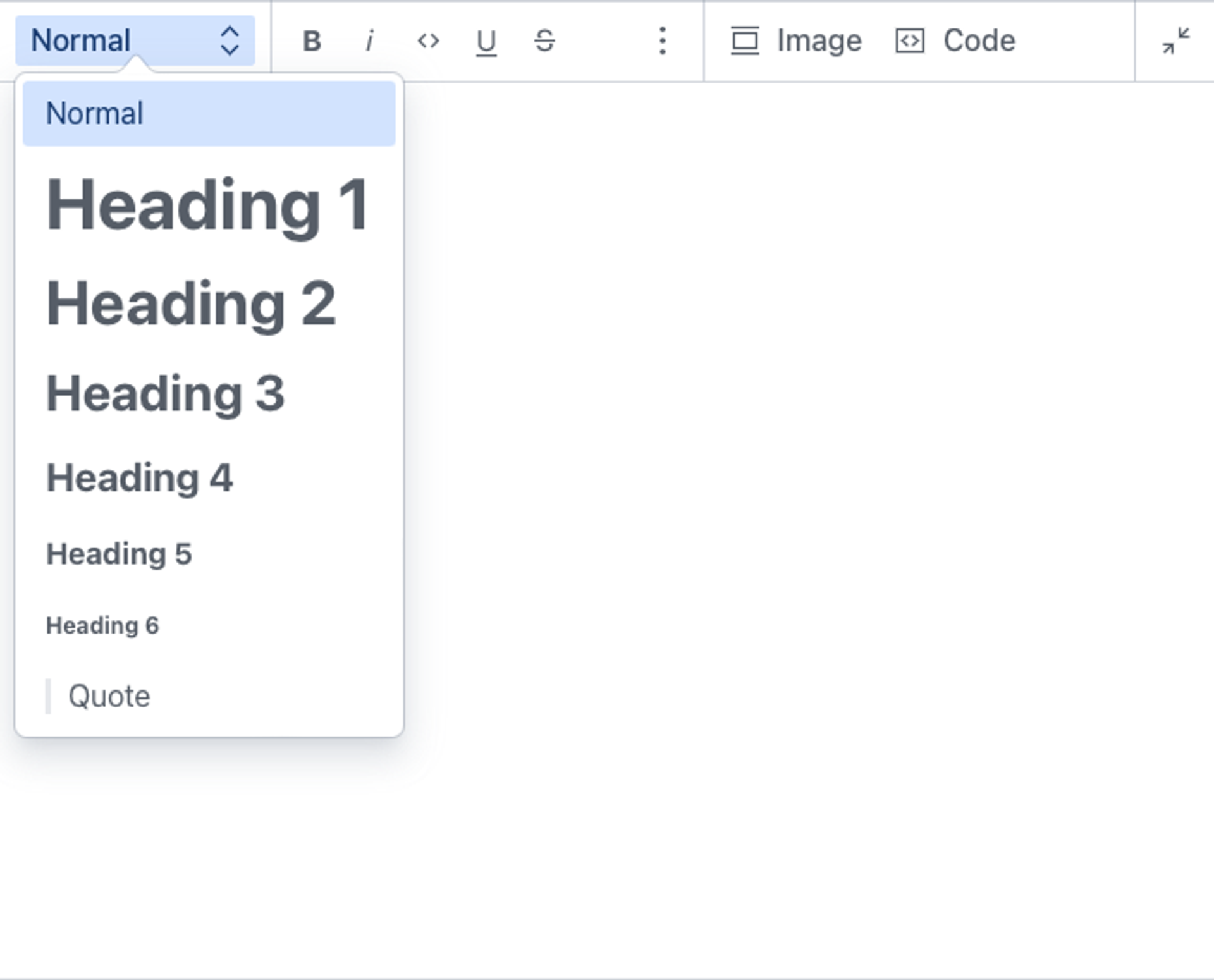
Out of the box, the Portable Text Editor includes the following styles: normal, h1 through h6, and blockquote. By default, they map to HTML, but a style can be an arbitrary value. The normal style is always available, because the editor prepends it if your styles array omits it.
// The default set of styles
export default {
  name: 'content',
  title: 'Content',
  type: 'array',
  of: [
    {
      type: 'block',
      styles: [
        {title: 'Normal', value: 'normal'},
        {title: 'Heading 1', value: 'h1'},
        {title: 'Heading 2', value: 'h2'},
        {title: 'Heading 3', value: 'h3'},
        {title: 'Heading 4', value: 'h4'},
        {title: 'Heading 5', value: 'h5'},
        {title: 'Heading 6', value: 'h6'},
        {title: 'Quote', value: 'blockquote'}
      ]
    }
  ]
}We recommend keeping the configuration reasonably abstract and following established conventions. If you plan to render with Sanity's Portable Text tooling, stay close to HTML naming conventions.
To override the default configuration for styles, add the styles key and set an array of title/value objects:
export default {
  name: 'content',
  title: 'Content',
  type: 'array',
  of: [
    {
      type: 'block',
      styles: [
        { title: 'Normal', value: 'normal' },
        { title: 'Heading 2', value: 'h2' },
        { title: 'Quote', value: 'blockquote' },
        { title: 'Hidden', value: 'blockComment' }
      ]
    }
  ]
}
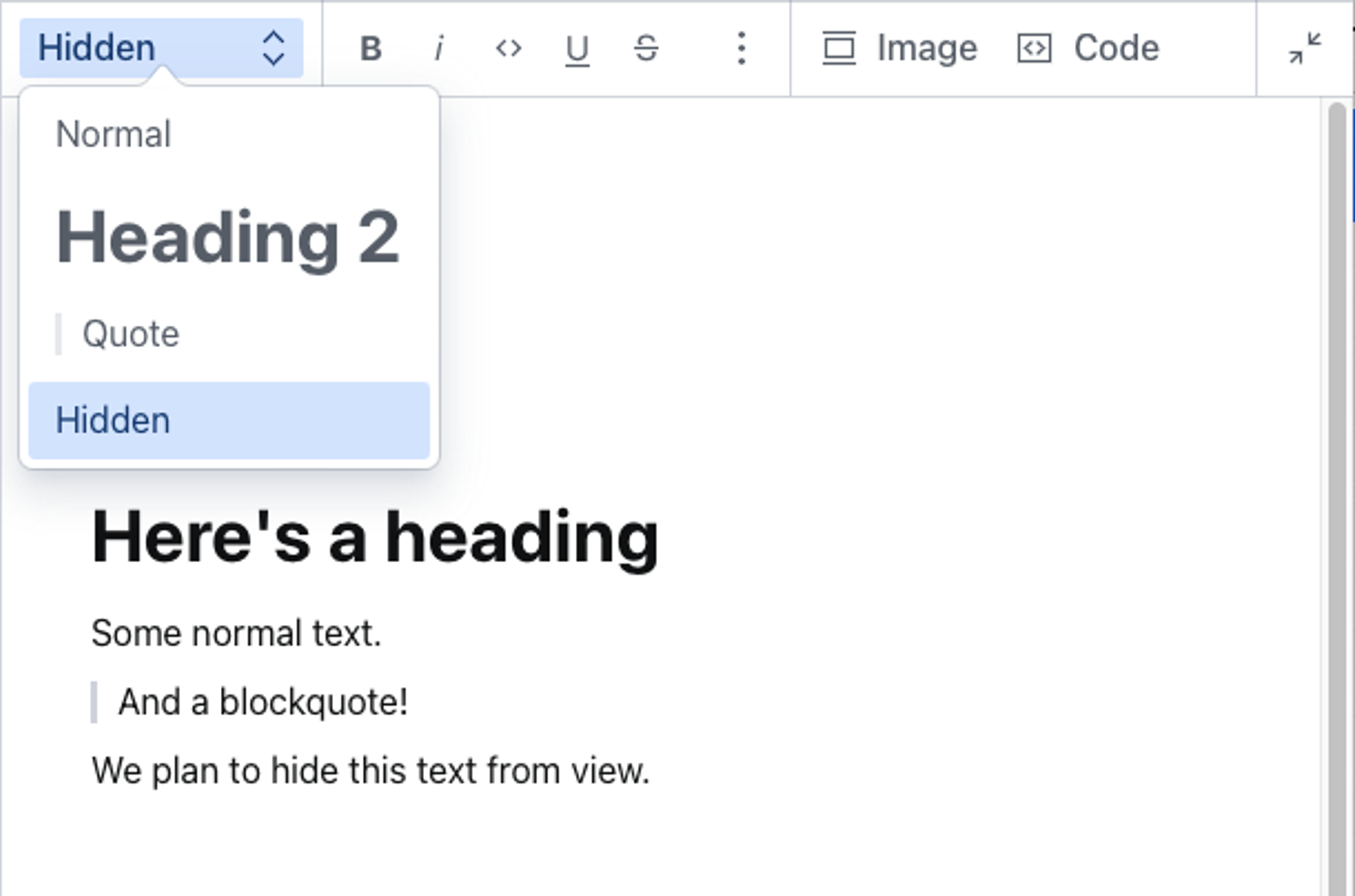
Here we have set four possible styles. The first three are from the default settings and are parsed in HTML to <p>, <h2>, and <blockquote>.
blockComment is an arbitrary style that we set because we plan to make it possible for editors to hide selected blocks of text from rendering, while keeping them available in the source code as block comments.
To change how blocks look inside the editor, see Customize the Portable Text Editor.
Configure lists for text blocks
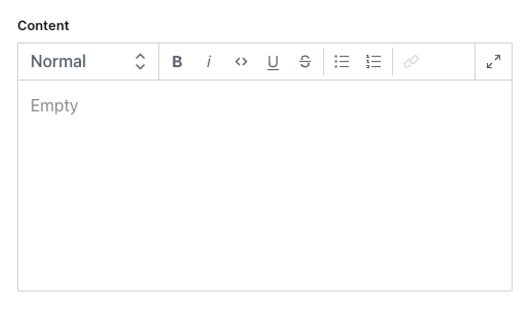
The editor supports two types of lists: bullet (unordered) and number (ordered). If your block type doesn't contain a lists definition, your editor features both a bullet list and a numbered list option:
The default is the equivalent of explicitly naming both:
// The default set of lists
export default {
  name: 'content',
  title: 'Content',
  type: 'array',
  of: [
    {
      type: 'block',
      lists: [
        {title: 'Bulleted list', value: 'bullet'},
        {title: 'Numbered list', value: 'number'}
      ] // yes please, both bullet and numbered
    }
  ]
}
You can override the default by naming the lists you want. To disable lists altogether, leave the array empty:
// No lists
export default {
  name: 'content',
  title: 'Content',
  type: 'array',
  of: [
    {
      type: 'block',
      lists: [] // no lists, thanks
    }
  ]
}
You also decide what goes into the title: {title: 'Prioritized', value: 'number'} works equally well.
Configure marks for inline text
Portable Text enables marks to label inline text with additional data. There are two types of marks: decorators and annotations. Decorators are simple string values, while annotations are keys pointing to a data structure. Annotations are a powerful feature of Portable Text in combination with the Content Lake, because they allow embedding complex data structures and references in running text.
Decorators
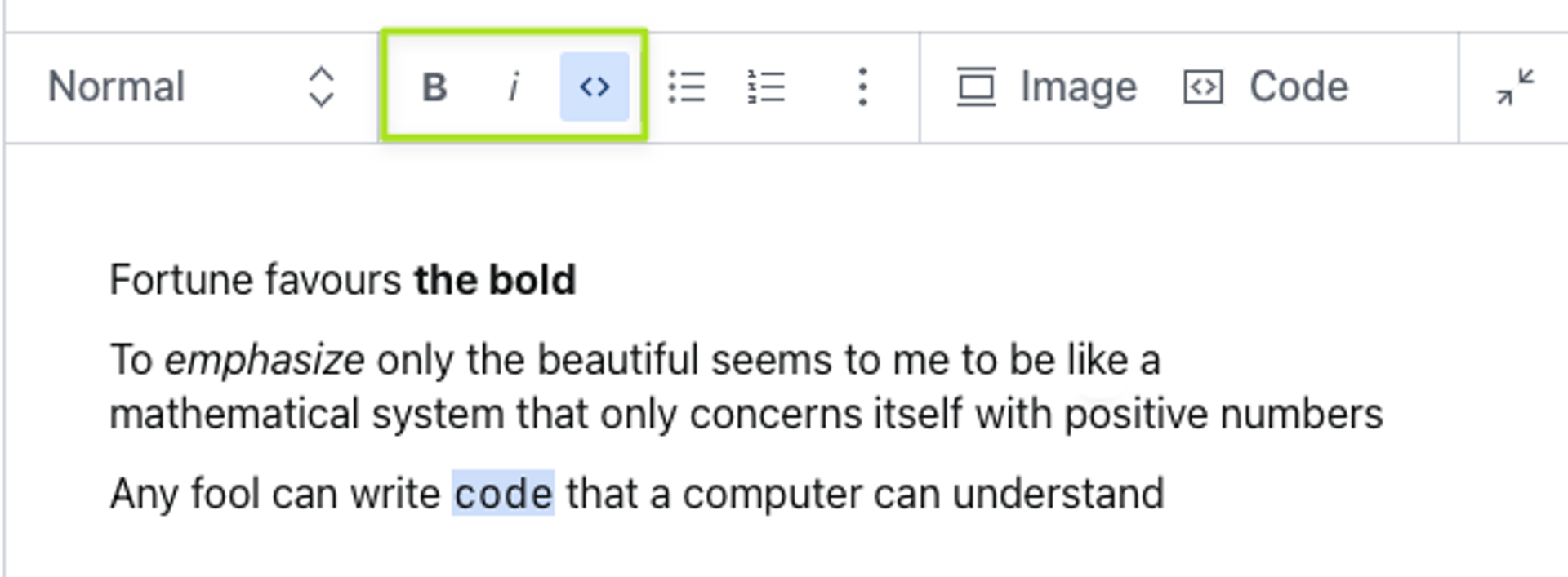
Decorators work similarly to styles, but they apply to spans, that is, inline text. The defaults are strong, em, code, underline, and strike-through (which the toolbar labels "Strike"). To replace these with your own set, add an array to the decorators key, under marks:
export default {
  name: 'content',
  title: 'Content',
  type: 'array',
  of: [
    {
      type: 'block',
      marks: {
        decorators: [
          {title: 'Strong', value: 'strong'},
          {title: 'Italic', value: 'em'},
          {title: 'Code', value: 'code'}
        ]
      }
    }
  ]
}
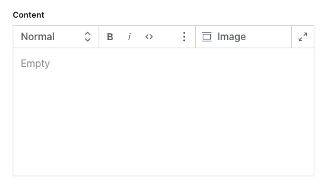
Decorators are displayed as icons in the toolbar. This configuration looks like this:
Annotations
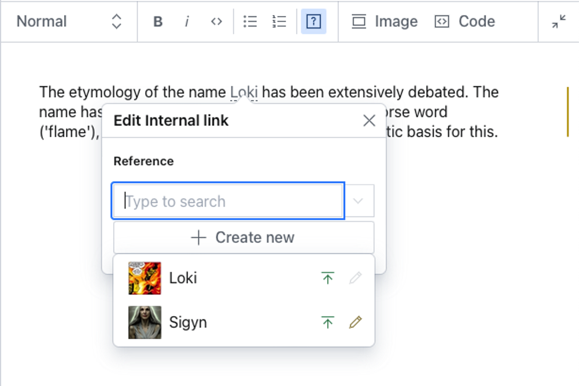
Annotations enable embedding rich content data in inline text. An example can be a reference to another document, typically used for internal linking.
To add an internal link annotation, configure the Portable Text schema like this:
export default {
  name: 'content',
  title: 'Content',
  type: 'array',
  of: [
    {
      type: 'block',
      marks: {
        decorators: [
          // ...
        ],
        annotations: [
          {
            name: 'internalLink',
            type: 'object',
            title: 'Internal link',
            fields: [
              {
                name: 'reference',
                type: 'reference',
                title: 'Reference',
                to: [
                  { type: 'post' },
                  // other types you may want to link to
                ]
              }
            ]
          }
        ]
      }
    }
  ]
}
Gotcha
If you plan to use Sanity’s GraphQL API, you should hoist internalLink as a schema type, and use type: 'internalLink' as the annotation, instead of the anonymous example above.
Annotations without an icon are displayed in the toolbar as question mark icons. For more information on editing toolbar icons, see Customize the Portable Text Editor.
The corresponding Portable Text data structure looks like this:
[
  {
    "_key": "da9dc50335a0",
    "_type": "block",
    "children": [
      {
        "_key": "da9dc50335a00",
        "_type": "span",
        "marks": [
          "5b86c1132a66"
        ],
        "text": "This is an internal link"
      },
      {
        "_key": "da9dc50335a01",
        "_type": "span",
        "marks": [],
        "text": "."
      }
    ],
    "markDefs": [
      {
        "_key": "5b86c1132a66",
        "_type": "internalLink",
        "reference": {
          "_ref": "1dfa4e95-9f92-4e13-901b-1a769724e23c",
          "_type": "reference"
        }
      }
    ],
    "style": "normal"
  }
]