The logo soup problem (and how to solve it)
A deep dive into the math behind making mismatched brand logos actually look good together. And a tiny React library that does it for you.

Rostislav Melkumyan
Senior SWE
Published
You know the scenario. Marketing sends over a folder labeled "Partner Logos Final FINAL v3." Inside: a chaotic mix of file formats, each logo arriving with its own special quirks.
Some are perfectly cropped SVGs with transparent backgrounds . Others are PNGs with mysterious amounts of padding baked in, as if someone screenshotted them from a website and called it a day. One has a thick stroke that makes it look bold and confident. Another is just a thin wordmark that practically whispers its existence.
You line them up in a row, and they look like a ransom note.
You try making them all the same width. Now the square logos tower over everything else like skyscrapers, while the wide ones shrink into illegibility. You try making them all the same height instead. Now the wide logos dominate the entire row like billboards, and the compact ones vanish into the background. You manually adjust each one, tweaking widths and heights until they look somewhat balanced. It works. Until next week, when three more logos arrive.
This is the logo cloud problem. It's not glamorous. It's not the kind of thing that makes it into conference talks or gets you promoted. But it's real, it's annoying, and it eats up more time than anyone wants to admit.
The usual suspects
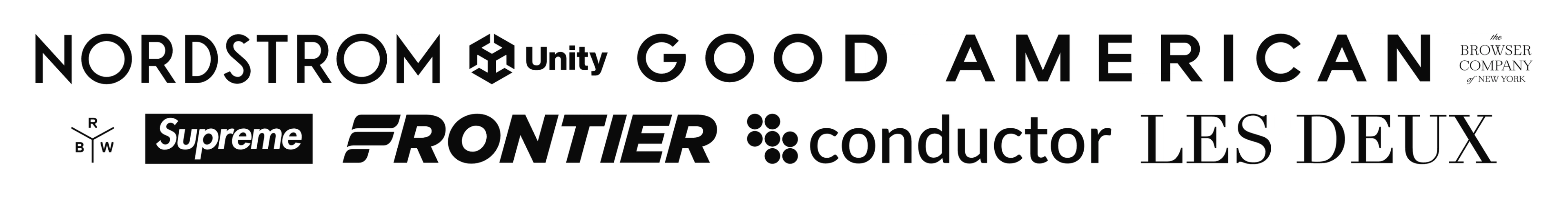
Let's talk about some real examples, all great logos in their own right. It’s when you try to put them together you’re getting into a bag of hurt.
Take logos like Nordstrom or Frontier. These are wide wordmarks, roughly 8:1 aspect ratio. Put them next to something like Sanity's square logo (1:1), and the difference is jarring. Then there's Browser Company, which manages to be both nearly square (1.44:1) and impossibly thin at the same time, somehow occupying visual space while barely registering on the retina.
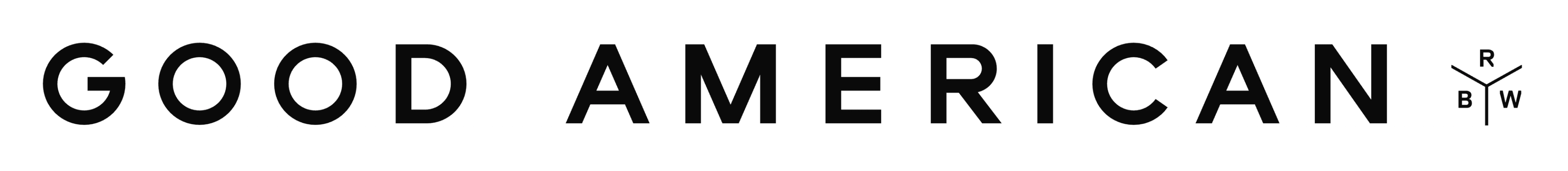
Or consider the extremes. Good American's logo clocks in at a staggering 15.65:1 aspect ratio. It's essentially a horizontal line with letters. On the other end, you have logos like Rich Brilliant Lighting at 0.87:1, which are actually taller than they are wide. Put these in the same row using naive sizing, and you get visual chaos.
The problem gets worse when you factor in visual weight. Some logos are dense and solid, like Unity or Supreme. They're blocky, filled with color, and they command attention. Others, like Conductor or Frame, are mostly negative space with thin letterforms. Even if you get the dimensions right, the dense logos still feel heavier, like they're shouting while the thin ones are mumbling.
So how do you actually solve this without spending hours and hours tweaking with specific styles and Figma edits?
Yep, you use maths™.
Sprinkle some PINF on it
Turns out, there's a mathematical approach that actually works. It's called the Proportional Image Normalization Formula, a grandiose name for what is essentially grade school math dressed up in production code. The core insight comes from Dan Paquette, who wrote about this problem years ago. His formula looks like this:
(imageWidth / imageHeight) ** scaleFactor * baseSize
Let's break it down. (you don’t have to understand this and there is a library that does this for you below)
You take the aspect ratio of your logo (width divided by height), raise it to a power (the scale factor), and multiply by a base size. The magic is in that scale factor. When the scale factor is 0, all logos end up the same width. When it's 1, they all end up the same height. Somewhere around 0.5, you hit a sweet spot where wide logos don't dominate and square logos don't balloon. It's a sliding scale between two bad solutions that somehow produces a good one.
Take these examples:
- For a square logo like Sanity (1:1 aspect ratio), the formula simplifies nicely. With a scale factor of 0.5 and a base size of 48px, you get:
(1) ** 0.5 * 48 = 48px. Perfect square. - For something wide like Nordstrom (7.98:1), you get:
(7.98) ** 0.5 * 48 ≈ 135px. Still readable, but not overwhelming. - For Good American's extreme 15.65:1 ratio:
(15.65) ** 0.5 * 48 ≈ 190px. Wide, but proportional to its actual shape.
The formula automatically accounts for aspect ratio in a way that feels natural to the human eye. Wide logos get wider, but not linearly so. The power function dampens the extremes.
Aspect ratios are just the tip of the logo iceberg
The aspect ratio formula solves one problem, but logos have other issues. Remember that visual weight problem? Dense logos versus thin ones? That requires measuring pixel density.
You need to actually analyze the image data, count how many pixels are filled versus transparent, and factor in opacity. A logo that's 80% filled with solid color should be scaled down compared to one that's 20% thin strokes.
Then there's the padding problem. Some logos arrive with whitespace baked into the image file itself. You can't just trust the image dimensions. You need to detect the actual content boundaries, crop to them, and then apply the normalization formula.
And if you really want to get fancy, there's optical alignment. The geometric center of a logo isn't always its visual center. An asymmetric logo might need to be shifted slightly to look properly aligned with its neighbors.
Solving all of this manually is tedious. Solving it programmatically is… well, that's where things get interesting.
Enter <LogoSoup />
This is exactly the kind of problem that begs for automation. And that's where LogoSoup comes in. It's a tiny React library that normalizes logos so they actually look good together. It implements the proportional normalization formula, measures pixel density, detects content boundaries, and can even handle optical alignment.
Here's what it looks like in practice:
import { LogoSoup } from "react-logo-soup";

function App() {
  return (
    <LogoSoup
      logos={["/logos/acme.svg", "/logos/globex.svg", "/logos/initech.svg"]}
    />
  );
}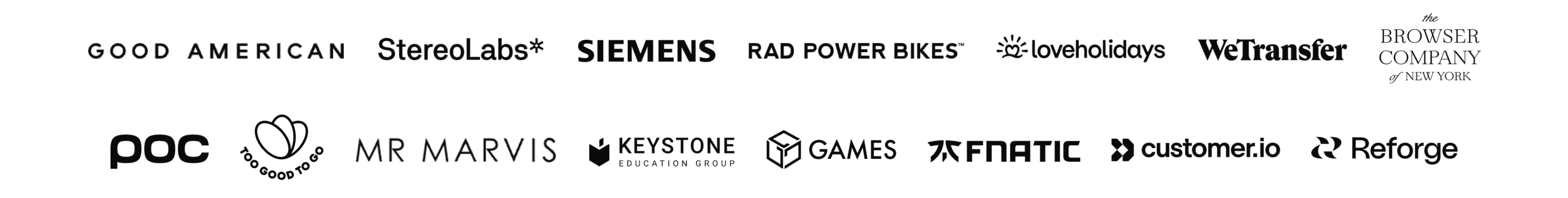
That's it. LogoSoup loads each image, analyzes it, and spits out normalized dimensions. No manual tweaking. No eyeballing.
The density compensation is particularly clever, and it’s on by default. LogoSoup analyzes each logo’s pixel data to calculate its visual weight. A dense, blocky logo like Unity gets scaled down slightly. A thin, airy logo like The Browser Company gets scaled up. The result is a row of logos that feels balanced, even when the underlying images are wildly different. You can control how aggressive this compensation is with the densityFactor prop. Set it to 0 and you’re back to pure aspect ratio normalization. Set it to 1 and density becomes the dominant factor. The default of 0.5 strikes a reasonable middle ground. If you want to disable it entirely, set densityAware={false}.
<LogoSoup
  logos={logos}
  densityAware={false} // disable density compensation
/>
There's also the padding problem. Some logos arrive with whitespace baked into the file itself. A designer exports a logo at 400x100, but the actual content only occupies 300x80 in the center. If you trust the file dimensions, you're sizing based on invisible padding. LogoSoup handles this with the cropToContent option:
<LogoSoup
  logos={logos}
  cropToContent={true}
/>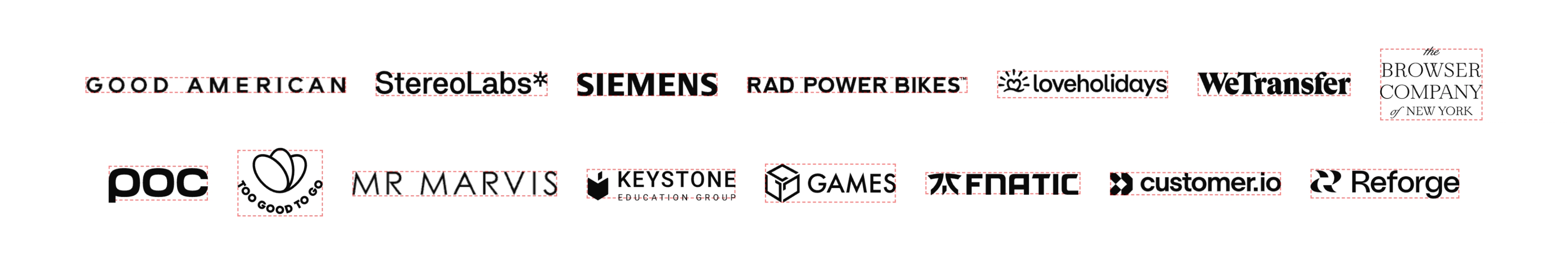
When enabled, LogoSoup analyzes each image, detects the actual content boundaries, and crops to them. The padding disappears. Logos align based on their visual content, not whatever arbitrary dimensions someone chose during export.
But there’s a subtler problem. The geometric center of a logo isn’t always where your eye perceives the center to be. An asymmetric logo needs a nudge to look properly aligned.
Here’s how it works under the hood: LogoSoup iterates through every pixel in the content bounding box. For each “content” pixel (not background), it calculates a weight using the Euclidean RGB distance and opacity: sqrt(colorDistance) * (alpha / 255). This fourth-root relationship to color difference is strong enough to matter, but dampened enough that one dark pixel won’t dominate. The weighted average of all pixel centers gives you a visual center of mass. Not the geometric midpoint, but where the “ink” actually lives.
This weighted center often differs from the geometric center, especially for logos with lopsided weight distribution. Think of a logo with a chunky icon on one side and thin text on the other. LogoSoup calculates the offset between visual and geometric centers, then applies a CSS transform to nudge it into optical alignment:
<LogoSoup
  logos={logos}
  alignBy="visual-center-y"
/>
You can choose to align by bounds (geometric center), visual center in both directions, or just horizontally or vertically. It's a subtle effect, but it makes a difference when you're dealing with logos that have asymmetric weight distribution. For custom layouts, you can skip the component entirely and use the useLogoSoup hook directly:
import { useLogoSoup, getVisualCenterTransform } from "react-logo-soup";

function App() {
  const { isLoading, normalizedLogos } = useLogoSoup({
    logos: ["/logo1.svg", "/logo2.svg"],
    baseSize: 48,
    scaleFactor: 0.5,
  });

  if (isLoading) return <div>Loading...</div>;

   return (
    <div className="text-center text-balance">
      {normalizedLogos.map((logo) => (
        <img
          key={logo.src}
          src={logo.src}
          width={logo.normalizedWidth}
          height={logo.normalizedHeight}
          style={{ transform: getVisualCenterTransform(logo, "visual-center") }}
          className="inline-block p-4 align-middle"
        />
      ))}
    </div>
  );
}
The hook gives you the normalized dimensions for each logo, and you can render them however you want. Build a grid, a carousel, a masonry layout. Whatever your design calls for.
Now anyone can make (good) logo soup
When you put together these logo soups manually, they tend to be hard coded in your frontend, but if you think about it: They are content. So folks who don’t push to git should be able to add, remove, and reorder them too. And do so without having to have the visual design chops that you might have.
So LogoSoup enables you to make these components easily editorialized. If you're working with a CMS like Sanity, you can now pull customer logos from Content Lake.
Here's how that might look with LogoSoup:
import { LogoSoup } from "react-logo-soup";
import { client } from "./sanity";

export async function CustomerLogos() {
  const customers = await client.fetch(`
    *[_type == "customer"] | order(name asc) {
      name,
      "logoUrl": logo.asset->url
    }
  `);

  const logos = customers.map(p => ({
    src: p.logoUrl,
    alt: `${p.name} logo`
  }));

  return (
    <LogoSoup
      logos={logos}
      baseSize={56}
      cropToContent={true}
      alignBy="visual-center-y"
    />
  );
}
The beauty here is that content teams can upload whatever logos they have, in whatever format, with whatever padding. LogoSoup handles the normalization automatically. No need for a style guide that dictates exact dimensions or manual cropping in Photoshop. The logos just work.
You could even extend this to handle different logo variants. Maybe you have light and dark versions, or full logos versus icon-only versions. Store them all in Sanity, query based on context, and let LogoSoup normalize them:
*[_type == "customer"] {
  name,
  "lightLogo": logoLight.asset->url,
  "darkLogo": logoDark.asset->url,
  "iconOnly": logoIcon.asset->url
}
Pick the variant you need, pass it to LogoSoup, and you're done. The normalization logic stays consistent regardless of which version you're displaying.
Start cooking
The logo soup problem isn't going away. But now you don't have to solve it by hand.
Install LogoSoup from NPM:
npm install react-logo-soup
Check out the live Storybook at react-logo-soup.sanity.dev to see it in action, or browse the source at github.com/sanity-labs/react-logo-soup (and remember to ⭐️ it).
Now go forth and normalize your logos!
