Design system definition
Design systems are reusable rules, components, and guidelines that unify design and code, ensuring consistent interfaces, faster delivery, improved collaboration, and brand-aligned experiences across products.
A design system is a company’s
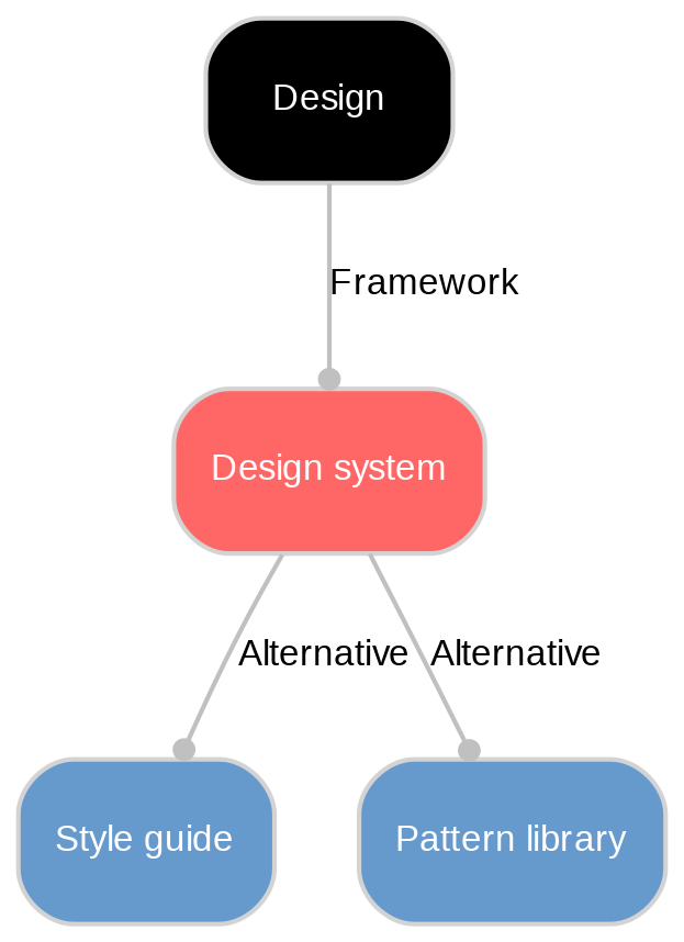
It typically includes reusable components (buttons, forms), visual foundations (colors, typography, spacing), usage guidelines, and code that mirrors the designs. With this shared language, designers and developers work faster, reduce rework, and keep products coherent across pages and platforms. Unlike a simple style guide, a design system connects standards, components, and documentation into a living product that supports accessibility and quality at scale, freeing people to focus on flow and features instead of reinventing basics.
They matter because they turn countless one‑off design decisions into reusable, trustworthy assets. That cuts duplication, protects the brand, and keeps interfaces consistent as products grow across platforms. By standardizing routine UI, teams ship features faster and spend their energy on real customer problems instead of rebuilding buttons and forms.
Design systems also improve teamwork. Clear guidance and examples create common standards for designers, developers, and writers, reducing miscommunication, especially in distributed teams. New hires onboard quicker with documented patterns. Because accessibility is baked into components and guidelines, products are inclusive by default. Centralized updates ripple through products, lowering maintenance costs and design debt while raising overall quality.
A robust system bundles foundations (color scales, type ramps, spacing, grids, elevation, motion), a catalog of components with states and variants, and reusable patterns for navigation, forms, and errors. It adds content guidelines for voice, tone, and microcopy, clear
It also includes thorough documentation with usage guidance, do/don’t examples, and code snippets; production-ready code libraries and token packages; versioning and changelogs; practical tooling (Figma libraries, token pipelines, linters, visual-regression tests); defined governance and contribution processes; and theming support (brands, dark mode) plus starter templates to speed adoption. A design system is increasingly read by coding agents as well as by people, which is why component manifests and MCP servers have joined that tooling list. Storybook added one in version 10.3 in April 2026, letting an agent query which components already exist and what props they accept so it reuses the system instead of inventing a new button.
Unlock New Possibilities with Sanity
With Design system under your belt, it's time to see what Sanity can do for you. Explore our features and tools to take your content to the next level.
Last updated: