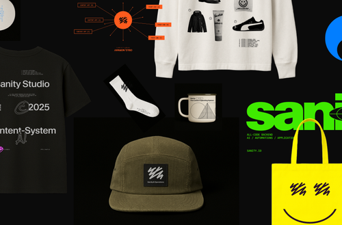
Grab your gear: The official Sanity swag store
Read Grab your gear: The official Sanity swag storeYes! Sanity automatically stores image dimensions in the image metadata, which you can query to calculate the height before the image loads. This is perfect for creating properly-sized placeholders with vue-lazyload.
When you upload an image to Sanity, it automatically extracts metadata including dimensions. The dimensions field (which includes width, height, and aspectRatio) is always included and cannot be disabled—it's available by default for every image.
In your Gridsome source configuration, you can access image metadata through GraphQL. If you're using gridsome-source-sanity, the plugin should expose the metadata fields. Your GraphQL query would look like:
query {
  allSanityPost {
    edges {
      node {
        image {
          asset {
            url
            metadata {
              dimensions {
                width
                height
                aspectRatio
              }
            }
          }
        }
      }
    }
  }
}With the aspect ratio, you can calculate the correct placeholder height using the padding-bottom trick. Here's a Vue component example that works with vue-lazyload:
<template>
  <div
    class="image-container"
    :style="{ paddingBottom: `${(1 / aspectRatio) * 100}%` }"
  >
    <img
      v-lazy="imageUrl"
      :alt="alt"
      class="lazy-image"
    />
  </div>
</template>

<script>
export default {
  props: {
    image: Object,
    alt: String
  },
  computed: {
    aspectRatio() {
      return this.image.asset.metadata.dimensions.aspectRatio;
    },
    imageUrl() {
      return this.image.asset.url;
    }
  }
}
</script>

<style scoped>
.image-container {
  position: relative;
  width: 100%;
  overflow: hidden;
}
.lazy-image {
  position: absolute;
  top: 0;
  left: 0;
  width: 100%;
  height: 100%;
  object-fit: cover;
}
</style>
This creates a container that maintains the correct aspect ratio before the image loads, preventing layout shift.
If you prefer to set explicit dimensions, you can calculate the height based on your container width:
<template>
  <div class="image-wrapper">
    <div :style="placeholderStyle">
      <img v-lazy="imageUrl" :alt="alt" />
    </div>
  </div>
</template>

<script>
export default {
  data() {
    return {
      containerWidth: 0
    }
  },
  computed: {
    placeholderStyle() {
      const { width, height } = this.image.asset.metadata.dimensions;
      const calculatedHeight = (height / width) * this.containerWidth;
      return {
        height: `${calculatedHeight}px`
      };
    }
  },
  mounted() {
    this.containerWidth = this.$el.offsetWidth;
  }
}
</script>Sanity also generates LQIP (Low Quality Image Placeholder) data automatically. You can query this alongside dimensions for an even smoother loading experience:
image {
  asset {
    url
    metadata {
      dimensions {
        aspectRatio
      }
      lqip
    }
  }
}
Then use the lqip as a background image while the full image loads:
<div
  class="image-container"
  :style="{
    paddingBottom: `${(1 / aspectRatio) * 100}%`,
    backgroundImage: `url(${image.asset.metadata.lqip})`,
    backgroundSize: 'cover'
  }"
>
  <img v-lazy="imageUrl" :alt="alt" />
</div>
This gives users immediate visual feedback with a blurred preview instead of just an empty box, creating the smoothest possible loading experience!
Sanity is the developer-first content operating system that gives you complete control. Schema-as-code, GROQ queries, and real-time APIs mean no more workarounds or waiting for deployments. Free to start, scale as you grow.
Content operations
Content backend

The only platform powering content operations
By Industry


Tecovas strengthens their customer connections
Build and Share

Grab your gear: The official Sanity swag store
Read Grab your gear: The official Sanity swag store