Design tokens definition
Design tokens are standardized design variables—colors, typography, spacing—that centralize brand decisions, enforce consistency, and enable cross-platform updates across code and design tools within design systems.
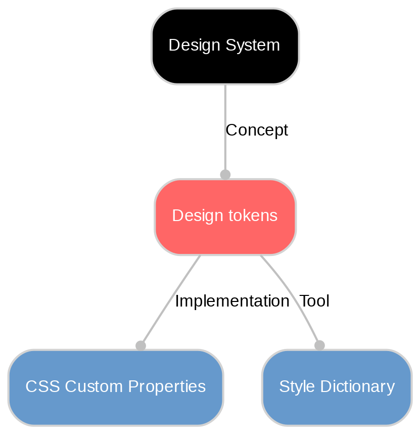
What are design tokens?
Design tokens are the small, named values that store your brand’s visual decisions—things like colors, typography, spacing, radii, and motion. Think of them as labeled ingredients that your products reuse everywhere. Instead of writing “#0A84FF” in many places, teams use a token like color.brand.primary as a single source of truth.
Because tokens live in a shared, language-agnostic format (often simple JSON), they can be used across websites, apps, and marketing surfaces. Update a token once and the change flows through all experiences, keeping interfaces consistent and on-brand. Major systems (like Material Design) rely on tokens, and teams often manage them in tools that connect design and development for faster, less error-prone updates.
Why design tokens matter for consistency and scale
Tokens turn brand decisions into reusable, machine-readable variables that your build tools translate into CSS variables, iOS, and Android styles. Components reference semantic tokens (like text.primary or surface.background), so when branding, themes, or accessibility standards change, every component updates in lockstep. This removes one-off overrides and prevents drift between platforms, products, and teams.
At scale, tokens enable multi-theme systems (light/dark, seasonal, multi-brand) and support accessibility by encoding contrast-safe color pairs. They also create safer workflows for non-technical teams: tools like Style Dictionary automate platform outputs, and solutions such as Sanity and compatible builders can read tokens so marketers compose pages that stay on-brand by default—without developer handoffs.
How to get started with tokens: simple steps and best practices
Start with a quick style inventory (colors, type scales, spacing). Create a small set of core/primitives (e.g., color.blue.500, space.16) and map semantic tokens to them (e.g., text.primary, surface.background). Agree on a clear naming convention, keep tokens in a simple shared file (often JSON), and put it under version control.
Automate outputs with Style Dictionary or similar so tokens become CSS variables, iOS, and Android values. Add accessibility checks (contrast-safe color pairs) and document intended use inside your design system. Pilot on a few components, then scale to themes. If you use a CMS like Sanity, connect tokens so content teams assemble pages that stay on‑brand by default.
Unlock New Possibilities with Sanity
Understanding Design tokens is just the beginning. Take the next step and discover how Sanity can enhance your content management and delivery.
Last updated: