sanity-plugin-editor-onboarding
Guided tours and field-level help for Sanity Studio editors, so the answer arrives where the confusion does. Ships five ready-made guides covering the questions editors always ask, and needs one line to install.
Install command
npm i sanity-plugin-editor-onboardingsanity-plugin-editor-onboarding
Short, unobtrusive guided tours for Sanity Studio editors — with a library of core Sanity concepts that works with zero configuration.
I build most things on Sanity these days, which means regularly handing a Studio to someone who has never used a CMS. Every handover has the same moment of doubt: will they actually get it? You can leave them to work it out, write a PDF nobody opens twice, or run a training session they will have forgotten in a fortnight. All three put the help somewhere other than where the confusion happens — not there at 4pm on a Tuesday when someone is staring at a field called "slug" wondering whether they are allowed to change it.
So this puts it in the Studio: answers to the questions editors reliably ask — what the draft/published distinction means, what publishing actually does, why renaming a slug breaks links — at the moment they are looking at the thing.
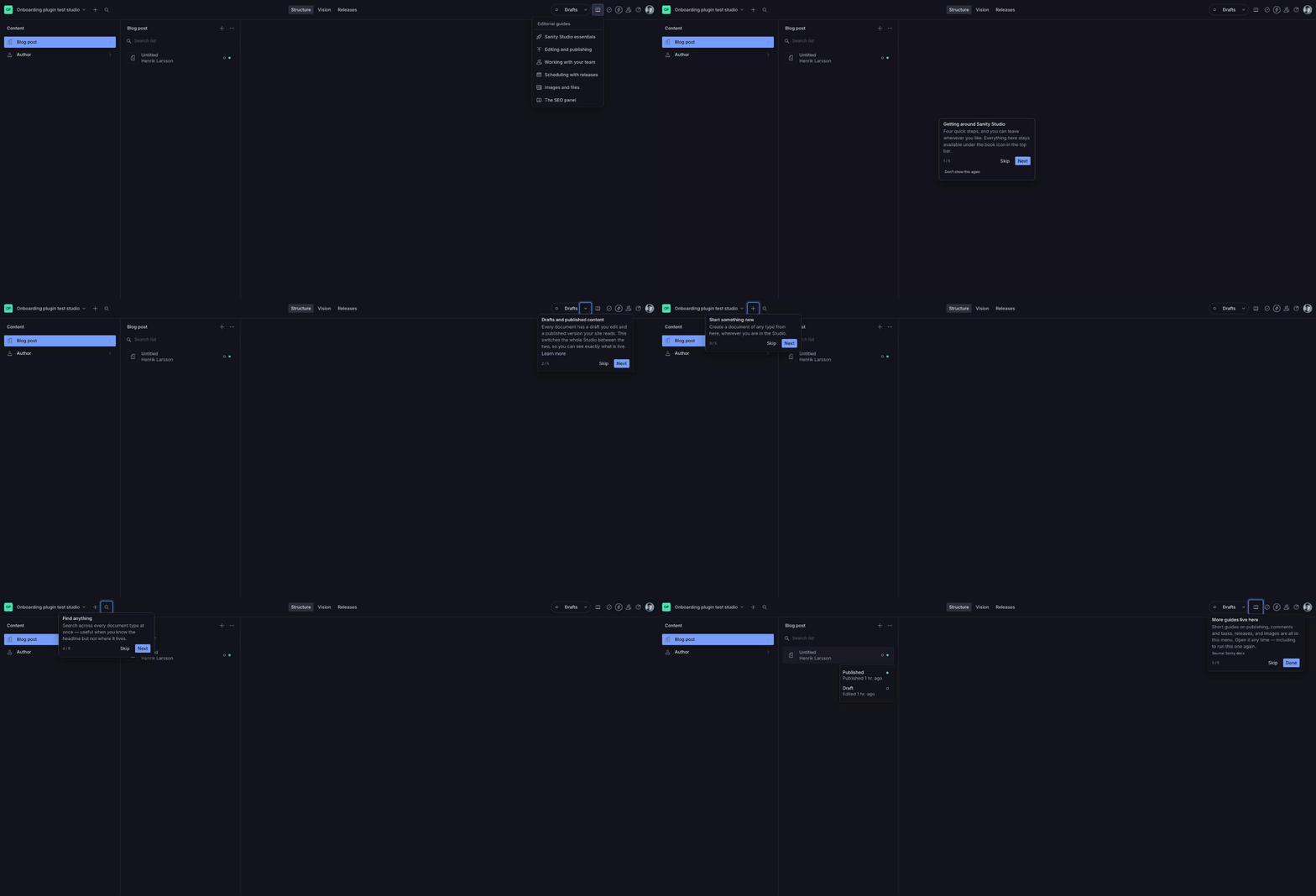
That is the whole surface — a ring and a popup. Nothing is dimmed, no modal opens, and it never interrupts someone mid-sentence. An editor who is not afraid of breaking something asks fewer questions and publishes more, which is really the point.
Quickstart
npm install sanity-plugin-editor-onboarding// sanity.config.ts
import {defineConfig} from 'sanity'
import {coreConcepts, onboardingTool} from 'sanity-plugin-editor-onboarding'
export default defineConfig({
// ...
plugins: [onboardingTool({tours: coreConcepts()})],
})That's the whole setup. Start your Studio and you get:
- A short Studio essentials tour that starts once, on first login.
- An Editorial guides button in the navbar listing every guide, so a tour is never lost to someone who dismissed it. It carries a small dot until opened once, and the last step of the first tour points at it.
- Steps that point at features your project doesn't have (Content Releases, say) quietly drop out — no configuration needed.
What's included
coreConcepts() ships five short tours. Only essentials starts on its own;
the rest wait in the help menu.
| Tour | Covers |
|---|---|
essentials | Drafts vs. published, creating documents, search |
publishing | Autosave, what a slug is, publishing, document history |
collaboration | Presence, comments and tasks |
releases | Bundling and scheduling content releases |
media | How assets are stored and reused |
Pick a subset if you want:
coreConcepts({include: ['essentials', 'publishing']})The publishing tour explains what a slug is — the term editors ask about most
and understand least, and the one field where a careless edit quietly breaks
every existing link. It targets the field by schema name, defaulting to slug.
If yours is called something else, say so:
coreConcepts({slugField: 'permalink'})Point it at a name that isn't in your schema, or leave it out of a project with no slug at all, and the step drops out with a console warning like any other missing target.
Drafting guides from your schema
npx sanity-plugin-editor-onboarding initReads your schema and drafts a field guide for every field it can classify —
references, images, files, arrays, portable text — into a file you edit and
commit. It leaves slugs alone, since coreConcepts() already explains those,
and skips fields it cannot identify rather than guessing: Sanity's schema
extract reports datetime, text and string identically.
The output is a first draft. The copy is chosen from field types alone and knows nothing about your project, so read every guide, rewrite it in your own words, and delete the ones that state the obvious.
The package also ships a SKILL.md, so an agent working in your repo can read
your actual schema source — titles, descriptions, validation rules — and write
better guides than any type-level heuristic can.
Your own tours
import {
  onboardingTool,
  coreConcepts,
  targetCustom,
  targetDocumentType,
} from 'sanity-plugin-editor-onboarding'

onboardingTool({
  tours: [
    ...coreConcepts(),
    {
      id: 'editorial-workflow',
      title: 'How we work',
      autoStart: 'first-login', // or 'manual', or (ctx) => boolean
      steps: [
        {
          target: targetDocumentType('Blog post'),
          title: 'Your articles live here',
          content: 'Every published and draft post, in one place.',
        },
        {
          target: targetCustom('team-activity'), // one of your own components
          title: 'Team activity',
          content: 'What everyone has been working on this week.',
        },
      ],
    },
  ],
})
Each step takes a title, a content of one to three sentences, an optional
learnMoreUrl, and an optional placement. If a step needs more words than
that, link out instead — it has stopped being a tour step.
Targeting
Built-in helpers cover Sanity's own UI, so you don't have to know its internals:
| Helper | Points at |
|---|---|
targetNavbar() | The top navigation bar |
targetToolMenu() | The tool switcher |
targetSearch() | Global search |
targetNewDocument() | The "create new document" button |
targetPerspectiveMenu() | The draft / published / release switcher |
targetReleases() | The Content Releases link |
targetPublishButton() | Publish, in an open document |
targetDocumentStatus() | The Draft / Published chips |
targetDocumentHistory() | The open document's context menu |
targetDocumentType(title) | A type in the structure list — by title, not schema name |
targetField(name) | A field in the open document, by schema name |
Your own components are marked explicitly, with an id you choose. Attach the
ref from useOnboardingTarget() to any element:
import {useOnboardingTarget} from 'sanity-plugin-editor-onboarding'

function TeamActivity() {
  const ref = useOnboardingTarget('team-activity')
  return <div ref={ref}>...</div>
}
...then point a step at the same id with targetCustom('team-activity').
If you'd rather not edit the component, mark it from the outside:
import {OnboardingTarget} from 'sanity-plugin-editor-onboarding'

<OnboardingTarget id="team-activity">
  <TeamActivity />
</OnboardingTarget>
This adds no element to the DOM — the child is cloned with a ref, so it is safe
inside flex and grid parents. The child does have to accept a ref and pass it
to a DOM node, which host elements do for free and your own components do as
long as they hand ref along. When one doesn't, use the hook inside it instead.
Prefer either of these over a CSS selector for anything you own. A selector written against your own class names breaks the next time you touch that component, silently and at a distance; a registered id doesn't.
Any CSS selector still works, and is the escape hatch for markup you can
reach but can't change: target: '.some-widget' or target: '[data-thing]'.
A target that can't be found is not a crash and not a silent failure: the step is skipped, the tour carries on, and you get a console warning naming the tour, the step and the selector that missed.
Help on a single field
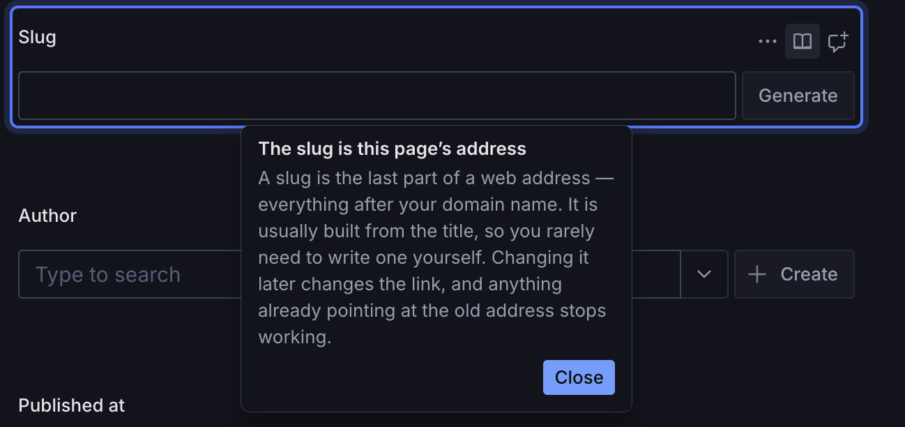
Editors get stuck on fields, not on tours. Any field can carry a book icon in its own action row, beside the comment button; clicking it explains that field and nothing else — no tour, no step counter.
onboardingTool({
  tours: coreConcepts(),
  fieldGuides: [
    {
      field: 'ingredients',
      documentType: 'recipe', // optional; omit to match every type
      title: 'One ingredient per line',
      content: 'The site renders each line as its own bullet.',
    },
  ],
})
A tour step does the same job by naming a field instead of a target — the
built-in slug step works this way, so it is both the second step of the
publishing guide and the help on the field itself, written once:
{field: 'slug', title: 'The slug is this page’s address', content: '...'}Nested fields take a dotted path ('seo.title'). Fields with no guide show no
icon at all, so this costs nothing on the other twenty fields in a document.
This is the one part of the plugin built on a Sanity API marked unstable
(unstable_fieldActions) — there is no other way into that row. It is only
registered when you declare field help, and if Sanity changes the API the icons
disappear while every tour keeps working.
Starting a tour yourself
The navbar help button is there by default. If you'd rather use your own:
import {useStartTour} from 'sanity-plugin-editor-onboarding'

function HelpButton() {
  const startTour = useStartTour('essentials')
  return <Button onClick={startTour} text="Show me around" />
}
Turn the built-in one off with onboardingTool({tours, navbarButton: false}).
Languages
Every string the plugin shows — its own buttons and menu, and all of the built-in guide content — is translatable. English is the base; Swedish ships too. Studio UI language is followed automatically, so if your editors run Sanity in Swedish, the guides are in Swedish with no extra setup.
Adding a language
Translations are plain locale bundles in the onboarding namespace. Nothing
needs to be forked:
// sanity.config.ts
import {defineConfig, defineLocaleResourceBundle} from 'sanity'
import {deDELocale} from '@sanity/locale-de-de'

const onboardingDeDE = defineLocaleResourceBundle({
  locale: 'de-DE',
  namespace: 'onboarding',
  resources: {
    'action.next': 'Weiter',
    'tour.essentials.title': 'Studio-Grundlagen',
    // ...
  },
})

export default defineConfig({
  // ...
  plugins: [deDELocale(), onboardingTool({tours: coreConcepts()})],
  i18n: {bundles: [onboardingDeDE]},
})
Any key you leave out falls back to English, so a partial translation is
perfectly usable. The full key list lives in src/i18n/locales/en-US.ts, and
the exported OnboardingResourceKey type will tell you if you miss one.
The same mechanism overrides individual strings — handy if "Editorial guides" should read as something else in your Studio:
defineLocaleResourceBundle({
  locale: 'en-US',
  namespace: 'onboarding',
  resources: {'menu.title': 'Guides', 'menu.button-label': 'Guides'},
})
Translations for more languages are very welcome as pull requests.
Localizing your own tours
Step text takes either a plain string or an i18n key, so you only opt in where you need it:
{
  // plain string — nothing to configure
  title: 'Your articles live here',

  // or a key from any namespace you've registered
  title: {key: 'tour.posts.title', ns: 'my-studio'},
  content: {key: 'tour.posts.body', ns: 'my-studio'},
}
Syncing progress across devices
onboardingTool({tours: coreConcepts(), syncProgress: true})Off by default. Turning it on stores one small document per editor in your dataset, so "seen it" follows them between browsers and machines. The document uses an unregistered type, so it never shows up in the structure tool or in search — but it is still your dataset, which is why this is opt-in rather than assumed.
Writes touch only the guides they name, so two tabs belonging to the same editor cannot erase each other's progress. It is best-effort in both directions. An editor without write access, or without a network, keeps working against their browser's own store; the developer gets one console warning and the editor gets none. Local and project state are merged per guide, newest wins, so two machines that each finished a different guide end up with both — and a guide someone switched off is never resurrected by an older record.
Auto-start waits for the project's copy to arrive before offering anything, since starting early is the exact bug this fixes.
Progress is per dataset, so a Studio with several workspaces tracks each separately.
Skip, dismiss, complete
These are three different intentions and the plugin stores them separately:
- Skip — "not now". The tour is offered again next session.
- Don't show this again — a real opt-out. It never auto-starts again, and is only reachable from the help menu.
- Done — reached the last step. Also never auto-starts again, but recorded distinctly from an opt-out.
Design notes
It stays out of the way. A soft ring around the target and a small popup is the whole visual treatment: no dimmed backdrop, no modal, no animation flourishes. The Studio underneath stays fully usable while a tour is open, and auto-start waits for a natural pause rather than interrupting you mid-sentence in a field.
Why not React Joyride / Reactour / Shepherd? All three were considered. The
tour UI here is built directly on @sanity/ui's Popover instead, because:
- Joyride's spotlight is coupled to a dimming full-screen overlay — disabling the overlay disables the highlight with it. That dim is exactly the "product tour took over my screen" feeling this plugin is trying to avoid.
- Building on
@sanity/uimeans the popup inherits the Studio's theme, spacing and elevation automatically, including custom and light themes, rather than being restyled to approximate them. @sanity/uiis already in every Studio, so this adds no runtime dependency.
Positioning, portalling and collision handling come from @sanity/ui (and
Floating UI underneath it), so the parts that are genuinely hard aren't
hand-rolled.
Accessibility
Each step is a non-modal role="dialog", labelled by its own title and
described by its own content, so a screen reader announces it as something that
has arrived rather than reading it as part of the page behind it.
It takes focus when it opens, so the next Tab reaches its own buttons rather
than something behind the popup. Escape leaves, the way it does everywhere else
in a Studio. When a guide closes, focus goes back to whatever opened it — or to
the guides button if that control is gone, since leaving focus on body would
restart a keyboard user at the top of the Studio.
Nothing is dimmed and nothing is trapped: the Studio underneath stays usable
while a guide is open, which is why aria-modal is false.
Known limitations
- Completion state is per browser unless you turn on syncing. By default it
lives in
localStorage, so an editor who switches browser or machine is offered the auto-starting tour once more. See below to sync it. - Some Studio test ids contain translated text. Sanity builds a few of them
from the label shown to the user, so
action-publishisaction-publicerain a Swedish Studio anddocument-header-Draft-chipisdocument-header-Utkast-chip. The built-in helpers match by shape rather than by name where that happens, but it is worth knowing before writing your own selector against something with a visible label in it. - Sanity's
data-testidattributes are not a public API. The built-in helpers target the attributes Sanity's own end-to-end tests use. They are verified against the Studio version noted below, but a major Studio release could move them. When that happens the affected step is skipped with a warning rather than breaking anything — and helper fixes ship as patch releases. targetDocumentType()keys off the title shown in the structure list, not the schema name, because that is what Studio puts in the DOM.- Docs links rot. Sanity moves documentation paths without leaving redirects,
and every "Learn more" this plugin originally shipped had gone 404 before
anyone clicked one. Every URL now lives in
src/concepts/docs.tsand is checked weekly in CI (npm run check:links), but a link can still be dead for up to a week. Point them at your own documentation instead — see below.
Verified against sanity@6.12.0. On a newer Studio major the plugin logs one
console warning to the developer; nothing is shown to editors, and steps whose
targets have moved skip themselves as usual.
Checking your guides still point at something
Because a step that cannot find its target is skipped rather than shown, a selector Sanity has renamed looks exactly like a feature you do not have — your editors are simply shown less than you think.
So in development, once per session, the plugin reports what it found:
[sanity-plugin-editor-onboarding] 14 of 18 anchored steps found their target on
this view (Sanity 6.12.0).
Misses are listed, separated into selectors that can never match — invalid CSS — and ones that are merely not on this view, which is expected for any step describing a document that is not open. Open a document and reload to check those. The report is development-only and never reaches an editor.
Where the guides get their facts
Each built-in guide cites the Sanity documentation page it summarises, shown once on its last step. Nothing here paraphrases Sanity as an authority of its own.
Both that citation and any step's learnMoreUrl are localized values, which is
what makes them overridable: point either at your own handbook by redefining the
key in a bundle, without redeclaring the tour.
// sanity.config.ts
i18n: {
  bundles: [
    defineLocaleResourceBundle({
      locale: 'en-US',
      namespace: 'onboarding',
      resources: {'tour.publishing.history.url': 'https://handbook.acme.com/versions'},
    }),
  ],
}
...given a tour that declares learnMoreUrl: {key: 'tour.publishing.history.url'}.
What's next
Nothing is being held back for a later version — the list below is what has been considered and deliberately left out, so you can tell a missing feature from an unfinished one.
- Tour engagement data, showing where editors drop off. Useful, but it means reporting on people's behaviour from inside their Studio, and this plugin currently makes no network requests it was not asked to. If it happens it will be opt-in and local to your own project, never to a third party.
- An in-Studio chat, answering questions the guides do not cover. This would change what the plugin is — no API keys, no per-seat cost and no procurement conversation are part of why it is easy to adopt — so it belongs in its own product rather than in a menu here.
- A JSON Schema for the config. The config is TypeScript, so your editor
already checks it; the shipped
SKILL.mdcovers what a schema could not, which is how to write guides worth reading.
A note on where this is
It is new. It has been walked end to end in a real Studio in two languages and has a test suite behind it, but nobody outside this repository has used it in anger yet — so if you install it and something is wrong, or a guide says something an editor found confusing, please open an issue. That is the feedback I cannot get on my own.
Contributing
npm install
npm test          # vitest, jsdom
npm run typecheck # tsc over src/, tests included — the build only checks what ships
npm run dev       # the Studio in test-studio/, on :3333
npm run build     # test-studio consumes dist/, so build before checking a change there
npm run check:links
npm run dev needs test-studio/.env with a SANITY_STUDIO_PROJECT_ID and
SANITY_STUDIO_DATASET.
Note that test-studio resolves this plugin to dist/, not src/ — a source
change is invisible in the running Studio until you rebuild.
License
MIT © Henrik Larsson