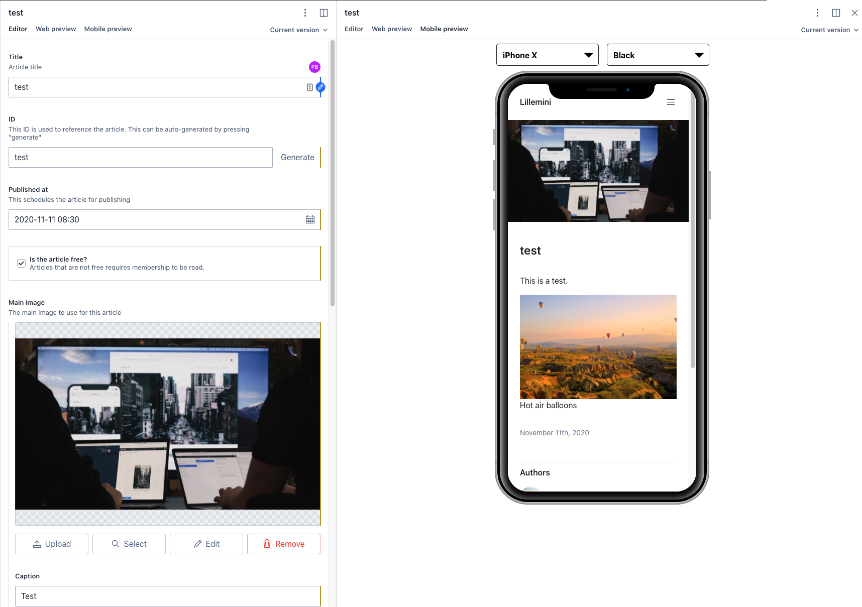
Mobile preview
The mobile preview plugin makes it possible to preview how a website looks on a mobile phone.
v2 install command (deprecated)
npm install sanity-mobile-previewsanity-mobile-preview
An NPM package written in React used to preview mobile devices. Especially helpful when used in combination with a CMS like sanity.

Install
npm install --save sanity-mobile-previewUsage
import SanityMobilePreview from 'sanity-mobile-preview'
import 'sanity-mobile-preview/dist/index.css?raw'

const Example = () => {
  return <SanityMobilePreview />
}
How to set up preview with Sanity
In order to set up mobile preview with Sanity, you first need to create a new view.
For simplicity, we will copy the predefined preview from IframePreview.js to a file called IframeMobilePreview.js
Add imports:
import SanityMobilePreview from 'sanity-mobile-preview'
import 'sanity-mobile-preview/dist/index.css?raw'
At line 47, replace
return (
  <div className={styles.componentWrapper}>
    <div className={styles.iframeContainer}>
      <iframe src={url} frameBorder={'0'} />
    </div>
  </div>
)
with
return (
  <div className={styles.componentWrapper}>
    <SanityMobilePreview>
      <div className={styles.iframeContainer}>
        <iframe src={url} frameBorder={'0'} />
      </div>
    </SanityMobilePreview>
  </div>
)
Then go to deskStructure.js.
Under getDefaultDocumentNode add the next snippet to the Schemes you want to add mobile preview to:
    S.view
        .component(IframeMobilePreview)
        .title('Mobile preview')
        .options({previewURL})
    ])
You should now be able to preview your website with a mobile view.
Customization
The SanityMobilePreview takes five optional arguments:
| Argument | Values | Default |
|---|---|---|
| allowedDevices | An array of MobileDevices. This will be the devices that are selectable in the dropdown menu. | All devices |
| preSelectedDevice | A MobileDevice. The default device to be selected. | 'iphone-x' |
| preSelectedColor | A device color. The default device color to selected. | 'black |
| showMenu | A boolean. Controls the visibility of the dropdowns. | true |
| preSelectedLandscape | A boolean. The default orientation of the devices | false |
If you have specified a preSelectedDevice that is not specified in allowedDevices, it will default to the first device in allowedDevices.
If you have specified a preSelectedColor that is not applicable to the preSelectedDevice, the preSelectedColor will default to black.
Example
This example will load a silver iPad mini as default, and only allows iPhone X and iPad to be selected:
const App = () => {
  return (
    <MobileDevicePreview
      preSelectedDevice={'ipad'}
      preSelectedColor={'silver'}
      allowedDevices={['ipad', 'iphone-x']}
    >
      <div> This is a demo 🤠</div>
    </MobileDevicePreview>
  )
}
Types
MobileDevices = 'iphone-x' | 'note8' | 'iphone8' | 'iphone8plus' | 'iphone5s' | 'ipad' | 'nexus5'
MobileDeviceColors = 'silver' | 'black' | 'gold'
Devices
The different devices are:
| DeviceId | Readable name | Colors |
|---|---|---|
| iphone-x | iPhone X | black |
| note8 | Note 8 | black |
| iphone8 | iPhone 8 | black, silver, gold |
| iphone8plus | iPhone 8 Plus | black, silver, gold |
| iphone5s | iPhone 5s | black, silver, gold |
| ipad | iPad mini | black, silver |
| nexus5 | Nexus 5 | black |
Credit
Marvel Devices
create-react-library
License
MIT