Last updated June 14, 2023
Setting up Tailwind with Vue.js
By Joe Holmes

In this article, we describe how Tailwind integrates with the Vue JavaScript framework, providing a streamlined and efficient styling workflow during development.
Why use TailwindCSS?
While it's an essential language for any web developer, with plenty of great capabilities, there are still many reasons to get frustrated writing Cascading Stylesheets (CSS).
One gripe is right there in the name: CSS expects developers to write the styling of their web or app in a separate file (called a 'stylesheet') which must be integrated harmoniously with the overall structure of the project and developed alongside the program code. Maintaining this separate file creates extra work that would be nice to avoid.
Another common complaint is how hard it is to continually invent accurate, descriptive names for one's classes. Being forced to invent these names throughout the development process often feels like an unnecessary cognitive load.
What if you could solve both of these problems in a single framework?
With TailwindCSS, you keep your CSS inline with your HTML, using descriptive utility classes to wipe out the need for inventive naming. In doing this, Tailwind removes the need for separate stylesheet files, too. It's easy to see why people love it.
Over the past few years, Tailwind has skyrocketed in popularity, becoming the go-to styling solution for millions of developers worldwide.
What are utility classes?
The fundamental building block of Tailwind's approach to styling is the utility class. To understand what utility classes are, first consider the conventional way a class is named in CSS.
.menu-button {
text-color: white;
background-color:blue;
font-size:18px;
}
The class menu-button describes a particular collection of styles we'd expect to assign to an actual button in HTML. The following line would create a button with a blue background, white text, and an 18pt font:
<button class="menu-button">Click me</button>
But there's another way to write classes. Say we wanted a single class that we could easily invoke wherever and whenever we wanted white text. We'd define a utility class as follows:
.text-white {
text-color:white;
}
As you can see, we've created a specific class name only for that exact line of CSS. Now, any time we want white text on anything in our HTML, we can write:
<p class="text-white">My white text</p>
Doing so saves us the time and effort of opening up the stylesheet just to style something with white text.
What if you tried abstracting all the functionality of CSS into utility classes like this one, and called them all from your HTML? This is the fundamental idea that TailwindCSS is built upon.
Getting started
If you'd like to follow along with our guide to setting up Tailwind with Vue, visit the repo here.
We're going to couple our Vue.js framework with Vite, an excellent build tool also created by the inventor of Vue.js, Evan You. Navigate to where you store your code and from the terminal run the following command:
npm create vite@latest tailwind-vue -- --template vue
Next, enter into the project with cd tailwind-vue, install the dependencies with npm install, then fire up the development server with npm run dev. Vite should notify you that localhost is now serving your new project:
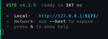
Visit localhost:5173 and you should see a Vite + Vue welcome screen. As a display of Vue's ability to handle state data, click the counter a couple of times and see it go up.

Installing Tailwind and dependencies
Next we'll add in Tailwind and the libraries it requires to function.
npm install -D tailwindcss postcss autoprefixer
npx tailwindcss init -p
Before we go further, let's briefly explore what these two dependencies are. PostCSS is a tool for transforming CSS with Javascript, which provides the underlying code Tailwind uses to manipulate its many utility classes.
AutoPrefixer is a plugin for postCSS that parses all of your CSS and adds the vendor prefixes to your CSS rules. This means you don’t have to worry about ensuring your styles work on all different types of browser vendors.
Now that our dependencies are installed, we can configure Tailwind in our Vue project. In tailwind.config.js in the project's root, update the file contents to the following:
/** @type {import('tailwindcss').Config} */
export default {
  content: [
    "./index.html",
    "./src/**/*.{vue,js,ts,jsx,tsx}",
  ],
  theme: {
    extend: {},
  },
  plugins: [],
}
This tells Tailwind to look at the specified files (in this case, every file with an appropriate extension in the src folder) to find the special Tailwind utility classes.
Now head to your src/style.css file and replace the boilerplate with the Tailwind directives:
@tailwind base;
@tailwind components;
@tailwind utilities;
Now we're ready to work! Run npm run dev from the root and replace the code in src/App.vue with the following:
<template>
  <div class="text-green-700 text-xl">Hello, from TailwindCSS!</div>
</template>
The utility classes above are for–you guessed it!–styling the text extra large and dark green. You should see that styling on your dev server now.
In the next section, we'll test drive Vue and Tailwind together by throwing together some quick styles for a blog.
Designing the NavBar and page structure
Setting up the router
npm install vue-router@next
Then, in src/router.js:
import { createRouter, createWebHistory } from 'vue-router';
import BlogPage from './components/BlogPage.vue';

// Define route components
const routes = [
  { path: '/blog', component: BlogPage },
];

// Create the router instance
const router = createRouter({
  history: createWebHistory(),
  routes, // short for `routes: routes`
});

export default router;
Finally, import the router into your main.js file and tell the app to use it, like so:
//main.js
import { createApp } from "vue";
import "./style.css";
import router from "./router";
import App from "./App.vue";

const app = createApp(App);
app.use(router);
app.mount("#app");
Designing the NavBar component
Let's start by creating a Navbar component.
Delete the HelloWorld.vue component and create the file NavBar.vue in your components folder. Add to it the following:
<!--./src/components/NavBar.vue -->

<template>
  <header class="p-6 bg-white shadow-md">
    <nav>
      <ul class="flex justify-end text-lg">
        <li class="hover:text-blue-500 cursor-pointer px-4">
          <router-link to="/">Home</router-link>
        </li>
        <li class="hover:text-blue-500 cursor-pointer px-4">
          <router-link to="/blog">Blog</router-link>
        </li>
        <li class="hover:text-blue-500 cursor-pointer px-4">
          <router-link to="about">About</router-link>
        </li>
      </ul>
    </nav>
  </header>
</template>

<script>
export default {
  name: "NavBar",
};
</script>
Then, in main.js:
import { createApp } from "vue";
import App from "./App.vue";
import router from "./router";

createApp(App).use(router).mount("#app");
Now import the Navbar into your App.vue by replacing what's in the App.vue file with this code:
<template>
  <div id="app">
    <NavBar />
    <router-view />
  </div>
</template>

<script type="text/javascript">
import NavBar from "./components/NavBar.vue";
export default {
  components: {
    NavBar, // register component
  },
};
</script>
And invoke it in App.vue:
<template>
  <div id="app">
    <NavBar />
    <router-view />
  </div>
</template>

<script type="text/javascript">
import NavBar from "./components/NavBar.vue";
export default {
  components: {
    NavBar, // register component
  },
};
</script>
You should now see a styled list of routes displayed on the app's home page. Looks pretty good, right?

Take a look at the styles we defined for the NavBar one more time:
<!--./src/components/NavBar.vue -->
<!-- inside the template tags: – >
  <header class="p-6 bg-white shadow-md">
    <nav>
      <ul class="flex justify-end text-lg">
        <li class="hover:text-blue-500 cursor-pointer px-4">
          <router-link to="/">Home</router-link>
        </li>
        <li class="hover:text-blue-500 cursor-pointer px-4">
          <router-link to="/blog">Blog</router-link>
        </li>
        <li class="hover:text-blue-500 cursor-pointer px-4">
          <router-link to="about">About</router-link>
        </li>
      </ul>
    </nav>
  </header>
One great thing about Tailwind is that the utility class names are readable and intuitive. As you learn the framework, you'll often find yourself correctly guessing the names of the desired CSS styles without needing to look at the docs.
For instance, above we see the header begins by setting all padding to 6 with p-6 (Tailwind uses its own scale for sizing), then declares the background color to be white. In the <ul> you'll see a Flexbox display wraps the child elements, and each item in the Flexbox is justified to the right side (justify-end).
These are just a few examples of how easy it can be to write CSS with Tailwind. Next we'll move on to adding a mocked-up blog page.
Adding the blog page
Now create a new component in a new file named BlogPage.vue. Write the code below into it:
<template>
  <div id="blog-home">
    <h1>Thoughts and Posts</h1>
    <div>
      <article>
        <figure>
          <img src="http://via.placeholder.com/250x250" alt="" />
        </figure>
        <h2>A blog post about my dog</h2>
        <p>Super awesome doggo, with a great smile.</p>
      </article>
    </div>
    <div>
      <article class="media">
        <figure>
          <img src="http://via.placeholder.com/250x250" alt="" />
        </figure>
        <h2>Post about some code we wrote</h2>
        <p>Coding can be hard sometimes. Sometimes it's easy.</p>
      </article>
    </div>
    <div>
      <article class="media">
        <figure>
          <img src="http://via.placeholder.com/250x250" alt="" />
        </figure>
        <h2>Titles are hard to think of.</h2>
        <p>Just like naming variables, naming title are hard.</p>
      </article>
    </div>
  </div>
</template>
We'll now work together to style this blog page together using Tailwind.
Adding Tailwind to the blog page
Navigate to BlogPage.vue and let's walk through giving it some frontpage-worthy styles.
We'll start by centering the title heading, like so:
<!--./src/components/BlogPage.vue-->

<template>
  <div id="blog-home">
    <h1 class="text-center text-xl mt-4">Thoughts and Posts</h1>
<!-- the rest of the file – >
Now we can wrap the div below the <h1> with a <main> tag, which we'll use to define a simple grid system. First, the main tag will pad the container, then it will declare a grid system with only one column on small screens and three columns on medium screens and larger:
<div id="blog-home">
<h1 class="text-center text-xl mt-4">Thoughts and Posts</h1>
<main
      class="container px-8 pt-24 mx-auto lg:px-4 grid grid-cols-1 md:grid-cols-3 gap-4"
    >
<div>
<!-- everything inside the div – >
</div>
</main>
</div>
</template>
Note Tailwind's use of prefixes md: and lg: here. They're used to denote breakpoints for responsive design: for screens large and bigger, the padding on the x-axis should be 4. For screens medium and larger, there should be three grid columns.
It's starting to shape up!
Now we'll design a card that will display the details of each blog post. Normally, we'd design this as a component and then have the application generate as many of them as needed for our posts, but since our goals are merely to get better acquainted with Tailwind in this tutorial, we're going to hard code these styles on the first post instead.
Take a look at the styling on the first post below.
<!-- everything leading up to the first post card →
        <div class="px-8 py-6 rounded-md bg-white shadow">
        <figure>
          <img
            class="object-cover object-center w-full h-40 mb-6 rounded"
            src="http://via.placeholder.com/250x250"
            alt=""
          />
        </figure>
        <h2 class="mb-3 text-lg lg:text-2xl">A blog post about my dog</h2>
        <p class="mb-4 leading-relaxed">
          Super awesome doggo, with a great smile.
        </p>
        <a
          href="#"
          class="inline-flex items-center md:mb-2 lg:mb-0 hover:text-blue-400"
        >
          Read More
        </a>
      </div>
<!-- the rest of the file →
In the container div we define padding, round the corners of the post card, and give it a drop shadow. In the image tag we make sure the image takes up the total space available to it and size it appropriately. The remaining text styles should be straightforward to pick up–notice the reappearance of those lg: and md: breakpoint designations.
We've also added a "Read More" link at the bottom of each card. Notice the hover: prefix here, which tells Tailwind what the style should be when the cursor is hovering over the element.
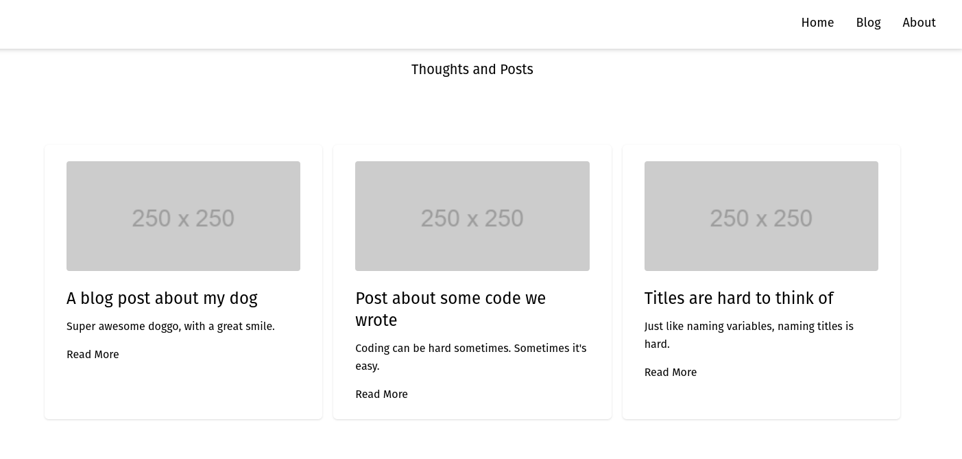
Save and take a look at your blog page. If you were to fill those same styles out on the other two dummy post cards, your page would look like this:
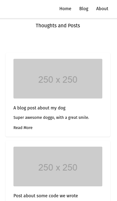
And on mobile:
Beautiful! Hopefully this whets your appetite for more Tailwind and Vue.js, as they're a great pair. If you'd like to learn more about Tailwind's styling structure, check out founder Adam Wathan's YouTube channel–he's got a ton of great videos walking through styling production apps with Tailwind.
Conclusion
You have now come to the end of our tutorial and created a blog page example using Tailwind. If you have been coding along while reading you would have learned the following:
- How to install TailwindCSS and PostCSS and set up our Vue application to use them.
- Create a responsive Navigation Bar that allows your end-users to navigate regardless of the size of their screen.
- Create a fully responsive Blog page with styled images, headings and excerpts, and the option to read more.
Now you have a good base layer, you can start adding your own post to your Vue application and explore using the ability to create your own themes.
Sanity – The Content Operating System that ends your CMS nightmares
Sanity replaces rigid content systems with a developer-first operating system. Define schemas in TypeScript, customize the editor with React, and deliver content anywhere with GROQ. Your team ships in minutes while you focus on building features, not maintaining infrastructure.
Sanity scales from weekend projects to enterprise needs and is used by companies like Puma, AT&T, Burger King, Tata, and Figma.


