Last updated May 31, 2023
How to use SVGs in React
By Derek Nguyen & Joe Holmes

This article will explore how to use SVG in React in three examples:
- A loading icon
- A hover text effect
- A pizza customizer
Scalable Vector Graphics, or SVGs, are a powerful secret weapon in the landscape of digital media.
Unlike raster images, which are grids of pixels that blur when enlarged, SVGs are vector images that can be infinitely scaled upward with no loss of quality. Additionally, as an XML-based image format, SVGs boast a lightweight digital footprint, making them load faster and take up less space than their graphical counterparts.
SVGs are additionally quite versatile. They can used for:
- crisp and animated favicons in the browser
- unique, bespoke text effects
- blurred placeholders for lazy-loaded images
- dynamic data visualization
- 3D graphics
How to use SVG in React
When it comes to React.js applications, there are several approaches one can take when incorporating SVGs into one's project. Here are the core methods for integrating SVGs into your React project:
- Deploying them as regular images, similar to JPEGs and PNGs
- Use bundlers to import the SVGs as components, thanks to tools like SVGR
- Write the SVGs as JSX, React's own XML extension
We'll now break down each method, offering the pros and cons to the usage of each in your project.
Use SVGs as regular images
SVGs can be used as an image, so we'd treat them as any other image resource:
<img src="/path/to/image.svg" alt="SVG as an image">
import mySvg from './path/to/image.svg'
Pros:
- Simple
- No learning curve
Cons:
- SVG can't be customized
Use case: Importing an SVG as an image file is a simple replacement for raster images that don’t need customization, e.g., logos.
Import SVGs as components via bundler magic
When importing an SVG as a component, we can inline SVGs directly in our markup & use them as a component.
import { ReactComponent as IconMenu } from './icons/menu.svg'

export const ButtonMenu = ({ onClick }) => {
  return (
    <button onClick={onClick}>
	    <span>Open Menu</span>
	    <IconMenu width="1rem" />
    </button>
  )
}
SVGR is the library that powers this ability. While setting this up can be a little hairy, many popular frameworks (Create React App, Gatsby) support this feature out of the box.
Pros:
- Easy to handle a large amount of SVG
- Powerful templating
Cons:
- May need additional configuration
- Writing React component template is not straightforward
Use case: A good example of using bundler magic with your SVGs is if you wanted to build a custom SVG icon library for a brand. You can use the templating to programmatically generate a variety of icons, saving yourself a ton of time after some initial investment in the config.
Include SVGs directly in JSX
As an XML-based syntax in its own right, JSX supports all SVG tags. We can (almost) paste the SVG directly into our React components!
This is the most straightforward method to take full advantage of SVG without bundler support, which is why we will use this method for all of our examples later in this article.
The only gotcha is that instead of regular HTML attributes, we have to use JS property syntax, e.g stroke-width -> strokeWidth
// fun fact: `viewBox` has always been camel-cased.
export const LoadingIcon = () => {
  return (
    <svg
	    viewBox="0 0 24 24"
	    xmlns="<http://www.w3.org/2000/svg>"
		>
			<path strokeWidth="2" stroke="tomato" d="M10...">
    </svg>
  )
}
Pros:
- Straightforward
- Minimal changes required to convert the SVG XML into valid JSX
Cons:
- Depending on the SVG, component code may not be readable
- Not scalable for a large number of SVGs
Use case: Writing SVGs as JSX and using them as components in your application is a good way to create one-off graphics such as illustrations, or blog headers.
SVGs & React in practice
This article will not be complete if we don’t at least show off a few SVG techniques. In the following examples, we will share with you some tips and tricks for making the most of this powerful graphical medium.
Prerequisite
All examples will use create-react-app (CRA) and CSS Module. A way to start a CRA project is using codesandbox. Otherwise, make sure Node is installed (any TLS versions will do) and run this:
npx create-react-app my-app && cd my-app
Example 1: A Loading Icon
Here's what we'll be making:

Let’s try writing this SVG from scratch. All we need is one circle, so this is the SVG in its entirety:
const LoadingIcon = () => {
	return (
	<svg
		viewBox="0 0 24 24"
		xmlns="<http://www.w3.org/2000/svg>"
	>
		<circle
			cx="12" cy="12" r="8"
			stroke-width="4" stroke="tomato"
			fill="none"
		/>

	</svg>
	)
}
Now let's make it move! We can now attach class names to SVG elements and animate them with CSS transform & animation.
Animating paths is a classic SVG trick, and the secret to it is using stroke-dasharray. This property creates dashed lines, like in the image below:
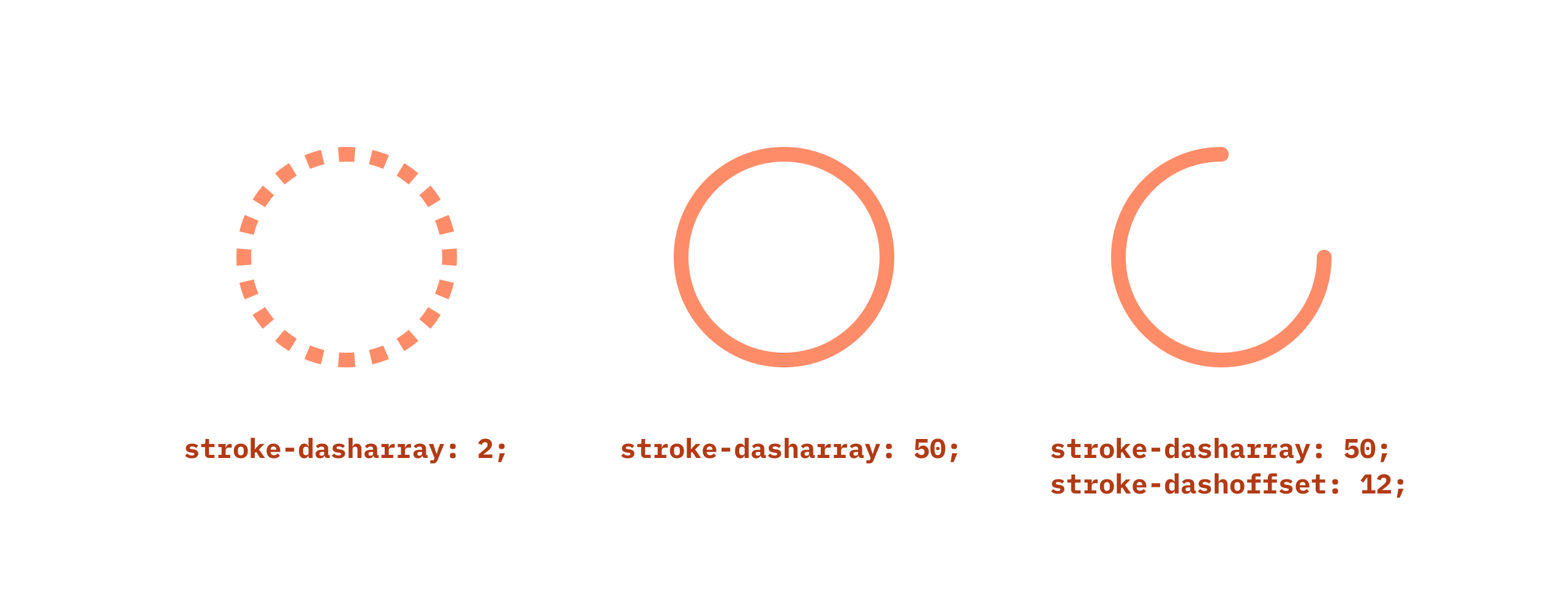
That's nothing too exciting. However, things get more interesting when you realize that these dashes can be offset. What if, instead of many short dashes, we have a single dash whose length is the same as the circle's circumference? We can then move that dash around by changing the offset, giving the appearance that the path is being shortened or lengthened.
Let's give it a try:
.main {
  stroke-dasharray: 50;
  stroke-dashoffset: 0;
  animation: load 5s linear infinite;
  transform-origin: center;
}

@keyframes load {
  0% {
    stroke-dashoffset: 50;
  }
  50% {
    stroke-dashoffset: 0;
  }
  100% {
    stroke-dashoffset: -50;
  }
}
Setting stroke-dashoffset to a negative value pushes the path further down & create the looping effect.
Finally, to make the animation more dynamic, let's also rotate the circle.
@keyframes load {
  0% {
    transform: rotate(0deg);
    stroke-dashoffset: 50;
  }
  50% {
    stroke-dashoffset: 0;
  }
  100% {
    transform: rotate(360deg);
    stroke-dashoffset: -50;
  }
}
prefers-reduced-motion
Loading icons typically don't have the type of animations that could cause issues. However, for a larger graphic with lots of animation, writing gentler animation code is a good practice. In our case, we can extract the animation duration into a CSS variable & define a larger value inside of the prefers-reduced-motion media tag.
/* simple-icon.module.css */

.svg {
  /* ... */
  --speed: 5s;
}

@media (prefers-reduced-motion: reduce) {
  .svg {
    --speed: 10s;
  }
}

.path {
  /* ... */
  animation: load var(--speed, 5s) linear infinite;
}
Customize with React
Now let's make the icon customizable. We want to allow users to change color & thickness.
import styles from "./simple-icon.module.css";

export const SimpleLoadingIcon = ({
	color = "currentColor",
	thickness = 2
}) => (
  <svg
    className={styles.svg}
    viewBox="0 0 24 24"
    xmlns="<http://www.w3.org/2000/svg>"
  >
    <circle
      className={styles.path}
      cx="12"
      cy="12"
      r="8"
      strokeLinecap="round"
      strokeWidth={thickness}
      stroke={color}
      fill="none"
    />
  </svg>
);
If color is unset, the stroke color will inherit from its parent.
Since our loading icon does not contain any text, we should give it a <title> so a screen reader can make sense of it. To dive deeper into accessibility with SVGs, CSS Tricks cover this topic extensively.
<svg aria-labelledby="svg-icon-loading">
	<title id="svg-icon-loading">Loading</title>
	...
</svg>
Now that we have a title, a tooltip will show up when the cursor hovers over the SVG. If that seems unnecessary, we can get rid of it by adding pointer-events: none to SVG's style.
Result
And with that, we can now use this loading icon anywhere! This Codesandbox demo contains a slightly more complex version of the icon above. This lightweight example can be easily saved and imported into any of your projects.
Example 2: Special Text Effect
SVG can do amazing things with text, but let’s start with something simple. Like the previous example, we will start with just the SVG and then work our way up to incorporating React.
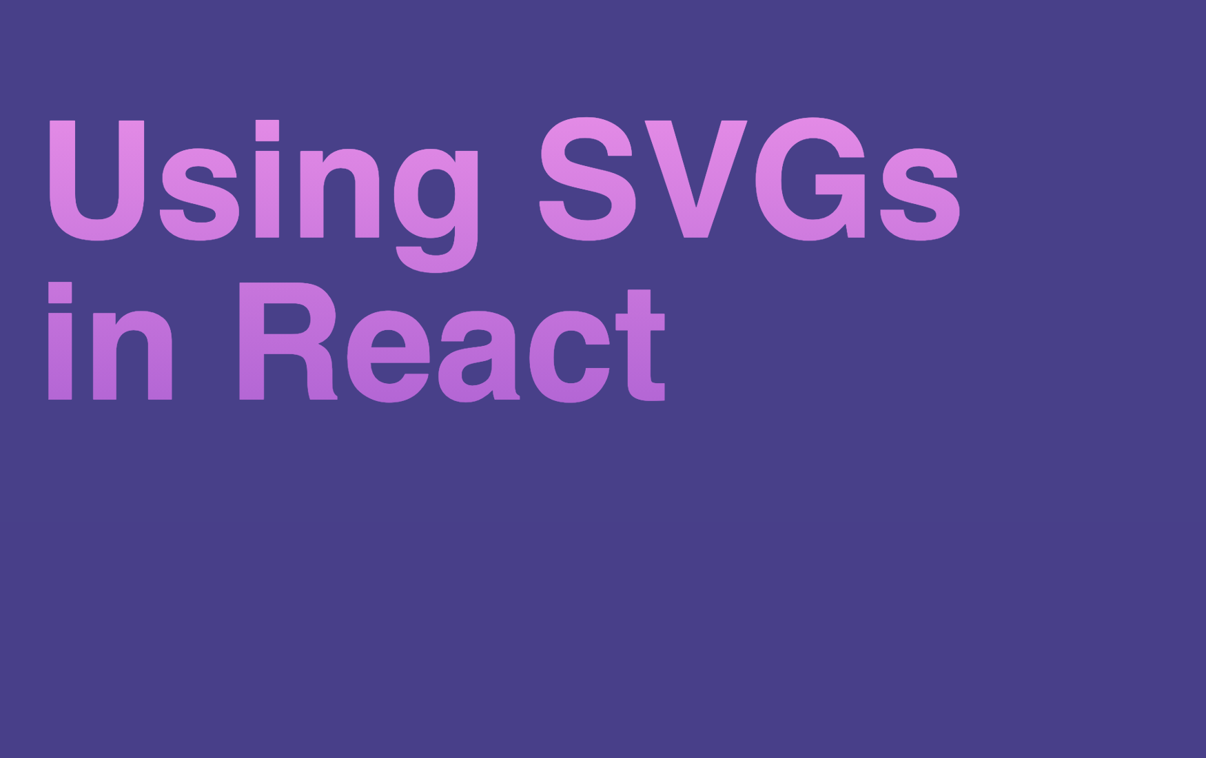
The graphic we'll be working with is rather long, but here's the main parts:
const Graphic = () => {
	return (
		<svg viewBox="0 0 600 337">
			<defs>
				<linearGradient id="gradient"> /* ... */
				</linearGradient>
			</defs>

			<text x="20" y="1.25em">
		    <tspan>Using SVGs</tspan>
		    <tspan x="20" dy="1em">in React</tspan>
		  </text>
		</svg>
	)
}
SEO Concerns
We can nest this SVG inside heading tags. It is valid HTML (test it with the w3c validation tool) and screen readers can pick up the text inside.
SVG assets
Let's look at the parts. <defs> is SVG's compartment where we can put stuff for later use. That can be shapes, paths, filters, and gradients, such as in the SVG above. True to the compartment analogy, browsers will not render elements placed inside a <def> block.
If we want to apply the defined gradient to the text object, we can reference its id with the following syntax:
<text x="20" y="1.25em" fill="url(#gradient)">
	<tspan>Using SVGs</tspan>
	<tspan x="20" dy="1em">in React</tspan>
</text>
Sweet! But we can achieve this effect in modern CSS as well. So let's see what else SVG can do.
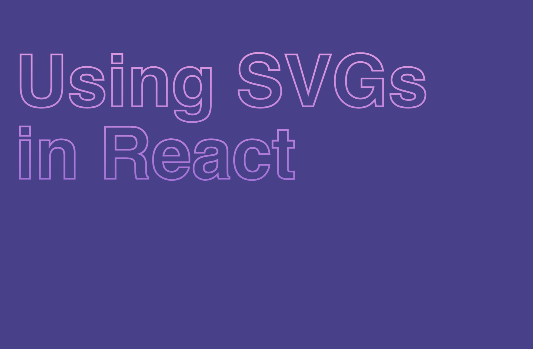
Creating outline text is relatively easy with SVG: just change fill to stroke, and the gradient will still be applied.
<text x="20" y="1.25em" stroke="url(#gradient)">
	<tspan>Using SVGs</tspan>
	<tspan x="20" dy="1em">in React</tspan>
</text>
And better yet, that gradient can be animated.
The syntax for creating SVG gradient animation is quite verbose, unfortunately.
<linearGradient id="gradient" x1="50%" y1="0%" x2="50%" y2="100%">
	<stop offset="0%" stop-color="plum">
		<animate
		  attributeName="stop-color"
		  values="plum; violet; plum"
		  dur="3s"
		  repeatCount="indefinite"
		></animate>
	</stop>

	<stop offset="100%" stop-color="mediumpurple">
		<animate
		  attributeName="stop-color"
		  values="mediumpurple; mediumorchid; mediumpurple"
		  dur="3s"
		  repeatCount="indefinite"
		></animate>
	</stop>
</linearGradient>
Let's make something even cooler. How about this XRay hover effect?
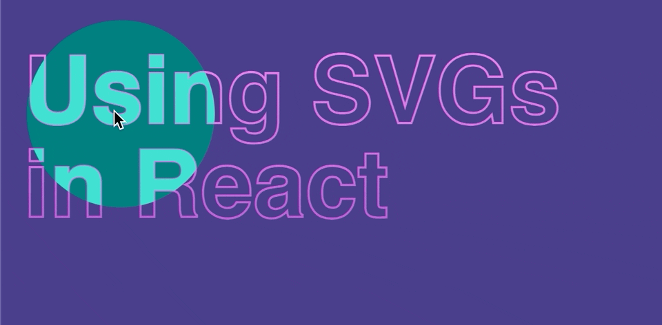
The trick here is to use text as a clipping path. We can then animate a circle clipped inside the text as we move the cursor in React.
We'll create a new element called clip-path (clipPath in JSX) in <defs>, and place <text> into it. This serves two purposes: so we can (1) use the text as a mask and (2) clone it to create the outline effect by using <use>.
<svg>
	<defs>
		<clipPath id="clip-text">
			<text id="text" x="20" y="1.25em">
		    <tspan>Using SVGs</tspan>
		    <tspan x="20" dy="1em">
		      in React
		    </tspan>
		  </text>
		</clipPath>
	</defs>

	{/* this circle visible to viewer. */}
	<circle ... />

	<use href="#text" stroke="url(#gradient)" />

	{/* this circle is clipped inside the text. */}
	<g clipPath="url(#clip-text)">
		<circle ... />
	</g>
</svg>
So far, we've been using url(#id) to refer to gradients & clipping paths placed inside of the <defs> block. For shapes and text, we'll need to use a tag: <use>, and the syntax is slightly different:
<use href="#id" stroke="..." fill="..." />
The referenced text can still be customized by adding attributes to the use tags. <use> is really cool & we'll see in the last example how it can be used to nest external SVGs.
SVG's coordinate systems
One of the pain points of using SVG is its coordinate system. If we naively implement the function like this:
window.addEventListener('mousemove', (e) => {
	$circle.setAttribute('cx', e.clientX)
	$circle.setAttribute('cy', e.clientY)
})
We'll quickly find out that the cursor position does not match up with the circle inside the SVG. The circle's unit is relative to its containing SVG's viewBox.
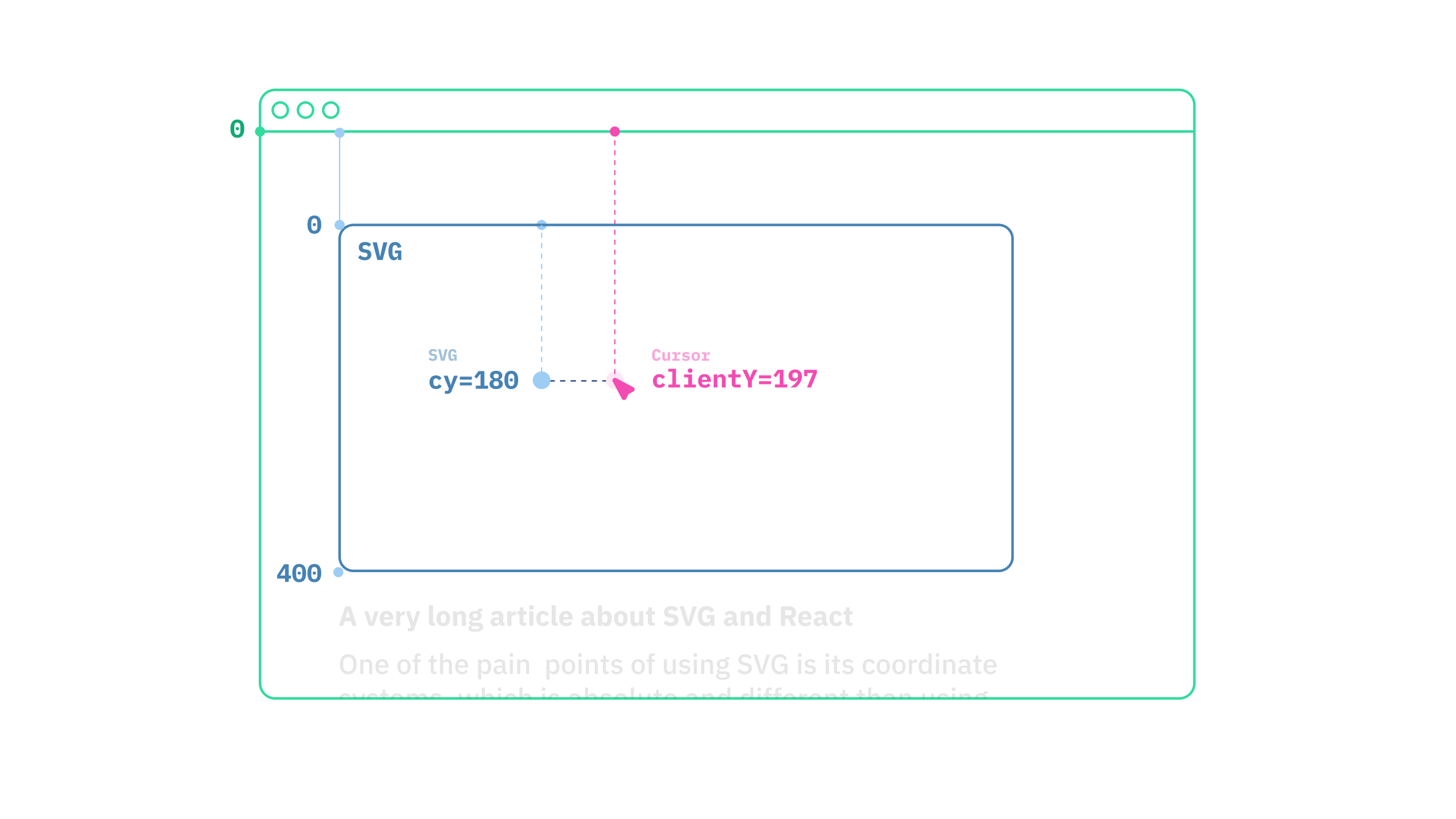
For this reason, we'll use a function that'll translate the position correctly.
const svgX = (clientX - svgElementLeft) * viewBoxWidth / svgElementWidth
const svgY = (clientY - svgElementTop) * viewBoxHeight / svgElementHeight
Move the circle with React
We'll need to move two circles, so let's attach some refs.
import { useRef, useEffect } from "react";

export const Graphic = () => {
  const innerCircleRef = useRef(null)
  const outerCircleRef = useRef(null)

  useEffect(() => {
    const $innerCircle = innerCircleRef.current
    const $outerCircle = outerCircleRef.current
    if (!$innerCircle || !$innerCircle) return

    const handleMouseMove = (e) => {
		  const { clientX, clientY } = e
			  /* Translate coordinate from window to svg, omitted for brevity */
	      const [x, y] = translateCoords(clientX, clientY)
	      $innerCircle.setAttribute('cx', x)
	      $innerCircle.setAttribute('cx', y)
	      $outerCircle.setAttribute('cx', x)
	      $outerCircle.setAttribute('cx', y)
	    }

	    window.addEventListener("mousemove", handleMouseMove)
	    return () => {
		    window.removeEventListener("mousemove", handleMouseMove)
	    }
  })

  return (
	  <svg>
		  {/* ... */}
		  <circle ref={outerCircleRef} />
		  {/* ... */}
		  <g clipPath="url(#text)">
			  <circle ref={innerCircleRef} />
		  </g>
	  </svg>
  )
}
Note: the code for translating position has been omitted for clarity. See the codesandbox below for a complete source.
Result
Check out the final product in this Codesandbox demo. See if you can find a hidden message!
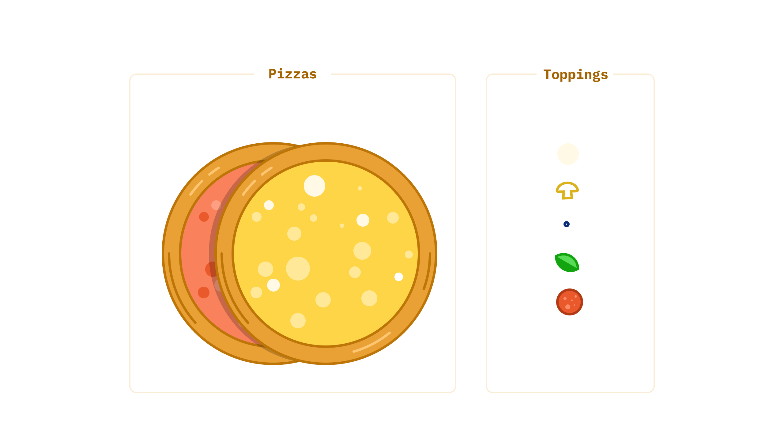
Example 3: Pizza Customizer
In this example, let’s explore how we can compose an SVG on the fly with React. A local pizzeria knocks on the door and asks if we could build them a fun graphic for their online ordering site. Armed with our new skills, of course we say yes!
Prerequisite
We'll need Sanity Studio for this example. Let's use the following structure:
pizza-sanity
  ├── frontend <create-react-app>
  └── studio <sanity studio>
Follow the steps below to install & initiate a new create-react-app project:
cd frontend npx create-react-app .
While waiting for the script to load, let's initiate the studio:
cd ../studio
npm install -g @sanity/cli
npm create sanity@latest
# after signing in, answer the questions as below
? Select project to use
❯ Create new project
? Your project name
❯ Sanity Pizza
? Use the default dataset configuration?
❯ Yes
? Project output path
❯ /Users/me/Documents/sanity-pizza/studio
? Select project template
❯ Clean project with no predefined schemas
? Do you want to use TypeScript? (Y/n)
❯ Yes
? Package manager to use for installing dependencies? (Use arrow keys)
❯ npm
When that's all done, we'll also want to add CRA's development host to the project's CORS allowed list.
sanity cors add http://localhost:3000 --credentials
See the getting started guide for further information. If you'd like a reference, see the project on Github.
Writing the schema
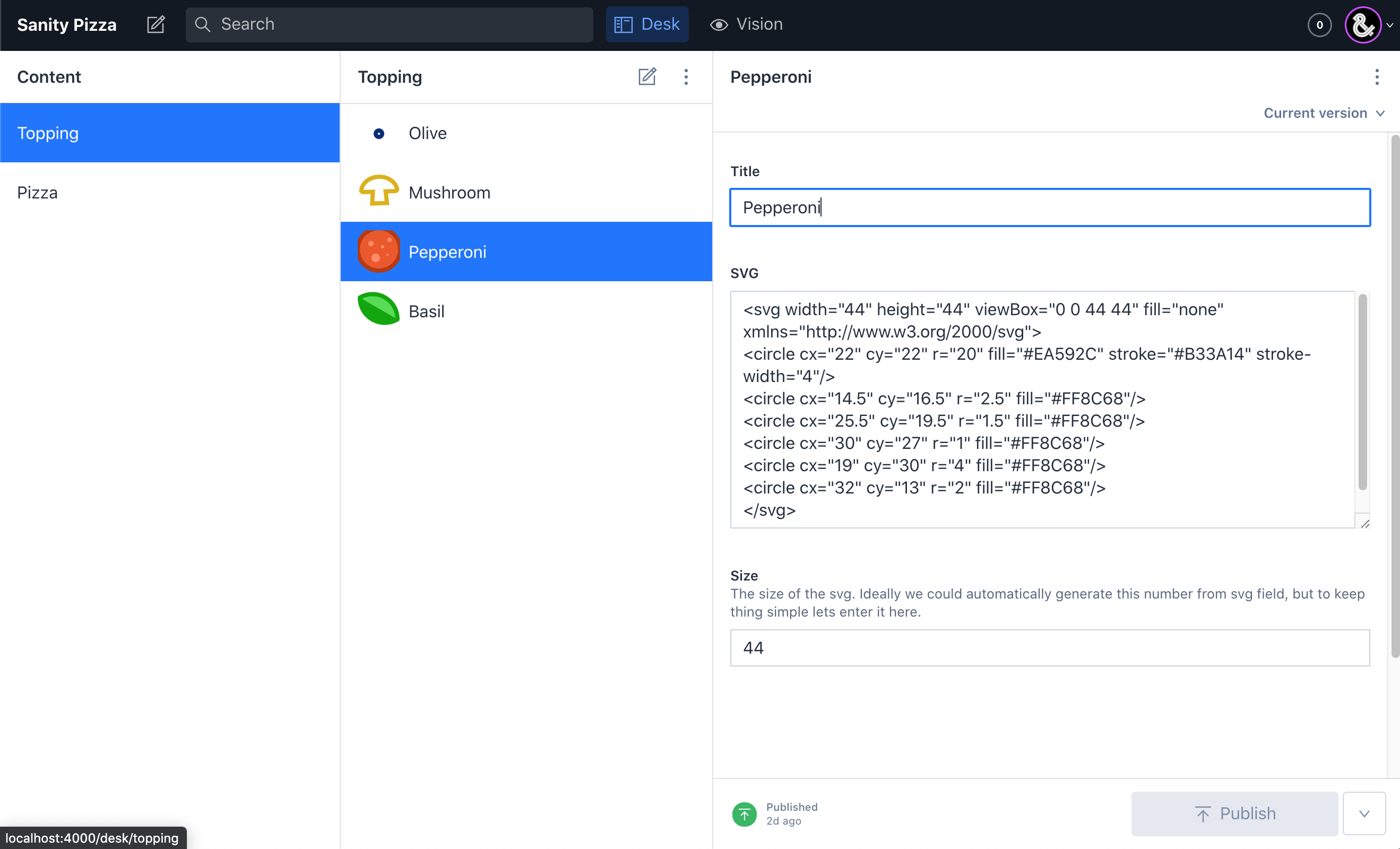
Toppings can be placed on different pizzas, so we could have two types of documents: toppings and pizzas, containing many other toppings.
Sanity allows us to create schema in code, making it powerful & flexible, but simple to get started. In schemas directory, create a new files:
/* schemas/pizza.js */

export const topping = {
	type: 'document',
  name: 'topping',
  title: 'Topping',
  fields: [
    {
      title: 'Title',
      name: 'title',
      type: 'string',
      validation: Rule => Rule.required().min(2),
    },
    {
      title: 'SVG',
      name: 'svg',
      type: 'text',
      validation: Rule => Rule.required().min(2),
    },
    fieldSize,
  ],
}

export const pizza = {
  type: 'document',
  name: 'pizza',
  title: 'Pizza',
  fields: [
    {
      title: 'Title',
      name: 'title',
      type: 'string',
      validation: Rule => Rule.required(),
    },
    {
      title: 'Base Pizza',
      name: 'svg',
      type: 'text',
      validation: Rule => Rule.required(),
    },
    fieldSize,
    {
      title: 'Toppings',
      name: 'toppings',
      type: 'array',
      of: [{
        type: 'reference',
        to: [{ type: topping.name }]
      }],
      validation: Rule => Rule.required().min(2),
    }
  ]
}
Note that inside of the pizza document type, we create an array of references to the available toppings.
For the topping itself, we create a text field where editors can paste the SVG graphic.
In Sanity Studio, there should be a schemas/index.ts file. Let's add the document types we've specified above.
import createSchema from 'part:@sanity/base/schema-creator'
import schemaTypes from 'all:part:@sanity/base/schema-type'
import { pizza, topping } from './pizza'

export default createSchema({
  name: 'default',
  types: schemaTypes.concat([
    topping,
    pizza
  ]),
})
Now that all the SVGs are placed in the Studio, it's time to build the React app. We'll use picosanity, a smaller Sanity client.
npm i picosanityMake a client.js file and create the Sanity client:
import PicoSanity from 'picosanity'

export const client = new PicoSanity({
  projectId: '<projectId>',
  dataset: 'production',
  apiVersion: '2021-10-25',
  useCdn: process.env.NODE_ENV === 'production',
})
Then we can import it into our React app and use it to fetch data. For simplicity, let's fetch in useEffect and store the data inside of a useState.
import { useState, useEffect } from 'react'
import { client } from './client'

const App = () => {
  const [data, setData] = useState(null)
  useEffect(() => {
    const getPizzaData = () => {
			client.fetch(`
		    *[_type == "pizza"] {
		      ...,
		      toppings[] -> {
		        _id,
		        title,
		        svg,
		        size,
		      }
		    }
		  `)
    }

    getPizzaData.then(data => setData(data))
  })

  return ( /* ... */ )
}
This will yield the following data:
[
  {
    _id: "2b2f07f0-cfd6-4e91-a260-ca30182c7736",
    _type: "pizza",
    svg: "<svg ...",
    title: "Pepperoni Pizza",
    toppings: [
      {
        _id: "92b5f3f1-e0af-44be-9575-94911077f141",
        svg: "<svg ...",
        title: 'Pepperoni'
      },
      {
        _id: "6f3083f3-a5d5-4035-9724-6e774f527ef2",
        svg: "<svg ...",
        title: 'Mushroom'
      },
    ]
  }
]
Let's assemble a pizza from the topping SVG and the pizza's base SVG. This is where <symbol> comes in handy.
export const Pizza = ({ data }) => {
	const { _id, svg: baseSvg, toppings } = data
	return (
	<svg>
		{/* create a symbol for each topping */}
		{toppings.map(({ _id: toppingId, svg }) => (
		  <symbol key={toppingId} id={toppingId} dangerouslySetInnerHTML={{ __html: svg }} />
		))}

		<g dangerouslySetInnerHTML={{ __html: baseSvg }} />
		{/* use them */}
		{toppings.map(({ _id: toppingId }) => {
		  return (
		    <use key={_id} href={`#${toppingId}`} />
		  )
		})}
	</svg>
	)
}
Symbols are hidden by default and can be created with <use>. We can still apply transform as with a standard SVG element. This is also how SVG sprite works.
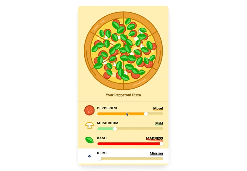
Add customizer
We'll add a slider for each topping and once again simply use useState to store users' inputs in an object.
import { useState } from 'react'

export const Pizza = ({ data }) => {
	const { _id, svg: baseSvg, toppings } = data
	const [ config, setConfig ] = useState({})
	const handleChangeFor = (toppingId) => (value) => {
	  setConfig(config => ({
		  ...config,
		  [toppingId]: value
	  }))
	}

	return (
	  <section>
		  <svg>{ /* ... */ }</svg>
		  <form>
			  {toppings.map(topping => (
				  <div key={topping._id}>
					  <label htmlFor={topping._id}>{topping.title}</label>
					  <input
						  type="range"
						  value={config[topping._id] || 0}
						  onChange={handleChangeFor(topping._id)}
					  />
				  </div>
			  ))}
		  </form>
	  </section>
	)
}
Randomizer
The most challenging part of this exercise is placing the toppings on top of the pizza. It turns out that just placing each topping at a random position does not create a very appetizing-looking pizza!
We want to place the toppings evenly. Thankfully geometers have already figured this out ages ago! A simple Vogel spiral will come to our rescue. Read more about it here.
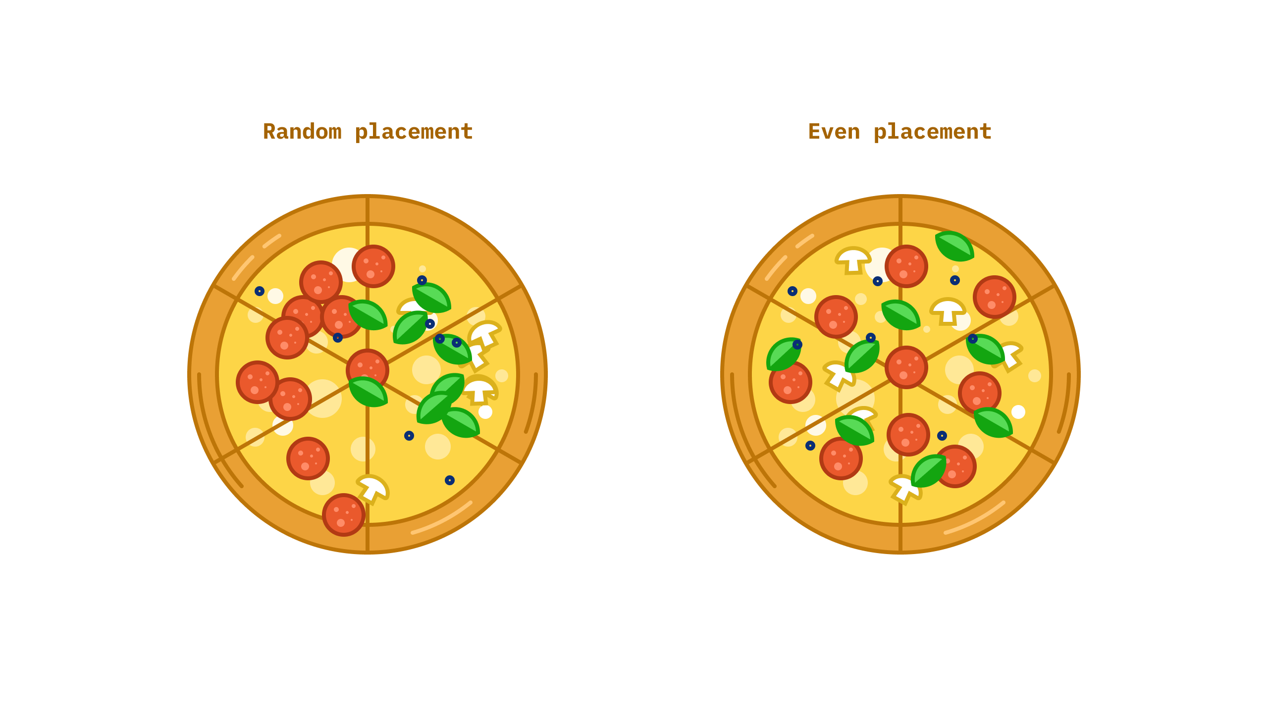
So far, so good! Let's give each topping a random rotation and vary its scale slightly, so the pizza looks more natural.
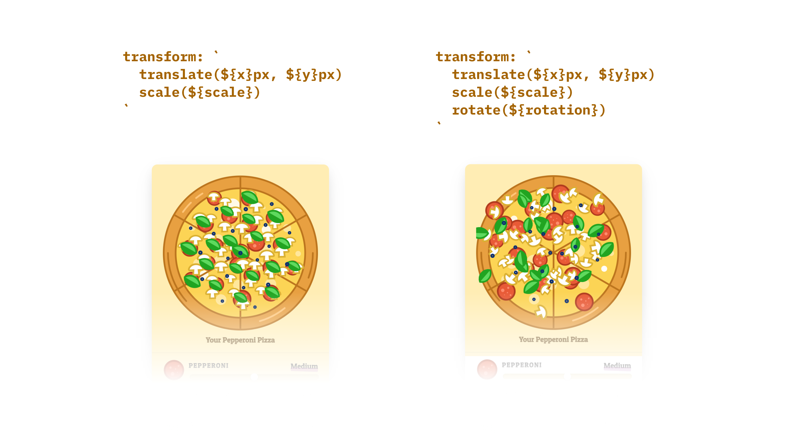
However, as soon as we add the transformation, the pizza becomes a mess... Here's what we're missing: instead of rotating from the center of itself, each topping's SVG is rotating from the center of its containing SVG (the pizza.) To fix this, we need to add the following CSS to each use element:
use {
  transform-origin: center;
  transform-box: fill-box;
}With that, we now have a decent pizza customizer!
Animate with react-spring
So far, we've been relying on CSS for animation, but CSS can only take us so far. Let's create an animation where toppings fall onto the pizza whenever users update their order.
Let's use react-spring to create a simple animation.
Note: using hook throws an error with <use/> for some reasons, so I'm using react-spring's render props API instead.
npm i react-springNow it's a good time to extract <use ... /> into its component & add the animation there.
import { Spring, config } from 'react-spring/renderprops'

export const UseTopping = ({ size, toppingId, x, y, i, rotation, scale }) => {
  return (
    <Spring
      from={{ y: y - 40, opacity: 0 }}
      to={{ y, opacity: 1 }}
      delay={i * 15}
      config={config.wobbly}
    >
      {props => (<use
        className={styles.topping}
        href={`#${toppingId}`}
        opacity={props.opacity}
        style={{
	        transform: `
	          translate(${x}px, ${props.y}px)
	          scale(${scale})
	          rotate(${rotation}deg)
	        `
        }}
      />)}
    </Spring>
  )
}
Result
Play with the final demo here! The source code is available on Github.
Wrapping Up
We haven’t even scratched the surface of the true power of SVGs. However, the SVG format is not without flaws:
- SVGs have a verbose syntax
- Texts inside SVG do not flow naturally like they do in HTML. The solution–breaking text up manually–works for one-off graphics, but it is not scalable.
- The position & coordinate system for SVGs can be tricky
- When animating complex SVGs, performance can be an issue
However, with a little time invested learning how they work, SVGs can enrich our React websites and applications for a wide range of popular use cases.
Sanity – The Content Operating System that ends your CMS nightmares
Sanity replaces rigid content systems with a developer-first operating system. Define schemas in TypeScript, customize the editor with React, and deliver content anywhere with GROQ. Your team ships in minutes while you focus on building features, not maintaining infrastructure.
Sanity scales from weekend projects to enterprise needs and is used by companies like Puma, AT&T, Burger King, Tata, and Figma.

