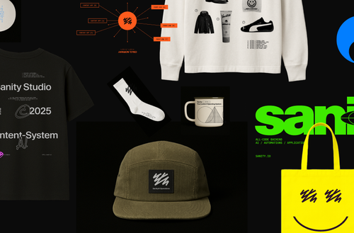
Grab your gear: The official Sanity swag store
Read Grab your gear: The official Sanity swag storeI can see the issue! You're manually setting focal point coordinates with .focalPoint(), which overrides Sanity's automatic hotspot handling. The hotspot data should be applied automatically by @sanity/image-url when you pass the full image object to the URL builder - you don't need to manually extract and set those coordinates.
The Problem:
When you call .focalPoint(0.18493150684931453, 0.30544983361040945) manually, you're bypassing the automatic hotspot system. This creates a fixed crop that doesn't adapt well to different aspect ratios, which is why your panoramic view isn't working correctly.
The Solution - Remove Manual focalPoint:
Simply remove the .focalPoint() call and let the image URL builder automatically use the hotspot data from your image object:
<Image
  src={urlFor(image).fit('crop').crop('focalpoint').url() || ''}
  layout="fill"
  objectFit="cover"
/>
Make Sure Your Query Includes Hotspot Data: Your GROQ query needs to include the hotspot and crop data:
*[_type == "yourType"] {
  image {
    asset,
    hotspot,
    crop
  }
}
When the full image object (with hotspot data) is passed to urlFor(), the image URL builder automatically applies the hotspot when generating the cropped image URL.
Alternative Approach for Framework-Specific Issues:
If you find that @sanity/image-url isn't respecting the hotspot with your specific Next.js setup (which can happen in some cases), you can manually apply the hotspot using CSS:
function getObjectPosition(hotspot) {
  if (!hotspot?.x || !hotspot?.y) return 'center';
  return `${hotspot.x * 100}% ${hotspot.y * 100}%`;
}

<Image
  src={urlFor(image).url() || ''}
  layout="fill"
  objectFit="cover"
  style={{ objectPosition: getObjectPosition(image.hotspot) }}
/>
This converts the hotspot coordinates (which are values between 0-1) into CSS percentage values that the browser can use for positioning.
For Different Screen Sizes:
If you need dramatically different crops for different screen sizes (like a panoramic desktop view vs mobile), generate multiple image URLs with different dimensions and use the HTML <picture> element or Next.js responsive image features:
const desktopUrl = urlFor(image).width(2560).height(1097).url()
const mobileUrl = urlFor(image).width(800).height(450).url()
The key takeaway: remove the manual .focalPoint() call and let Sanity's image URL builder automatically apply the hotspot data from your image object. This gives you responsive, intelligent cropping that adapts to the dimensions you specify in the URL builder.
Sanity is the developer-first content operating system that gives you complete control. Schema-as-code, GROQ queries, and real-time APIs mean no more workarounds or waiting for deployments. Free to start, scale as you grow.
Content operations
Content backend

The only platform powering content operations
By Industry
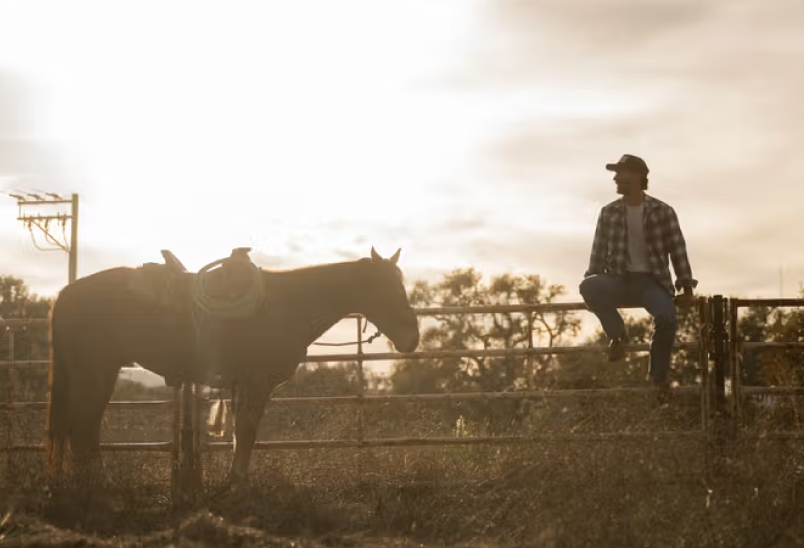
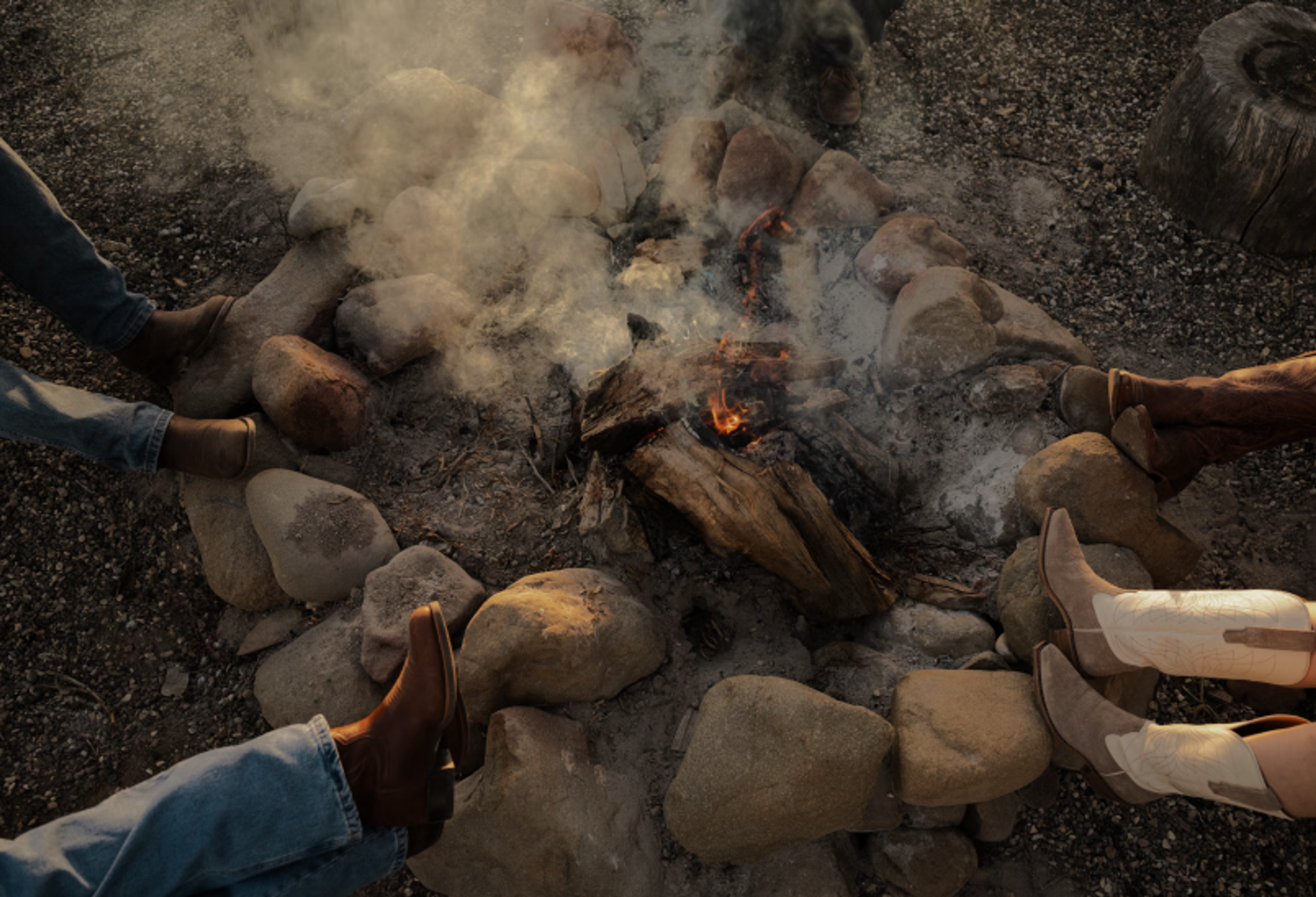
Tecovas strengthens their customer connections
Build and Share

Grab your gear: The official Sanity swag store
Read Grab your gear: The official Sanity swag store