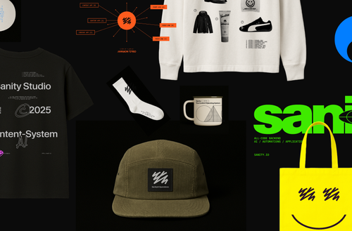
Grab your gear: The official Sanity swag store
Read Grab your gear: The official Sanity swag storeGlad you're enjoying Sanity UI! 😊
Yes, you can absolutely add icons inside input components like the date picker using the prefix and suffix props that are available on Sanity UI's TextInput component. While there isn't a dedicated DatePicker component in @sanity/ui, you can build one using TextInput with icons.
Here's how you'd add an icon inside an input:
import {TextInput} from '@sanity/ui'
import {CalendarIcon} from '@sanity/icons'

<TextInput
  prefix={<CalendarIcon />}
  // or use suffix for right-side icon
  suffix={<CalendarIcon />}
/>
The prefix and suffix props accept any React.ReactNode, so you can use icons from @sanity/icons or any custom React component. This gives you full flexibility to style your inputs just like the Studio's native components.
For a full date picker experience, you'd typically combine TextInput with a Popover component to show a calendar interface. The community has built several date picker implementations using this pattern - you might want to check out plugins like sanity-plugin-date-input or similar for inspiration.
The Autocomplete component is another good example of how Sanity UI combines TextInput with icons and popovers to create more complex input patterns - you can use similar patterns for building custom date pickers!
Sanity is the developer-first content operating system that gives you complete control. Schema-as-code, GROQ queries, and real-time APIs mean no more workarounds or waiting for deployments. Free to start, scale as you grow.
Content operations
Content backend


The only platform powering content operations
By Industry


Tecovas strengthens their customer connections
Build and Share

Grab your gear: The official Sanity swag store
Read Grab your gear: The official Sanity swag store