Published May 13, 2021
Crafting a Theme Engine
By Kevin Green

This guide will explain the concept of theming inside of a Sanity architecture. It will also show practical examples of how it can be applied to frontends. This pattern is great for sanity instances powering multiple web experiences, or for creating more powerful staging/development testing for your clients.
The concept of this experience requires a relatively specific setup. Once this pattern is adopted it can be pushed as far as desired and opens up the doors for clients/users to build and preview content in a more ways.
In the past we've relied on code updates, inline previews of specific pages and even new development environments and datasets to preview new/different content. In this guide I'll show you how I do all this in a single dataset.
This pattern was inspired by Shopify themes, the ability to switch to a theme quickly for marketing campaigns. It was also inspired by the Wordpress homepage setting, where you could quickly change your core homepage in the backend. It's a merging of these concepts.
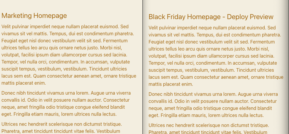
What are we building?
Quick video guide of what our studio can look like at the end of completing this guide:
Creating Core Modules
In this example, we'll be creating a header and footer content type, the reasoning for this is to create unique global patterns that can be applied too many experiences and interchanged between campaigns. So imagine building a Black Friday Menu/Footer that you turn on hours before Black Friday starts.
Building our Header & Footer
First let's build a simple header content type, this is a striped back component I am using on a site, you'll notice the ctaList component, which is just an array of links to varying types of content in my build (pages, collections, products etc). This exact pattern can be applied to the footer, I won't paste that content type as it's redundant, but imagine a footer that has other custom modules things like, newsletter text, legal links, a legal statement etc.
import React from 'react'
import Emoji from 'a11y-react-emoji'

const Icon = () => <Emoji style={{fontSize: '2em'}} symbol="🎩" />

export default {
  name: 'header',
  title: 'Header',
  icon: Icon,
  type: 'document',
  fields: [
    {
      name: 'headerTitle',
      title: 'Header Title',
      type: 'string',
      description: 'Only used internally in the CMS',
    },
    {
      name: 'siteLinks',
      title: 'Site Links',
      type: 'ctaList',
      validation: Rule => Rule.required(),
    },
  ],
  preview: {
    select: {
      title: 'headerTitle'
    },
    prepare: (selection) => {
      return {
        ...selection
      }
    },
  },
}
Now that we have our header component we can make `many` headers, meaning we can make a Live Header or a Black Friday header, whatever makes sense for the current build.
Setting up Modular Pages
In my past projects I've preached a modular approach for pages, opposed to a singleton pattern, I allow clients to create all pages in the system via a large flexible modular component system. Meaning any page can be rebuilt/duplicated and altered. This theme pattern relies heavily on a modular page approach. So if you are currently using Singletons for a homepage I recommend migrating your singleton homepage to a pages content type. If you really want to keep modules specific to a homepage you could always make a homepage content type and at least keep them organized in that fashion. I however prefer to keep them in single page structure.
Simple example of a page content type:
import React from 'react';
import Emoji from 'a11y-react-emoji';
import Tabs from 'sanity-plugin-tabs';

const Icon = () => <Emoji style={{fontSize: '2em'}} symbol="📝" />;

export default {
	name: 'page',
	title: 'Page',
	icon: Icon,
	type: 'document',
	inputComponent: Tabs,
	fieldsets: [
		{name: 'main', title: 'Main'},
		{name: 'seo', title: 'SEO'},
	],
	fields: [
		//
		// === Main ===
		//

		{
			name: 'title',
			title: 'Title',
			type: 'string',
			fieldset: 'main',
			validation: Rule => Rule.required(),
		},
		{
			name: 'slug',
			title: 'Slug',
			type: 'slug',
			options: {
				source: 'title',
				maxLength: 96,
			},
			fieldset: 'main',
			validation: Rule => Rule.required(),
		},
		{
			type: 'pageComponentList',
			name: 'components',
			title: 'Components',
			fieldset: 'main',
		},

		//
		// === Meta ===
		//
		{
			type: 'seo',
			name: 'seo',
			fieldset: 'seo',
		},
	],
	preview: {
		select: {
			title: 'title',
			subtitle: 'url',
		},
		prepare({title, subtitle}) {
			return {
				title,
				subtitle,
				media: <Icon />,
			};
		},
	},
};
Nothing too out of the ordinary above, I am using the Tabs plugin for organizational purposes, it's clearly not required for this to work.
Setting up Themes
Now that we have our content types for pages, headers, footers we can set up our theme. Our theme will link to the active instances of each of these components.
import React from 'react'
import Emoji from 'a11y-react-emoji'

const Icon = () => <Emoji style={{fontSize: '2em'}} symbol="🏡" />

export default {
  name: 'theme',
  title: 'Site Theme',
  icon: Icon,
  type: 'document',
  fields: [
    {
      name: 'themeTitle',
      type: 'string',
      title: 'Theme Title',
    },
    {
      name: 'homepage',
      title: 'Homepage',
      description: 'Select the page you want to be the homepage on the marketing site.',
      type: 'reference',
      to: [{type: 'page'}],
      validation: Rule => Rule.required(),
    },
    {
      name: 'headerMenu',
      title: 'Header Menu',
      description: 'Build complex menus from the menu area, assign them here to update the menu everywhere',
      type: 'reference',
      to: { type: 'header' },
			validation: Rule => Rule.required()
    },
    {
      name: 'footerMenu',
      title: 'Footer Menu',
      description: 'Build complex menus from the module area, assign them here to update the menu everywhere',
      type: 'reference',
      to: { type: 'footer' },
			validation: Rule => Rule.required()
    }
  ],
  preview: {
    select: {
      title: 'themeTitle'
    },
    prepare: (selection) => {
      return {
        ...selection
      }
    },
  },
}
Above you can see we're referencing the various components we just set up, so imagine setting your homepage to the page you just created for your Black Friday campaign, or if for whatever reason you wanted to set the homepage to your About page, with this pattern you could easily do that. Keep in mind the Title here is exclusively being used to easily find the theme you're using in the system when attaching it to the global config that we will set up next.
Global Configuration Singleton
Finally we're going to set up our global config, this will actually be a singleton to house any global related items in our schema, I usually put things like Social Icons, Global SEO patterns and some other top level (non-theme) required items here. You can of course move SEO/other things into the theme if you'd wish but it's sort of use at your own discretion.
import React from 'react'
import Emoji from 'a11y-react-emoji'
import Tabs from 'sanity-plugin-tabs'

const Icon = () => <Emoji style={{fontSize: '2em'}} symbol="⚙️" />

export default {
  name: 'globalConfig',
  _id: 'globalConfig',
  title: 'Global Config',
  icon: Icon,
  type: 'document',
  inputComponent: Tabs,
  fieldsets: [
    { name: 'main', title: 'Main' },
    { name: 'staging', title: 'Staging' },
		{name: 'seo', title: 'Seo'},
	],
  fields: [

    {
      name: 'theme',
      title: 'Production Theme',
      type: 'reference',
      to: { type: 'theme' },
      validation: Rule => Rule.required(),
      fieldset: 'main'
    },
    {
      name: 'stagingTheme',
      title: 'Staging Theme',
      description: 'This theme will deploy to any branch/deploy previews, easily view the whole theme while doing development',
      type: 'reference',
      to: { type: 'theme' },
      validation: Rule => Rule.required(),
      fieldset: 'staging'
    },
    {
      type: 'seo',
      name: 'SEO',
      fieldset: 'seo'
    },
  ],
  preview: {
    prepare: () => ({title: 'Global Config'}),
  },
}
Now is where is the magic starts to happen, in the above we have a production theme and a staging theme. This will allow us to craft frontend experiences at the data layer, making new headers, new footers and new homepages. Not only that but you could easily build new pages in the system that you don't want linked anywhere on the site but could be linked in your staging header so you can test the holistic experience. The benefit to this pattern is you can share a preview link with your client/team that has code updates + staging header/footers/homepages etc. This pattern can be applied in many other aspects of the site.
Enhancing the Studio Experience
So we've done a lot with content structure to improve the data, but we haven't touched the desk structure yet, this is the obvious progression to enhance the sanity user experience. We're going to extend the desk structure to show our active theme in the side navigation. Keep in mind this is not a guide to using the desk structure builder so you'll need some background there (which can be found on this site :))
//
// === Theme ===
//

const activeStorefrontTheme =  S.listItem()
    .title('Active Storefront Theme')
    .child(async () => {
      // Lets fetch the theme from the global config
      const theme = await client.fetch(`*[_id == 'globalConfig'][0] {
        theme->
      }`)
      const {
        _id
      } = theme.theme
      return S.document().id(_id).schemaType('theme')
    })

const activeWholesaleTheme =  S.listItem()
    .title('Active Staging Theme')
    .child(async () => {
      const theme = await client.fetch(`*[_id == 'globalConfig'][0] {
        stagingTheme->
      }`)
      const {
        _id
      } = theme.stagingTheme
      return S.document().id(_id).schemaType('theme')
    })

const allThemes = S.listItem()
  .title('Themes')
  .schemaType('theme')
  .child(S.documentTypeList('theme').title('All Themes'))

const themeMenuItem = S.listItem()
  .title('Themes')
  .icon(ThemeIcon)
  .child(
    S.list()
      .title('Themes')
      .items([
        activeStorefrontTheme,
        activeStagingTheme,
        S.divider(),
        allThemes,
      ]),
  )
The above shows us building the Theme navigational item in the desk structure, the reason for this is so that we can nested helpful access to our active theme. This will allow the client to quickly make modifications at the theme level.
The above pattern could also be used in pages to fetch the nested active homepage per environment as well, this will give the sanity user the fastest access to the active states of the experience. This pattern can be used on the header/footers as well.
Many Environments
While I only touch on a production & staging theme, this could be extended to multi-sites or multi-lang experiences pretty easily.
Rendering the Frontend
Finally we need to display the data, I am using Netlify but this could be applied pretty easily to Vercel as well. The idea here is fetching our top level home/theme directly from the globalConfig. This means your index template doesn't actually fetch a page directly but via references. I'll show both examples together:
import groq from 'groq'

//
// === Components ===
//

// Context set in netlify.toml based on branch/preview deploys
const DEPLOY_CONTEXT = process.env.SITE_CONTEXT

export const cta = groq`{
	...,
	_type == 'link' => {...},
	_type == 'pageLink' => {...},
	_type == 'productLink' => {...},
	_type == 'collectionLink' => {...},
}`


//
// === Page Components ===
//

export const componentList = groq`[]{
	_type,
	_key,

	...
}`


//
// === Documents ===
//

export const pageItems = groq`
	_id,
	title,
	'slug': slug.current,
	components ${componentList},
	seo,
`

// Get homepage from active theme
const homeQuery = groq`{
	homepage->{${pageItems}}
}`

const home = DEPLOY_CONTENT !== 'development' ?
	`theme-> ${homeQuery}` :
	`stagingTheme-> ${homeQuery}`

export const homepage = groq`*[
	_id == "globalConfig" &&
	!(_id in path("drafts.**"))
][0] {
  'theme': ${home}
}`

const headerMenu = groq`{
  siteLinks[] ${cta}
}`

const footerMenu = groq`{
  companyLinks[] ${cta},
  footerText,
  listId,
  newsletterText
}`

const themeDataQuery = groq`{
	'header': {
		'menu': headerMenu-> ${headerMenu},
	},
	'footer': {
		'menu': footerMenu-> ${footerMenu}
	}
}`

const productionTheme = DEPLOY_CONTEXT !== 'development' ?
	`theme-> ${themeDataQuery}` :
	`stagingTheme-> ${themeDataQuery}`


export const layout = groq`*[
	_type == "globalConfig" &&
	!(_id in path("drafts.**"))
][0] {
  'theme': ${theme}
}`
There is a lot to unpack here, but the core importance is the theme ternary moments, we're using the deploy content in this instance, but we could also use branch content/env variables to set our staging/other environments.
You'll use the above queries to build your homepage, and the second query to push a global layout/theme context to all your templates. Example query for building the homepage and global content to be used in next/gatsby/whatever.
import sanityClient from '@sanity/client'
import * as queries from './queries'

const useCdn = process.env.SANITY_USE_CDN === 'true'

const client = sanityClient({
  projectId: process.env.SANITY_PROJECT_ID,
  dataset: process.env.SANITY_DATASET,
  token: useCdn ? null : process.env.SANITY_API_TOKEN,
  apiVersioN: process.env.SANITY_API_VERSION,
  useCdn,
})

export default client

//
// === Sanity API Requests ===
//

// Pages
export const getHomepage = () => client.fetch(queries.homepage)

export const getSiteData = async () => {
  const [global, config] = await Promise.all([
    client.fetch(queries.layout),
    client.fetch(queries.globalConfig)
  ])

  return {
    global,
    config
  }
}
I'm sure you could replicate this with Graphql if you are using the sanity-source-plugin as well, but I'm less familiar with best practices there, so if anyone wants to contribute that bit free to slack me to add it, I'm in the Sanity slack!
Closing Thoughts
With the above we now have a really dynamic many environment/many theme experience. Hoping this pattern can replace some complex staging/prod dataset patterns, or remove the need to flag content across the board per environment. If anyone has further iterations on this I am always open to improving the experience. This concept is still evolving even now as I write this!
Cheers~
Sanity – The Content Operating System that ends your CMS nightmares
Sanity replaces rigid content systems with a developer-first operating system. Define schemas in TypeScript, customize the editor with React, and deliver content anywhere with GROQ. Your team ships in minutes while you focus on building features, not maintaining infrastructure.
Sanity scales from weekend projects to enterprise needs and is used by companies like Puma, AT&T, Burger King, Tata, and Figma.