Published June 18, 2023
Enhancing Image Previews with renderDefault()

This guide is designed to solve a problem that may arise when working with an array of images and using the grid layout. The previews may default to an inconvenient crop, making it hard to determine which pictures they represent. We will learn how to change the props provided to a custom input component in order to serve up alternative image addresses instead.
After migrating to v3, I decided to use the opportunity to revisit a quirk of presentation I could never quite figure out.
My schema included an array of images using the grid layout option to produce re-usable object type called gallery. Our primary use case involves managing a slider of logo images on the front end.
However, the image previews default to a tight crop. If a logo was much wider than it was tall, for example, the preview might only display the middle of the image.
Much of the artwork in my studio consisted of light, thin line drawings, so appearing effectively zoomed-in made it tough to tell it apart. This hampered our editors' ability to make swift changes.
So, how can we fix this?
Previously, in v2, when making a custom component, I would start out by copying boilerplate from existing guides and tweaking it to my needs.
By comparison, in v3, custom components get introduced through a new approach, an object you can add to your schema that distinguishes between the input proper, the field area surrounding the input, a preview object and an item object.
You can override each selectively, either on a per-field basis or by changing a similar object in your config file.
Additionally, there are now purpose-built components available that accommodate iterating through members of an array or object.
I'll admit that I was initially concerned about altering the image grid to achieve my goal, because I thought it might require copying and modifying the very components used by the studio itself.
The image preview is deceptively simple-looking, but I observed that clicking different parts of the interface triggered unique events, and I had no clue how to emulate that. Clicking one element provokes a modal, for instance, and another displays a context menu. None of that sounded as straightforward as I'd hoped.
Fortunately, though, in the process of researching the new tools v3 offers, I came across documentation of the renderDefault function.
If you're designing a custom component, but would like to inherit the default markup and data structure that would otherwise be there, using renderDefault tells the studio to inject both into the form and allows you to build around it.
In essence, renderDefault acts like a factory that produces the expected result "out of the box," as a sort of convenience method for situations where you might want to do things like wrap a text field with a character counter that reads from and interprets the relevant input.
It occurred to me that the same data that the studio uses to compose the previews might contain a reference to the grid images themselves.
The Sanity studio is, after all, just an interface you use to interact with your content lake dataset. In a very real sense, it's an app "made with Sanity" just the same as anything else you're likely to create, so it stands to reason that its approach to querying for such information is reproducible.
I decided to change the schema for the gallery field by logging the props for each of the four possible customizable components in the browser, and settled on the preview object, like so:
{
    name: 'image',
    type: 'image',
    title: 'Image',
    components: {
        preview: (props) => console.log(props)
    }
}
I discovered that each array member within the props contained a media property similar to the media property found in the List Previews.
I also found out that you can supply JSX components as a value to that property, just as you could in the List Previews in v2.
My idea was simple enough: clone the props, tweak them to include my alternative media key's value, and feed the clone to renderDefault to render something slightly different than the default.
Being able to set a new media value meant I could easily slip in a replacement image tag. But how would I get that alternate image? How would I get the source of the image at all?
You'll remember that I mentioned each array member having a media property. In this case, it was a _ref that looked like this:image-b8ae975f9da778c542ffebc44958b5d0cd-700x250-png which meant I now had a _ref I could feed into the Sanity image builder package in order to get a customized URL, without cropping and at my desired size.
Once I had that package installed, I needed to instantiate a client in-studio to run fetches for the constructed addresses returned by the builder.
What follows is the actual custom preview component as written in my schema. This is often contained in a separate file, then imported and invoked by reference. After we're finished constructing it, we'll simply keep it at the top of the schema file and use it inline.
Don't worry, it's fairly concise and I can walk you through it afterwards:
import createImageUrlBuilder from '@sanity/image-url'
import React, {useMemo} from 'react'
import {useClient} from 'sanity'

export function PreviewImage(props) {

  const {media} = props
  const client = useClient({apiVersion: '2021-03-25'})

  const imageUrlBuilder = useMemo(() =>
      createImageUrlBuilder(client),
      [client])

  const imgSrc = useMemo(() =>
      media?._ref && imageUrlBuilder.image(media?._ref)
      .width(500)
      .url(),
      [media?._ref, imageUrlBuilder]
)

  if (!imgSrc) {
    return null
  }

  const newProps = {
    ...props,
    media: <img src={imgSrc} />,
  }

  return props.renderDefault(newProps)
}As the component opens, we deconstruct the props to pull out just the media property.
Next, we instantiate a client to feed into the URL builder so that it can fetch the resolved image addresses.
After that, we declare a variable that has, as its value, the _ref that exists on the original props' media key. In this case, as a performance optimization, we're invoking useMemo to persist the value between renders, making sure to include the associated constants in its dependency array.
We follow that with an early return, in case the cached value is no value at all, and set the result to be the src attribute of an img tag.
That tag then gets used as the replacement media value in some new props that are cloned from the original props object using spread syntax.
Lastly, we pass the cloned props into renderDefault, allowing it to work its magic but utilizing the alternate image addresses instead!
Now we can finish things off with the simplest move of all, which is to actually tell the studio that we'd like to use this component to preview our images. Here's an example of that, assuming you've chosen to include the component at the top of the same file:
export default {
  name: 'gallery',
  type: 'object',
  title: 'Gallery',
  fields: [
    {
      name: 'images',
      type: 'array',
      title: 'Images',
      of: [
        {
          name: 'image',
          type: 'image',
          title: 'Image',
          components: {
            preview: PreviewImage,
          }
        }
      ]
    }
  ]
}
You can see a before and after comparison of the results below:
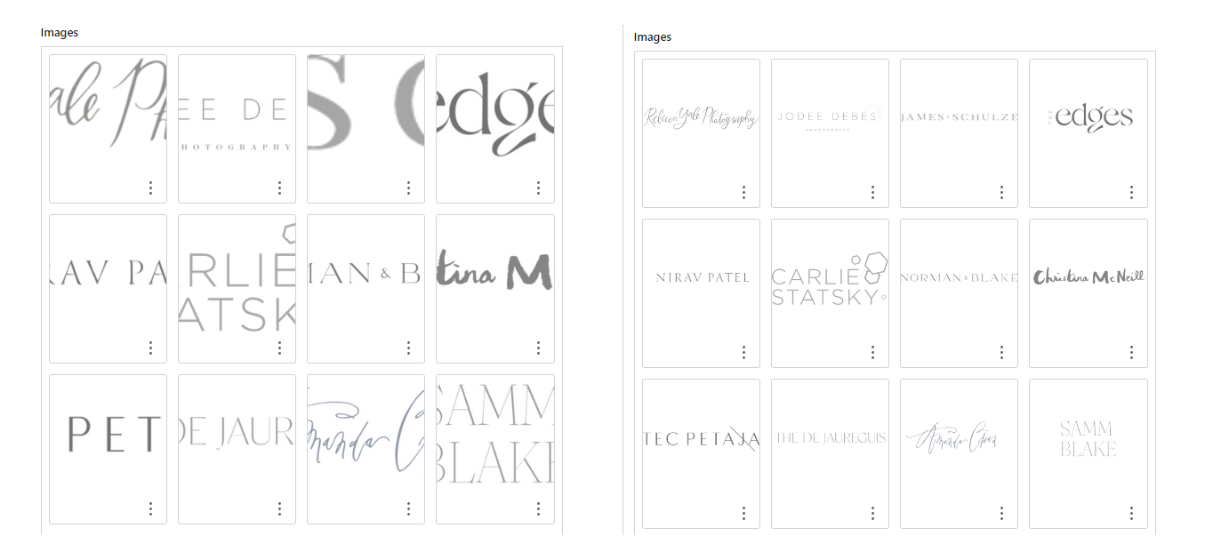
That's it! You've now customized the image previews in array fields. Not only does this improve the look of your gallery, but it also significantly enhances its usability during the editing experience.
I look forward to seeing what you create using this straightforward pattern of modifying the props fed to this important function.
Note: Thanks to Knut Melvær for his feedback on this article.
Sanity – The Content Operating System that ends your CMS nightmares
Sanity replaces rigid content systems with a developer-first operating system. Define schemas in TypeScript, customize the editor with React, and deliver content anywhere with GROQ. Your team ships in minutes while you focus on building features, not maintaining infrastructure.
Sanity scales from weekend projects to enterprise needs and is used by companies like Puma, AT&T, Burger King, Tata, and Figma.