Form components
The Form Components API lets you customize the look and feel of the fields in your studio individually, or at a root level that will affect every field in the Studio.
Custom form components are available in your root studio configuration and plugins via form.components, and on individual schema types via the components property. It accepts component customizations including:
// sanity.config.js
import {defineConfig} from 'sanity'

export default defineConfig({
  // ...rest of config
  form: {
    components: {
      input: MyInput,
      field: MyField,
      item: MyItem,
      preview: MyPreview,
    }
  }
})
The props for each component available in the API include a callback function called renderDefault. As the name implies, renderDefault renders the default component. When you call renderDefault, you also pass along the props needed to render the default component. You can modify the props to your liking before passing them along.
// ./custom-string.js

import {Stack, Text, Card} from '@sanity/ui'

export function CustomStringInput(props) {
  return (
    <Stack space={3}>
      {props.renderDefault(props)}
      <Text size={1}>Characters: {props.value?.length || 0}</Text>
    </Stack>
  )
}
If you want to completely replace the component in question with your own markup, you can do so by not invoking renderDefault in your return. Be aware that doing so in a plugin setup might cause unexpected behavior because of the chainable nature of the components API (discussed in the next section).
Prerequisites
- A Sanity Studio project.
- Working knowledge of React, since form components are React components.
- Familiarity with Studio configuration and schema types.
Composing renderDefault()
The rendering of components in this API uses a middleware pattern. This means that plugin customizations are applied in a chain. Each plugin may call props.renderDefault(props) to defer to default rendering. If any component in the chain fails to invoke the callback function, the chain breaks. To learn more about renderDefault, see the article on the components API.
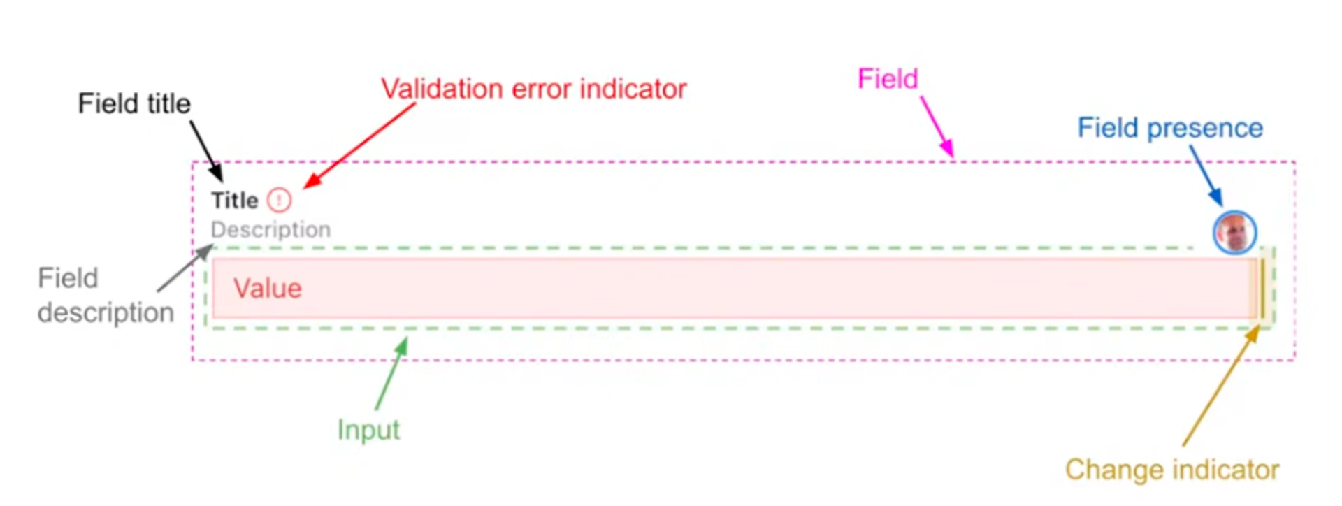
Input and field components
The input and field custom components are easiest to understand when examined together. To demonstrate the difference between these two, we’ll take a closer look at the anatomy of a field widget in the Studio. In the illustration below the field includes everything within the purple dashed border conveniently marked “field,” while the input includes only what’s within the green dashed border marked “input.”
Often, developers are chiefly interested in customizing the input widget itself and happy to leave the rest to studio defaults. In these cases, you would opt to replace components.input. If you do want to control the field in its entirety, you can do so by replacing the components.field component.
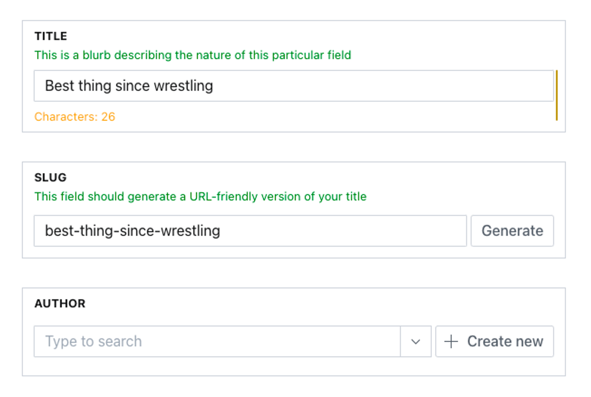
In the following example, we assign a custom field component (adding a border and transforming the title and description visually) to all studio fields. In contrast, we do a check to only assign a custom input component (adding a character count) if the field has the string schema type.
// sanity.config.js

import {Stack, Text, Card} from '@sanity/ui'
import {defineConfig} from 'sanity'
import schemaTypes from './schemas'

function CustomStringInput(props) {
  return (
    <Stack space={3}>
      {props.renderDefault(props)}
      <Text size={1} style={{color: 'orange'}}>
        Characters: {props.value?.length || 0}
      </Text>
    </Stack>
  )
}

function CustomField(props) {
  const {description, title, ...restProps} = props
  return (
    <Card border padding={3}>
      <Stack space={3} marginBottom={3}>
        <Text size={1} weight="bold">
          {title?.toUpperCase()}
        </Text>
        {description && (
          <Text size={1} style={{color: 'green'}}>
            {description}
          </Text>
        )}
      </Stack>
      {props.renderDefault(restProps)}
    </Card>
  )
}

export default defineConfig({
  // ...rest of config
  form: {
    components: {
      field: CustomField,
      input: (props) =>
        props.schemaType?.name === 'string' ? <CustomStringInput {...props} /> : props.renderDefault(props),
    },
  },
})
The result in the Studio is that all fields are customized to use the CustomField component, which transforms the title and description and adds a border around the field, while only the fields of type string are affected by the CustomStringInput component, which adds a character count in bright orange.
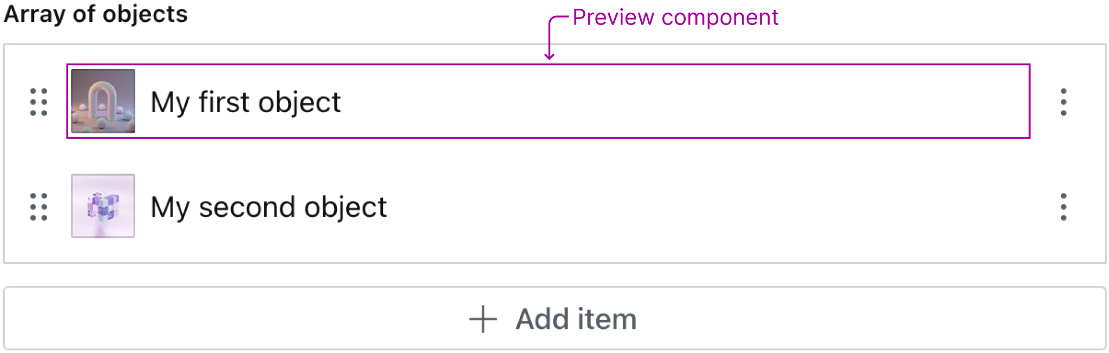
Preview components
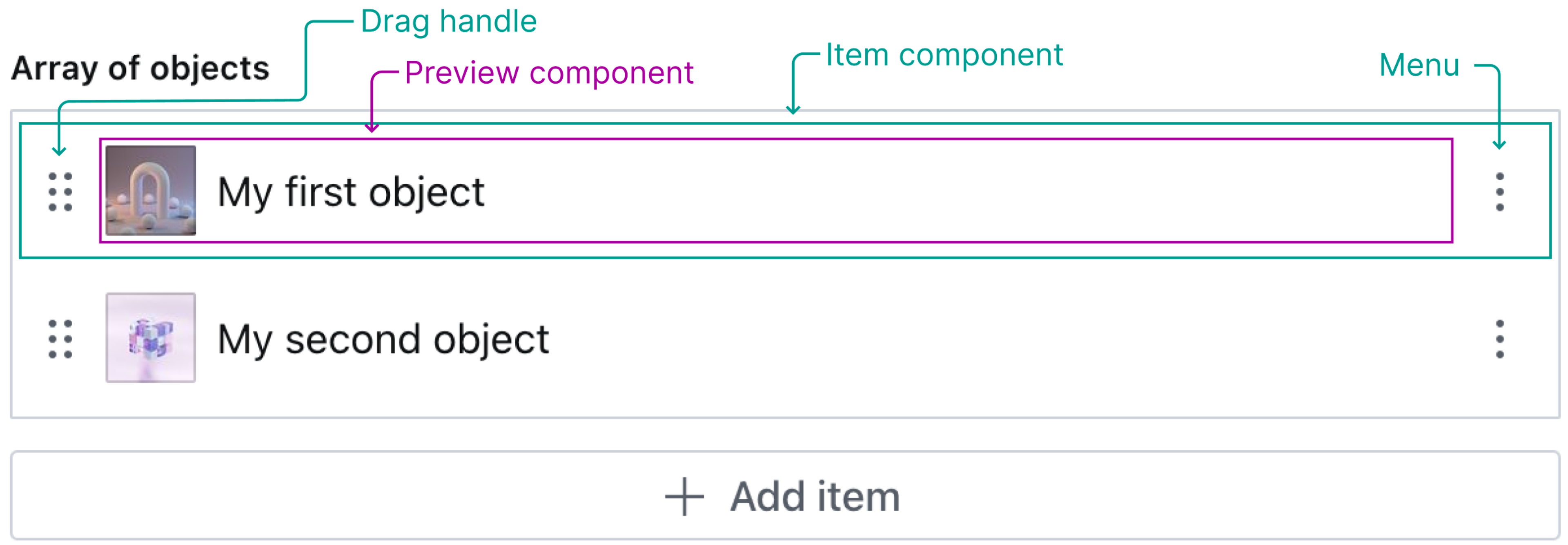
The preview component decides how an object, image, or reference value is displayed in list views. The illustration below shows an example of an array of objects, where each object has a string and an image field defined. The default preview component tries its best to guess which fields should be displayed by introspecting the defined fields of the object.
As with input and field components, it is possible to configure a custom preview component. The custom preview component can be configured either in sanity.config.js, in a plugin, or directly in the schema definition. In the following example, we will configure a custom preview component directly in the schema definition.
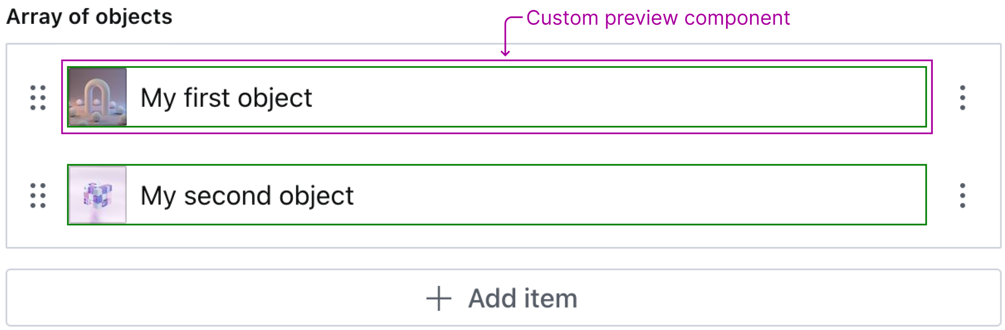
To keep the example minimal, our custom preview component will be a div with a green border that wraps the default preview component rendered using renderDefault. However, it is possible to configure a completely custom component and not use renderDefault.
The following schema definition is what the illustration above represents. Since we want to configure a custom preview component for each object in the array, we add our component to the components.preview property for the object field definition.
// ./custom-array.js

import {defineField} from 'sanity'

// Render a div that wraps the default preview component
function MyPreviewComponent(props) {
  return (
    <div style={{border: '1px solid green'}}>
      {props.renderDefault(props)}
    </div>
  )
}

export const arrayOfObjects = defineField({
  type: 'array',
  name: 'arrayOfObjects',
  title: 'Array of objects',
  of: [
    {
      type: 'object',
      name: 'myObject',
      title: 'My object',
      components: {
        preview: MyPreviewComponent, // Add custom preview component
      },
      fields: [
        {
          type: 'string',
          name: 'myString',
          title: 'My string',
        },
        {
          type: 'image',
          name: 'myImage',
          title: 'My image',
        },
      ],
    },
  ],
})
As you can see in the illustration below, our custom preview component is rendered.
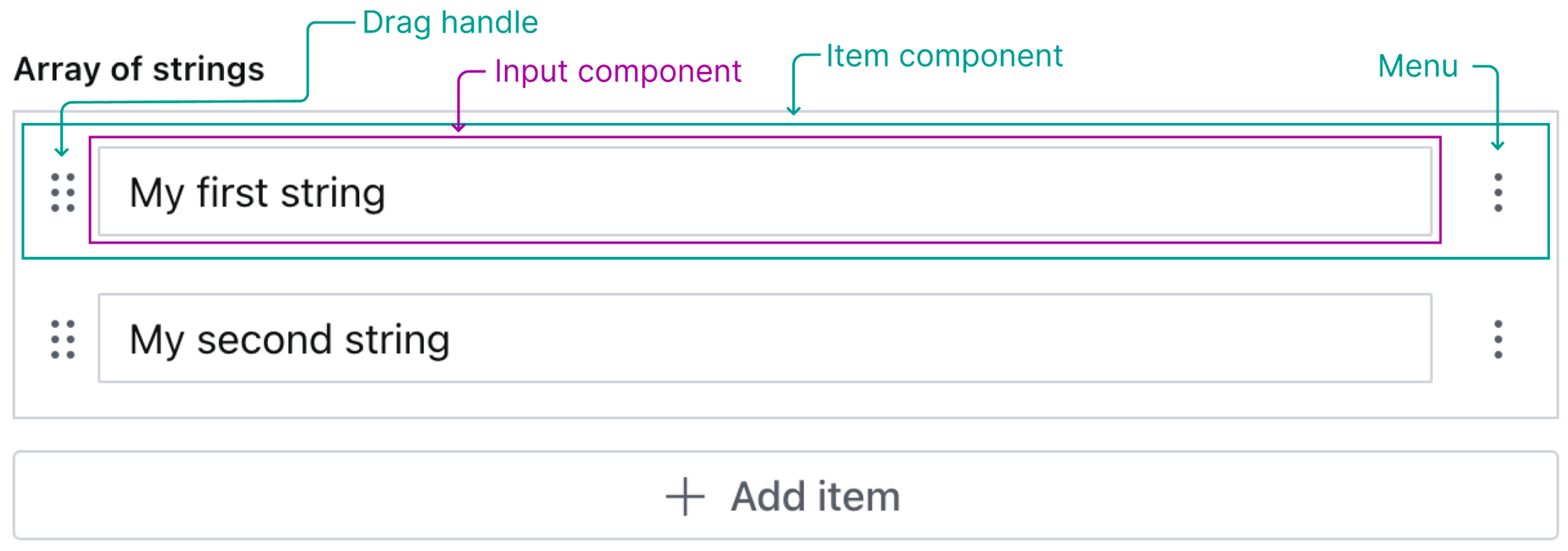
Item components
The item component is the component that represents each item in an array field. The default item component contains a drag handle for sorting, a menu with actions (such as duplicate and delete), and some content. The content, that is, what is between the drag handle and the actions menu, varies based on what type of field(s) the item represents.
In an array of objects, a preview component is displayed as content, but in an array of primitive types (e.g., boolean or string), an input component is displayed as content.
Typical use cases/problems this solves
- Decorate the default component, or modify the props passed to the default component, using
renderDefault. - Create your own completely custom component.
Targeting the whole document form
Registering an input component at form.components.input applies it to every field across the Studio. To wrap the document form itself, rather than every field within it, use the same registration but check props.id === 'root' and props.schemaType.type?.name === 'document' inside the component to detect the document root, then return props.renderDefault(props) for everything else:
import {defineConfig} from 'sanity'
import type {InputProps} from 'sanity'

function CustomDocumentInput(props: InputProps) {
  if (
    props.id === 'root' &&
    props.schemaType.type?.name === 'document'
  ) {
    // Render around the entire document form
    return (
      <div>
        {/* Add header, sidebar, progress indicator, etc. */}
        {props.renderDefault(props)}
      </div>
    )
  }
  return props.renderDefault(props)
}

export default defineConfig({
  // ...
  form: {
    components: {
      input: CustomDocumentInput,
    },
  },
})
You can further limit the rendering to specific document types by adding an additional condition that compares the props.schemaType.name value. For a complete worked example, see Create a document form progress component.