Sanity logosanity.ioAll Systems Operational© Sanity 2026
Change Site Theme
Sanity logo

Documentation

    • Overview
    • Platform introduction
    • Next.js quickstart
    • Nuxt.js quickstart
    • Astro quickstart
    • React Router quickstart
    • Studio quickstart
    • Build with AI
    • Content Lake
    • Functions
    • APIs and SDKs
    • Agent Actions
    • Visual Editing
    • Blueprints
    • Platform management
    • Dashboard
    • Studio
    • Canvas
    • Media Library
    • App SDK
    • Content Agent
    • HTTP API
    • CLI
    • Libraries
    • Specifications
    • Changelog
    • User guides
    • Developer guides
    • Courses and certifications
    • Join the community
    • Templates
Studio
Overview

  • Setup and development

    Installation
    Project Structure
    Development
    Hosting and deployment
    Embedding Sanity Studio
    Upgrading Sanity Studio
    Environment Variables
    Using TypeScript in Sanity Studio
    Understanding the latest version of Sanity

  • Configuration

    Introduction
    Workspaces
    Schema and forms
    Conditional fields
    Field Groups
    List Previews
    Connected Content
    Validation
    Initial Value Templates
    Cross Dataset References
    Sort Orders
    Visual editing and preview
    Incoming reference decoration

  • Block Content (Portable Text)

    Introduction
    Configure the Portable Text Editor
    Customize the Portable Text Editor
    Create a Portable Text behavior plugin
    Add Portable Text Editor plugins to Studio
    Common patterns
    Standalone Portable Text Editor

  • Studio customization

    Introduction
    Custom component for Sanity Studio
    Custom authentication
    Custom asset sources
    Diff components
    Form Components
    How form paths work
    Icons
    Favicons
    Localizing Sanity Studio
    New Document Options
    Studio Components
    Studio search configuration
    Focus and UI state in custom inputs
    Real-time safe patches for input components
    Sanity UI
    Studio Tools
    Create a custom Studio tool
    Tools cheat sheet
    Theming

  • Workflows

    The Dashboard tool for Sanity Studio
    Add widgets to dashboard
    Document actions
    Release Actions
    Custom document badges
    Localization
    Content Releases Configuration
    Enable and configure Comments
    Configuring Tasks
    Scheduled drafts
    Scheduled publishing (deprecated)
    Manage notifications

  • Structure builder

    Introduction
    Get started with Structure Builder API
    Override default list views
    Create a link to a single edit page in your main document type list
    Manually group items in a pane
    Dynamically group list items with a GROQ filter
    Create custom document views with Structure Builder
    Cheat sheet
    Structure tool
    Reference

  • Plugins

    Introduction
    Installing and configuring plugins
    Developing plugins
    Publishing plugins
    Internationalizing plugins
    Reference
    Official plugins repo

  • AI Assist

    Installation
    Translation
    Custom field actions
    Field action patterns

  • User guides

    Comments
    Task
    Copy and paste fields
    Compare document versions
    Content Releases
    Scheduled drafts
    View incoming references
    Common keyboard shortcuts

  • Studio schema reference

    Studio schema configuration
    Array
    Block
    Boolean
    Cross Dataset Reference
    Date
    Datetime
    Document
    File
    Geopoint
    Global Document Reference
    Image
    Number
    Object
    Reference
    Slug
    Span
    String
    Text
    URL

  • Studio reference

    Asset Source
    Configuration
    Document
    Document Badges
    Document Actions
    Form
    Form Components
    Hooks
    Structure tool
    Studio Components Reference
    Tools
    Initial Value Templates
    Studio API reference

On this page

StudioLast updated January 9, 2026

Theming

Learn how to customize the styling and branding of your studio

Theming in Sanity Studio

Using buildLegacyTheme

The top-level theme config property allows you to customize the color palette of the studio. You can create your own themes using the buildLegacyTheme helper function exported from the sanity package.

import {buildLegacyTheme, defineConfig} from 'sanity'

const props = {
  '--my-white': '#fff',
  '--my-black': '#1a1a1a',
  '--my-blue': '#4285f4',
  '--my-red': '#db4437',
  '--my-yellow': '#f4b400',
  '--my-green': '#0f9d58',
}

export const myTheme = buildLegacyTheme({
  /* Base theme colors */
  '--black': props['--my-black'],
  '--white': props['--my-white'],

  '--gray': '#666',
  '--gray-base': '#666',

  '--component-bg': props['--my-white'],
  '--component-text-color': props['--my-black'],

  /* Brand */
  '--brand-primary': props['--my-blue'],

  // Default button
  '--default-button-color': '#666',
  '--default-button-primary-color': props['--my-blue'],
  '--default-button-success-color': props['--my-green'],
  '--default-button-warning-color': props['--my-yellow'],
  '--default-button-danger-color': props['--my-red'],

  /* State */
  '--state-info-color': props['--my-blue'],
  '--state-success-color': props['--my-green'],
  '--state-warning-color': props['--my-yellow'],
  '--state-danger-color': props['--my-red'],

  /* Navbar */
  '--main-navigation-color': props['--my-black'],
  '--main-navigation-color--inverted': props['--my-white'],

  '--focus-color': props['--my-blue'],
})

export default defineConfig({
  // rest of config...,

  theme: myTheme,
})

Using the Themer app

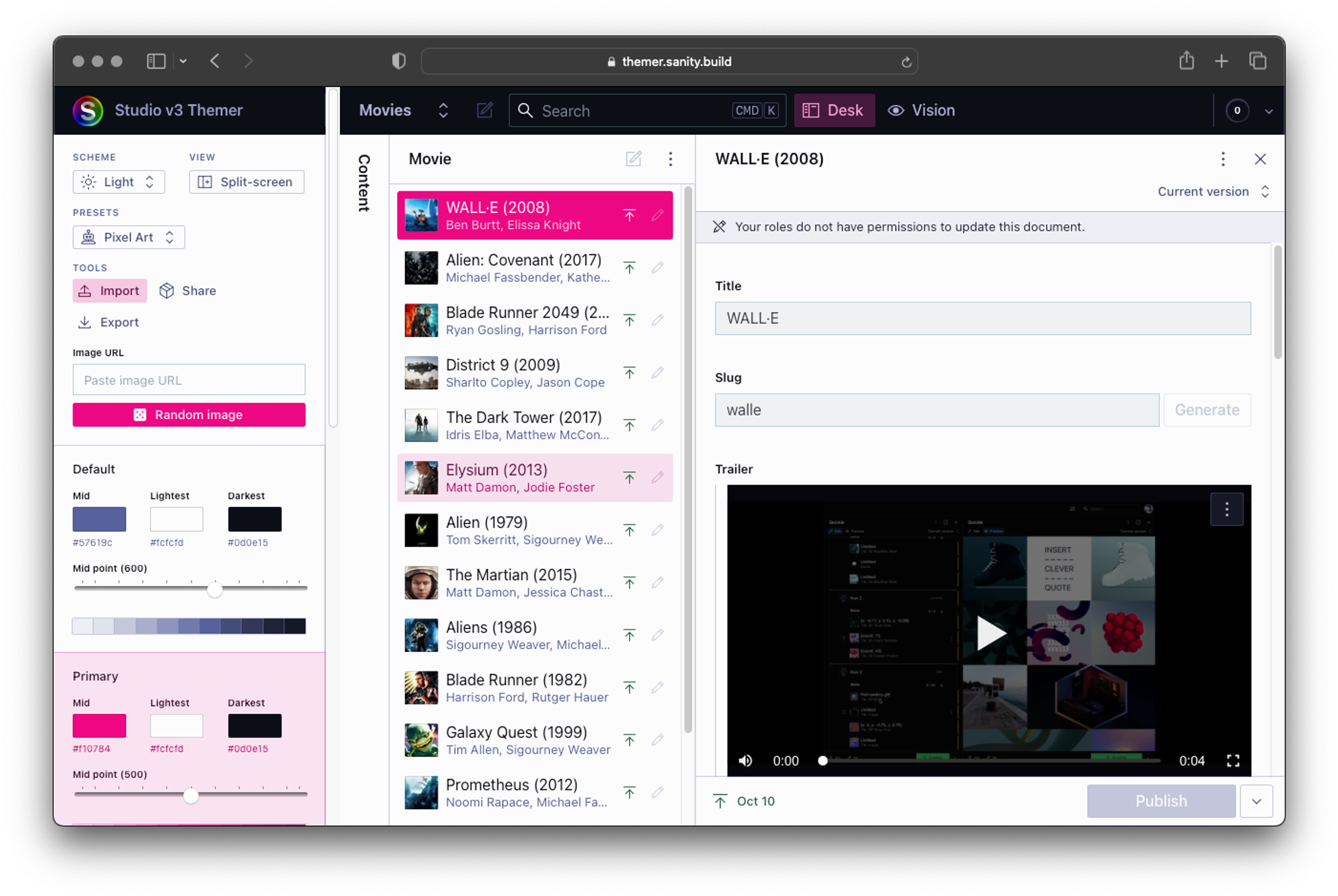
A potentially quicker and easier way to go about creating themes for your studio is to use Themer. This web app was created in-house at Sanity and will let you visually create a custom palette that you can then export for your own use.

Loading...
The Themer app makes generating themes for the studio easy!

On this page

  • Theming in Sanity Studio
  • Using buildLegacyTheme
  • Using the Themer app
  • Article
  • Changelog
import {buildLegacyTheme, defineConfig} from 'sanity'

const props = {
  '--my-white': '#fff',
  '--my-black': '#1a1a1a',
  '--my-blue': '#4285f4',
  '--my-red': '#db4437',
  '--my-yellow': '#f4b400',
  '--my-green': '#0f9d58',
}

export const myTheme = buildLegacyTheme({
  /* Base theme colors */
  '--black': props['--my-black'],
  '--white': props['--my-white'],

  '--gray': '#666',
  '--gray-base': '#666',

  '--component-bg': props['--my-white'],
  '--component-text-color': props['--my-black'],

  /* Brand */
  '--brand-primary': props['--my-blue'],

  // Default button
  '--default-button-color': '#666',
  '--default-button-primary-color': props['--my-blue'],
  '--default-button-success-color': props['--my-green'],
  '--default-button-warning-color': props['--my-yellow'],
  '--default-button-danger-color': props['--my-red'],

  /* State */
  '--state-info-color': props['--my-blue'],
  '--state-success-color': props['--my-green'],
  '--state-warning-color': props['--my-yellow'],
  '--state-danger-color': props['--my-red'],

  /* Navbar */
  '--main-navigation-color': props['--my-black'],
  '--main-navigation-color--inverted': props['--my-white'],

  '--focus-color': props['--my-blue'],
})

export default defineConfig({
  // rest of config...,

  theme: myTheme,
})
Screenshot of web app that lets you define custom color palettes for the Sanity Studio
Previous

Tools cheat sheet

Next

The Dashboard tool for Sanity Studio

Was this page helpful?