Number
Schema type reference for the Number type.
A number. See the NumberDefinition reference for the full type definition.
Any number, e.g. 900, 900.0, 9E+2 or 9.0E+2.
Properties
Requiredtype
Value must be set to
number.Requiredname
Required. The field name. This will be the key in the data record.
Human readable label for the field.
If set to
true, this field will be hidden in the studio. You can also return a callback function to use it as a conditional field.If set to
true, this field will not be editable in the content studio. You can also return a callback function to use it as a conditional field.Short description to editors how the field is to be used.
The initial value used when creating new values from this type. Can be either a literal number value or a resolver function that returns either a literal number value or a promise resolving to a number value.
Lets you provide custom components to override the studio defaults in various contexts. The components available are
field,input,item,preview.Marks a field or document type as deprecated in the studio interface and displays a user-defined message defined by the single required
reasonproperty.If you deploy a GraphQL API schema, this property will translated into the
@deprecateddirective.Supply a custom icon for this field. See icons documentation for more information.
Placeholder text shown in the input when it has no value.
Options (NumberOptions)
A list of predefined values that the user may pick from. The array can include numeric values
[1, 2]or objects[{value: 1, title: 'One'}, ...].Controls how the items defined in the
listoption are presented. If set to'radio'the list will render radio buttons. If set to'dropdown'you'll get a dropdown menu instead. Default isdropdown.Controls how radio buttons are lined up. Use
direction: 'horizontal|vertical'to render radio buttons in a row or a column. Default isvertical. Will only take effect if thelayoutoption is set toradio.
Validation (NumberRule)
Ensures that this field exists.
Minimum value (inclusive).
Maximum value (inclusive).
Value must be less than the given limit.
Value must be greater than the given limit.
Value must be an integer (no decimals).
Specifies the maximum number of decimal places allowed.
Requires the number to be positive (>= 0).
Requires the number to be negative (< 0).
Create a custom validation.
Sets a custom error message for the preceding validation rule.
Sets a custom warning message for the preceding validation rule. Warnings do not prevent publishing.
Sets a custom info message for the preceding validation rule. Info messages are purely informational and do not prevent publishing.
Gets the value of a sibling field to use in validation. Useful for creating validation rules that depend on the value of another field.
Input
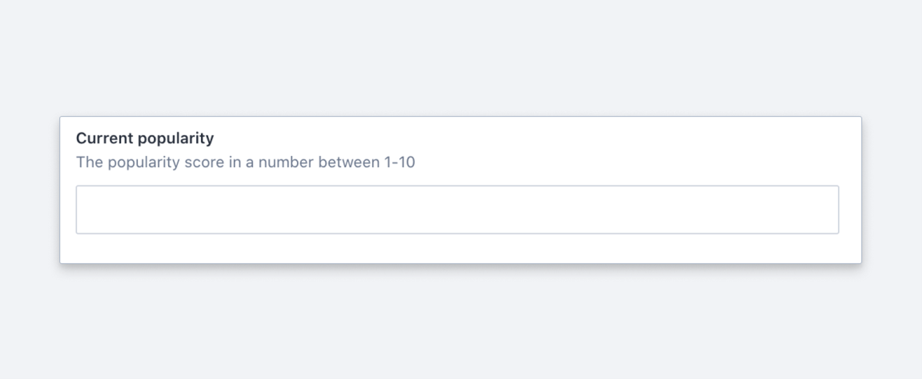
{
  title: 'Current popularity',
  name: 'popularity',
  type: 'number'
}
Response
{
  "_type": "movie",
  "popularity": 12.5,
  ...
}
Gotcha
Never use number for storing a phone-number. Minimize pain down the road and use string instead.