Object
Schema type to create custom types to use in a document.
The object type is the bread and butter of your data model. You use it to define custom types with fields of strings, numbers, and arrays, as well as other object types. See the ObjectDefinition reference for the full type definition.
By default, object types cannot be represented as standalone documents in the data store. To define an object type to represent it as a document with an ID, revision, as well as created and updated timestamps, you should define with the document type. Apart from these additional fields, there's no semantic difference between a document and an object.
Protip
If you plan to use your schemas with the GraphQL API, you'll need to import object types on the top-level (called “hoisting”). Learn more about how to make “strict schemas” in our GraphQL documentation.
Properties
Requiredtype
Value must be set to
object.Requiredname
Required. The field name. This will be the key in the data record.
Requiredfields
The fields of this object. At least one field is required. See documentation below.
A list of fieldsets that fields may belong to. Documentation below.
Groups fields into tabs.
groups: [{name: 'seo', title: 'SEO'}],On field:
group: 'seo',
For details, see this reference doc.Enables specifying a preview option that replaces the default preview for the document type. For more information, see List Previews.
Human readable label for the field.
If set to
true, this field will be hidden in the studio. You can also return a callback function to use it as a conditional field.If set to
true, this field will not be editable in the content studio. You can also return a callback function to use it as a conditional field.Short description to editors how the field is to be used.
The initial value that will be used when creating new objects from this type. Can be either the literal value or a function that returns either the literal value or a promise that resolves to the initial value.
Lets you provide custom components to override the studio defaults in various contexts. The components available are
field,input,item,preview.Marks a field or document type as deprecated in the studio interface and displays a user-defined message defined by the single required
reasonproperty.If you deploy a GraphQL API schema, this property will translated into the
@deprecateddirective.renderMembers
function
Enables developers to inject decoration members (custom UI components) into document forms without persisting data.
Supply a custom icon for this field. See icons documentation for more information.
Options (ObjectOptions)
If set to
true, the object will make the fields collapsible. By default, objects will be collapsible when reaching a depth/nesting level of 3. This can be overridden by settingcollapsible: falseSet to
trueto display fields as collapsed initially. This requires thecollapsibleoption to be set totrueand determines whether the fields should be collapsed to begin with.An integer corresponding to the number of columns in a grid for the inputs to flow between.
Controls how the modal (for object content editing) is rendered. The types you can choose between is
dialogorpopover. Default isdialog. You can also set the width of the modal.modal?: {type?: 'dialog' | 'popover'width?: number | number[] | 'auto'}
Validation (ObjectRule)
Ensures that this field exists.
Creates a custom validation rule.
Sets a custom error message for the preceding validation rule.
Sets a custom warning message for the preceding validation rule. Warnings do not prevent publishing.
Sets a custom info message for the preceding validation rule. Info messages are purely informational and do not prevent publishing.
Gets the value of a sibling field to use in validation. Useful for creating validation rules that depend on the value of another field.
Fields
Fields are what gives an object its structure. Every field must have a name and a type. An object can reference any field type. You may specify the properties and options that are supported for the given type, e.g.:
{
  title: 'Address',
  name: 'address',
  type: 'object',
  fields: [
    {name: 'street', type: 'string', title: 'Street name'},
    {name: 'streetNo', type: 'string', title: 'Street number'},
    {name: 'city', type: 'string', title: 'City'}
  ]
}
Once a type is added to the schema, it can be reused as the type for other fields, so lets use it in our screening:
Input
{
  title: 'Screening',
  name: 'screening',
  type: 'document',
  fields: [
    // ...
      {
      title: 'Cinema address',
      name: 'address',
      type: 'address'
    }
    // ...
  ]
}
Response
{
  "_type": "screening",
  "_id": "2106a34f-315f-44bc-929b-bf8e9a3eba0d",
  "title": "Welcome to our premiere of Valerian and the City of a Thousand Planets!",
  //...
  "address": {
    "_type": "address",
    "street": "Dronningens gate",
    "streetNo": "16",
    "city": "Oslo"
  }
  //...
}
Field names
A field name must start with a letter from a-z, and can can only include:
- Letters
- Numbers
- Underscores
This means field names can't contain hyphens. We also recommend using the camel case naming convention for field names.
Additional Field options
Sometimes you may have fields which are not meant to be exposed to the editors through the studio, but are populated by backend services or scripts. By setting the hidden property to true, you can make sure that the field is still included in the schema but not displayed in the studio. Example:
{
title: 'Movie',
name: 'movie',
type: 'document',
fields: [
// ... other fields
{
title: 'Last synchronized',
name: 'lastSynced',
description: 'Timestamp the movie was last synced with external service. Not shown in studio.',
type: 'datetime',
hidden: true
}
]
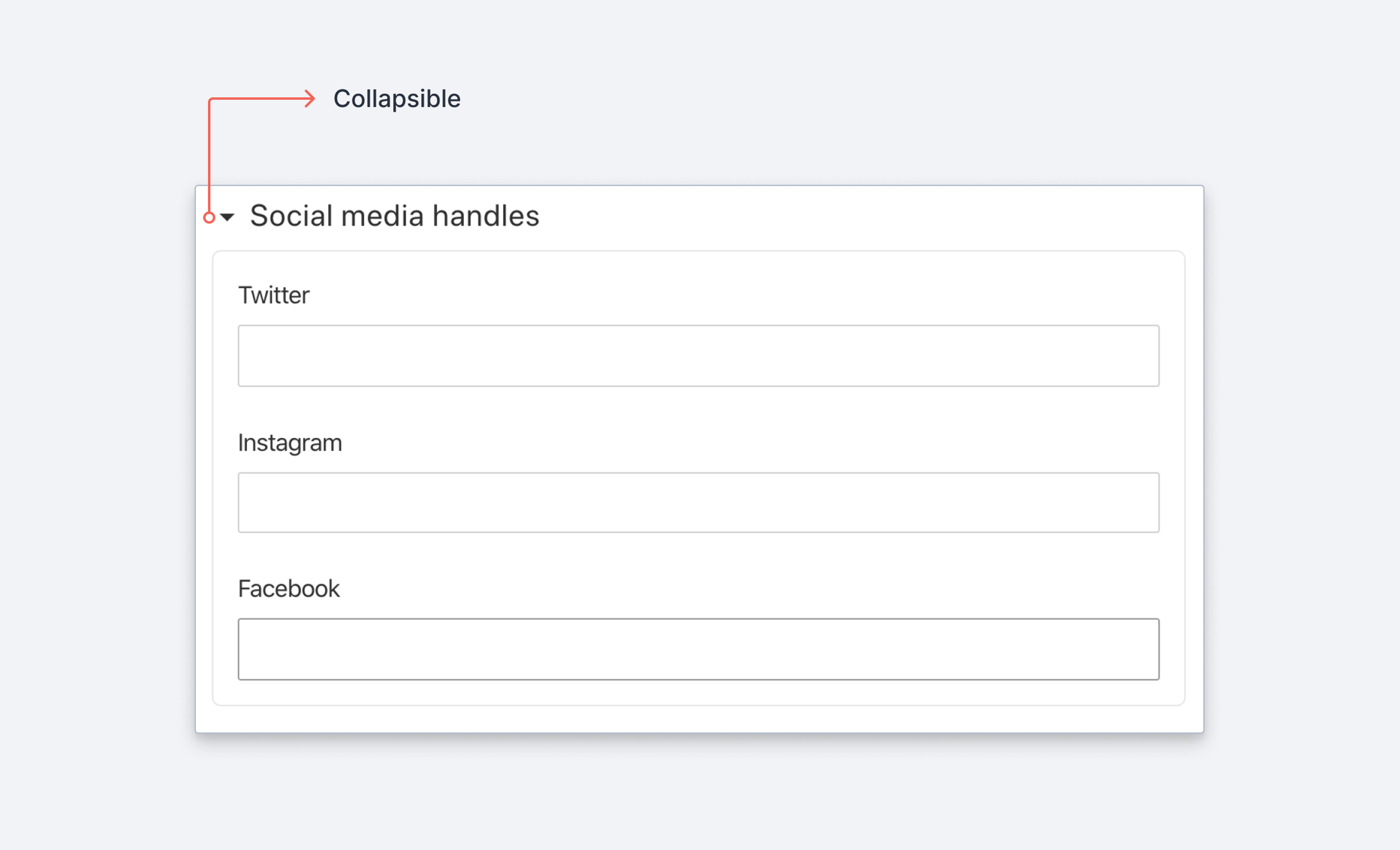
}Fieldsets
Sometimes it makes sense to group a set of fields into a fieldset. Say you want the social fieldset, to be grouped together in Sanity Studio like this:
Input
{
  type: 'object',
  name: 'person',
  fieldsets: [
    {name: 'social', title: 'Social media handles'}
  ],
  fields: [
    {
      title: 'Name',
      name: 'name',
      type: 'string'
    },
    {
      title: 'Twitter',
      name: 'twitter',
      type: 'string',
      fieldset: 'social'
    },
    {
      title: 'Instagram',
      name: 'instagram',
      type: 'string',
      fieldset: 'social'
    },
    {
      title: 'Facebook',
      name: 'facebook',
      type: 'string',
      fieldset: 'social'
    }
  ]
}
Response
// Values will still appear at the same level in the data
{
  "name": "Somebody",
  "twitter": "@somebody",
  "instagram": "@somebody",
  "facebook": "somebody"
}
Fieldsets takes the same collapsible options as described for objects above, as well as the hidden and readOnly properties, e.g.:
{
  title: 'Social media handles',
  name: 'social',
  hidden: false, // Default value
  readOnly: true,
  options: {
    collapsible: true, // Makes the whole fieldset collapsible
    collapsed: false, // Defines if the fieldset should be collapsed by default or not
    columns: 2, // Defines a grid for the fields and how many columns it should have
    modal: {type: 'popover'} //Makes the modal type a popover
  }
}
Tip
For more advanced form layouts, you can build custom form components.
Render members
Enables developers to inject decoration members (custom UI components) into document forms without persisting data.
import {DecorationComponent} from "./DecorationComponent"

//....
defineField({
  name: 'settings',
  type: "object",
  title: 'Settings',
  renderMembers: (members) => {
    return [
      ...members,
     // Adds the decoration component after all the fields members
      {
        key: 'decoration',
        kind: 'decoration',
        component: () => <DecorationComponent title="My first decoration" />,
      },
    ]
  },
})
import {ConfettiIcon} from '@sanity/icons'
import {Card, Text} from '@sanity/ui'
export function Decoration({title}: {title: string}) {
return (
<Card padding={2} paddingY={3} radius={2} border>
<Text>
{title} {' '} <ConfettiIcon />
</Text>
</Card>
)
}