Custom asset sources
How to add custom asset sources for Sanity Studio.
Sanity Studio comes with a rudimentary asset selector out of the box. It lets you browse and select images or files you have already uploaded. You can also add multiple asset sources, or replace the default one, globally or for a specific asset field.
Asset source plugins
You can find available asset source plugins in the Sanity Exchange or by searching for them on npmjs.com. Just like other plugins, asset source plugins are installed using your preferred package manager. Some asset source plugins will require that you add some configuration, for example, an API token.
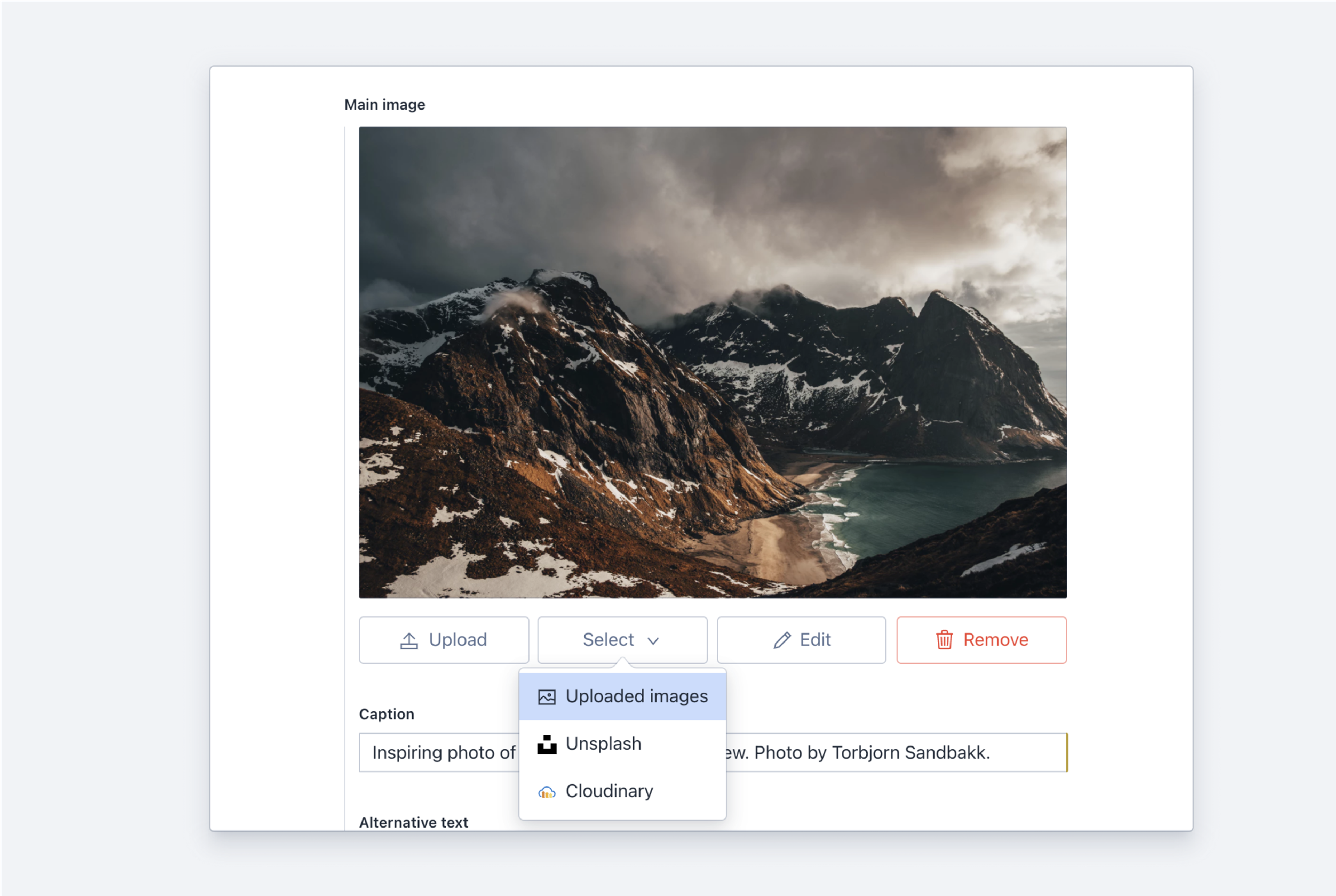
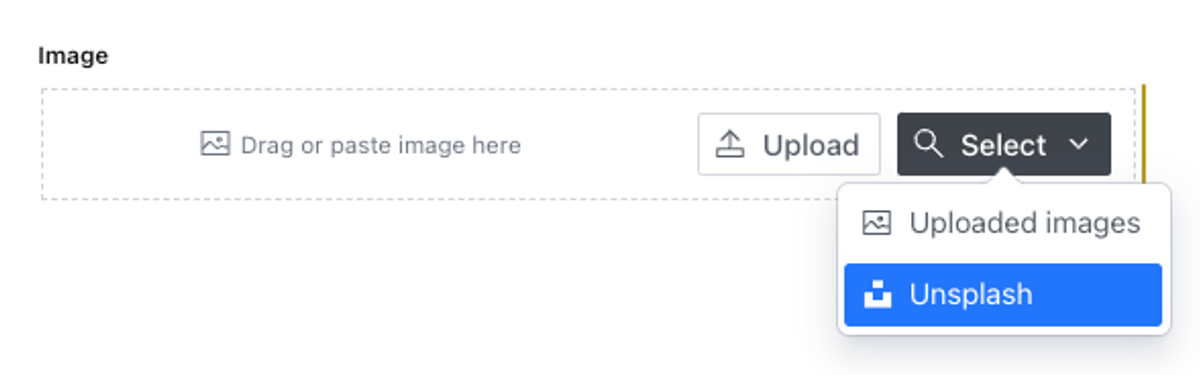
When adding custom asset source plugins to your studio, the Select button for the upload field will become a drop-down button, showing the multiple sources:
Defining asset sources globally
Assets sources that are distributed as npm packages usually come with a plugin definition for easy setup.
Let's say you want to add the Unsplash asset source. First, install the plugin by running npm i sanity-plugin-asset-source-unsplash in your project folder. Then, in sanity.config.js, add the following:
import {defineConfig} from 'sanity'
import {deskTool} from 'sanity/desk'
import {unsplashImageAsset} from 'sanity-plugin-asset-source-unsplash'
import {schemaTypes} from './schemas'

export default defineConfig({
  name: 'default',
  projectId: '<projectId>',
  dataset: 'YOUR_DATASET',
  plugins: [
    deskTool(),
    unsplashImageAsset(),
  ],
  schema: {
    types: schemaTypes,
  },
})
Adding unsplashImageAsset() to the plugins array will deal with registering the asset source and adding it to the list of assets sources for images in your project.
If you want to only allow the Unsplash asset source instead of adding it to the default upload option, you can instead import unsplashAssetSource and add it to form.image as the sole member of the returned array value.
import {defineConfig} from 'sanity'
import {deskTool} from 'sanity/desk'
import {unsplashAssetSource} from 'sanity-plugin-asset-source-unsplash'
import {schemaTypes} from './schemas'

export default defineConfig({
  name: 'default',
  projectId: '<projectId>',
  dataset: 'YOUR_DATASET',
  plugins: [deskTool()],
  form: {
    image: {
      assetSources: () => [unsplashAssetSource],
      directUploads: false,
    },
  },
  schema: {
    types: schemaTypes,
  },
})
Gotcha
Many properties of the studio configuration can accept both a static value – an array of asset sources in this case – or a callback function that returns that same value. One crucial difference between the two is that providing a static array of sources will append those sources to the list of existing sources that may have been added by plugins or the studio's default settings, while returning an array of sources from the callback function will replace the current list of sources.
The callback is invoked with the current list of sources as the first argument, so to append to the list when using the callback option you might do something like this: assetSources:(prev)=>[...prev, unsplashAssetSource]
Using sources on a single type
You can customize sources for single image or file type field in the schema via the options.sources property:
{
  name: 'mainImage',
  title: 'Main image',
  type: 'image',
  options: {
    sources: [unsplashAssetSource],
  },
}
Remove the Browse option
You can remove the Browse button on an image field (making the field upload-only) by specifying options.sources as an empty array:
{
  name: 'uploadedImage',
  title: 'Upload an Image',
  type: 'image',
  options: {sources: []}
}
Anatomy of an asset source plugin
The plugin exports an AssetSource object with the following shape:
export default {
  name: 'cloudinary', // Unique source name
  title: 'Cloudinary', // Title displayed in lists, buttons etc
  component: Cloudinary, // Selection component
  icon: Icon // Icon for lists, buttons etc.
}
The selection component
The plugin must define a component that will let the user select some asset(s) from somewhere.
If the user selects something, the component calls the props.onSelect function with an array of asset objects like this:
type AssetFromSource = {
  kind: 'assetDocumentId' | 'file' | 'base64' | 'url'
  value: string | File
  assetDocumentProps?: ImageAsset
}
An asset can be a URL, user agent File object, base64 encoded binary data or an assetDocumentId. It can have assetDocumentProps that will end up as properties on the resulting asset document. The allowed document props are:
originalFilenamestring
If you would like to use the original filename, when saving the file etc.
sourceobject
{name, id, url?}- Optional object identifying the asset in the source, so you can find all assets from that source, or find it back to the specific assets when opening the plugin etc. If set, the object propertiesnameandidare required, buturlis optional. An example for Instagram images:{name: 'instagram', id: '_cjqbJKwZB', url: 'https://www.instagram.com/p/_cjqbJKwZB/'}titlestring
Optional title for the asset.
descriptionstring
Optional description for the asset.
creditLinestring
Optional credit line for the asset. E.g. John Doe by Instragram
labelstring
Optional label.
Component Props
RequiredselectionTypestring
If the opening interface selection type is
'single'or'multiple'.RequiredselectedAssetsarray
An array of Sanity assets if they are selected in the opening interface. These are Sanity asset documents.
RequiredonSelectfunction
Accepts an array of asset objects (
AssetFromSource[])When assets are selected and returned to
props.onSelect, the Studio will make sure to upload the asset(s). If the selected asset is uploaded previously, the existing asset document and file will be used instead.RequiredonClosefunction
The component must call
props.onCloseif the select action is canceled or closed somehow.dialogHeaderTitleReact.ReactNode
A component that serves as the header element for the dialog window.
assetTypestring
Either
fileorimage
Basic component example
The following code shows how to implement a selection component for an asset source plugin. It's not very useful as it will only allow you to pick one very specific image, but it should serve nicely as an example.
import React, {useCallback} from "react";
import {
  Dialog,
  Card,
} from "@sanity/ui";

export default function GitHubAssetSource({ onSelect, onClose }) {
  const handleSelect = useCallback(() => {
    onSelect([
      {
        kind: "url",
        value:
          "https://github.githubassets.com/images/modules/site/sponsors/logo-mona.svg",
        assetDocumentProps: {
          originalFilename: "logo-mona.svg", // Use this filename when the asset is saved as a file by someone.
          source: {
            // The source this image is from
            name: "github.githubassets.com",
            // A string that uniquely idenitfies it within the source.
            // In this example the URL is the closest thing we have as an actual ID.
            id: "https://github.githubassets.com/images/modules/site/sponsors/logo-mona.svg",
          },
          description: "Mona Lisa Octocat",
          creditLine: "By Github.com",
        },
      },
    ]);
  }, [onSelect]);

  const handleClose = useCallback(() => {
    onClose();
  }, [onClose]);

  return (
    <Dialog
      id="github-asset-source"
      header="Select image from Github"
      onClose={handleClose}
      width={4}
      open
    >
      <Card>
        <img
          src="https://github.githubassets.com/images/modules/site/sponsors/logo-mona.svg"
          onClick={handleSelect}
        />
      </Card>
    </Dialog>
  );
}
Gotcha
CORS headers for image URLs
When calling onSelect with kind: 'url' the resource must respond with a access-control-allow-origin header that allows the image to be read by the Studio host. Using * will allow all hosts (including Studio host).
Protip
Best practice
When integrating with an external service, be sure to read the usage guidelines for that service or API. Some will require you to honor the credits for the asset, not expose any API keys etc. Use the assetDocumentProps for onSelect to store any required or relevant information to the resulting asset document. If it is from a service where the asset has an ID and can be displayed in the service, you should use the source key for the assetDocumentProps to store that information. In that way, you can find back to the original asset.