Document Badges API
Reference documentation for the document badges.
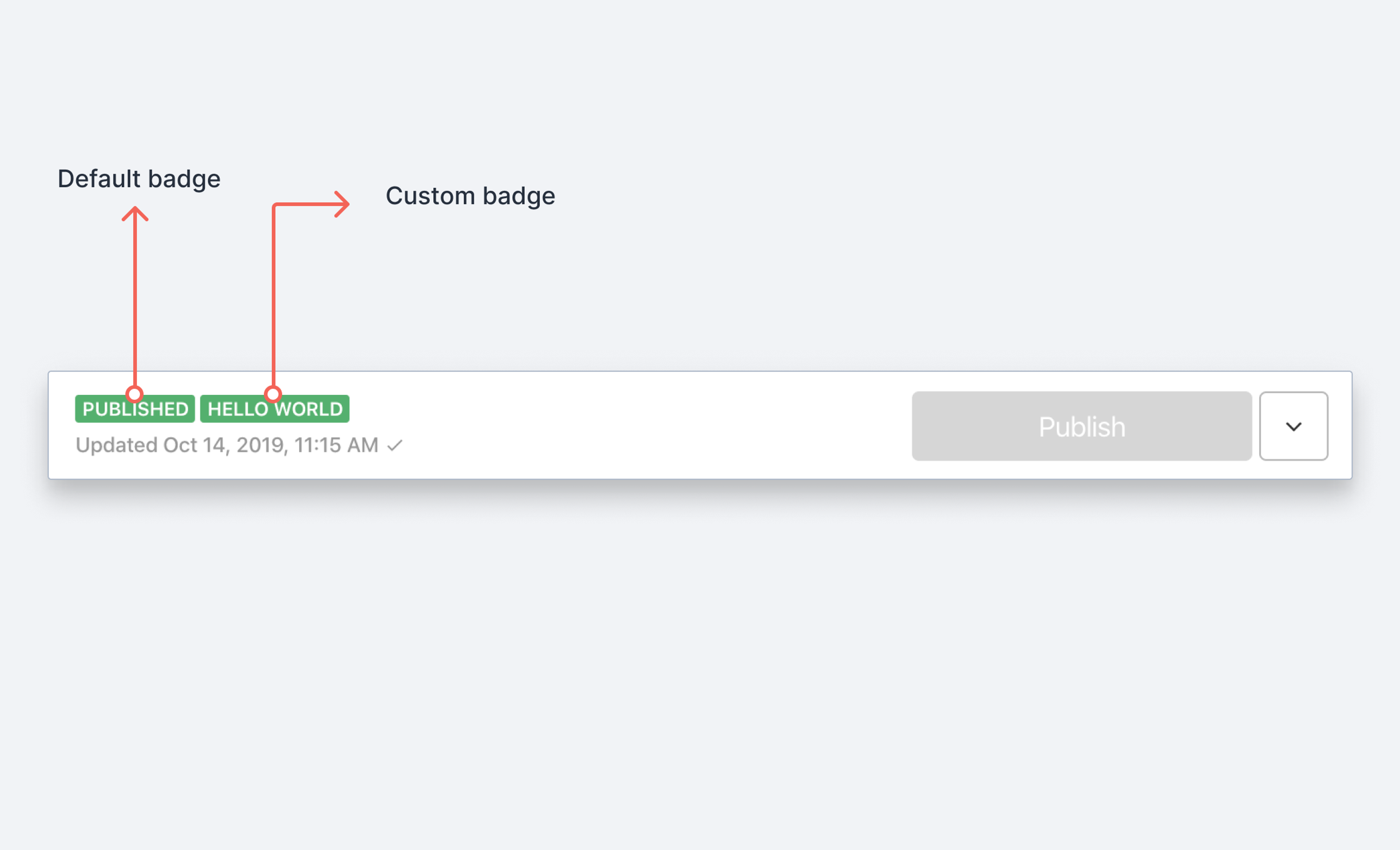
A document badge is a small UI component that indicates the status of a document. It currently appears in the Studio next to the toolbar actions. The default set of document badges currently shows draft and published status.
Introduction to using document badges →
Learn how to use document badges when building custom workflows →
Document badge properties
These are the properties returned to a badge component.
idstring
An id for the current document (e.g. the id of the published document)
typestring
The schema type of the current document.
draftSanityDocument
Returns the draft document (a document with unpublished changes) if any. Returns
nullif there is no draft document.publishedSanityDocument
The version of the document that is currently published, if available. Returns
nullif the document isn't published.
Document badge description
These are the properties a badge description object must follow.
Example
export function HelloWorldBadge(props) {
  return {
    label: 'Hello world',
		title: 'Hello I am a custom document badge',
    color: "success"
  }
}