Customize the Portable Text Editor
Customization guidelines and examples to tailor the Portable Text editor to your needs.
Sanity Studio's Portable Text Editor is customizable so that it can fit different editorial needs. You can configure and tailor several different editors throughout the studio.
For more information about configuring the editor, see Configuring the Portable Text Editor.
In general, customization works by passing components to the schema definitions of the editor's content types.
Toolbar icons and span rendering
When you configure custom marks, like decorators (simple values) and annotations (rich data structures), they display as icons in the toolbar. The default icon is a question mark. You can customize it to display a different icon.
If you add custom decorators and annotations, you may want to control their visual preview in the editor. By default, decorators are invisible, whereas annotations have a gray background and a dotted underline.
Decorators
Some often-used decorators, such as strong, emphasis, and code, feature rendering out of the box.
For example, let’s say you created a decorator to highlight text using the following configuration:
export default {
  name: 'content',
  title: 'Content',
  type: 'array',
  of: [
    {
      type: 'block',
      marks: {
        decorators: [
          { title: 'Strong', value: 'strong' },
          { title: 'Emphasis', value: 'em' },
          { title: 'Code', value: 'code' },
          { title: 'Highlight', value: 'highlight' }
        ]
      }
    }
  ]
}
Now, add a custom toolbar icon by passing in an anonymous function that returns H as a string to .icon:
// RichTextEditor.jsx
export default {
name: 'content',
title: 'Content',
type: 'array',
of: [
{
type: 'block',
marks: {
decorators: [
{ title: 'Strong', value: 'strong' },
{ title: 'Emphasis', value: 'em' },
{ title: 'Code', value: 'code' },
{
title: 'Highlight',
value: 'highlight',
icon: () => 'H'
}
]
}
}
]
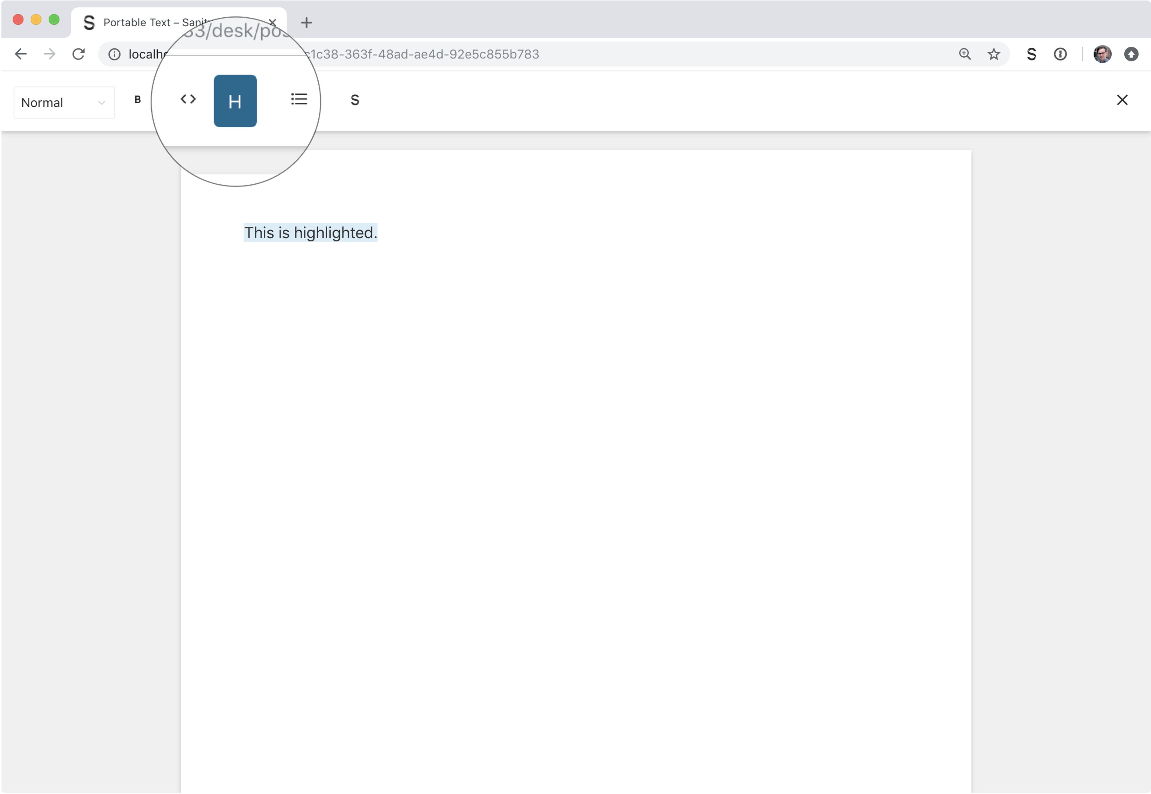
}The string is rendered in the decorator button in the toolbar:
You can also pass a JSX component directly in the schema, or via an import.
The following example adds simple inline styling to a span holding the character H.
import React from 'react'

const HighlightIcon = () => (
  <span style={{fontWeight: 'bold'}}>H</span>
  )

export default {
  name: 'content',
  title: 'Content',
  type: 'array',
  of: [
    {
      type: 'block',
      marks: {
        decorators: [
          { title: 'Strong', value: 'strong' },
          { title: 'Emphasis', value: 'em' },
          { title: 'Code', value: 'code' },
          {
            title: 'Highlight',
            value: 'highlight',
            icon: HighlightIcon
          }
        ]
      }
    }
  ]
}
The next step is to render the actual highlighted text in the editor. We do this by passing the props into a React component and wrapping them in a span with some styling.
import React from 'react'
const HighlightIcon = () => (
<span style={{ fontWeight: 'bold' }}>H</span>
)
const HighlightDecorator = props => (
<span style={{ backgroundColor: 'yellow' }}>{props.children}</span>
)
export default {
name: 'content',
title: 'Content',
type: 'array',
of: [
{
type: 'block',
marks: {
decorators: [
{ title: 'Strong', value: 'strong' },
{ title: 'Emphasis', value: 'em' },
{ title: 'Code', value: 'code' },
{
title: 'Highlight',
value: 'highlight',
icon: HighlightIcon,
component: HighlightDecorator
}
]
}
}
]
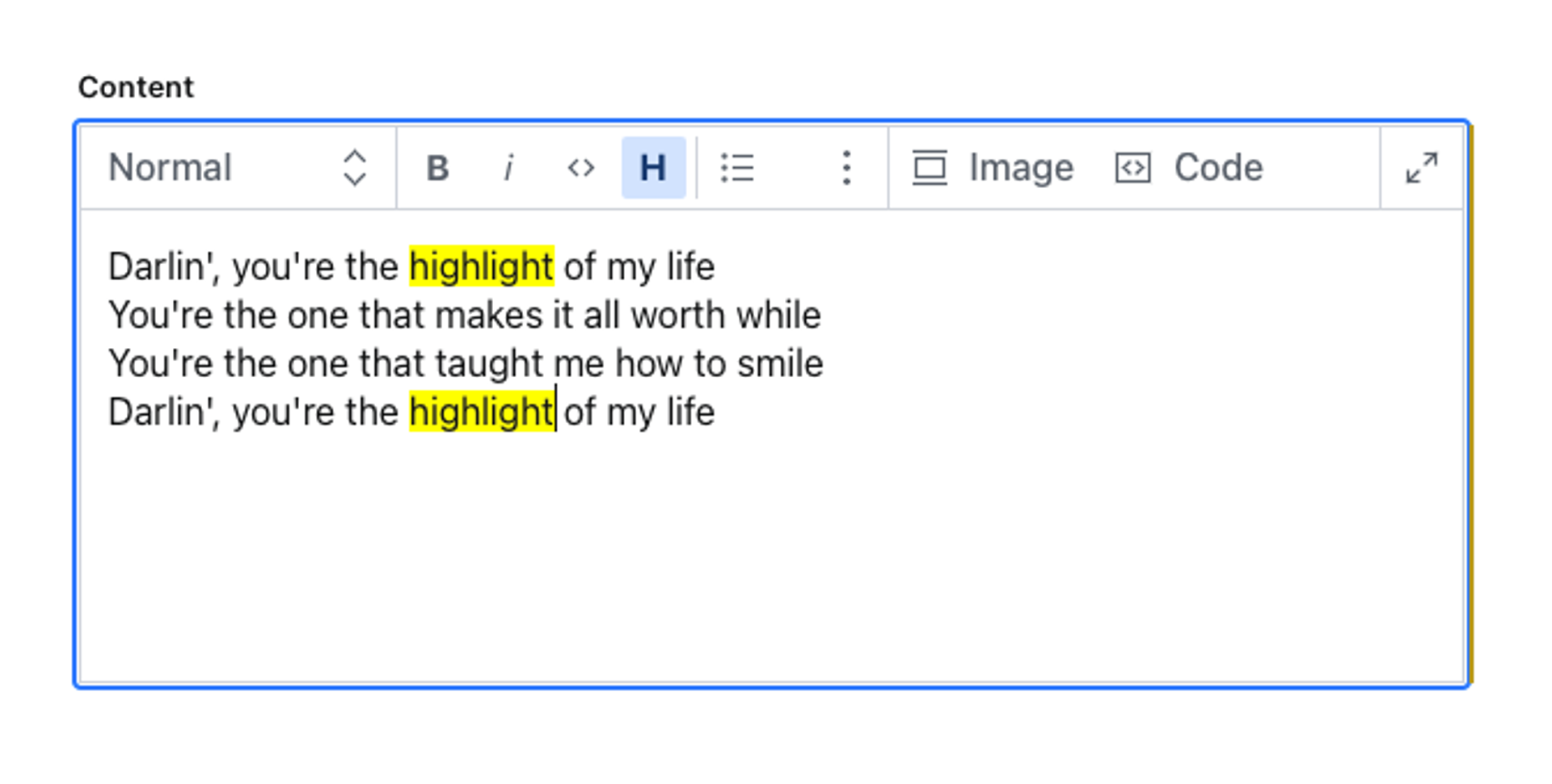
}The rendered presentation in the editor is a yellow background for highlighted text:
Protip
When you create your custom decorators, you can keep all, some, or none of the built-in decorators.
These are the built-in decorators:
{ "title": "Strong", "value": "strong" },
{ "title": "Emphasis", "value": "em" },
{ "title": "Code", "value": "code" },
{ "title": "Underline", "value": "underline" },
{ "title": "Strike", "value": "strike-through" }
Make sure you include those you intend to keep.
Annotations
Customizing annotations works much in the same way as decorations: you pass an icon and a renderer in the schema definition.
A common use case is to have an annotation for an internal reference, in addition to a link with an external URL.
You can customize the editor to display a custom icon for the internal link, and a renderer that helps recognize external links when they are inline in the text.
The following example imports an icon from the @sanity/icons-package. In the example, you configure a user icon to represent internal references to a person type.
import { UserIcon } from '@sanity/icons'
export default {
name: 'content',
title: 'Content',
type: 'array',
of: [
{
type: 'block',
marks: {
annotations: [
{
name: 'link',
type: 'object',
title: 'link',
fields: [
{
name: 'url',
type: 'url'
}
]
},
{
name: 'internalLink',
type: 'object',
title: 'Internal link',
icon: UserIcon,
fields: [
{
name: 'reference',
type: 'reference',
to: [
{ type: 'person' }
// other types you may want to link to
]
}
]
}
]
}
}
]
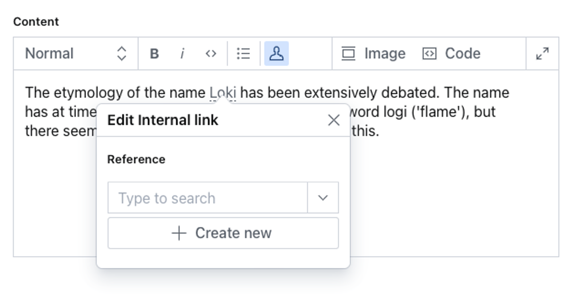
}Now the user icon replaces the default question mark icon in the toolbar:
Custom components
The next step is to create a custom renderer for external links. The following example appends an "arrow out of a box" icon to mark these links. To do this, you pass a small React component.
In the /schemas/components directory, create a file and name it ExternalLinkRenderer.tsx.
import React from 'react'
import { LaunchIcon } from '@sanity/icons'

const ExternalLinkRenderer = props => (
  <span>
    {props.renderDefault(props)}
    <a contentEditable={false} href={props.value.href}>
      <LaunchIcon />
    </a>
  </span>
)

export default ExternalLinkRenderer
Then, import the following component, and pass it to components.annotation in the schema type:
import { UserIcon } from '@sanity/icons'
import ExternalLinkRenderer from './components/ExternalLinkRenderer'
export default {
name: 'content',
title: 'Content',
type: 'array',
of: [
{
type: 'block',
marks: {
annotations: [
{
name: 'link',
type: 'object',
title: 'link',
fields: [
{
name: 'url',
type: 'url'
}
],
components: {
annotation: ExternalLinkRenderer
}
},
{
name: 'internalLink',
type: 'object',
title: 'Internal link',
icon: UserIcon
fields: [
{
name: 'reference',
type: 'reference',
to: [
{ type: 'person' }
// other types you may want to link to
]
}
]
}
]
}
}
]
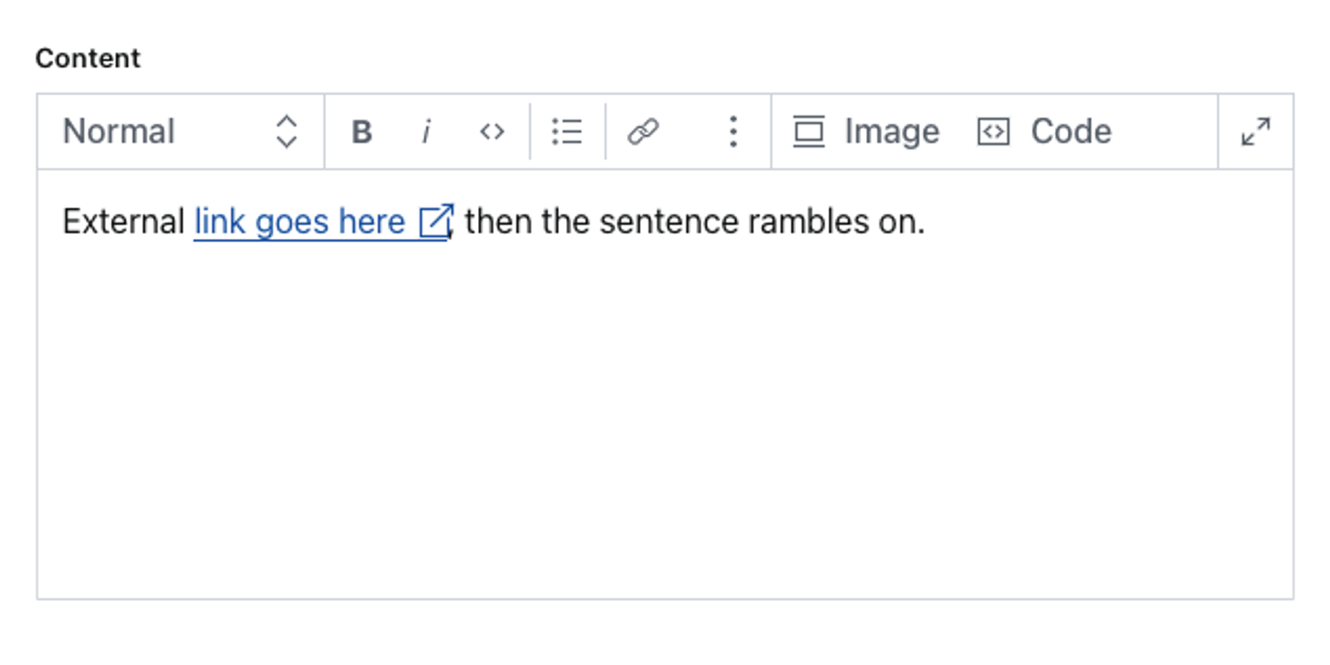
}As a result, external links now look like this:
Include default annotations and decorators
There may be instances where you want to add to the default Sanity Studio annotations and decorators rather than overwrite them. Import the constants and spread them in their respective sections as shown below. Then include your custom additions.
import {defineType, defineArrayMember, DEFAULT_ANNOTATIONS,
  DEFAULT_DECORATORS} from 'sanity'

export default defineType({
  name: 'content',
  title: 'Content',
  type: 'array',
  of: [
    defineArrayMember({
      type: 'block',
      marks: {
        decorators: [
          // Spread the default decorators
          ...DEFAULT_DECORATORS,
          // ... your custom decorators
        ],
        annotations: [
          // Spread the default annoations
          ...DEFAULT_ANNOTATIONS,
          // ... your custom annotations
        ]
      }
    })
  ]
})
Block styles
The Portable Text Editor ships with a set of styles that translate well to their corresponding HTML ones. You can also customize how these appear in the editor by supplying your own components.
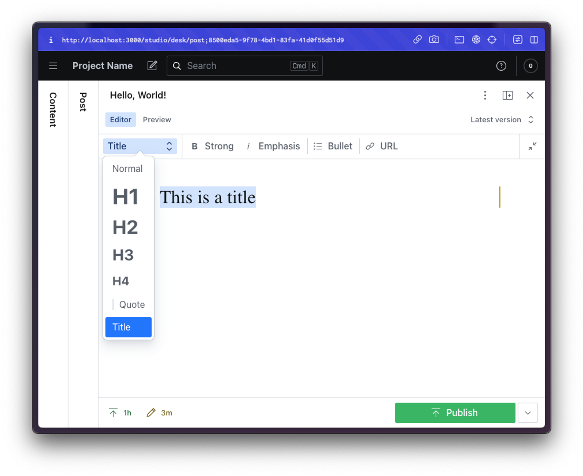
The following example produces a custom title style using Garamond as the font face with a slightly increased font size. First, define a custom style called title:
export default {
  name: 'content',
  title: 'Content',
  type: 'array',
  of: [
    {
      type: 'block',
      styles: [
        {title: 'Normal', value: 'normal'},
        {title: 'Title', value: 'title'},
        {title: 'H1', value: 'h1'},
        {title: 'H2', value: 'h2'},
        {title: 'H3', value: 'h3'},
        {title: 'Quote', value: 'blockquote'},
      ]
    }
  ]
}
Without any customization, the block looks exactly like the normal one.
To change that, create and pass a React component to component. The props of the block contain the element to style and the appropriate styling.
In the following example, the React component is added to the configuration file.
import React from 'react'

const TitleStyle = props => (
  <span style={{fontFamily: 'Garamond', fontSize: '2em'}}>{props.children} </span>
)

export default {
  name: 'content',
  title: 'Content',
  type: 'array',
  of: [
    {
      type: 'block',
      styles: [
        {title: 'Normal', value: 'normal'},
        {title: 'H1', value: 'h1'},
        {title: 'H2', value: 'h2'},
        {title: 'H3', value: 'h3'},
        {title: 'Quote', value: 'blockquote'},
        {
          title: 'Title',
          value: 'title',
          component: TitleStyle
        },
      ]
    }
  ]
}
The component prop applies the custom style to the title block, as it's rendered in the editor:
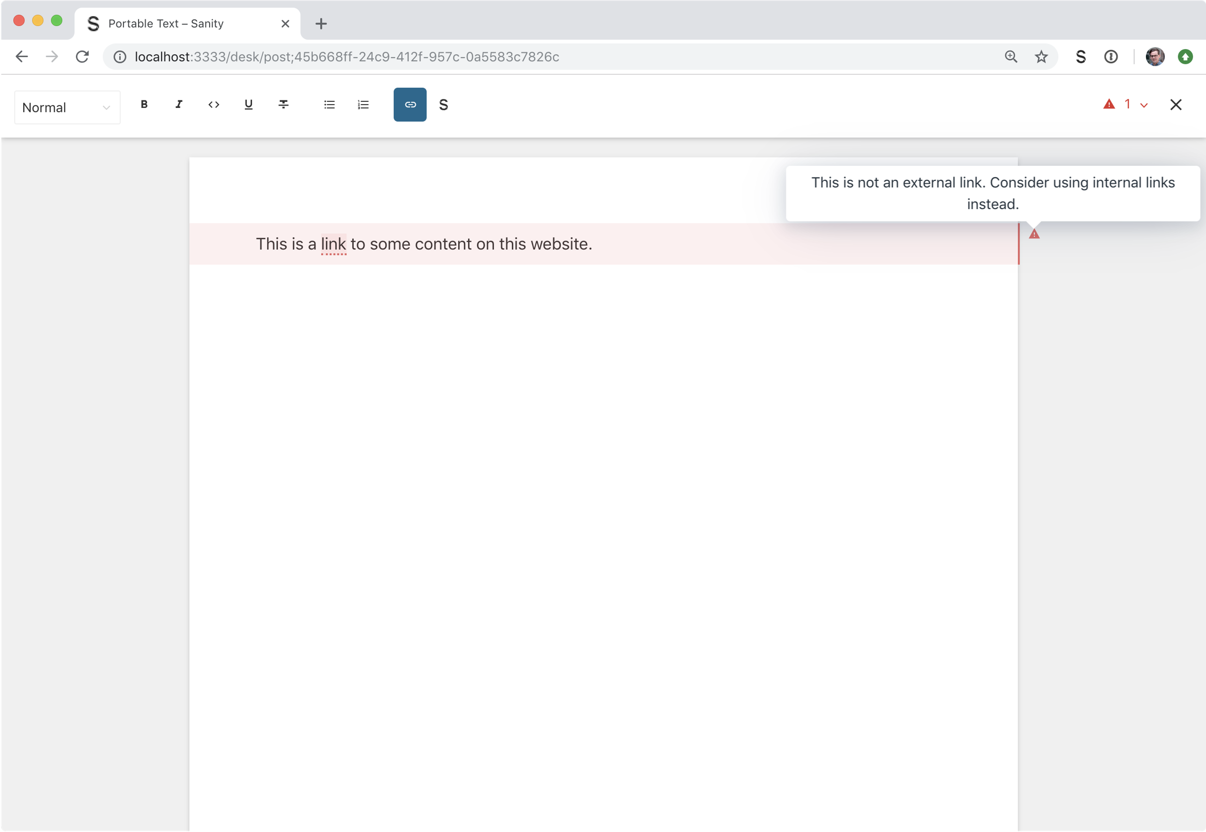
Validation of annotations
Like other content types, annotations support content validation. Warnings are displayed in the margin and in the document. A pointer activates the annotation modal for the editor. Validations help editors structure the content correctly. It's generally a good idea to involve editors in creating validations and testing the warning messages so that they are helpful for them.
Let's say that you are using the same content for multiple websites. In this case, it's important that internal linking use an annotation with a reference input. This helps prevent accidental deletion of linked content and resolve internal links in the front-end project.
You can create a validation that takes care of this:
export default {
  name: 'content',
  title: 'Content',
  type: 'array',
  of: [
    {
      type: 'block',
      marks: {
        annotations: [
          {
            name: 'link',
            type: 'object',
            title: 'link',
            fields: [
              {
                name: 'url',
                type: 'url',
                validation: Rule =>
                  Rule.regex(
                    /https:\/\/(www\.|)(portabletext\.org|sanity\.io)\/.*/gi,
                    {
                      name: 'internal url',
                      invert: true
                    }
                  ).warning(
                    `This is not an external link. Consider using internal links instead.`
                  )
              }
            ]
          },
          {
            name: 'internalLink',
            type: 'object',
            title: 'Internal link',
            fields: [
              {
                name: 'reference',
                type: 'reference',
                to: [
                  { type: 'post' }
                  // other types you may want to link to
                ]
              }
            ]
          }
        ]
      }
    }
  ]
}
The regular expression /https:\/\/(www\.|)(portabletext\.org|sanity\.io)\/.*/i triggers on all URLs that match all the variations of either portabletext.org or sanity.io with some sub-paths (this allows linking to the root domain).