Icons
Use icons for types to display in the creation dialogue and when you're missing an media preview.
Icons
Use icons for types to display in the creation dialogue and when you're missing a media preview.
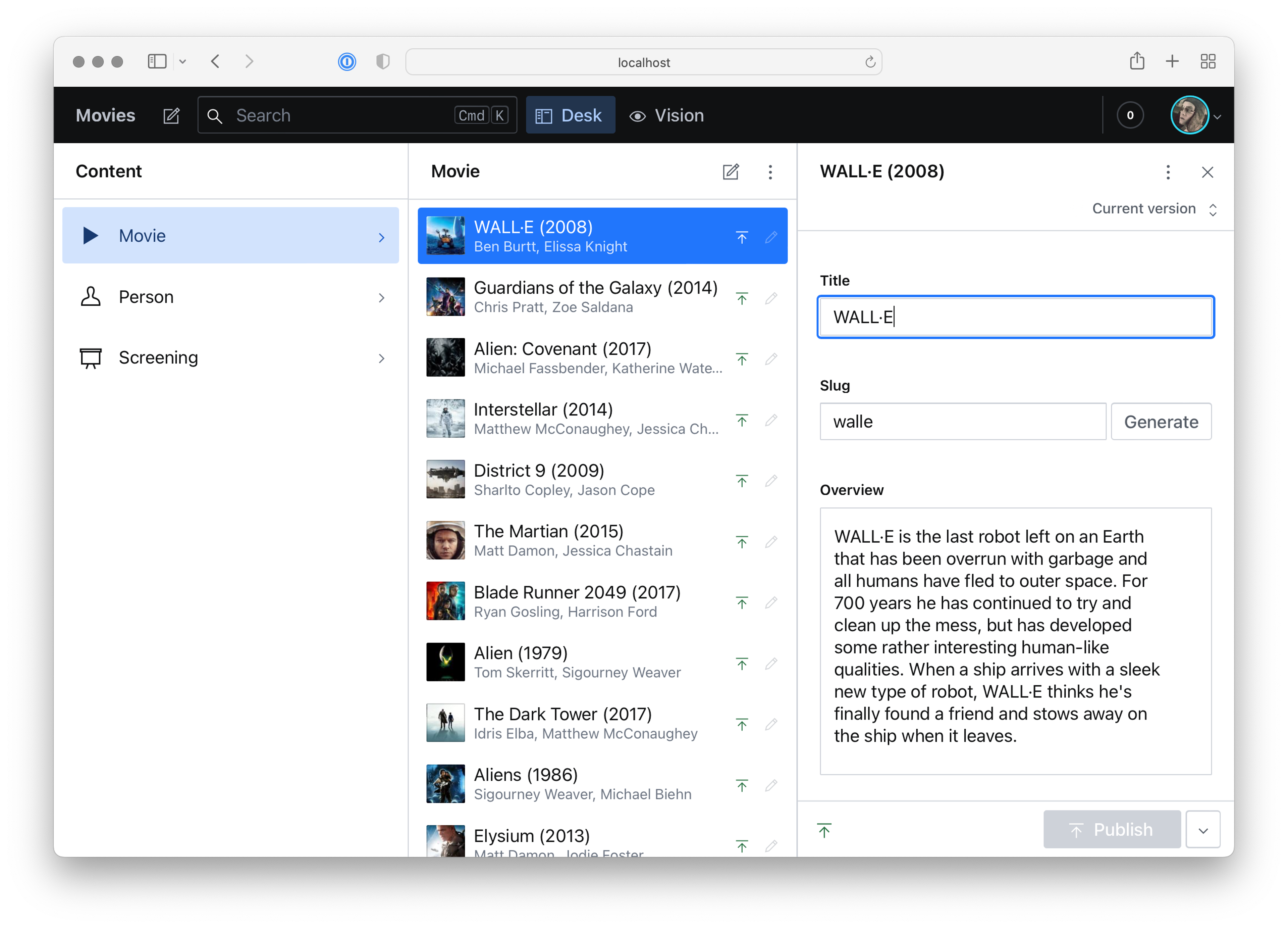
Helpful icons can improve the editorial experience, and can be applied in several contexts throughout the studio interface, such as in structures created in Structure Builder, and as tool icons in the Portable Text Editor.
Each document type can also be assigned an icon to illustrate its purpose. We recommend using an SVG file, but it can be any react component you like.
If you want to have your icons reflect the default style found throughout the Studio, you might opt to install the @sanity/icons-package. Another popular package is react-icons which includes a plethora of open source SVG icons from collections like Font Awesome, Material Design, Typicons, and Github Octicons.
Example
Install the icon package using your favorite package manager, and use them in your schemas! Just remember that any schema file with icons in them should have a .jsx or .tsx extension.
Example
After including react-icons in your package.json with yarn add react-icons you can add it to your schema:
import { PlayIcon } from '@sanity/icons'

export default {
  name: 'movie',
  type: 'document',
  icon: PlayIcon,
  fields: [
    {
      title: 'Title',
      name: 'title',
      type: 'string'
    },
    {
      title: 'Release Date',
      name: 'releaseDate',
      type: 'date'
    }
  ],
  preview: {
    select: {
      title: 'title',
      subtitle: 'releaseDate'
    }
  }
}