Custom component for Sanity Studio
Change the look and feel of your studio and craft tailor-made editorial interactions.
Sanity Studio lets you customize your editorial experience by overriding different parts of the Sanity Studio with your own components written in React. The customized components can be split into two main categories:
- Studio components
- Layout
- Navbar
- Tool menu
- Form components
- Fields
- Inputs
- Array items
- Preview
Studio components
The studio.components configuration property accepts replacements for several parts of the studio UI, such as the layout, navbar, and toolMenu. Studio components can be declared in your root workspace configuration, i.e. the defineConfig function, or as part of a plugin config, i.e. the definePlugin function.
// sanity.config.js
import {defineConfig} from 'sanity'

export default defineConfig({
  // ...rest of config
  studio: {
    components: {
      layout: MyLayout,
      navbar: MyNavbar,
      toolMenu: MyToolMenu,
    },
  },
})
Gotcha
logo is deprecated
- Custom
logocomponents are no longer rendered. - Instead, provide custom components for individual workspace icons in the Studio configuration.
Form components
The form.components property deals with the rendering of form fields and inputs in the studio. The components available for customizing are field, input, item and preview. Form components can be declared in your root workspace configuration, i.e. the defineConfig function, as part of a plugin config, i.e. the definePlugin function, or individually on any field in your schemas.
// sanity.config.js
import {defineConfig} from 'sanity'

export default defineConfig({
  // ...rest of config
  form: {
    components: {
      field: MyField,
      input: MyInput,
      item: MyItem,
      preview: MyPreview,
    },
  },
})Composing components with renderDefault
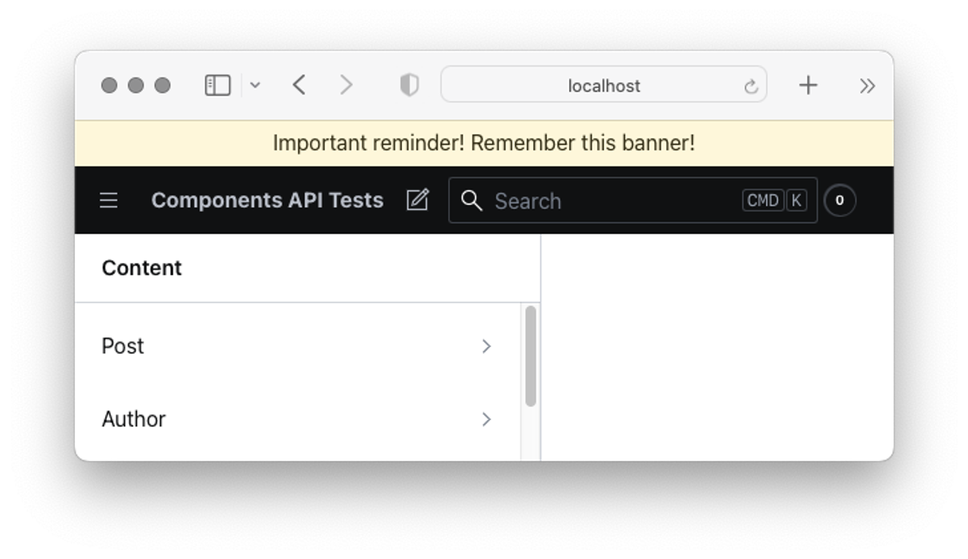
The components available in this API are rendered using a middleware pattern. This means that plugin customizations are applied cumulatively in a chain or cascade. Each component declaration receives a callback function named renderDefault which, as the name implies, will defer to the default studio rendering of the component. When you call renderDefault you also pass along the props needed to render the component, with any changes you care to make.
import { Stack, Card, Flex, Text } from '@sanity/ui'

// Adds markup and invokes renderDefault()
function MyEnhancedNavbar(props) {
  return (
    <Stack>
      <Card padding={3} tone="caution">
        <Flex justify="center">
          <Text>Important reminder! Remember this banner!</Text>
        </Flex>
      </Card>
      <>{props.renderDefault(props)}</>
    </Stack>
  )
}You may opt not to call renderDefault if you want to replace the component in question in its entirety with your own markup, but be aware that doing so in a plugin might result in unexpected behavior as it breaks the middleware chain.
Typical use cases/problems this solves
- Hide certain tools when the studio is in development mode with a custom
toolMenu - Wrap your studio with multiple context providers with a custom
layoutcomponent - Create a custom
inputto display a range slider on anumberfield, or add a character counter on allstringfields