Published September 25, 2019
How to make a Custom Input Component

Step-by-step guide to create a custom input component
The Sanity Studio grants a developer the power to create pretty much any editing experience. The schema types which are built into Sanity (string, boolean, image etc) all come with their own input components and will help you build UIs for most use-cases.
But let's say we are creating landing pages for a brick-and-mortar store, and we want to give editors the ability to update the opening hours for each day of the week.
It seldom makes sense to reinvent the wheel, and since custom input components can be shared on NPM like any other JavaScript package, we would typically start by checking npmjs.com and the Sanity plugins page to see if someone else has already open-sourced something we can reuse.
For this tutorial we're pretending the above search turned up empty. No problem at all, let's do this ourselves!
Examining the available schema types, we see that neither the Date type (e.g. 2019-09-28) nor the Datetime type (e.g. 2019-09-28T18:30:000Z) is a perfect fit. We want user input to be formatted as 18:30.
Sure, we can achieve this by using a vanilla string input for both day and time, but let's aim for a user interface which editors will enjoy and which guarantees properly formatted data. It's time for a custom input component!
This guide will move through the following steps:
- Get a Sanity Studio up and running
- Create a schema type which will enable day & time input
- Configure the Sanity Studio to use our new type
- Implement a React component which renders a time-picker widget and sends incoming data to the Sanity Backend
- Use custom CSS to apply some style
Get a Sanity Studio
First off, we need a Sanity Studio as playground. You probably have one of those already. If you do, feel free to stick with what you're familiar with. However, if you want to start with a blank slate, you have two options:
- Get only a Sanity Studio using the CLI
- Get both a Studio and a front-end via sanity.io/create
Command Line - only the Studio
This is the "Fast and clean" option
Open your terminal and ensure you have the latest Sanity CLI package
npm install -g @sanity/cli
Bootstrap a new Studio & project:
sanity initDuring sanity init you'll get some prompts. If you are unsure what to choose, go with "Create new project", choose the blog template and run with the defaults on the rest of the prompts.
Web - Studio and front-end
This is the "Everything included" option
- Go to [sanity.io/create](https://www.sanity.io/create)
- Select a template, e.g. Next.js Landing Pages and follow all the steps
You now have a Studio + Frontend! And they're both deployed to Netlify and thus running independently of your computer. However, for the development we are about to do, you need the source code on your local computer. Now is the time to clone your newly created GitHub repository. If you're unsure how to do that, GitHub has you covered.
---
Whichever of the two options you chose, you now have a Sanity Studio ready to run on your local computer.
Change directory to where your Studio code is located, ensure all dependencies are installed, and start up the Sanity Studio:
cd <studio folder>
npm install
sanity start
🔥 Congratulations! You now have a Sanity Studio running on your local computer! The Studio connects to the Sanity backend and it renders a UI which enables you to edit your cloud-stored data.
It's time to open your favorite code editor start the customization!
Edit the Schema
Let us reason a bit about how to keep track of our opening hours. It might make sense to keep an array of objects, where each object represents a day of the week, along with two distinct points in time, one for when the store opens and the other for when it closes.
We're going to call the array openingHours. Each object therein will be dayAndTime objects, which in turn consist of three fields: day, opensAt and closesAt.
This is nice! We have settled on the shape of our data, but we also need a document type to keep it in. Let's create a new file at schemas/documents/store.js which defines a store document:
👉 Beware that during the below editing, a running Studio will crash. Don't worry, this is because our code is referring to stuff that hasn't yet been implemented. We'll deal with that very soon!
export default {
  title: 'Store',
  name: 'store',
  type: 'document',
  description: 'Keep track of data regarding a particular store',
  fields: [
    {
      title: 'Name',
      name: 'name',
      type: 'string'
    },
    {
      title: 'Address',
      name: 'address',
      type: 'string'
    },
    {
      title: 'Opening Hours',
      name: 'openingHours',
      type: 'array',
      of: [{type: 'dayAndTime'}]
    },
    {
      title: 'Storefront Image',
      name: 'storefrontImage',
      type: 'image',
      description: 'A nice picture of the store so bypassers will know what to look for'
    }
  ]
}
Next we need to define the dayAndTime type. Create a file schemas/objects/dayAndTime.js and add the following code to that file:
// 1. Import the TimeInput react component
import TimeInput from '../../components/TimeInput'

// 2. List of days the editor may choose from
const days = ['Monday', 'Tuesday', 'Wednesday', 'Thursday', 'Friday', 'Saturday', 'Sunday']

// 3. Validate function which is invoked on user input
const verifyInput = dayAndTime => {
  const {day, opensAt, closesAt} = dayAndTime
  if (!day) {
    return 'Please select a day'
  }
  if (!opensAt) {
    return 'Choose when the store opens'
  }
  if (!closesAt) {
    return 'Choose when the store closes'
  }
  return opensAt < closesAt ? true : `Let's open the store before we close it on ${day}, shall we?`
}

export default {
  name: 'dayAndTime',
  title: 'Day and Time',
  type: 'object',

  // 4. Perform validation
  validation: Rule => Rule.custom(verifyInput),

  fields: [
    {
      // 5. Enable editors to input a string from a predefined list (days)
      name: 'day',
      title: 'Day',
      type: 'string',
      description: 'Select day of week',
      options: {
        list: days,
        layout: 'radio'
      }
    },
    {
      // 6. Enable editors to input a point in time using a custom input component
      name: 'opensAt',
      title: 'Opens at',
      type: 'string',
      description: 'Choose when the store opens',
      inputComponent: TimeInput
    },
    {
      // 7. Same time input as above, but assigned to a different field
      name: 'closesAt',
      title: 'Closes at',
      type: 'string',
      description: 'Choose when the store closes',
      inputComponent: TimeInput
    }
  ],

  // 8. Define how the dayAndTime object will render in the Studio
  preview: {
    select: {
      day: 'day',
      opensAt: 'opensAt',
      closesAt: 'closesAt'
    },
    prepare({day, opensAt, closesAt}) {
      return {
        title: day,
        subtitle: `${opensAt} - ${closesAt}`
      }
    }
  }
}
There are a few things going on here, so let's run through each in turn. Numbers follow the comments in the code above.
- Import the
TimeInputreact component which serves as our custom input component (see implementation below). You can read more about Sanity parts and how to use them. - A hard coded list of which days the editor may choose from. We use these in the
dayfield. - The validate function is invoked when the editor changes a value. If all is well, this function should return
true. If the input does not validate, this function should return a humanly readablestringexplaining why. - Define which validation rule to use (
customin this case) and call the function which evaluates user input. More on validation here. - Enable the editor to input a
stringfrom a predefined list of strings (names of days in this case). You may useoptions.layoutto control how the list is rendered. - Enable the editor to input a point in time, stored as
string, using our soon-to-be-defined TimeInput custom input component. - Same as above, but the time string is stored to
closesAt, instead ofopensAt - Define how a
dayAndTimeobject will render as a list item in the Sanity Studio. More on preview here.
Finally, we need to make sure our Studio is aware that the new store and dayAndTime schema types exist. Open the schemas/schema.js file and import + append them to the schema types array:
import store from './documents/store'
import dayAndTime from './objects/dayAndTime'
// ...
export default createSchema({
  types: schemaTypes.concat([
    //someType,
    //someOtherType,
    store, // <-- Our new store document type!
    dayAndTime // <-- Our new dayAndTime object type!
  ])
})
Custom Input Component
Oh yes! The schema is in place! Now, let's implement the component!
For the actual UI widget, we're going to use react-timepicker. True, this particular choice may not be a thing of transcendent beauty. And there do exist plenty of open-source time pickers out there, but finding one with...
- 24 hour input
- A decent user interface
- A small dependency footprint
...isn't trivial. If you know of such a package, let me know and I'll be happy to update this guide!
Disclaimer done. It's time to install some needed dependencies to the Studio:
npm install -S react-timepicker lodash
And create a folder for the code to live in:
mkdir componentsNow create the file components/TimeInput.js and insert this code:
import React from 'react'
import PropTypes from 'prop-types'
import {Timepicker} from 'react-timepicker'
import {padStart} from 'lodash'
import {withDocument} from 'part:@sanity/form-builder'
import FormField from 'part:@sanity/components/formfields/default'
import PatchEvent, {set, unset} from 'part:@sanity/form-builder/patch-event'

// 1. Import react-timepicker CSS
import '../node_modules/react-timepicker/timepicker.css?raw'

// 2. Transform hours and minutes to a formatted time string
const outgoingValue = (hours, minutes) => `${padStart(hours, 2, '0')}:${padStart(minutes, 2, '0')}`

// 3. Transform a formatted time string to hours and minutes
const incomingValues = value => {
  if (!value) {
    return {}
  }
  const [hours, minutes] = value.split(':')
  return {
    hours: Number(hours),
    minutes: Number(minutes)
  }
}

// 4. Create a Sanity PatchEvent based on a change in time value
const createPatchFrom = value => PatchEvent.from(value === '' ? unset() : set(value))

class TimeInput extends React.Component {

  // 5. Declare shape of React properties
  static propTypes = {
    type: PropTypes.shape({
      title: PropTypes.string,
      description: PropTypes.string
    }).isRequired,
    value: PropTypes.string,
    onChange: PropTypes.func.isRequired
  }

  timeInput = React.createRef()

  // 6. Called by the Sanity form-builder when this input should receive focus
  focus = () => {
    this.timeInput.current.focus()
  }

  // 7. Function called whenever an editor changes a value
  handleTimeChange = (hours, minutes) => {
    const {onChange} = this.props
    if (Number.isInteger(hours) && Number.isInteger(minutes)) {
      const timeAsString = outgoingValue(hours, minutes)
      onChange(createPatchFrom(timeAsString))
    }
  }

  render = () => {
    const {type, value} = this.props
    const {hours, minutes} = incomingValues(value)
    return (

      // 8. Use FormField if you want title and description rendered like any other input field
      <FormField label={type.title} description={type.description}>

        {/* Render Timepicker with hours, minutes and onChange callback function */}
        <Timepicker
          hours={hours}
          minutes={minutes}
          onChange={this.handleTimeChange}
          ref={this.timeInput}
        />
      </FormField>
    )
  }
}

export default withDocument(TimeInput)
A quick summary of what's going on, same sequence as the comments:
- Import
react-timepickerCSS. Yes, we're starting off with an ugly hack which imports thereact-timepickerCSS into our component. In a better world, the timepicker would have handled this "under the hood". Sadly, we don't live in that world 😭 - A function which transforms hours and minutes to a formatted time string. E.g. the numbers
7, 30becomes'07:30' - A function which transforms a formatted time string to an object with hours and minutes. E.g. `
'07:30'` becomes `{hours: 7, minutes: 30}` - Create a Sanity PatchEvent based on an updated time value. This eventually performs an HTTP request to the Sanity backend, notifying that this particular field should change it's value
- Declare the shape of our component's properties. The React propTypes documentation has more on how to do this.
- A function called by the Sanity
form-builderwhen this input should receive focus - A function called whenever the editor changes a value
- Use `
FormField` if you want title and description rendered like any other input field - Render `
<Timepicker />` with current hours + minutes and have it call back on user input
Success!
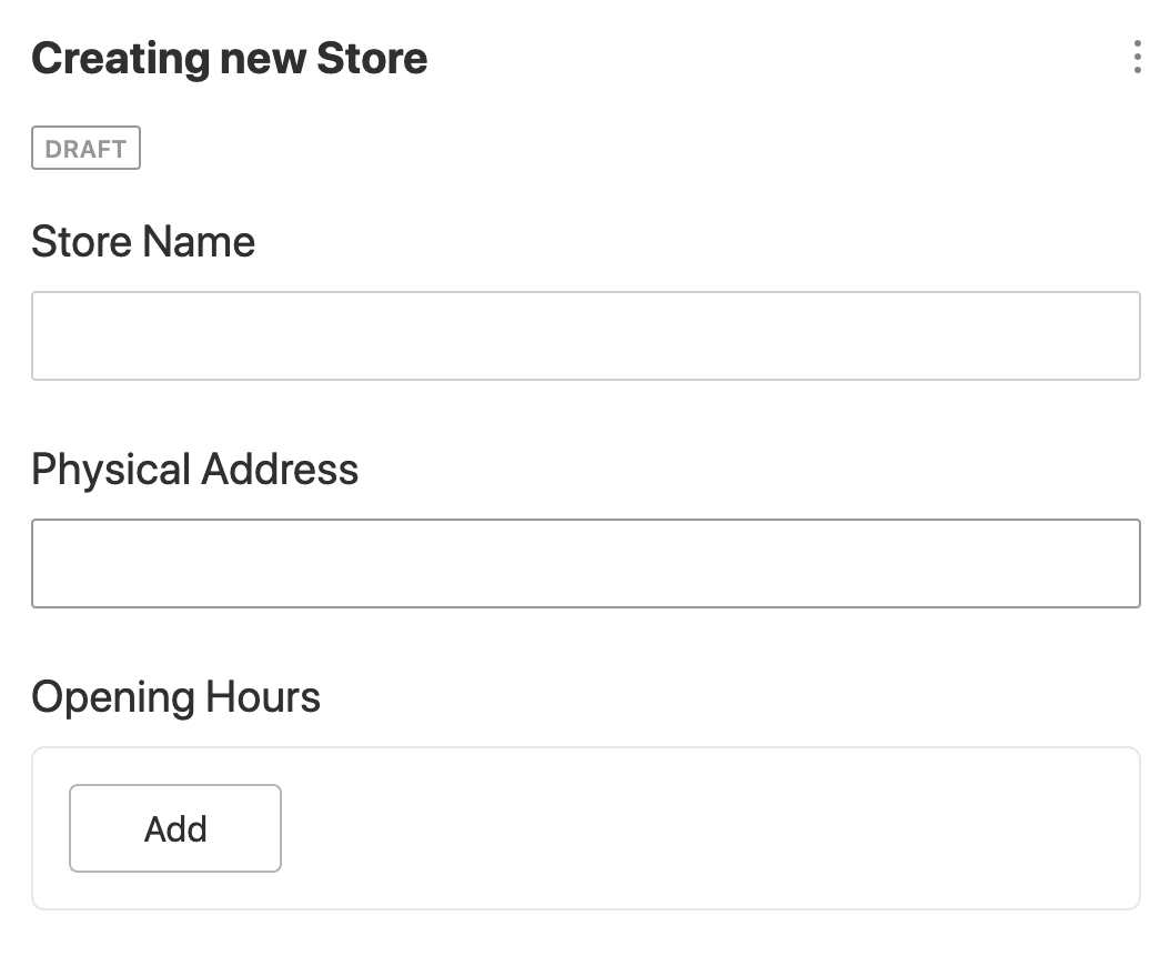
Good job! Let's give our new UI a spin! Run sanity start, point you browser to http://locahost:3333 and you should be able to create a new store document, and get a UI like this:
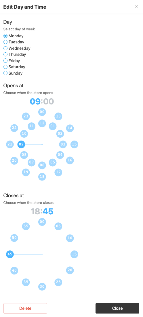
Under "Opening Hours", clicking the "Add" button will bring up a modal looking something like this:
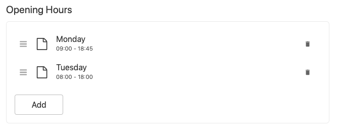
And once you have entered some data, the preview function we defined in the dayAndTime schema type will produce something like this:
Add Some Style
Some style customization is usually of value! Say we want a border of solid gold surrounding our time-picker (to make it look expensive) and also a hover effect which makes the background pink! To do that, we need to wire up our own CSS. Open components/TimeInput.js and add this line somewhere near the top:
import styles from './TimeInput.css'
And at the end, wrap <Timepicker /> in a <div> and give it a className like so:
<div className={styles.timePicker}>
  <Timepicker
    hours={hours}
    minutes={minutes}
    onChange={this.handleTimeChange}
    ref={this.timeInput}
  />
</div>
Next, create the file components/TimeInput.css and add
.timePicker {
  border: 2px solid gold;
  &:hover {
    background: linear-gradient(rgba(255,110,199,.7), rgba(255,110,199,.7));
  }
}
And voilà, CSS in effect!
Sanity – The Content Operating System that ends your CMS nightmares
Sanity replaces rigid content systems with a developer-first operating system. Define schemas in TypeScript, customize the editor with React, and deliver content anywhere with GROQ. Your team ships in minutes while you focus on building features, not maintaining infrastructure.
Sanity scales from weekend projects to enterprise needs and is used by companies like Puma, AT&T, Burger King, Tata, and Figma.