Last updated May 24, 2023
Top 5 rich-text React components
By William Ugonna Imoh & Joe Holmes

It's not flashy UIs or cutting-edge tech stacks that drive online traffic. It is content–communicative media such as text, images, and video published for an online audience–that most reliably brings people to websites and apps.
Knowing how to deliver content on your platform is essential for driving sustained, organic traffic. And one of the most important formats for developing such content is rich text: online text that comes with a large variety of expressive formatting options such as bolds, italics, bullet lists, hyperlinks, and so on.
Under the hood of your site or application, you need to be sure you're using the expressive powers of rich text to their full potential. Web libraries used to render and edit rich text need to be selected carefully, as content plays such a central role in an organization's web presence.
We've selected 5 of the top rich text components for the popular React.js framework below, so you can start delivering rich content faster and more expressively to your audiences.
TipTap
Billing itself as the "headless editor framework for web artisans," TipTap has set itself apart from the rich text pack by offering deep customization options and a robust extension system alongside polished, hosted options for real-time collaboration and editing.
TipTap also presents itself as framework-agnostic, so while you'll have the option to design your rich text system in React, you can also use TipTap in Vue, Svelte, Angular, and other frameworks.
Finally, TipTap's TypeScript support enables all the goodness of type safety and automatic documentation within your rich text system.
Installation
The easiest way to get started is to run the following:
npm install @tiptap/react @tiptap/pm @tiptap/starter-kit
The starter kit includes TipTap's most popular extensions, so you can easily get started quickly.
Usage
Usage for TipTap is straightforward after installation: create a component that calls its useEditor hook, then pass in the starter kit's extensions when the hook is initialized. Next, you can export TipTap's EditorContent component and pass in the values returned from the useEditor hook.
Now simply call that component, and you're good to go!
Pros
- Deeply powerful editor system based on the ProseMirror library
- Extensions allow for a user-friendly, customizable experience
- The "headless" approach gives developers full control over the presentation
Cons
- The "headless" approach also necessitates styling decisions, though this is mitigated by TipTap's extension system
- If you're looking for a lightweight or lower-level approach, TipTap might be a bit heavy
Lexical
Developed by Facebook, Lexical is a text editing engine focused on reliability, accessibility, and developer experience.
Though a lower-level library designed to help build one's own rich text interface, Lexical aims to make the process easy and fun by exposing a variety of ergonomic helper functions.
Like TipTap, Lexical is framework-agnostic, but comes with bindings and strong support for React.
Installation
Install Lexical and its React bindings via:
npm install --save lexical @lexical/react
Usage
After installation, you'll then proceed to import each Lexical module you'll need and make each module a child of the Lexical Composer component. See a functioning example in this CodeSandbox provided by their docs.
Pros
- It allows developers to create complex editor instances with ease, including attaching DOM elements, registering listeners, and implementing commands.
- Editor States in Lexical are immutable once created, ensuring consistency and making it easier to manage and track changes.
Cons
- It may prove to have a prohibitively high learning curve for simpler projects, as it's a low-level framework.
React Quill
Quill.js is a fast and lightweight rich text editor built with cross-platform and cross-browser support in mind.
Its strength also lies in its extensibility and configurability using themes.
React-Quill is a Quill component for React with support for TypeScript. React-Quill ships with a full-featured editor with the option to customize the toolbars and set up themes.
React-Quill is seamless to integrate. React-quill touts a hybrid input of controlled and uncontrolled behavior, using the component’s value prop bound to its state.
A theme specification and a function passed to the onChange prop of the component are only required to render the editor and handle data input.
React-Quill outputs HTML and can be used in JSX elements with dangerouslySetInnerHTML.
Installation
React-quill is installed via npm or yarn with:
npm install react-quill
yarn add react-quill
Usage
Import the React-quill component along with the theme required. The default theme Snow is used when a theme is not specified.
import ReactQuill from "react-quill"
import 'react-quill/dist/quill.snow.css'

export default function App() {
  const [convertedText, setConvertedText] = useState("Some default content");
  return (
    <div>
      <ReactQuill
        theme='snow'
        value={convertedText}
        onChange={setConvertedText}
        style={{minHeight: '300px'}}
      />
    </div>
  );
}
Pros
- Allows complete toolbar customization with HTML & JSX elements support
- Ease of setup and use
- It outputs HTML, so it serves simpler use cases like blog posts and content presentation layers with precise data requirements.
- Theming support for preset editor styling
Cons
- Limited customization of content blocks
- Security vulnerabilities of primarily rendering HTML
Slate
Slate.js, currently in beta, is a framework for building robust, rich text editors. Slate is made to be highly extensible, thus improving its native capabilities to create rich text editors. Slate is built with inspiration from tools including Quill and Draft.js.
Slate poses to solve several bottlenecks with managing rich text content, some we have seen previously in this post.
Slate aims to solve these challenges:
- Serialization to HTML & Markdown doesn’t ship out of the box
- Collaborative content creation is an afterthought
- Restrictive schema definition of document models
- Dynamic content creation should transcend beyond text, links, and media content
Installation
Slate is distributed as a monorepo and can be installed along with its React plugin using npm or yarn with:
npm install slate slate-react
yarn add slate slate-react
Slate also requires the installation of React and React-dom as peer dependencies.
Usage
A Slate editor’s essential representation is a fundamental contentEditable element, customized further until the desired functionality is achieved.
To use Slate, we import the slate editor composer and components from its React plugin.
import React, { useState, useMemo } from "react";
import { createEditor } from "slate";
import { Slate, Editable, withReact } from "slate-react";
In the imports we have:
Slate: A context provider component for the Slate editor. It’s a controlled component that tracks the full editor state and updates.
Editable: Renders an editable rich text document, similar to contentEditable.
withReact: Provides the editor with React specific functionalities
Creating an <SlateEditor/> component and rendering a simple editor, we have:
import React, { useState, useMemo } from "react";
import { createEditor } from "slate";
import { Slate, Editable, withReact } from "slate-react";
import "./styles.css";

export default function SlateEditor() {
  const editor = useMemo(() => withReact(createEditor()), []);
  const [value, setValue] = useState([
    {
      type: "paragraph",
      children: [{ text: "We have some base content." }]
    }
  ]);
  return (
    <div className="App">
      <h1>React Editors</h >
      <h2>Start editing to see Slate in action!</h2>
      <Slate
        editor={editor}
        value={value}
        onChange={(newValue) => setValue(newValue)}
      >
        <Editable style={{ border: "1px solid black" }}/>
      </Slate>
    </div>
  );
}
useMemo hook maintains a consistent editor object during the component update. We initialized the Slate controlled component’s state data with an array containing an object with a block and children.
Slate uses the default renderer, which outputs a div to render the default paragraph content. The editor can be extended further using events, custom renderers, custom elements, and commands to include controls, filters, and much more.
You can find out more on using Slate to build a fully-featured rich text editor similar to Medium and dropbox paper here.
Pros
- Ships robust APIs and handlers to build out fully featured rich text editors
- Dynamic content blocks with types to further customize or abstract portions of the content
- Outputs plain JSON; hence serialization to other data formats is seamless
- Extensible with the use of plugins
Cons
- Requires setup with a steep learning curve to handle simple content use cases
- Requires UI setup to operate controls in the editor
Jodit-React
Jodit is an open-source WYSIWYG editor written in TypeScript. Jodit-react, a wrapper for Jodit, is a great WYSIWYG rich text editor that ships with controls to handle most rich text formatting, links, and tables.
Installation
Install Jodit and jodit-react using npm and yarn with:
npm install jodit jodit-react
yarn add jodit jodit-react
Usage
Here’s the sample usage below to render a rich text editor with default controls and a handler to update the component state using the onBlur event.
import React, { useState, useRef } from "react";
import JoditEditor from "jodit-react";
import "./styles.css";
export default function App() {
const editor = useRef(null);
const [content, setContent] = useState("Start writing");
const config = {
readonly: false,
height: 400
};
const handleUpdate = (event) => {
const editorContent = event.target.innerHTML;
setContent(editorContent);
};
return (
<div className="App">
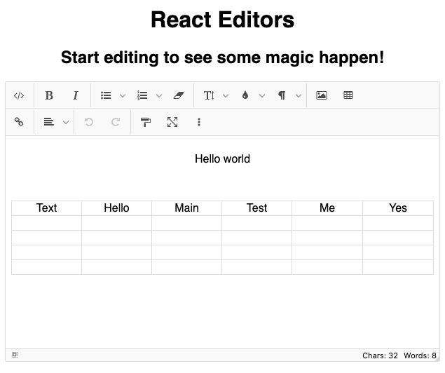
<h1>React Editors</h1>
<h2>Start editing to see some magic happen!</h2>
<JoditEditor
ref={editor}
value={content}
config={config}
onBlur={handleUpdate}
onChange={(newContent) => {}}
/>
<div dangerouslySetInnerHTML={{ __html: content }} />
</div>
);
}We imported the required modules and set up a basic config for the editor. You can find more editor config options here.
We proceed to create a function to handle state updates with data from the editor. <JoditEditor/> renders the editor, which looks like this:
Pros
- Provides themes and custom theme creation
- Easy to setup WYSIWYG editor for simple content requirements
- Provides custom controls and buttons to enhance the editor
- Allows the creation of custom plugins for editor extensibility
Cons
- Absence of block content with types for more in-depth content control
- It doesn’t support robust data requirements like embeds and collaborative content creation
- The content output is in HTML as typical with WYSIWYG editors, with potential security vulnerabilities when rendering the data using
dangerouslySetInnerHTMLin React.
Portable Text
Portable Text is a JSON-based open specification with a renewed approach to handling and presenting rich text in modern applications. Portable Text is created to solve challenges in creating rich content and its presentation in various differing interfaces.
Portable Text content can be serialized into any content format. Its customizable and extensible data structure serves a limitless approach to constructing multi-level content either with data entities as siblings or children.
Portable Text returns content in the form of an array containing blocks of child content with a style, types, and mark definitions - these are formats applied to content types. The JSON formatted portable text content is further transformed into any standard data format, including HTML and Markdown with serializers.
Sanity Studio
Sanity Studio is an open-source CMS with real-time collaboration on modern data requirements. Sanity utilizes Portable Text to serve block content created in the Sanity Studio. Portable text and the structured content approach of the Sanity Studio allow users to create various content models bordered on solving both domain and generalized content problems.
Sanity Studio also offers the ability to extend content solutions with plugins, integrations, and interfaces.
Sanity Studio installation
Sanity has multiple official templates to get started on a project quickly. These include starters for JAMStack frameworks like Next.js, Astro, Remix, and SvelteKit. There are starters for blogs, e-commerce sites, a portfolio website or a landing page with data from Sanity Studio.
Alternatively, we can create a new project from scratch using npm create sanity@latest.
To do this, install Sanity CLI globally with:
npm install -g @sanity/cli
On Sanity CLI installation completion, proceed to create a Sanity account or login from the CLI with:
sanity loginOnce we log in, we run npm create sanity@latest and follow the CLI prompts to create a new project. We’ll choose the default dataset configuration and any of the project templates. Here, we choose the blog template that ships with the schema.
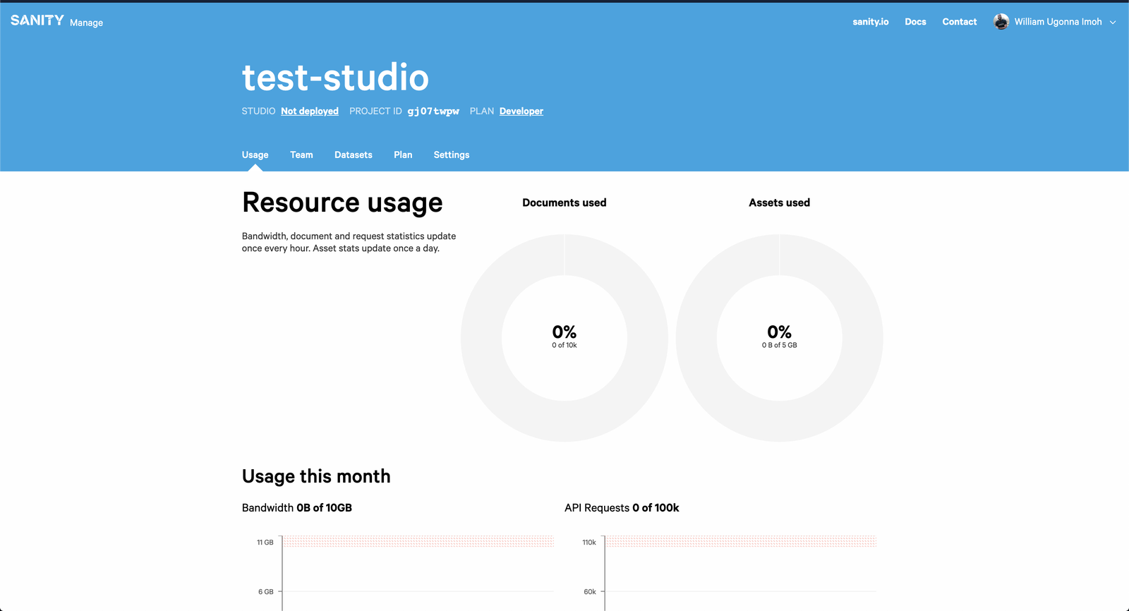
With the project’s successful setup, we change the directory into the project folder, and run sanity manage to open the project in the browser, and it looks like this:
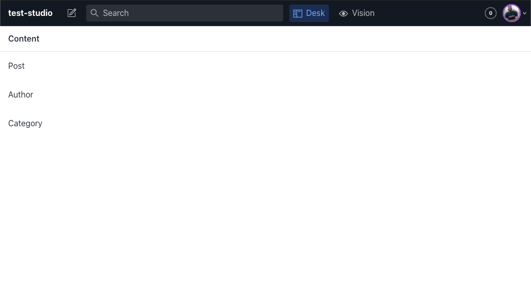
To open the studio locally, in the project directory, we run:
npx sanity devThis command creates a local development server on http://localhost:3333. The local studio looks like this with the blog data schema:
In the studio’s Post menu, we click the plus (+) icon on the top right corner to open the blog creation page. The blog editor contains a Portable Text rich-text editor for structured block content. We create a sample blog content with title and text content.
We’ll deploy a GraphQL API for the studio. This way, we can query data from the studio. We’ll do this with:
sanity graphql deploy
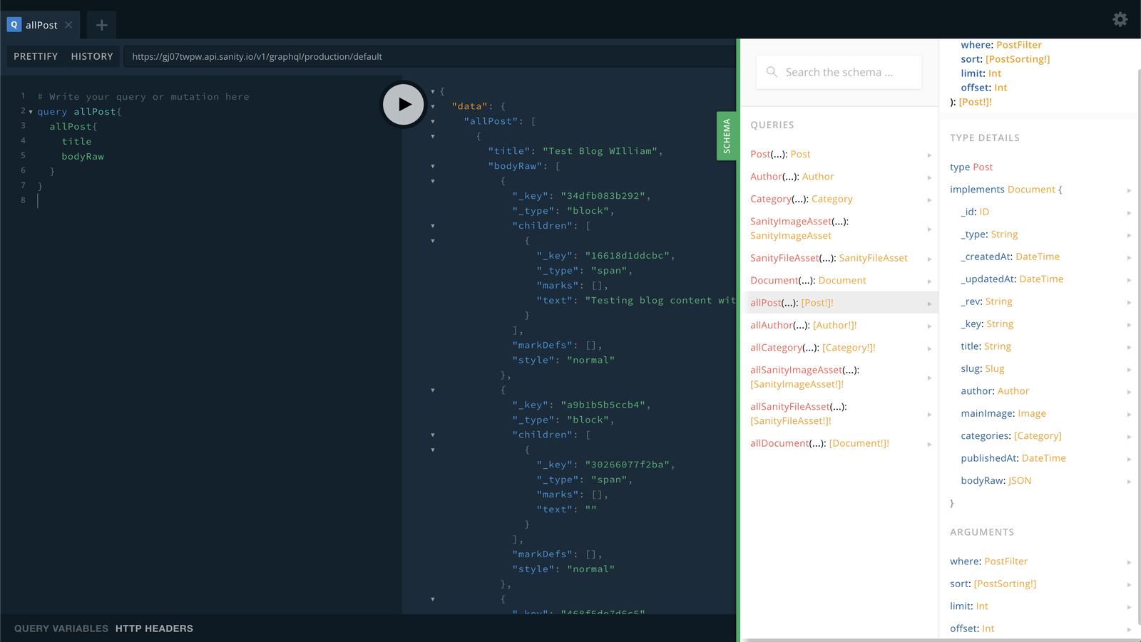
A GraphQL API is created and deployed to sanity with a default data tag. We’ll click the presented URL to see the schema in the GraphQL playground. Here’s a sample query to fetch the title and JSON Portable Text content in bodyRaw of all blog posts:
Sanity Studio Content in Gatsby.js
Gatsby.js is a tool for building super-fast single-page JAMstack applications. To use data from Sanity Studio in a atsby project, we require a source plugin for Gatsby.js. gatsby-source-sanity solves this.
We’ll install it with:
npm install gatsby-source-sanity
In a Gatsby project (different from the Sanity Studio project), we specify the plugin configuration in the plugins array of gatsby-config.js with:
module.exports = {
  plugins: [
    [...]
    {
      resolve: "gatsby-source-sanity",
      options: {
        projectId: "enter your project id",
        dataset: "production || any other dataset on sanity",
        token: "enter your sanity read token",
      }
    }
  ]
}
Refresh the Gatsby development server and open the GraphQL playground to see the source data from Sanity.
We can pull the content we want from Sanity into our Gatsby project, along with other content created on Sanity.
In Gatsby projects, we use @portabletext/react to serialize Portable Text.
Summary
In this post, we discussed five popular React rich text editors that can help your organization deliver rich text more effectively. We showed off some robust editors with support for block content, like Sanity, to WYSIWYG editors, like Jodit-React, for simpler content requirements. Each of these fits specific use cases depending on the project's complexity.
We discussed Portable Text and the problems it solves in dynamic content creation - lastly, we set up Sanity Studio with a blog schema that uses Portable Text. We created a GraphQL API for the content and utilized gatsby-source-sanity to source the GraphQL data into a Gatsby.js project, for just a small taste of the rich text power Sanity is capable of.
Sanity – The Content Operating System that ends your CMS nightmares
Sanity replaces rigid content systems with a developer-first operating system. Define schemas in TypeScript, customize the editor with React, and deliver content anywhere with GROQ. Your team ships in minutes while you focus on building features, not maintaining infrastructure.
Sanity scales from weekend projects to enterprise needs and is used by companies like Puma, AT&T, Burger King, Tata, and Figma.
