Published August 06, 2020
How to add promotional images to the 11ty Blog Starter

You can use the Sanity Asset Pipeline and 11ty shortcodes to return optimized and art directed images for various template types.
If you want to add a bit of visual interest to your blog posts, images are key. In this guide, we'll take the 11ty Blog Starter and add support for each post to have a "Main Image." The main image will be used for multiple views in 11ty. We’ll also make sure our editors can art direct the images, and that we optimize our images with performance in mind.
Key Concepts for adding promotional images
- Updating our GROQ query to pull the correct image information
- Creating 11ty Shortcodes to take advantage of Sanity's asset transformations
- Using our new shortcodes to pull the appropriate image size for our use cases
Before we get started
If you haven't run through the first post in this series, be sure to go through that guide's instructions. Once you have the project downloaded and set up, make sure you're running both the 11ty site and Sanity Studio. The best way to do this is to use npm run dev in the root folder of our project. This will run both 11ty and Studio in one command.
Updating the GROQ query to pull the post image data
To be able to display an image, first we need to have the data for the image. The 11ty Blog Starter’s Studio already supports an editor adding a promotional image.
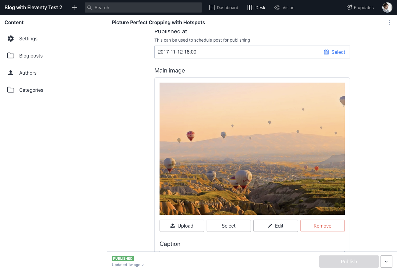
Let's take a look at a blog post and see what data we have available. If we navigate to an individual post inside of Studio, we can inspect the data for the post by clicking the three dots at the top right of the post editor window. From there, we click "Inspect" to get all the data available for our query.
If we look at the data, our field is called "Main Image." There's an object called mainImage, which contains the data we're looking for. On this object, we have a reference to our asset, but we also have more than that. There's an alt text field and a caption field. There are also two interesting objects: crop and hotspot.
{
  "_type": "mainImage",
  "alt": "A road lined by palm trees leading into an uncertain future",
  "asset": {
    "_ref": "image-cc93b69600f5cd1abce97fd0d4aa71793dbbba76-1350x900-png",
    "_type": "reference"
  },
  "caption": "Photo by Richard Jaimes",
  "crop": {
    "_type": "sanity.imageCrop",
    "bottom": 0.19718513694417317,
    "left": 0.47710843373493983,
    "right": 0.00120481927710836,
    "top": 0.16462245377908025
  },
  "hotspot": {
    "_type": "sanity.imageHotspot",
    "height": 0.5502990374644983,
    "width": 0.5100857459349317,
    "x": 0.7437523077554258,
    "y": 0.4397719725113294
  }
}
Above: The full mainImage object with a reference to the asset document, alternative text, caption, and the coordinates for the crop and hotspot.
This data will all be important to how we process the images in the frontend. To make our image data accessible in our 11ty templates, we change the query in our ~/web/_data/posts.js document. We need to add the mainImage object, in its entirety, into our data.
const projection = groq`{
    _id,
    publishedAt,
    title,
    slug,
    excerpt,
    mainImage,
    body[]{
      ...,
      children[]{
        ...,
        // Join inline reference
        _type == "authorReference" => {
          // check /studio/documents/authors.js for more fields
          "name": @.author->name,
          "slug": @.author->slug
        }
      }
    },
    "authors": authors[].author->
  }`
Now that we have the image data, we need to figure out how to use the object in 11ty.
Creating an 11ty Shortcode to manage images
For our main promotional images, we want to add them to 2 spots on our site. First, we want to add them to the top of the blog posts. We want those to be the natural aspect ratio provided by Sanity. For our second use case, we want a cropped, smaller image for our post list pages.
To do this, first, we need to be able to get the URL for the asset from Sanity's Asset Pipeline.
We could ship that specific piece of data to 11ty using our GROQ query, but we would have missed out on a lot of power by doing that.
Instead, we want to pass our entire image object to the @sanity/image-url NPM package.
This gives us a function to get the final URL for the image, but also creates various transformations on the asset before displaying it.
In this starter, we already have access to the image-url package and it's configured inside ~/web/utils/imageUrl.js. The function that file exports is a wrapper around the package that we import and use in our .eleventy.js configuration file.
Since 11ty is focused on author experience inside of templates, we don't necessarily have access to JavaScript in them. We need to create a template tag to get our image URLs in different contexts.
11ty gives us the ability to add custom tags to any or all of our template languages. To do it, we create a new Shortcode in our configuration file.
Shortcode 1: Create an image URL and constrain the width of the image returned
{% imageUrlFor imageObject, 900 %}In our first shortcode, we want to request an image URL from Sanity. For performance reasons, we don't want a full-size image. Instead, we request an image with a maximum width set.
First, we need to register a custom shortcode with 11ty. To do that, we'll use the addShortcode method on the eleventyConfig object.
const urlFor = require('./utils/imageUrl');

module.exports = function(eleventyConfig) {

  eleventyConfig.addShortcode('imageUrlFor', (image, width="400") => {
    return urlFor(image)
      .width(width)
      .auto('format')
  })

}
The addShortcode method takes two arguments: a string that we use in our templates and a function to run when the shortcode is used in templates. In our first shortcode, our function takes two arguments. The first is the image object we get from our GROQ query. The second is a unitless width value.
We start by requiring the urlFor function at the top of our .eleventy.js file and use that with an immediate return in our shortcode's function.
We reference the urlFor function and pass our image object into it. After that, we chain multiple transformations onto that image. In this case, we adjust the image's intrinsic width.
By passing the entire image object into the package, we get back the image as it was cropped by an editor in Studio.
Protip: For extra performance gain, we also append .auto('format') to return an image in the best file type for the current browser. In other words, for browsers that support formats like WebP, the function returns a WebP image. For those that don't, it returns a more traditional format like JPEG or PNG.
Shortcode 2: Getting a cropped image for use on the blog list page
We'll do a similar function for a cropped image, as well.
In this shortcode, we pass both a width and a height. The Asset Pipeline returns a cropped image that matches the height and width. Because we pass the entire object to the image-url function, it has access to the "hotspot" coordinates that an editor set. This hotspot is respected in the crop that is returned.
eleventyConfig.addShortcode('croppedUrlFor', (image,width,height) => {
    return urlFor(image)
      .width(width)
      .height(height)
      .auto('format')
  })
Gotcha: The image-url package will also work if you only pass it an image reference. If you just pass the reference, however, you won't get the benefits of the crop and hotspot. This is why we pass the full object.
Using the shortcodes inside a template
Now that we have these shortcodes, we can use them in any template we need to. These work in our Nunjucks templates, but also in Liquid, and Handlebars.
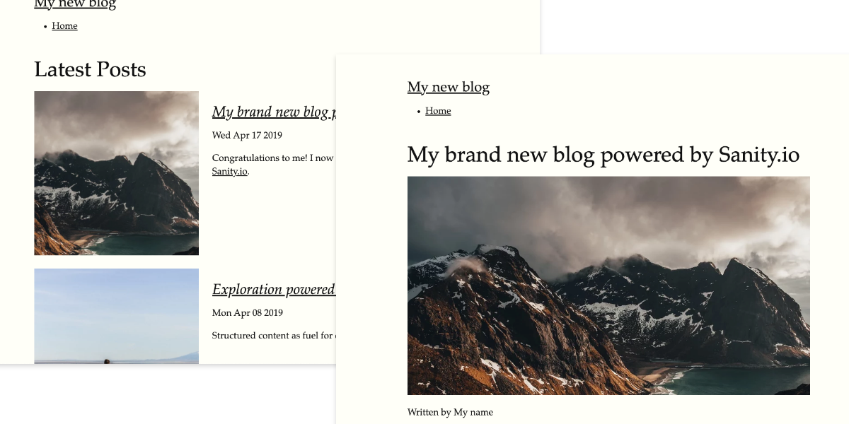
First, we modify our ~/web/_includes/layouts/post.njk to pull a mainImage for each post.
Traditionally, this type of image is either just before or just after the headline of a blog post. Our image shortcode doesn't include the HTML needed to render an image, so we still need to write that.
Inside our shortcode, we provide the image object and an appropriate width value for this use case.
<!-- ~/web/_includes/post.njk -->
---
layout: layouts/base.njk
templateClass: tmpl-post
---
<article>
  <h1>{{ post.title }}</h1>

  <!-- Using the new tag -->
  <img src="{%  imageUrlFor imageObject, 900  %}" alt="{{ post.mainImage.alt }}">

  <p>Written by {% for author in post.authors %}{{author.name}}{% endfor %}  </p>
  {{ post.body | markdownify | safe }}
  <p><a href="{{ '/' | url }}">← Home</a></p>
</article>With this code added to our template, we can navigate to any of our blog posts and see the image render on the page. Currently, the image will always be 900 pixels wide. We need to change a little CSS to make sure our image sizes responsively.
Head into ~/web/_includes/style.css and we add one small snippet of CSS to make sure that our images won't exceed the size of their containers.
/* ~/web/_includes/style.css

/*
  ... existing code
*/

img {
    max-width: 100%;
}
After this, we have our main image displayed at 900px wide on screens that support wider images and scale down for smaller browsers.
To use our cropped tag, we do something similar on our homepage and archive page. To add this to both pages, we open our include that controls the list on both of these pages: ~/web/_includes/postslist.njk.
To use the croppedUrlFor, we pass the image object, a width, and a height.
<!-- ~/web/_includes/postslist.njk -->
<ol reversed class="postlist">
{% for post in postslist | reverse %}
  {% set currentPost = post.data.post %}
  <li class="postlist-item{% if post.url == url %} postlist-item-active{% endif %}">

    <img src="{% croppedUrlFor currentPost.mainImage, 600, 600 %}" alt="{{ currentPost.mainImage.alt }}">

    <div class="post-content">
      <h2><a href="{{ post.url | url }}" class="postlist-link">{% if currentPost.title %}{{ currentPost.title }}{% else %}<code>{{ post.url }}</code>{% endif %}</a></h2>
      <time class="postlist-date" datetime="{{ currentPost.publishedAt }}">{{ currentPost.publishedAt|readableDate }}</time>
      {{ currentPost.excerpt | markdownify | safe }}
    </div>
  </li>
{% endfor %}
</ol>
At this point, we have a square image, served at those exact dimensions.
Next Steps
With image transformations, there’s a lot of power we can bring to our 11ty site’s visuals. If you want to do a deeper dive into the world of web performance, you could create a new shortcode to manage a large range of sizes for a responsive image or picture element through srcset or source elements.
Managing height and width is just scratching the surface of what the Asset Pipeline can produce. You can also transform your images by changing saturation, orientation, and even blur. Pick a transformation and implement a shortcode to use it in your templates.
Sanity – The Content Operating System that ends your CMS nightmares
Sanity replaces rigid content systems with a developer-first operating system. Define schemas in TypeScript, customize the editor with React, and deliver content anywhere with GROQ. Your team ships in minutes while you focus on building features, not maintaining infrastructure.
Sanity scales from weekend projects to enterprise needs and is used by companies like Puma, AT&T, Burger King, Tata, and Figma.