Create interactive array items for featured elements
Save time going in-and-out of modals by moving some light interactivity to array items.
This developer guide was contributed by Simeon Griggs (Principal Educator).
Save time going in-and-out of modals by moving some light interactivity to array items.
What you need to know:
This guide assumes that you know how to set up and configure a Sanity Studio and have basic knowledge about defining a schema with document and field types. Basic knowledge of React and TypeScript is also useful, although you should be able to copy-paste the example code to get a runnable result.
Custom form components by example
One of Sanity Studio’s most powerful features is custom drop-in replacements for form fields. This guide is one in a series of code examples.
You can get more familiar with the Form Components API in the documentation.
- Create a “coupon generator” string field input
- Create a visual string selector field input
- Create a survey rating number field input
- Create a time duration object field
- Create an array input field with selectable templates
- Create interactive array items for featured elements
- Create richer array item previews
- Create a document form progress component
What you’ll be learning
In this guide, you will learn how to:
- Create a custom array item input with a toggle that can write changes to multiple values on the array
- Add advanced customization to list previews
- Write custom validation rules for array fields
- Decorate and customize native array items using
renderPropsand Sanity UI - Use the
pathargument to patch values in specific array items
Schema preparation
In this example you’ll create readingList documents that have an array of recommendations. The array items include an object with a reference to a book, and whether it is “featured” or not.
Create the following schema types in your Studio to get started.
First, a simple document type for a book:
// ./schema/bookType.ts

import {defineField, defineType} from 'sanity'
import {BookIcon} from '@sanity/icons'

export const bookType = defineType({
  name: 'book',
  title: 'Book',
  type: 'document',
  icon: BookIcon,
  fields: [
    defineField({
      name: 'title',
      type: 'string',
    }),
    defineField({
      name: 'author',
      description: 'This field should be a reference, but is a string in this demo for brevity',
      type: 'string',
    }),
    defineField({
      name: 'year',
      type: 'number',
    }),
  ],
  preview: {
    select: {
      title: 'title',
      author: 'author',
      year: 'year',
    },
    prepare: ({title, author, year}) => ({
      title,
      subtitle: `${author} (${year})`,
    }),
  },
})
Next, a recommendation object schema.
Note the comprehensive preview key setup so that list items are displayed with rich information about the object.
// ./schema/recommendation/recommendationType.ts

import {defineField, defineType} from 'sanity'
import {BookIcon} from '@sanity/icons'

export const recommendationType = defineType({
  name: 'recommendation',
  title: 'Recommendation',
  type: 'object',
  fields: [
    defineField({
      name: 'book',
      type: 'reference',
      to: [{type: 'book'}],
    }),
    defineField({
      name: 'featured',
      type: 'boolean',
      initialValue: false,
    }),
  ],
  preview: {
    select: {
      title: 'book.title',
      author: 'book.author',
      year: 'book.year',
      featured: 'featured',
    },
    prepare: ({title, author, year, featured}) => ({
      title: [featured ? '⭐️ ' : '', `${title ?? `No book selected`}`].join(` `),
      subtitle: author && year ? `${author} (${year})` : undefined,
      media: BookIcon,
    }),
  },
})
Lastly, you’ll need a place to use these fields. Create a new document schema named readingList
// ./schema/readingListType.ts

import {Reference, defineField, defineType, isKeyedObject} from 'sanity'

type Recommendation = {
  _key?: string
  book?: Reference
  featured?: boolean
}

export const readingListType = defineType({
  name: 'readingList',
  title: 'Reading list',
  type: 'document',
  fields: [
    defineField({
      name: 'title',
      type: 'string',
    }),
    defineField({
      name: 'recommendations',
      type: 'array',
      of: [{type: 'recommendation'}],
      validation: (rule) =>
        rule.custom((items?: Recommendation[]) => {
          const featuredItems = items ? items.filter((item) => item.featured) : []

          if (featuredItems.length > 1) {
            return {
              paths: featuredItems.filter(isKeyedObject).map((item) => [{_key: item._key}]),
              message: 'Only one book can be featured',
            }
          }

          return true
        }),
    }),
  ],
})
Take note of the validation rule above that will look through the list and check if there is more than one “featured” item. If so, an array of paths is returned to mark each featured item as invalid. It’s important to give authors absolute clarity if something is invalid and what must be done to resolve it.
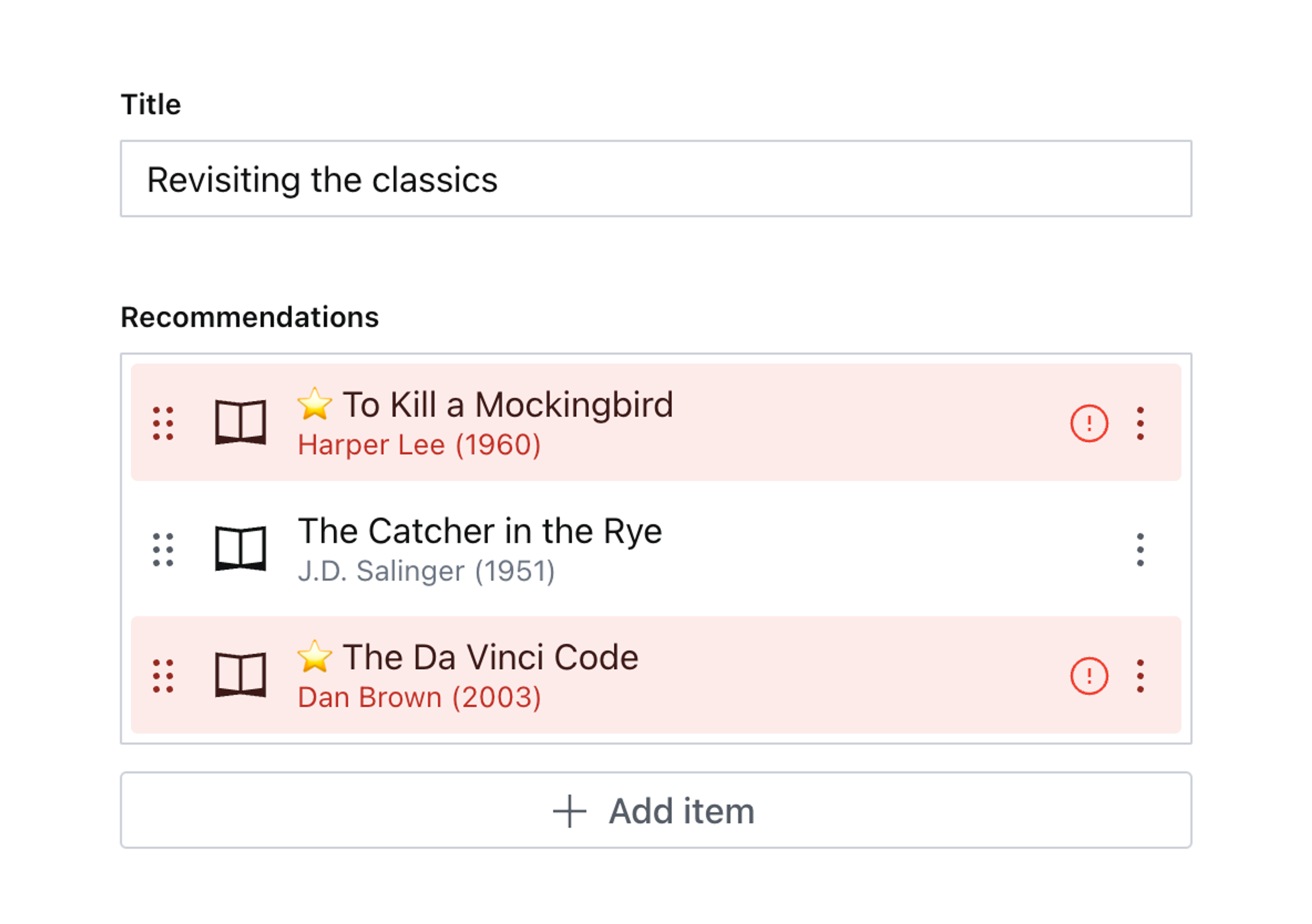
Create and publish some book documents and a “Reading list” document with some recommendations. It should look something like this:
This is a great start; rich list previews and clear validation warnings where necessary.
The authoring experience could still be better. Consider the many operations our content creators will take to remove all the “featured” values from each array item individually!
Instead, you could create a custom item to render a button to write changes to the field without having to enter any modals.
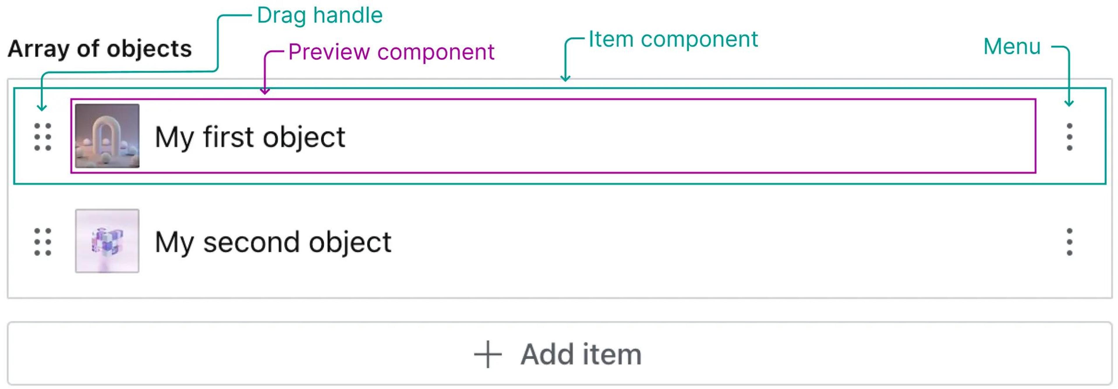
Custom items
A schema field’s “item” is used when an object is displayed in an array – including inside a Portable Text field.
For more details, see the Form Components documentation.
To start, create a new item component which will render a Switch input component from Sanity UI, along side each array item’s out-of-the-box preview:
// ./schema/recommendation/RecommendationItem.tsx

import {ObjectItemProps} from 'sanity'
import {Box, Flex, Switch} from '@sanity/ui'
import {Recommendation} from './recommendationType'

export function RecommendationItem(props: ObjectItemProps<Recommendation>) {
  return (
    <Flex gap={3} paddingRight={2} align="center">
      <Box flex={1}>{props.renderDefault(props)}</Box>
      <Switch checked={props?.value?.featured} />
    </Flex>
  )
}
A TypeScript thing to notice is that the ObjectItemProps type is generic and can take in the Recommendation type, this will be applied to value of props.
Import this component in the recommendation schema field and add it to the components.item property in the schema type definition:
// ./schema/recommendation/recommendationType.ts
import {RecommendationItem} from './RecommendationItem'
export const recommendationType = defineType({
name: 'recommendation',
// ...all other settings
components: {item: RecommendationItem},
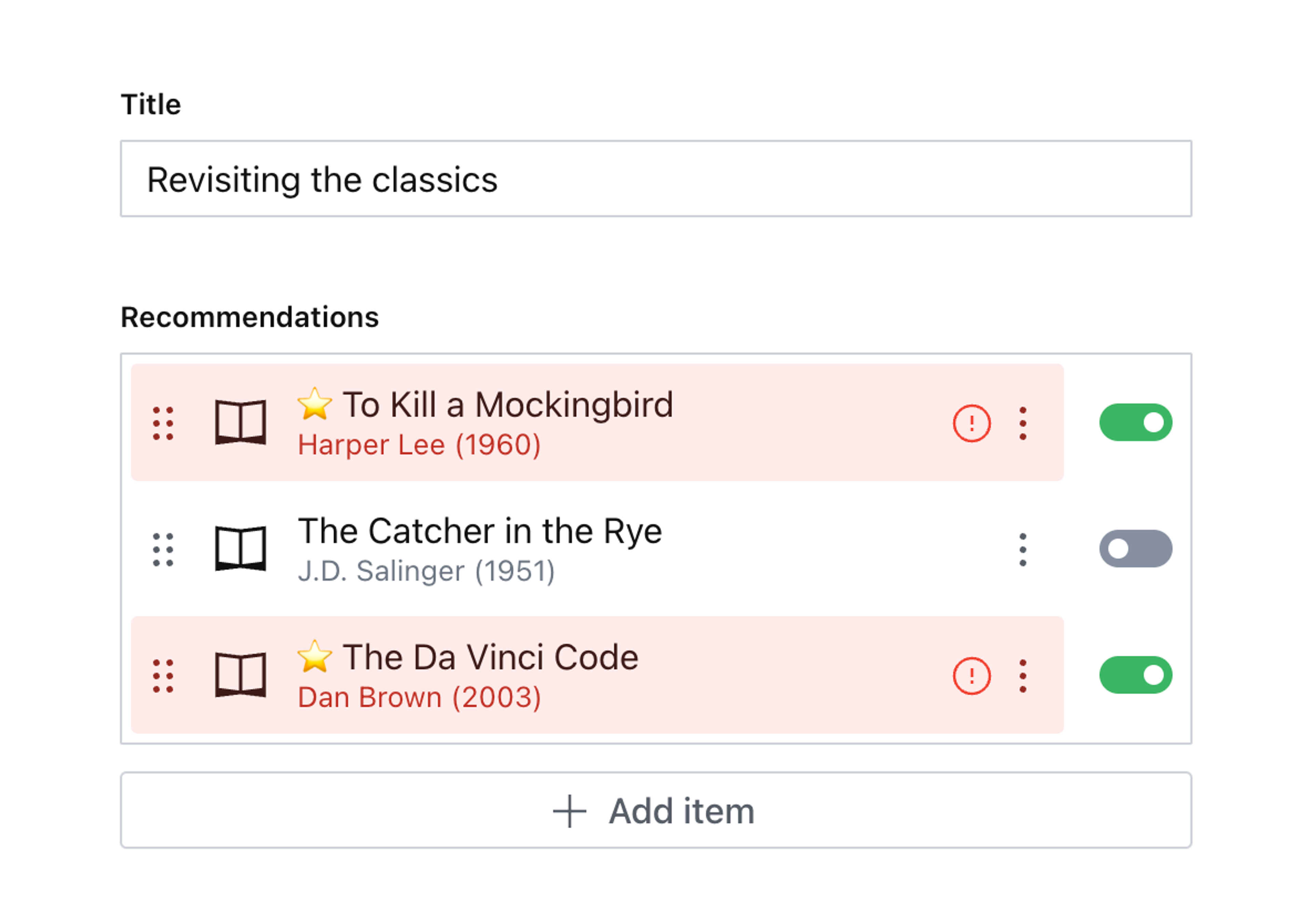
})Now when editing the same field, you get the same experience, but an additional toggle has been added to the right-hand side of the item.
You can click it, but it won’t do anything … yet!
Handling updates for values in array items
Customizing the array item is typically used to add extra context. Since this example will write changes to the document, you’ll need to dig a bit deeper for some functions.
The example below uses a hook currently marked as internal: useDocumentPane. There may be upcoming changes to the Studio that break its functionality. This guide will be updated when that happens.
Update the component code to match the example below.
// ./schema/recommendation/RecommendationItem.tsx

import {ObjectItemProps, PatchEvent, set, useFormValue} from 'sanity'
import {Box, Flex, Switch} from '@sanity/ui'
import {useDocumentPane} from 'sanity/desk'
import {useCallback} from 'react'
import {Recommendation} from './recommendationType'

export function RecommendationItem(props: ObjectItemProps<Recommendation>) {
  const {value, path} = props

  // Item props don't have `onChange`, but we can get it from useDocumentPane()
  // This hook is currently marked internal – be aware that this can break in
  // future Studio updates
  const {onChange} = useDocumentPane()

  // Get the parent array to check if any other items are featured
  const parentPath = path.slice(0, -1)
  const allItems = useFormValue(parentPath) as Recommendation[]

  const handleClick = useCallback(() => {
    const nextValue = value?.featured ? false : true
    const clickedFeaturedPath = [...path, 'featured']
    const otherFeaturedPaths = allItems.length
      ? allItems
          ?.filter((p) => p._key !== value?._key && p.featured)
          .map((p) => [...parentPath, {_key: p._key}, 'featured'])
      : []

    // Because onChange came from useDocumentPane
    // we need to wrap it in a PatchEvent
    // and supply the path to the field
    onChange(
      PatchEvent.from([
        // Update this field
        set(nextValue, clickedFeaturedPath),
        // Maybe update other fields
        ...otherFeaturedPaths.map((path) => set(false, path)),
      ])
    )
  }, [value?.featured, value?._key, path, allItems, onChange, parentPath])

  return (
    <Flex gap={3} paddingRight={2} align="center">
      <Box flex={1}>{props.renderDefault(props)}</Box>
      <Switch checked={value?.featured} onClick={handleClick} />
    </Flex>
  )
}
Note some of the hooks being used to power this component.
useDocumentPanecontains the root-level context for many of the functions passed down to individual inputs. Because a custom item does not currently receiveonChange– like a custom input – the document context is where you need to access ituseFormValueis a way to retrieve values from the current document at a specified path. Since this custom component loads for each individual item in the array, this hook is required to get the outer “parent” value of every item in the array. This is how the component knows to removefeaturedfrom other items, when adding it to this item.- The
handleClickfunction updates thefeaturedvalue of this item to either true or false – as well as setting other items false if they are true. Notice how eachset()function includes a path to each specific item.
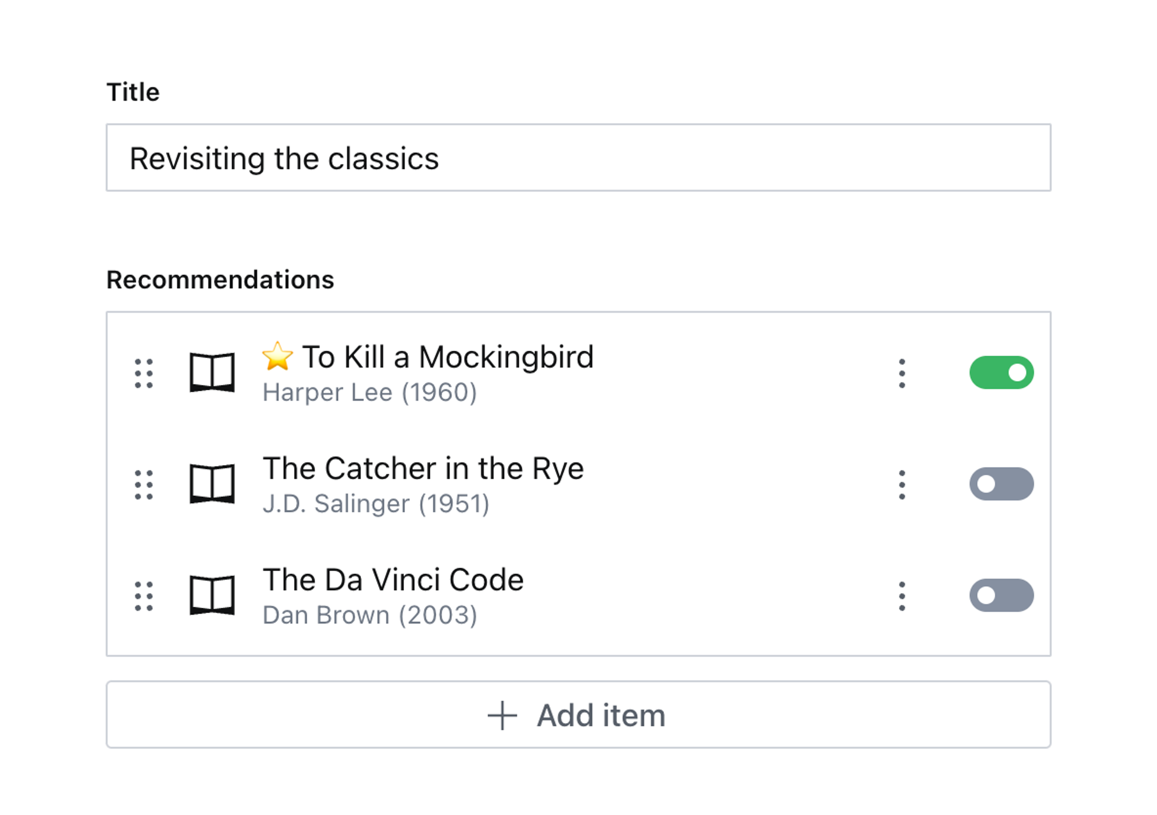
Now back to your custom item component; not only can you update the featured value from the array list itself – other featured items will be set to false. Not only is this experience faster, but it’s also better! It’s impossible to put any item into an invalid state using these new controls.
Next steps
- Consider other ways an interactive element displayed in an array item might be used. Consider copy and paste between documents, and multi-select.
- This idea might apply to other schema types, like an array of quiz questions where only one can be marked as correct.