How to use structured content for page building
Learn how to create a page builder from structured content that can withstand the test of time and redesigns.
This developer guide was contributed by Knut Melvær (Head of Developer Community and Education), Simeon Griggs (Principal Educator), and Irina Blumenfeld (Solution Architect @ Sanity).
You can use structured content to make landing page builders that will be useful beyond your next redesign. This guide shows you the basics of page building, and offers advice for dealing with presentation-related concerns.
Building with Next.js? We have a complete course on Sanity Learn covering why and how to implement a page builder within an application. Check it out!
Sanity can be used to manage things like landing page builders: they give editors enough control over page composition to get their message across using content modules, without breaking layout.
In this guide, you’ll find suggestions for how to create content modules for page builders that should nicely translate to a component-based frontend framework or design system.
While page builders can be a very handy approach to content creation, it's worth asking yourself if a page builder is what you actually need. You can also arrive at compelling combinations of content and presentation by sourcing content from from various places using simple rules in your frontend.
Why you should model for meaning, not presentation
The goal of structured content is to make sure that your content stays resilient, adaptable, and easy to integrate wherever you need it. That’s why you should generally make content models that reflect your content's meaning rather than how it is presented. Because different presentation contexts (even within the same medium) come with different constraints: what makes sense on the web might not make sense in an app, and so on.
This guide makes no assumptions about presentation: no colors, floats, etc. While it might be tempting to add these, we think it best to leave those kinds of concerns to your code. They can add complexity to the implementation and to the things editors need to keep track of.
Think about your next redesign. Would you rather:
- Start with clean content that you can apply to a new channel or design?
- Or, have to untangle your core content from a lot of presentation-related stuff that only made sense to your last design?
We find that modeling for meaning leads to better workflows and more durable content.
The rest of this guide involves a basic knowledge of schema building with Sanity.io. If you’ve never made one before, take a 3 minute detour to learn the basics of schema configuration, and/or keep our schema docs open as a reference .
Set up a page builder
The page builder is typically an array of custom object or reference types that can be reordered. It's the container for all your building blocks. With Sanity, there are no pre-built blocks for you to use, but it's fast and easy to make what you need.
If you use objects, the content is easier to query but trapped within the document.
If you use references, the content can be reused between documents, and your queries must resolve them.
Let's add some blocks you’d expect to see on a typical landing page:
- Hero: for your boldest statements
- Text + illustration: when words aren’t enough
- Call to action: a reference to a "promotion" document
- Gallery: for eye candy 🍬
- Form: newsletter signups, contact, etc
- Video: for your latest promo clip or live stream recording
Now let's bring them to life in a bare-bones document type called page:
// ./schemas/pageType.ts

import {defineArrayMember, defineField, defineType} from 'sanity'

export const pageType = defineType({
  name: 'page',
  type: 'document',
  title: 'Page',
  fields: [
    defineField({name: 'title', type: 'string'}),
    defineField({
      name: 'pageBuilder',
      type: 'array',
      title: 'Page builder',
      of: [
        defineArrayMember({
          name: 'hero',
          type: 'hero',
        }),
        defineArrayMember({
          name: 'textWithIllustration',
          type: 'textWithIllustration',
        }),
        defineArrayMember({
          name: 'gallery',
          type: 'gallery',
        }),
        defineArrayMember({
          name: 'form',
          type: 'form',
        }),
        defineArrayMember({
          name: 'video',
          type: 'video',
        }),
        defineArrayMember({
          name: 'callToAction',
          type: 'reference',
          to: [{type: 'promotion'}],
        }),
        // etc...
      ],
    }),
  ],
})
All the fields within the pageBuilder array are selectable types that authors can build with. The custom types named here are not yet registered to the schema and will need to be created. As well as the "promotion" document type used by the callToAction reference field.
Modeling the content blocks
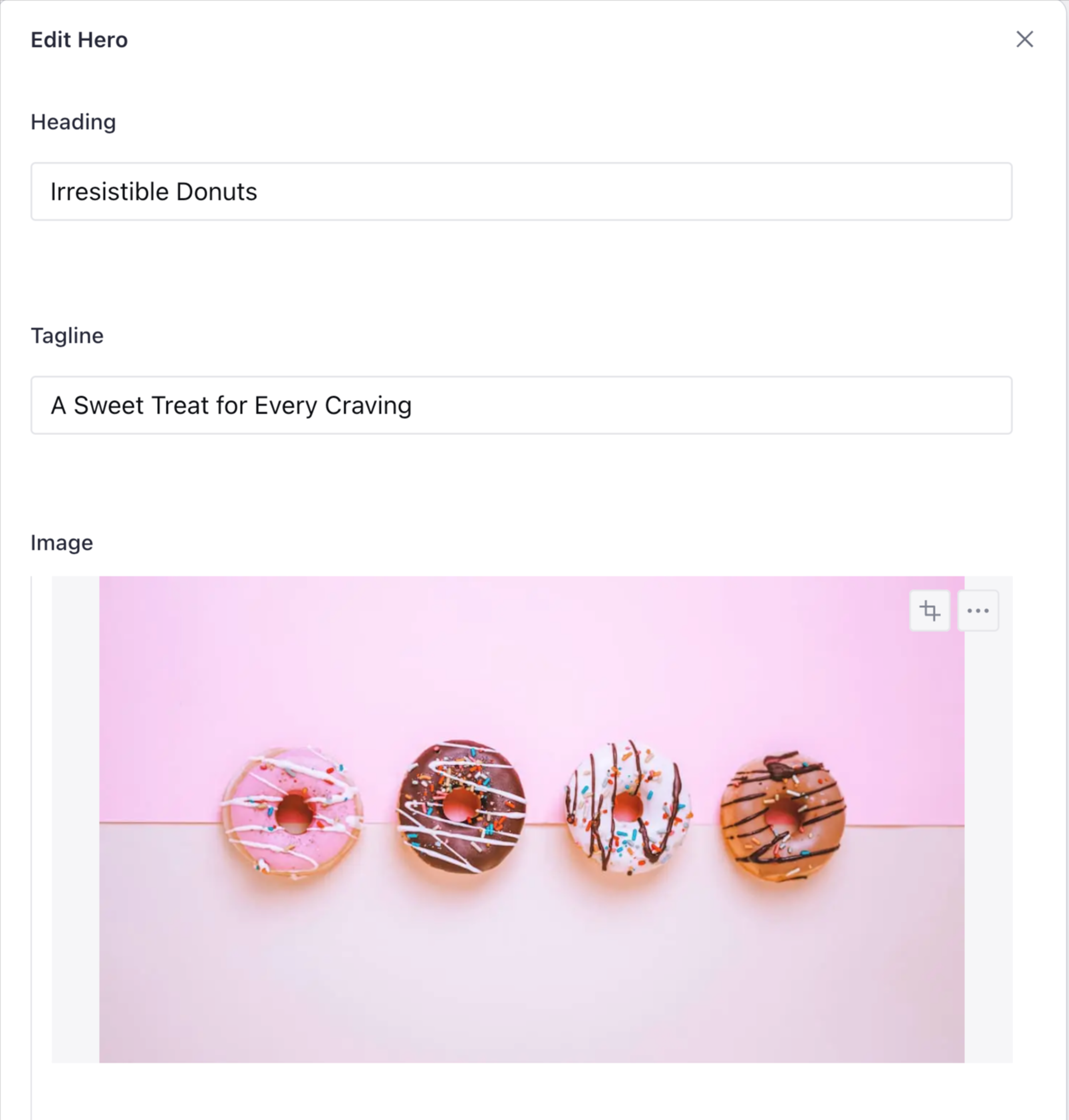
Hero
Let's setup heroType.ts as an object type so that it can be reused elsewhere in our schema if we need it. We’ll add fields for heading, tagline, and an image.
// ./schemas/heroType.ts

import {defineField, defineType} from 'sanity'

export const heroType = defineType({
  name: 'hero',
  type: 'object',
  title: 'Hero',
  fields: [
    defineField({
      name: 'heading',
      type: 'string',
    }),
    defineField({
      name: 'tagline',
      type: 'string',
    }),
    defineField({
      name: 'image',
      type: 'image',
      options: {hotspot: true},
      fields: [
        defineField({
          name: 'alt',
          type: 'string',
          title: 'Alternative text',
        }),
      ],
    }),
  ],
})
We enabled the hotspot option for art direction in the image field and added a simple string field for alternative text. Alt-text provides a text-based alternative to non-text content (like images) on web pages. Among other things, it helps vision-impaired people understand the meaning of your images.
You may consider enforcing the existence of alt-text by applying validation to this field.
Those fields will look like this in your Sanity Studio:
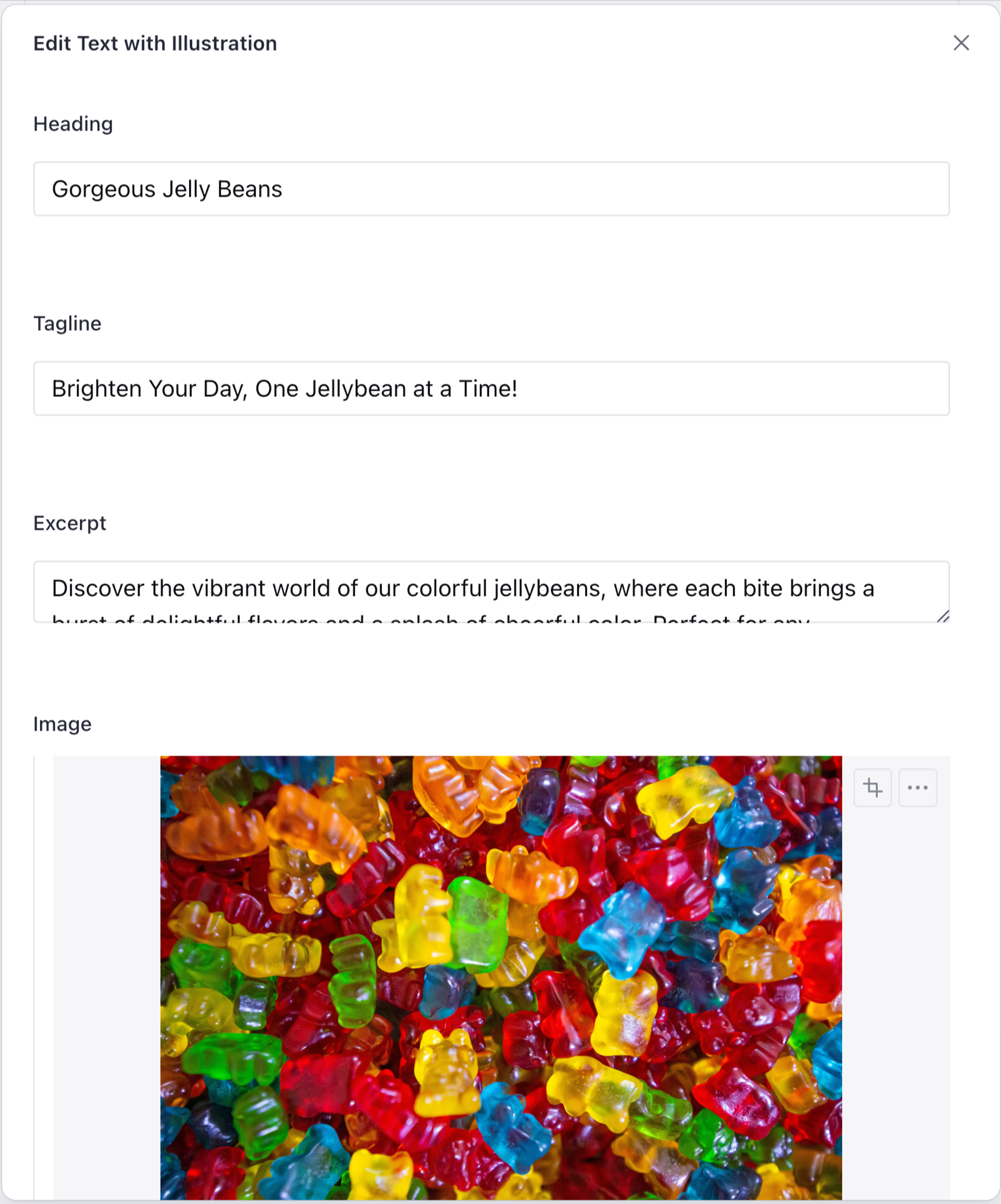
Text with illustration
This object looks a lot like our hero, except we’ve added a field called excerpt to store multiline text content.
// ./schemas/textWithIllustration.js

import {defineField, defineType} from 'sanity'

export const textWithIllustrationType = defineType({
  name: 'textWithIllustration',
  type: 'object',
  title: 'Text with Illustration',
  fields: [
    defineField({
      name: 'heading',
      type: 'string',
    }),
    defineField({
      name: 'tagline',
      type: 'string',
    }),
    defineField({
      name: 'excerpt',
      type: 'text',
    }),
    defineField({
      name: 'image',
      type: 'image',
      options: {hotspot: true},
      fields: [
        defineField({
          name: 'alt',
          type: 'string',
          title: 'Alternative text',
        }),
      ],
    }),
  ],
})
If you need more than plain text you could use the block content type to include things like bold, italics, etc.
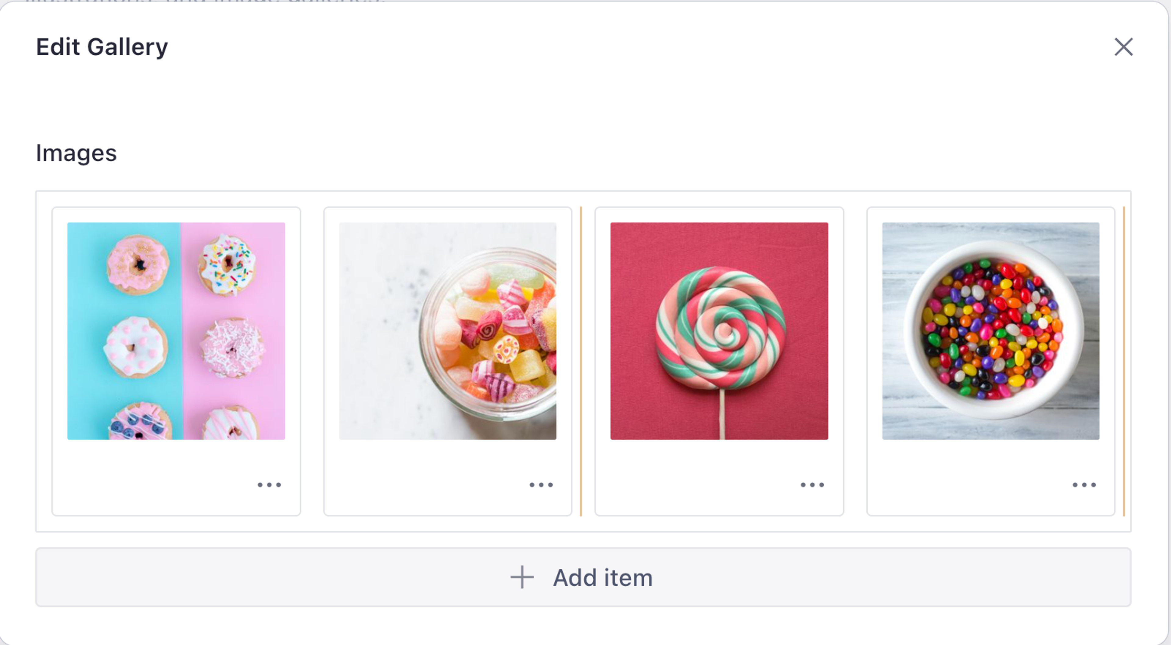
Image gallery
When you strip away all the presentation concerns, a gallery is just a sortable list of images. Normally the array type presents a vertically draggable list, but if you set it to grid it will do look like the example above. Here's how you do it:
// imageGallery.js

import {defineField, defineType} from 'sanity'

export const imageGalleryType = defineType({
  name: 'gallery',
  type: 'object',
  title: 'Gallery',
  fields: [
    {
      name: 'images',
      type: 'array',
      of: [
        defineField({
          name: 'image',
          type: 'image',
          options: {hotspot: true},
          fields: [
            {
              name: 'alt',
              type: 'string',
              title: 'Alternative text',
            },
          ],
        }),
      ],
      options: {
        layout: 'grid',
      },
    },
  ],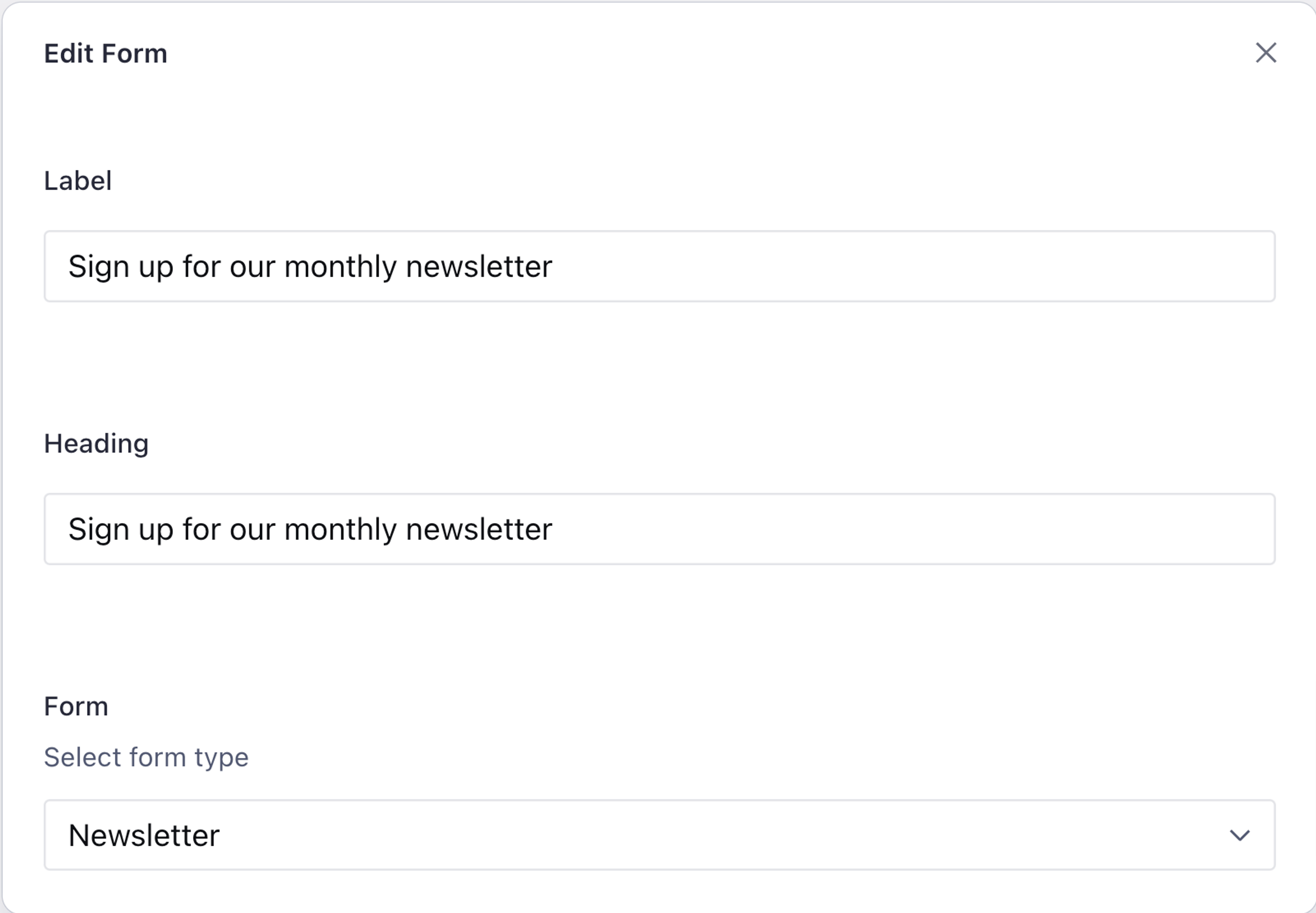
})Form
Forms come in many different shapes and sizes. In order to preserve the durability of our content structure beyond the next redesign, all we really need to do is declare the kind of form we want to embed in our page builder array. Here's an example presenting 3 variations for newsletter, register, and contact form types:
// ./schemas/formType.js

import {defineField, defineType} from 'sanity'

export const formType = defineType({
  name: 'form',
  type: 'object',
  fields: [
    defineField({
      name: 'label',
      type: 'string',
    }),
    defineField({
      name: 'heading',
      type: 'string',
    }),
    defineField({
      name: 'form',
      type: 'string',
      description: 'Select form type',
      options: {
        list: ['newsletter', 'register', 'contact'],
      },
    }),
  ],
})You can then use frontend code to provide varying presentations of your forms depending on the page context, and the type of form you selected.
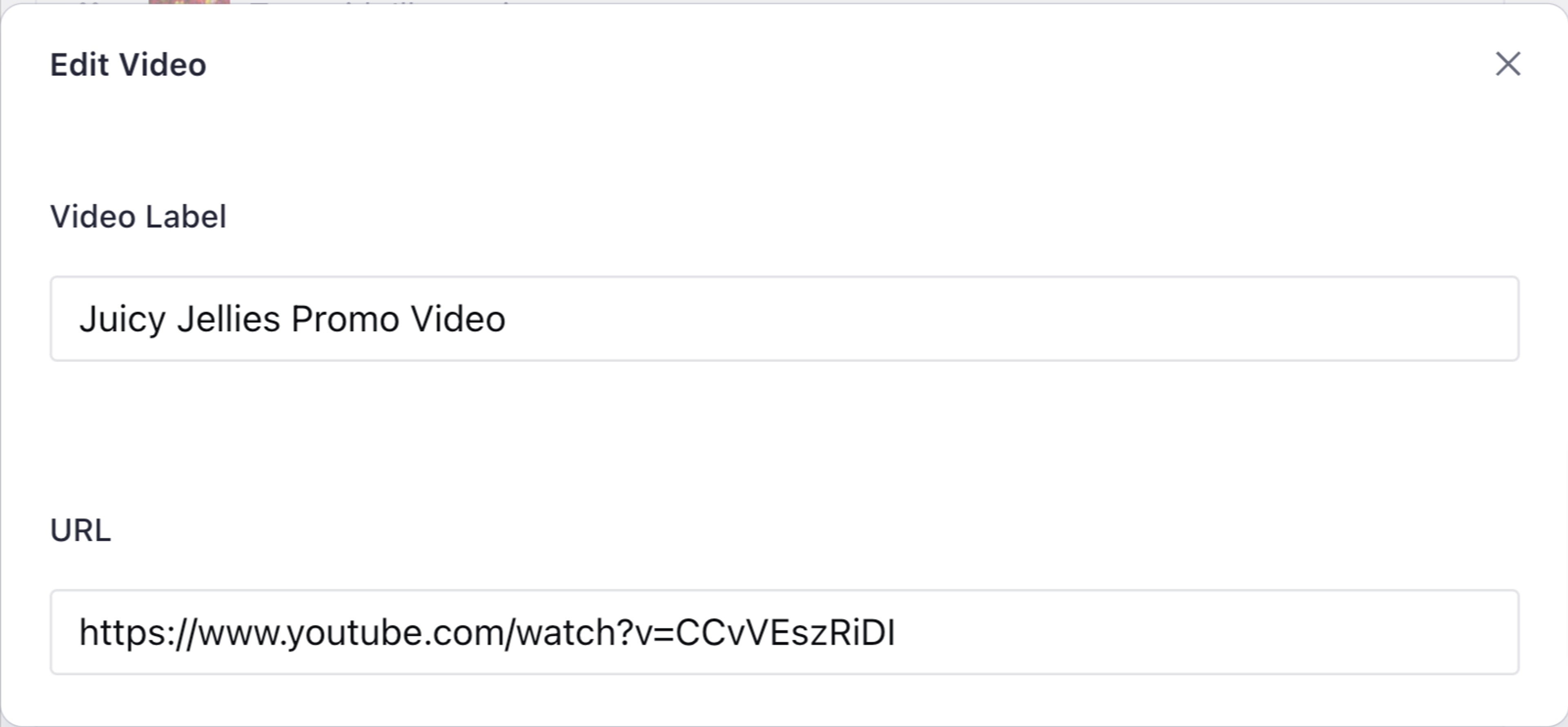
Video
If you strip away presentation-based thinking, a video object can be modeled in the same way as our call to action object:
- a URL field to define the resource location of your video file
- a
stringfield for the video's label
// ./schemas/videoType.js

import {defineField, defineType} from 'sanity'

export const videoType = defineType({
  name: 'video',
  type: 'object',
  fields: [
    defineField({
      name: 'videoLabel',
      type: 'string',
    }),
    defineField({
      name: 'url',
      type: 'string',
      title: 'URL',
    }),
  ],
})Call to action
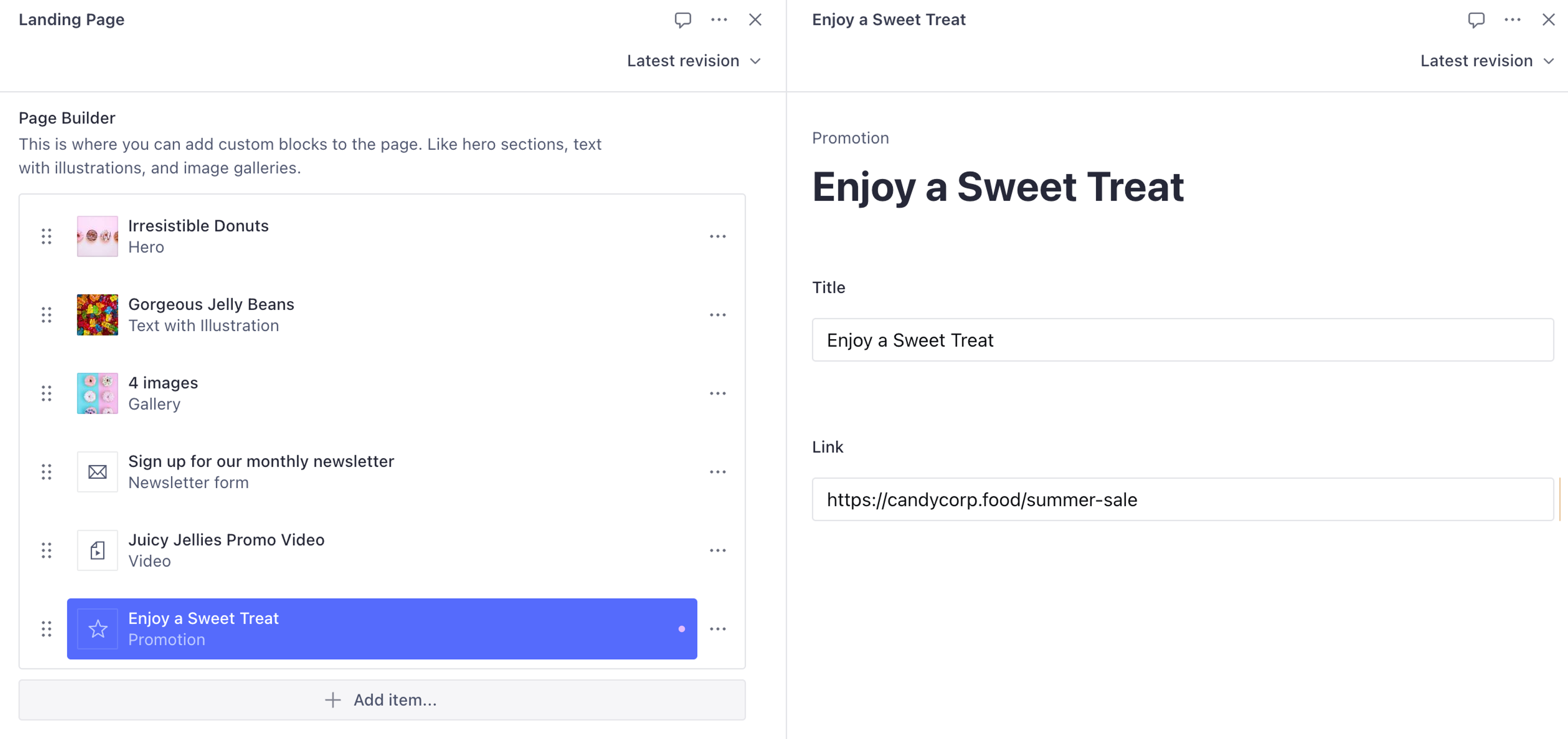
The call to action field inside the pageBuilder is a reference to a new document type. Using references opens up the potential to re-use content across multiple pages – or have those references be pages of their own.
For this we'll need to create a new document type:
// ./schemas/promotionType.ts

import {defineField, defineType} from 'sanity'

export const promotionType = defineType({
  name: 'promotion',
  type: 'document',
  title: 'Promotion',
  fields: [
    defineField({
      name: 'title',
      type: 'string',
    }),
    defineField({
      name: 'link',
      type: 'url',
    }),
  ],
})Register new types to your schema
With these new schema files created, ensure they're registered to your Studio's schema by loading them into the schemaTypes array of your sanity.config.ts
// ./schemas/index.ts

import {callToActionType} from './callToActionType'
import {formType} from './formType'
import {heroType} from './heroType'
import {imageGalleryType} from './imageGalleryType'
import {pageType} from './pageType'
import {textWithIllustrationType} from './textWithIllustrationType'
import {videoType} from './videoType'

export const schemaTypes = [
  pageType,
  heroType,
  callToActionType,
  textWithIllustrationType,
  imageGalleryType,
  formType,
  videoType,
]
Improved UI with custom item previews
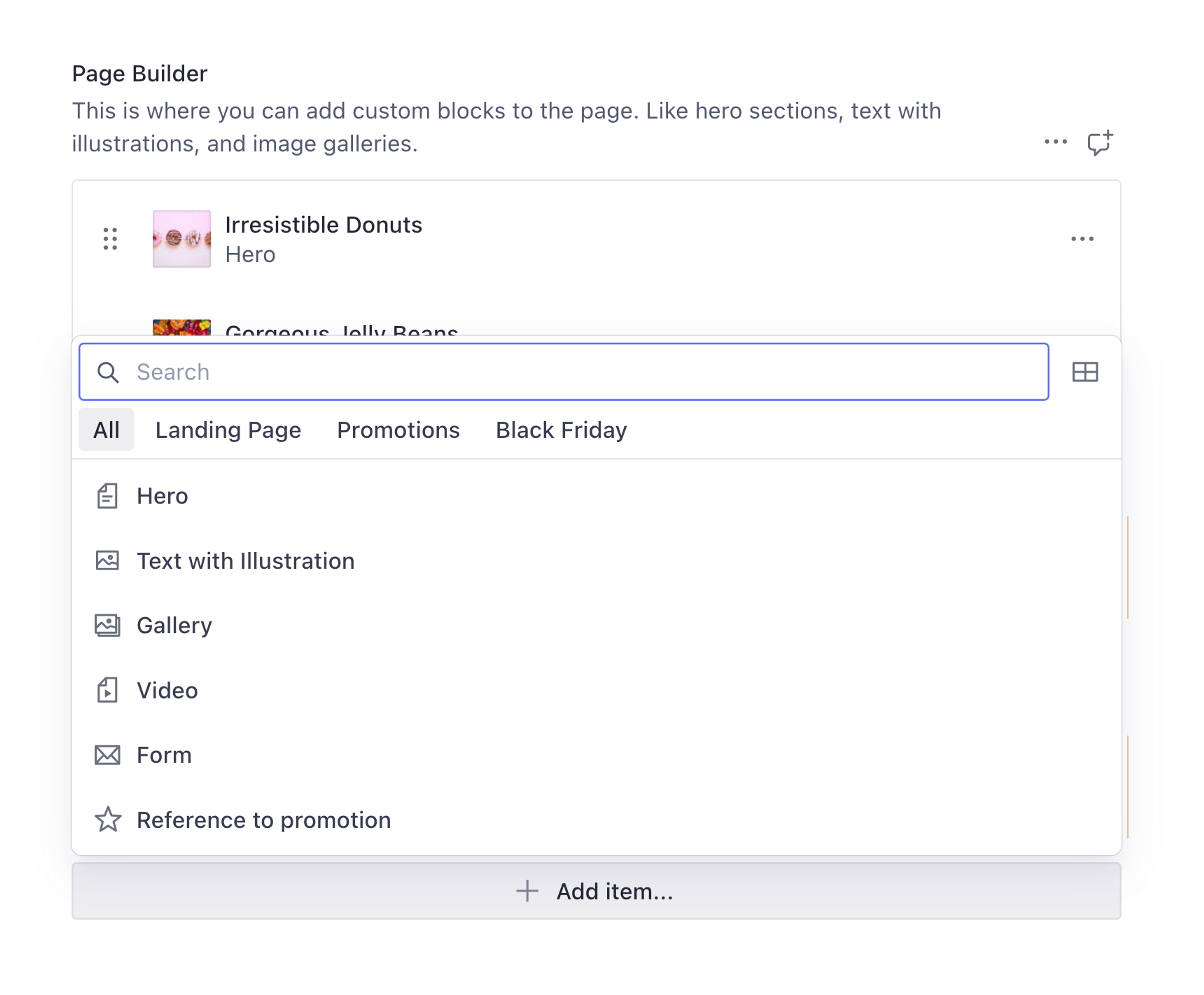
You now have an interface for content creators to build new layouts from predetermined "blocks". This authoring experience is currently lacking some flair and the individual blocks are difficult to differentiate.
In any object or document schema type, the preview key can be customized so that the items can contain an icon or image and more contextual information about themselves.
Revisiting the schema in heroType.ts, customize the icon and preview keys to improve the user interface for creating new Hero items and viewing existing Hero items in an array.
// ./schemas/heroType.ts
import {DocumentTextIcon} from '@sanity/icons'
import {defineField, defineType} from 'sanity'
export const heroType = defineType({
// ... existing configuration
icon: DocumentTextIcon,
preview: {
select: {
title: 'heading',
image: 'image',
},
prepare({title, image}) {
return {
title: title || 'Untitled',
subtitle: 'Hero',
media: image || DocumentTextIcon,
}
},
},
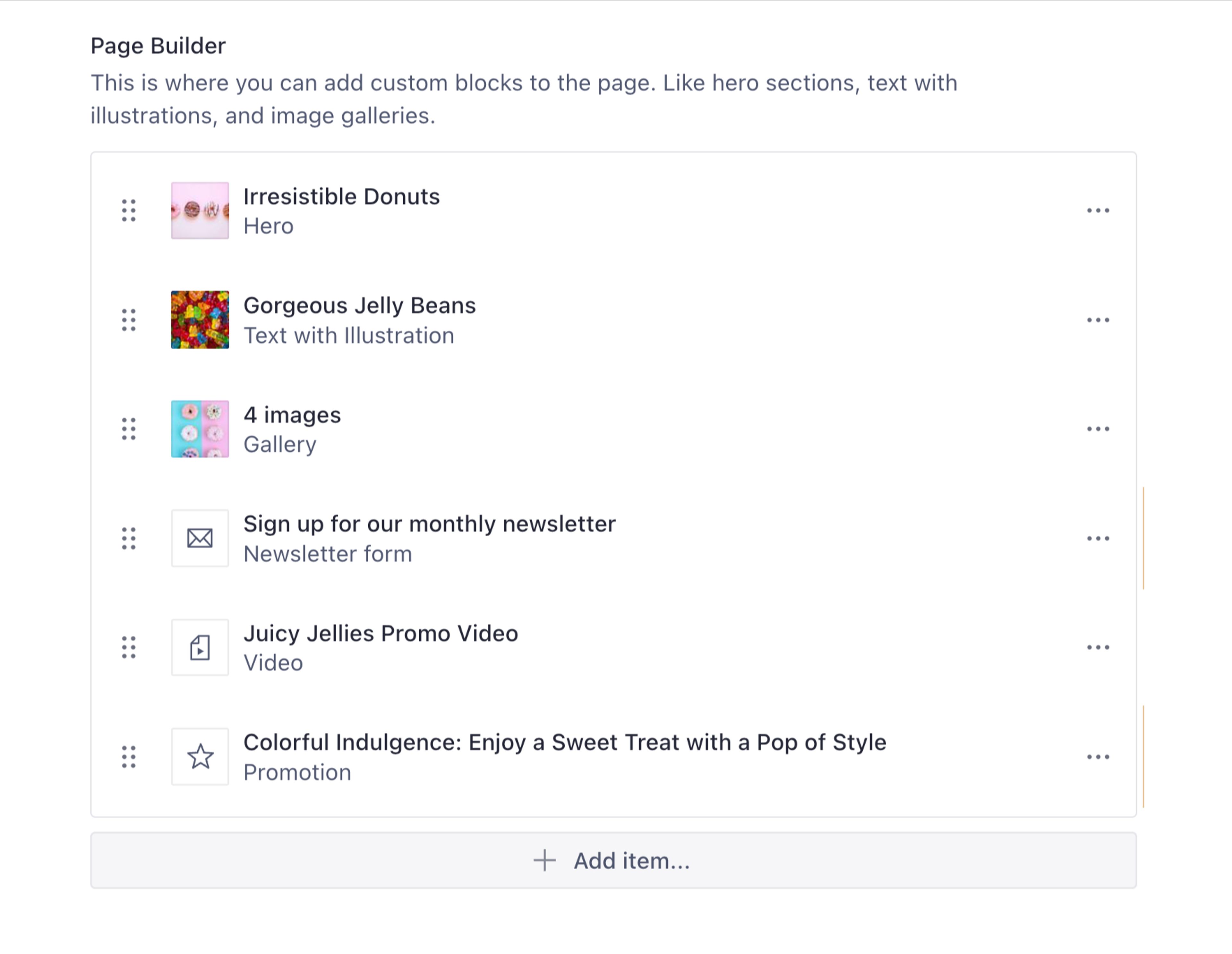
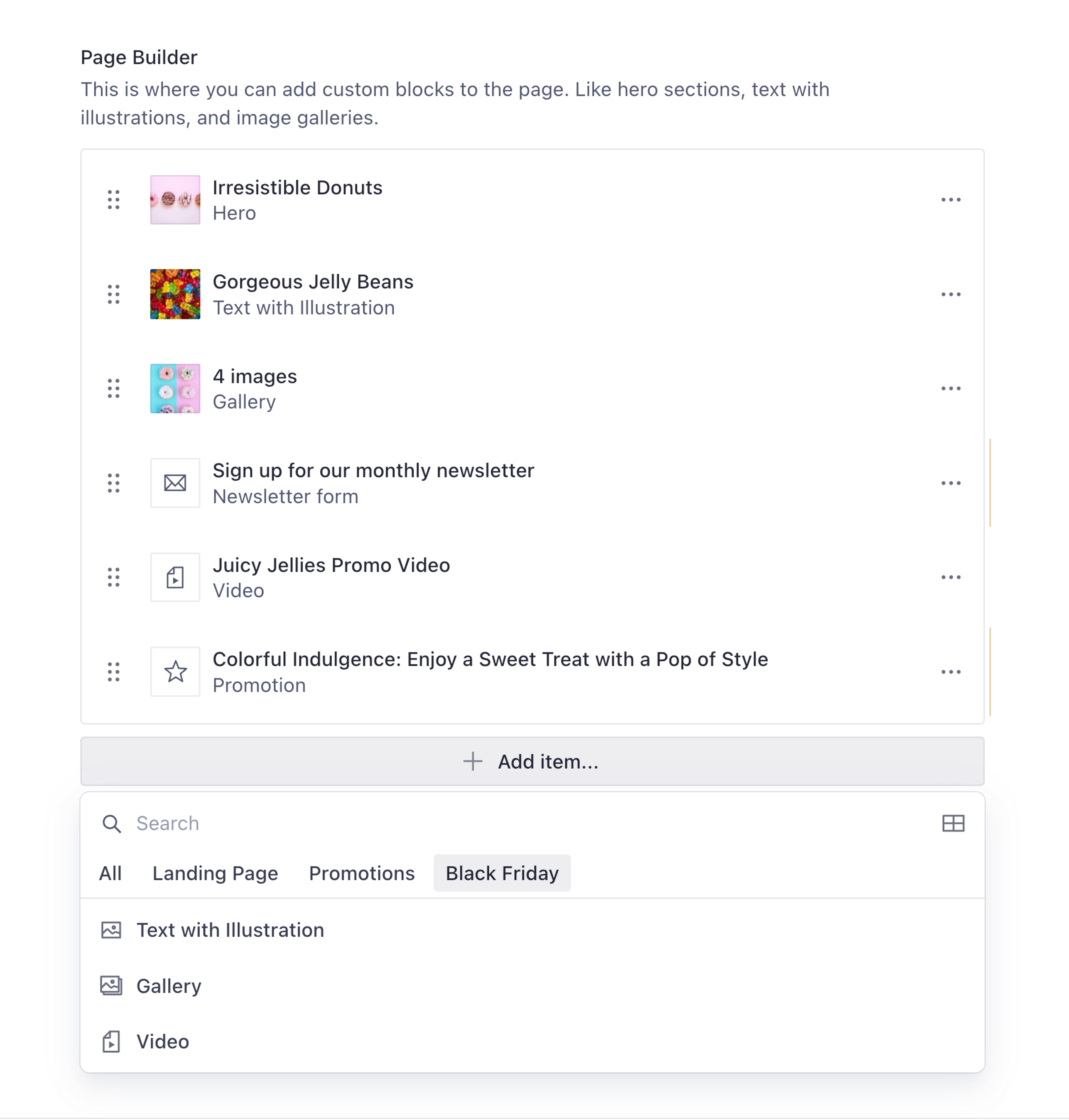
})Repeat this for all custom object types and documents. Once complete, the page builder array should look something more like this:
Add groups and create a grid layout
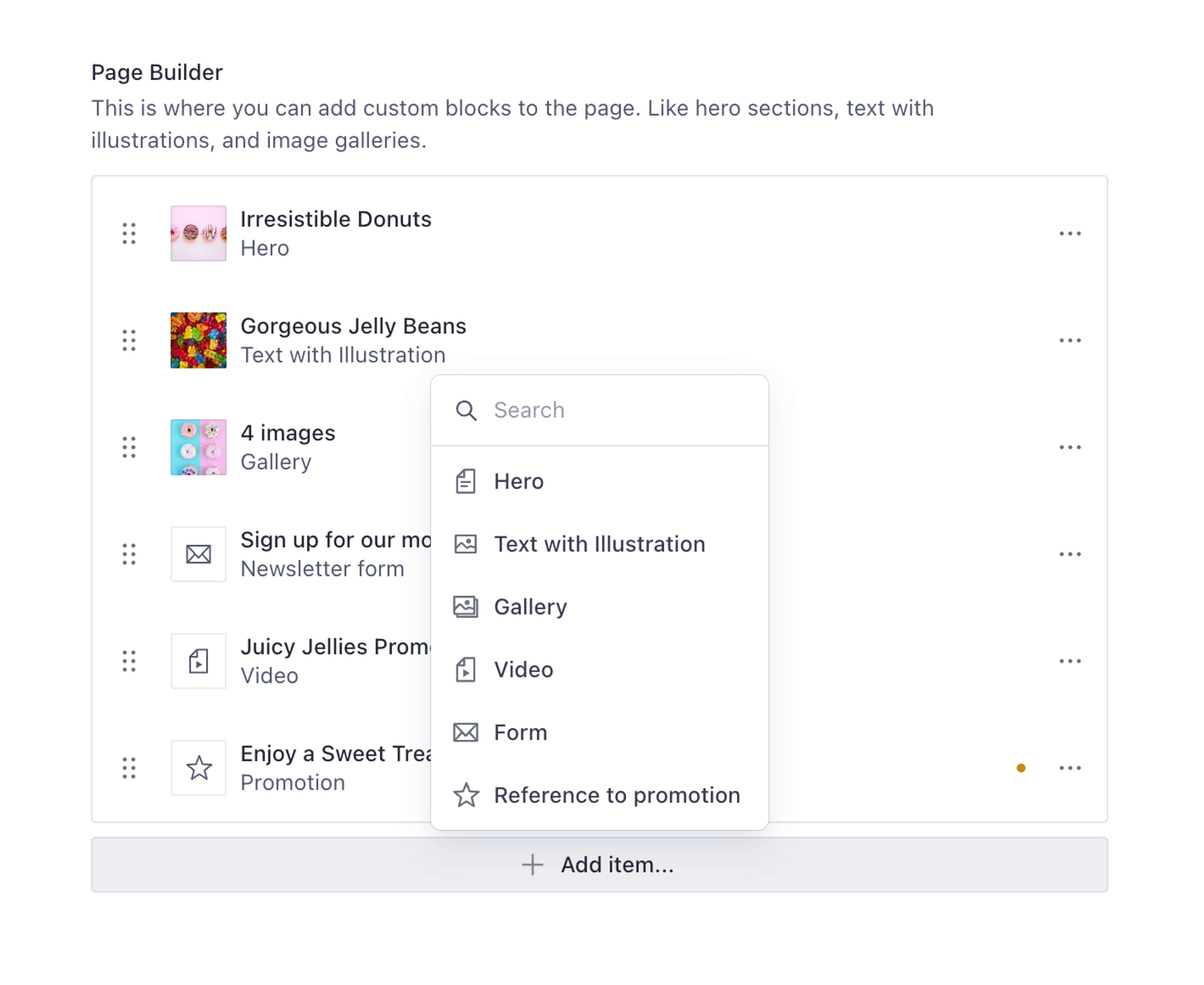
Now let’s add the options object to our pageBuilder array to create a grid layout, and add an insertMenu to separate the modules into groups, such as Landing Page, Promotions and Black Friday.
options: {
    layout: 'grid',
    insertMenu: {
      filter: true,
      groups: [
        {
          name: 'landing',
          title: 'Landing Page',
          of: ['hero', 'promotion', 'form'],
        },
        {
          name: 'promotions',
          title: 'Promotions',
          of: ['gallery', 'video', 'promotion'],
        },
        {
          name: 'blackFriday',
          title: 'Black Friday',
          of: ['textWithIllustration', 'gallery', 'video'],
        }
      ],
      views: [
        {name: 'list'},
        {name: 'grid',
          previewImageUrl: (schemaTypeName) => `/static/preview-${schemaTypeName}.jpg`
        }
      ]
    }
  },
Groups allow faster findability of related modules for a specific purpose.
Filter makes it easier to search for modules if there is a long list.
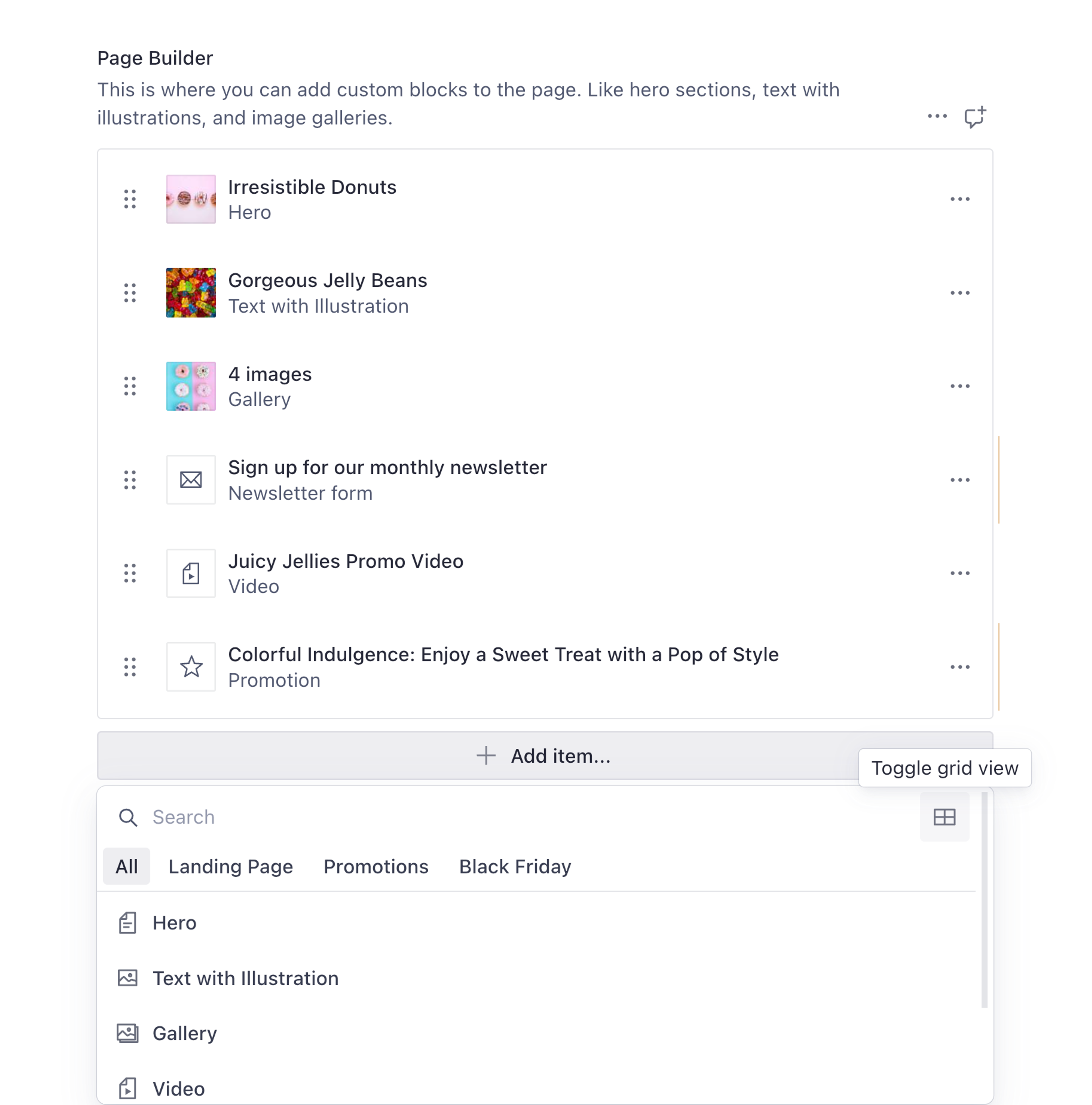
Views allow you to toggle between list and grid options with optional preview images for each type. If the optional preview image is not defined, the icon associated with the respective schema type will be displayed.
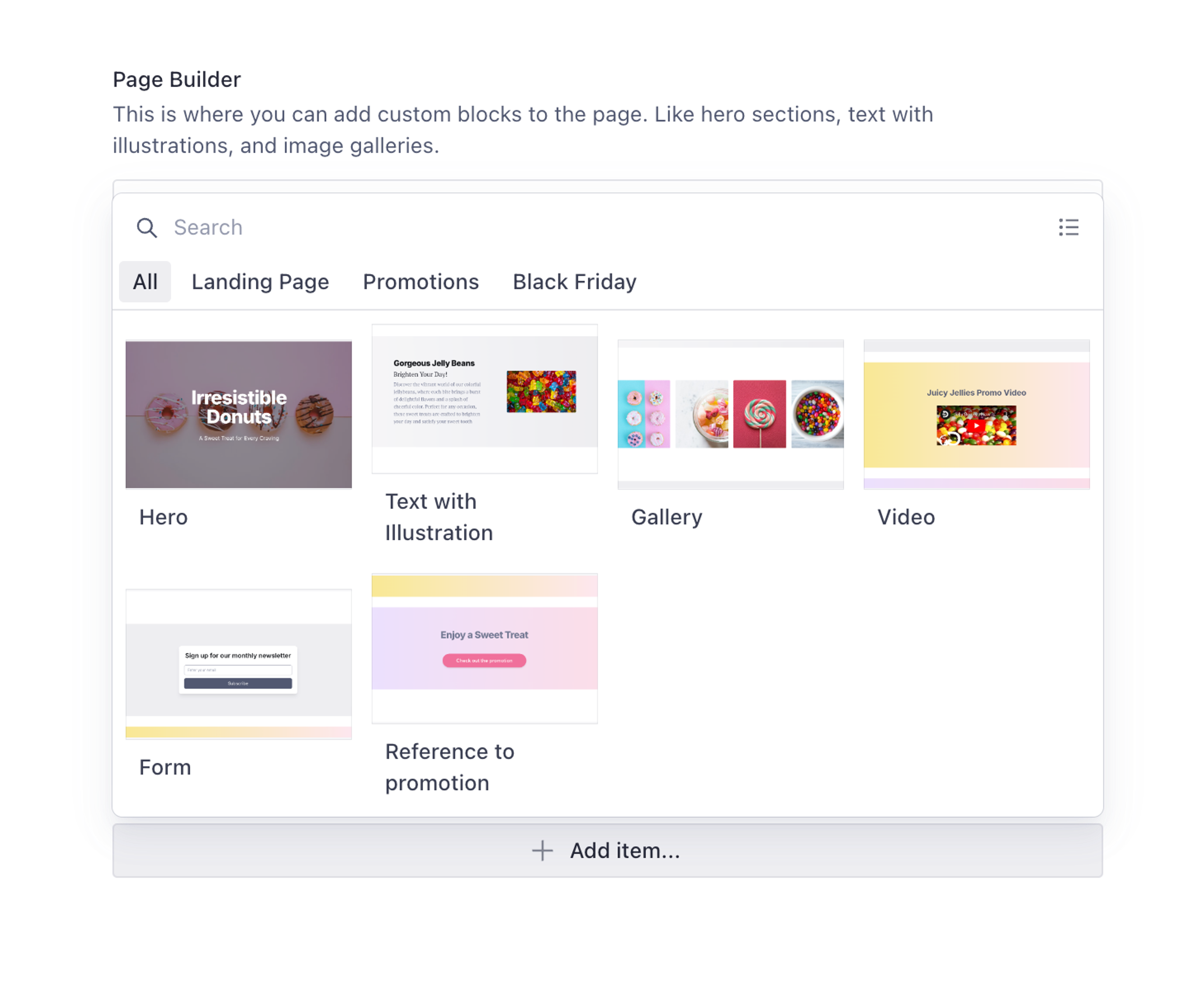
If you toggle grid view, you will see the following view that includes the preview image for each block.
If the optional preview image is not defined inside the pageBuilder array schema, the icon associated with the respective schema type will be displayed.
Much better for both creating and reading!
Use your front end for flexible presentations
Because we avoided embedding presentation concerns in our page builder, you can now present that content in many ways in front end code. For example, perhaps your hero item renders its heading field as an <h1> if it is the first item in the array; otherwise, as an <h2> with a different layout.
It's possible to present those fields in countless ways without compromising the content's meaning.
Querying the page builder array with GROQ
When querying an array of objects with GROQ you may need to resolve different fields – and resolve references – from different types. To do this, you can use the shorthand form of GROQ's select() function to create a unique projection for each unique type in the array.
*[_type == "page"]{
  pageBuilder[]{
    // "hero" in an "object" from which we can "pick" fields
    _type == "hero" => {
      _type,
      heading,
      tagline,
      image
    },
    // "callToAction" is a "reference"
    // We can resolve "itself" with the @ operator
    _type == "callToAction" => @-> {
      _type,
      title,
      link
    }
    // ...continue for each unique "_type"
  },
}
What we have learned
We've learned the basics of modeling a page builder with Sanity.io. We've primed the pump with a few common builder modules that you can alter or extended to fulfill the unique needs of your project.
Along the way, we made a case for keeping presentation-related concerns out of your content models. Content editing will be less complicated, and code maintenance will be easier, and your next redesign budget will thank you for it!
Page building demo
The example code in this guide can be found in this example Sanity Studio.
Get started by cloning this repository, using your own project and then render the content into one of our starter templates.