Structure Tool Home Page
Insert a home page component onto the blank default space shown in the Structure tool
Install command
npm i sanity-plugin-blank-spacesanity-plugin-blank-space
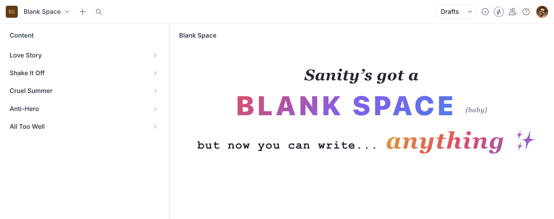
A Sanity Studio plugin that renders a custom component in the structure tool's empty pane area - it's the love story your Studio's blank space has been waiting for. Perfect for welcome screens, dashboards, or getting-started guides, and works all too well with any existing structure configuration.
Installation
npm install sanity-plugin-blank-spaceUsage
Add the plugin to your sanity.config.ts and shake off the empty pane - no changes to existing structure setup required:
import {defineConfig} from 'sanity'
import {structureTool} from 'sanity/structure'
import {structureHomeLandingPlugin} from 'sanity-plugin-blank-space'

function WelcomePane() {
  return <div style={{padding: 32}}>Welcome to the Studio</div>
}

export default defineConfig({
  // ...
  plugins: [
    structureTool(),
    structureHomeLandingPlugin({component: WelcomePane}),
  ],
})
Custom Component Examples
You can use any React component - style it however you like, including ones that use Sanity hooks.
User Greeting with Sanity hooks
Use useCurrentUser and useProjectId from sanity to personalise the landing pane:
import {useCurrentUser, useProjectId} from 'sanity'
import {Card, Heading, Text, Stack, Flex, Avatar, Inline} from '@sanity/ui'

function UserGreeting() {
  const user = useCurrentUser()
  const projectId = useProjectId()

  return (
    <Flex align="center" justify="center" height="fill">
      <Card padding={5} radius={3} shadow={1}>
        <Stack space={4}>
          <Inline space={3}>
            {user?.profileImage && <Avatar src={user.profileImage} size={1} />}
            <Heading size={3}>Hello, {user?.name || 'there'}!</Heading>
          </Inline>
          <Text muted>
            You are editing project <code>{projectId}</code>. Select a document from the sidebar to
            get started.
          </Text>
        </Stack>
      </Card>
    </Flex>
  )
}
Quick Actions
Use useDocumentTypes to build a "create new" panel - it returns user-defined document types from the schema, filtering out internal sanity.* types. Pair it with IntentLink or useIntentLink from sanity/router for navigation:
import {IntentLink} from 'sanity/router'
import {Card, Stack, Flex, Heading, Button} from '@sanity/ui'
import {useDocumentTypes} from 'sanity-plugin-blank-space'
import {AddIcon} from '@sanity/icons'
function QuickActions() {
const documentTypes = useDocumentTypes()
return (
<Flex align="center" justify="center" height="fill">
<Card padding={5}>
<Stack space={4}>
<Heading size={2}>Create New</Heading>
{documentTypes.map((docType) => (
<Button
key={docType.name}
as={IntentLink}
intent="create"
params={{type: docType.name}}
icon={docType.icon ?? AddIcon}
text={docType.title}
mode="ghost"
/>
))}
</Stack>
</Card>
</Flex>
)
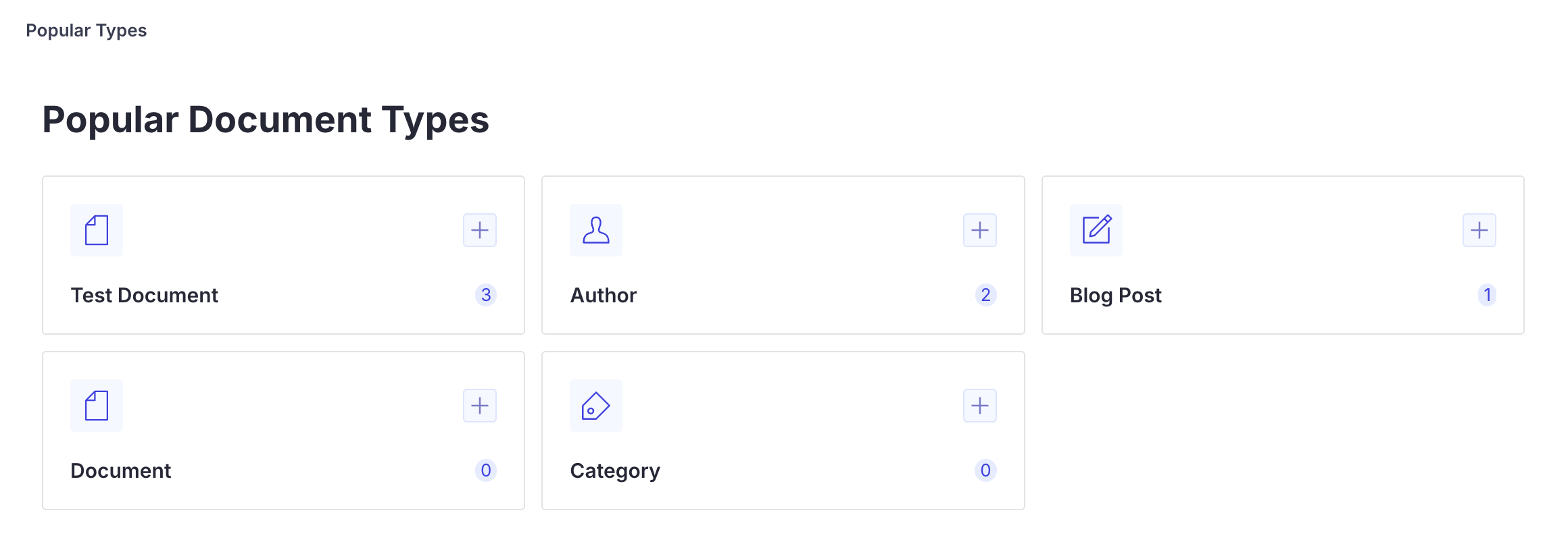
}Popular Document Types
Use usePopularDocumentTypes to rank document types by count. Pair with useIntentLink to add a create action per type. The example Studio implementation extends this with a card layout and icons.
import {AddIcon} from '@sanity/icons'
import {Badge, Button, Card, Flex, Heading, Spinner, Stack, Text} from '@sanity/ui'
import {useIntentLink} from 'sanity/router'
import {usePopularDocumentTypes} from 'sanity-plugin-blank-space'

function CreateButton({type}: {type: string}) {
  const {onClick, href} = useIntentLink({intent: 'create', params: {type}})
  return (
    <Button
      as="a"
      href={href}
      onClick={onClick}
      icon={AddIcon}
      mode="ghost"
      padding={2}
      tone="primary"
    />
  )
}

function PopularTypes() {
  const {data, isLoading, error} = usePopularDocumentTypes()

  if (isLoading) return <Spinner />
  if (error) return <Text>Failed to load document counts</Text>

  return (
    <Flex align="center" justify="center" height="fill">
      <Card padding={5}>
        <Stack space={4}>
          <Heading size={2}>Popular Types</Heading>
          {data.map((docType) => (
            <Flex key={docType.name} align="center" gap={3}>
              {docType.icon && (
                <Text>
                  <docType.icon />
                </Text>
              )}
              <Text weight="semibold" flex={1}>
                {docType.title}
              </Text>
              <Badge tone="primary">{docType.documentCount}</Badge>
              <CreateButton type={docType.name} />
            </Flex>
          ))}
        </Stack>
      </Card>
    </Flex>
  )
}
API Reference
structureHomeLandingPlugin(options)
| Option | Type | Required | Default | Description |
|---|---|---|---|---|
component | ComponentType | Yes | - | React component to render in the empty pane |
title | string | No | "Welcome" | Label shown in the pane header |
paneId | string | No | "home" | Internal pane ID used in the Studio URL routing |
useDocumentTypes()
React hook that returns user-defined document types from the Studio schema.
Returns DocumentTypeInfo[]:
| Property | Type | Description |
|---|---|---|
name | string | The document type name |
title | string | Display title (falls back to name) |
icon | ComponentType | Optional icon component from the schema |
usePopularDocumentTypes(limit?)
React hook that returns document types sorted by document count, most popular first. Pairs useDocumentTypes() with a GROQ count query.
| Parameter | Type | Required | Default | Description |
|---|---|---|---|---|
limit | number | No | - | Cap the number of returned types |
Returns UsePopularDocumentTypesResult:
| Property | Type | Description |
|---|---|---|
data | DocumentTypeWithCount[] | Types sorted by count, descending |
isLoading | boolean | true while counts are loading |
error | Error | null | Fetch error, if any |
DocumentTypeWithCount
Extends DocumentTypeInfo with:
| Property | Type | Description |
|---|---|---|
documentCount | number | Documents of this type in the dataset |
UsePopularDocumentTypesResult
TypeScript interface for the usePopularDocumentTypes() return value.
StructureHomeLandingPluginOptions
TypeScript interface for the plugin options, exported for use in typed configurations.
Development
The example Studio has four workspaces, one for each component example above.
pnpm install
pnpm dev:studio    # starts Sanity Studio at http://localhost:3333
See Local Development for the full dev workflow.
License
MIT