icons-sanity
A searchable icon picker for Sanity Studio, backed by a 633-icon library and a matching React component — editors pick the icon in Studio, you just choose where to render it in your app.
By Jatin Kumar
Install command
npm i @web-portfolio/icons-sanity@web-portfolio/icons-sanity
A Sanity Studio plugin that adds a proper icon
picker field to your schema, backed by the same 633-icon library as
@web-portfolio/icons.
It exists because "paste an SVG into a text field" is a bad experience for
content editors — they either need to know what valid SVG markup looks
like, or they need you to do it for them every time a new skill or social
link gets added. This plugin turns that into: click the field, search,
pick an icon, done.
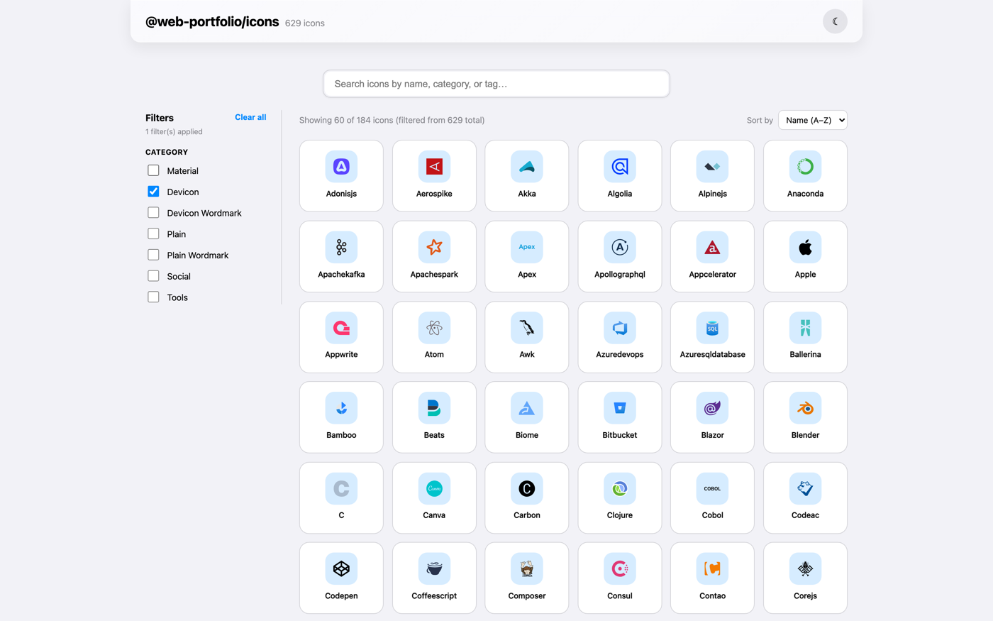
Browse the icon set → before you install, to see exactly what your editors will be choosing from.


Contents
Why this plugin
If you've built a portfolio, agency site, or any Sanity project with a "skills" or "tech stack" or "connect with us" section, you've probably built some version of an icon field before. This plugin is meant to save you from doing that again:
- 633 icons, ready to search. Tech-stack logos, social platform icons, and everyday UI icons — editors search by name, label, or tag, and can narrow to a category, no SVG knowledge required.
- Results ranked, not just filtered. Typing
goleads withgo, notgodot— exact matches first, then name prefixes, then everything that merely mentions the term. - Nothing fetched while editing. Icon markup (via
@web-portfolio/icons) and search metadata (via this plugin) are both bundled at build time, so the picker opens instantly and works even if Studio is running offline. - Stores a name, not a blob. The field value is a plain string
(
"react","github") rather than raw markup or an asset reference, which pairs directly with@web-portfolio/icons's<Icon name="..." />on your frontend — no lookups, no asset resolution, just the name. - Shows what's selected. The current icon renders inline in the form alongside its label, category, and the exact string that got stored — so editors can confirm at a glance they picked the right one.
- Built entirely from Sanity UI.
Card,Dialog,Badge,Select,TextInput, sized off the Sanity UI space scale. It inherits your Studio's theme and light/dark scheme instead of fighting it, and respectsreadOnlyfields and Studio's focus/presence tracking like a built-in input.
Installation
npm install @web-portfolio/icons-sanitypnpm add @web-portfolio/icons-sanityPeer dependencies:
sanity >=3, @sanity/ui >=2, react >=18, styled-components >=6
(already present in any standard Sanity Studio project — this plugin is
tested against every Studio major from v3 through the current v6), plus
@web-portfolio/icons >=1.0.1, which renders the icons this plugin picks —
install it if your Studio doesn't already have it.
Setup
Add the plugin to your Studio config:
// sanity.config.ts
import { defineConfig } from 'sanity'
import { sanityIconPicker } from '@web-portfolio/icons-sanity'

export default defineConfig({
  // ...your existing config
  plugins: [
    // ...your existing plugins
    sanityIconPicker(),
  ],
})
This registers an iconRef schema type you can use on any document or
object.
Usage
Use type: 'iconRef' on any field that should store an icon:
// schemaTypes/documents/skill.ts
import { defineField, defineType } from 'sanity'

export default defineType({
  name: 'skill',
  title: 'Skill',
  type: 'document',
  fields: [
    defineField({ name: 'name', type: 'string' }),
    defineField({ name: 'icon', title: 'Icon', type: 'iconRef' }),
  ],
})
In Studio, that renders as a field editors click to open a searchable grid.
They type "react" or "docker" or "mail", pick a result, and the field
stores that icon's name as a plain string — e.g. "react".
What editors see
- The collapsed field shows the chosen icon, its label, its source category, and the raw string stored in the document.
- Clicking Select icon / Change icon opens a dialog with a search field and a category dropdown (Devicon, Material, Social, Tools, …). Results render a page at a time so the dialog opens instantly even though the whole 633-icon set is in memory.
- Hovering a tile reveals its registry name — the exact value that gets saved.
- A
readOnlyfield (schema-level, or a role without write access) disables both actions and emits no patches. - If a document holds a name that is no longer in the bundled set — say the icon was renamed upstream — the field says so explicitly instead of rendering an empty box, and offers to replace or clear it.
Building your own input
If iconRef isn't the shape you want, the pieces are exported so you can
wire the same picker into a custom schema type or reuse its matching logic:
import {
  IconPickerInput, // the input component itself
  formatCategoryLabel, // "original" -> "Devicon"
  matchesQuery, // name/label/tag matching
  rankMatch, // relevance score, lower is better
  type IconEntry, // the shape matchesQuery/rankMatch expect
} from '@web-portfolio/icons-sanity'
Social/contact links example
defineField({
  name: 'socialLinks',
  title: 'Social links',
  type: 'array',
  of: [
    defineType({
      type: 'object',
      name: 'socialLink',
      fields: [
        defineField({ name: 'icon', type: 'iconRef' }),
        defineField({ name: 'url', type: 'url' }),
      ],
    }),
  ],
})
Rendering the picked icon on your frontend
This is the part that makes the whole thing worth it — pair with
@web-portfolio/icons
and pass the stored string straight through as name, no transformation
needed:
import { Icon } from '@web-portfolio/icons'

function SkillBadge({ skill }: { skill: { name: string; icon: string } }) {
  return (
    <span>
      <Icon name={skill.icon} size={20} />
      {skill.name}
    </span>
  )
}
What's in the icon set
633 icons from three sources, shared with @web-portfolio/icons:
- devicon (578 icons, MIT) — programming languages, frameworks, databases, cloud platforms, dev tools.
- Material Symbols (38 icons, Apache-2.0) — everyday UI icons: mail, call, arrows, menu, close, connected TV, bolt, translate, checklist, gift, and more.
- Simple Icons (17 icons, CC0-1.0) — social platforms and dev-tool brands devicon doesn't cover (Instagram, YouTube, WhatsApp, MCP, LangChain, Ollama, and more).
Not sure exactly what's in there? The gallery is the fastest way to check — search or filter by category to see every icon before you commit to using it in a schema.
Limitations
- Closed set. Editors pick from the 633 bundled icons; there's no
"upload your own SVG" escape hatch in the picker itself. If you need a
one-off brand mark that isn't in the set, it has to be added to the
upstream registry and shipped in a new version of this plugin (and
@web-portfolio/icons) before it shows up here. - Requires
@web-portfolio/iconsat render time. The field only stores a name — you need the sibling package on your frontend to turn that name back into markup. It's a peer dependency for exactly this reason. - ESM-only as of v3. There's no CommonJS entry point; if something in
your toolchain still calls
require()on this package directly, it will fail. Sanity Studio v3+ already loads plugins as ESM, so this only bites unusual setups. - Renames need a re-pick. If an icon's registry name changes upstream, documents that stored the old name show an explicit "not found" state rather than silently rendering nothing — but an editor still has to open the field and choose the replacement; it isn't automatic.
Changelog
v3.1.0 — Sanity Studio v6 compatibility
@sanity/iconsis no longer a dependency. It dropped its root barrel export in v5.0.0 —import {ImageIcon} from '@sanity/icons'stopped resolving — and Sanity Studio v6 (the current major) already installs@sanity/icons^5.2 for itself, so this plugin would fail to load in any new v6 Studio. Its four UI-chrome icons (search, trash, warning, the "no icon" placeholder) are now inlined instead — visually identical, zero version dependency.- Fixed layout on
@sanity/uiv4.Stack'sspaceprop andGrid'scolumnsprop were both removed there (in favor ofgapandgridTemplateColumns) — silently, with no error, just missing spacing and a non-responsive icon grid. Both are replaced with plain CSS (gapvia a specificity override, aminmax()-based grid) that doesn't depend on which major is installed. Tooltipis no longer imported from@sanity/ui. It moved to the@sanity/ui/tooltipsubpath in v4 — a subpath that doesn't exist in v2/v3 — so importing it from the root, as this plugin used to, resolves toundefinedon v4 and crashes the results grid the moment it renders. The per-tile tooltip (showing an icon's raw registry name on hover) is now a nativetitleattribute instead;aria-labelalready carried the same information for assistive tech.- Verified against real installs of every Studio major still actively
maintained — v3, v4, v5, and v6 — not just against the changelogs above.
v6 in particular installs
@sanity/ui4.0.7 andsanityitself pulls in React 19.2 and@sanity/icons5.2, the exact combination the fixes above target; the full test suite passes against that real combination, not just this package's own (older) pinned dev dependencies.
Icon picker: grid fixes + reliable auto-focus
- Fixed overlap: grid tiles' icon row was sized off an unrelated Sanity UI theme token, which was shorter than the icon itself — the glyph visually spilled down over its own label. The row now sizes off the actual icon dimension, so this can't happen regardless of icon or theme.
- Icons are 20% bigger in the grid (24px → 29px) for better legibility.
- Fewer icons per page (96 → 48), matching the larger tiles so a page still renders as a comfortable handful of rows.
- Search field now reliably auto-focuses when the dialog opens. Sanity
UI's
Dialogunconditionally focuses its own header close button on mount (it's the first focusable element in the DOM), which was winning a race against the search field'sautoFocus— the field now explicitly reclaims focus after Dialog's own mount behavior runs, so opening the picker always drops you straight into search.
v3.0.0 — ESM-only, built with @sanity/plugin-kit
- The build now uses
@sanity/plugin-kitand@sanity/pkg-utilsinstead of a hand-rolledtsupconfig — the same toolchain Sanity's own plugin ecosystem uses. - Breaking: the package is now ESM-only. The
require()/CJS entry point (main,modulefields, and therequireexport condition) has been removed — Sanity Studio v3+ is pure ESM, so this plugin was never actually loaded viarequire()in practice. If you import this package withrequire()directly (outside a Studio config), switch toimport. - No other behavior changed: same
sanityIconPicker()export, sameiconRefschema type, same peer dependencies.
97% smaller package
- This plugin no longer bundles its own copy of the 633-icon SVG registry.
It now renders icon previews through
@web-portfolio/icons's<Icon>component (added as a peer dependency, see below) and only carries the lightweight search index — name, label, tags, category, no SVG markup — that the picker's search and filtering actually need. - Published size: 1.1 MB → 35.7 KB (tarball), 1.36 MB → 60.5 KB
(unpacked JS), 577 KB → 15 KB (gzipped). Since any project using this
plugin already installs
@web-portfolio/iconsto render the picked icon on its frontend, that icon data is no longer downloaded twice.
Security & supply chain
- Bumped
vitestto 3.2.7 anddrizzle-ormto 0.45.2 across the monorepo, and pinned several transitive dependencies (esbuild,sharp,postcss,glob,js-yaml,uuid,prismjs,adm-zip,es-define-property) to patched versions via pnpm overrides. - Install scripts now run only for an explicit allow-list (
esbuild,sharp) instead of the whole dependency tree by default. - Current
Socket.dev
score: 100 Vulnerability, 100 Quality, 100 License, 88
Maintenance, 80 Supply Chain Security. This plugin still ships zero
runtime dependencies of its own — the Supply Chain number reflects
Socket's scan of the full Sanity Studio peer tree (
sanity,@sanity/ui, ...), not this plugin's code.
License
MIT — see LICENSE. Bundled icon sets keep their original licenses (devicon: MIT, Material Symbols: Apache-2.0, Simple Icons: CC0-1.0) — see the repo README for full attribution.