Key Value Input
Sanity Studio input component for editing ordered key-value string pairs. Supports add, remove, and reorder operations with real-time patch updates.
Install command
npm i @liiift-studio/sanity-key-value-inputsanity-key-value-input


Sanity Studio input component for editing ordered key-value string pairs. Supports add, remove, and reorder operations with real-time patch updates.
Use it in place of Sanity's default array-of-objects editor when you want a compact, spreadsheet-style row layout — both fields visible inline, with explicit up/down reordering — for metadata, attributes, or any ordered list of key → value strings.
Preview
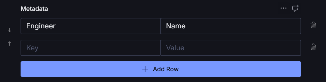
Empty / initial state — a single placeholder row with the Add Row button below.

With entries — once rows exist, the reorder rail appears on the left and a trash icon on the right of each row.
Install
npm install @overpunch/sanity-key-value-inputUsage
Use KeyValueInput as a custom input component on an array field. The array items must be objects with two string fields named exactly key and value — the component reads and writes those field names directly.
import { defineType, defineField } from 'sanity'
import { KeyValueInput } from '@overpunch/sanity-key-value-input'

export const mySchema = defineType({
	name: 'myDocument',
	type: 'document',
	fields: [
		defineField({
			name: 'metadata',
			title: 'Metadata',
			type: 'array',
			of: [
				{
					type: 'object',
					fields: [
						{ name: 'key', type: 'string' },
						{ name: 'value', type: 'string' },
					],
				},
			],
			components: {
				input: KeyValueInput,
			},
		}),
	],
})
The component provides:
- Add new key-value pairs
- Remove existing pairs
- Reorder pairs up and down
- Inline editing of both key and value fields
Data shape & querying
Each row is persisted as an object with an auto-generated _key plus the key and value strings. The component manages _key for you (you do not need to set it), so the stored field is an ordered array of:
flowchart LR
	A["metadata (array)"] --> B["{ _key, key, value }"]
	A --> C["{ _key, key, value }"]
	A --> D["…"]
	subgraph item["one row"]
		B1["_key: string  (auto-generated)"]
		B2["key: string   (your label)"]
		B3["value: string (your value)"]
	end
	B -.-> item
A stored document field looks like:
"metadata": [
	{ "_key": "a1b2c3d4e", "key": "Engineer", "value": "Name" },
	{ "_key": "f5g6h7i8j", "key": "Edition",  "value": "2024" }
]
Read the pairs back with GROQ — array order is preserved:
*[_type == "myDocument"]{
	"metadata": metadata[]{ key, value }
}
Styling (optional)
The reorder and remove controls render as functional buttons out of the box. For finer visual control they expose styling hooks via the class names manualButton, manualButtonUp, manualButtonDown, and manualButtonWrap. The package does not ship CSS for these — add your own rules in the consuming Studio if you want to customise their appearance. Reorder and remove work whether or not you style them.
Requirements
Supports Sanity Studio v3, v4, v5 and v6 from a single build. It uses set() patches and the array field components.input API, and must render inside a Sanity Studio React tree.
The peer dependencies below must be present in the consuming Studio — they already are in any Studio install.
| Package | Supported range |
|---|---|
sanity | >=3 <7 (Studio v3 – v6) |
react | >=18 |
@sanity/ui | >=2 <5 |
@sanity/icons | >=2 <6 |
How one build spans four majors
The peer ranges look inconsistent at a glance, so here is the reasoning:
@sanity/uiv4 moved components to subpath entries.Tooltip,Menu,MenuButton,MenuItem,Code,Popover,Autocomplete,ToastanduseToastare no longer on the package root.@sanity/iconsv5 removed every named*Iconexport — includingAddIcon,ArrowUpIcon,ArrowDownIconandTrashIcon, which this component's controls use.- Both still declare the removed names in their
.d.ts, typednever. A named import therefore type-checks, compiles, and only then fails at runtime — the breakage is invisible totscand to a green build. - So this package imports no
@sanity/uior@sanity/iconssymbol directly. Everything routes through@overpunch/sanity-ui-compat(a real runtime dependency, installed for you), which resolves the installed namespace at runtime and works against either layout.
The @sanity/ui peer is >=2 <5, and that is correct for Sanity v6 — Studio v6 ships @sanity/ui v4, not v5. It is not a stale upper bound.
Verification status
v3 – v6 support is established by the declared peer ranges, green builds, and the runtime-resolving compat layer. Beyond that, this component has been exercised in three in-house Studios. It has not been broadly tested in a running Sanity 6 Studio outside those. Please open an issue if you hit a version-specific problem.
Packaging
- Ships ESM (
dist/index.mjs) and CJS (dist/index.js). - The build sets
dts: false, so no bundled.d.tstype declarations are shipped. TypeScript consumers will need their own module declaration, or can import from the publishedsrc/(exposed via thesourceexport condition).
License
MIT © Liiift Studio