Last updated October 19, 2023
Awesome custom input component for metadata

When you set metadata such as title, altText, and description on an image field, the values are stored at the document level instead of in the image. If you use the media browser plugin, you can set these values on the asset; however, you cannot review or edit them at the document level.
To add metadata directly to the asset, you can add a custom input component to the image type/fields; the custom input displays the values under the image, and it enables editing them without leaving the document.
The example code to build the custom input component is in JavaScript.
A complete version in TypeScript is available as a GitHub Gist.
Step 1: define a custom image schema type
First, define a simple image type you can reuse; enable hotspot and add an optional property for general metadata.
Go to your schemas folder, create an image subfolder, and then in the subfolder, add a new file named imageType.ts (or .js):
// schemas/image/imageType.js

import { ImageIcon } from '@sanity/icons'
import { defineType } from 'sanity'

export const imageType = defineType({
  name: 'imageWithMetadata',
  type: 'image',
  title: 'Image',
  icon: ImageIcon,
  options: {
    hotspot: true,
	metadata: ['blurhash', 'lqip', 'palette'],
	// requiredFields are set here for custom validation and more
	requiredFields: ['title', 'altText'],
  },
  preview: {
    select: {
      media: 'asset',
      title: 'asset.title',
    },
  },
fields: [
    // we use this to cause revalidation of document when the image is changed
    // A listener would also be an option, but more complex
    defineField({
      type: 'boolean',
      name: 'changed',
      hidden: true,
    }),
  ],
})Then, open sanity.config.ts and add imageType.js to the existing schema.types:
// imageType.js

import { visionTool } from '@sanity/vision'
import { defineConfig } from 'sanity'
import { media } from 'sanity-plugin-media'
import { deskTool } from 'sanity/desk'

import { apiVersion, dataset, projectId } from './sanity/env'
import { schema } from './sanity/schema'
import { imageType } from './schemas/image/imageType'

export default defineConfig({
  basePath: '/studio',
  projectId,
  dataset,
  schema: {
    // Add 'imageType' to the schema types
		types: [...YOUR_OTHER_TYPES, imageType],
	},
  plugins: [
    deskTool(),
    visionTool({ defaultApiVersion: apiVersion }),
    media(),
  ],
})
Step 2: create the custom input component
Go to /schemas/image and add a new subfolder named components. Inside components, create a file named ImageInput.jsx.
The file defines an image input component:
// for fully typed version see https://gist.github.com/bobinska-dev/103e589ffc254a3b13f3965423f41fed
const ImageInput = (props) => {

return <div>Hello</div>
}
export default ImageInput
Use renderDefault and add a button
In this case, you’re adding custom functionality to the default image input. To render the image, use renderDefault to take care of the operation.
To produce a tidy UI, use the @sanity/ui components. Moreover, use Stack to space the components vertically and Flex to avoid Button from spanning across the whole width. This makes it possible to add more elements when the need arises.
// schemas/image/components/ImageInput.jsx

import {
  Button,
  Flex,
  Stack,
} from '@sanity/ui'

const ImageInput = (props) => {

	return (
		<div>
		  {props.renderDefault(props)}
			<Stack paddingY={3}>
              <Flex paddingY={3}>
                <Button
                mode="ghost"
                text="Edit metadata"
                />
              </Flex>
            </Stack>
		</div>
	)
}
export default ImageInput
Then, add the custom input component to the image type to see what it looks like in the GUI:
// schemas/image/imageType.js
import { ImageIcon } from '@sanity/icons'
import { defineType } from 'sanity'
import ImageInput from './components/ImageInput'
export const imageType = defineType({
name: 'imageWithMetadata',
type: 'image',
title: 'Image',
icon: ImageIcon,
options: {
// optional and not used in this guide for now
hotspot: true,
metadata: ['blurhash', 'lqip', 'palette'],
// requiredFields are set here for custom validation and more
requiredFields: ['title', 'altText'],
},
components: {
input: ImageInput,
},
preview: {
select: {
media: 'asset',
title: 'asset.title',
},
},
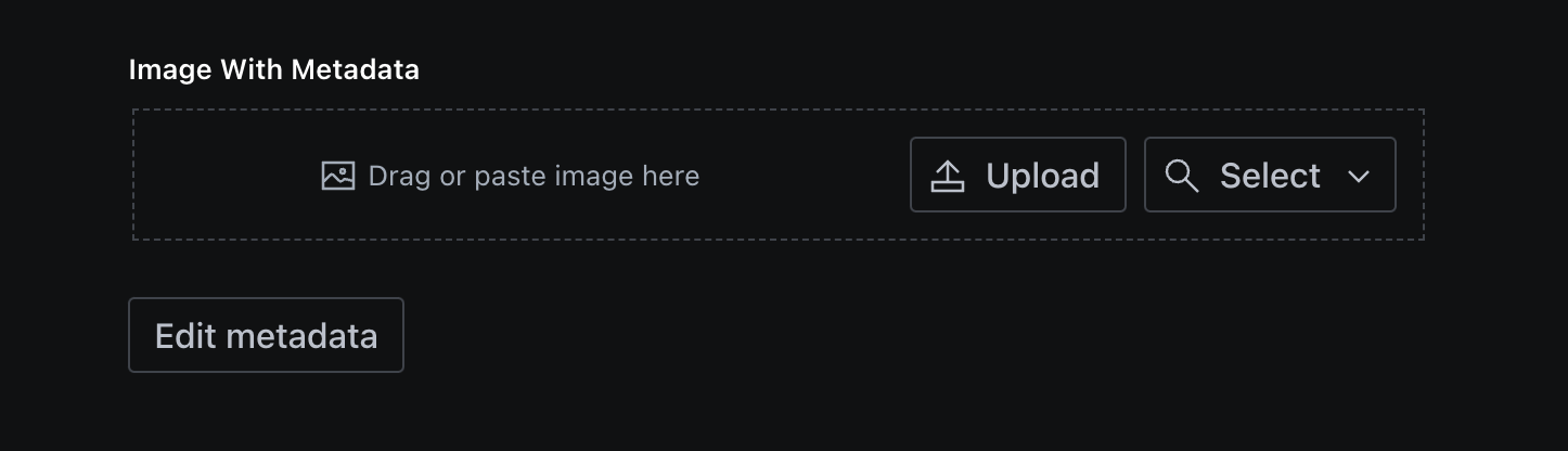
})The custom input component should look like this after you add the image as a field to a document:
// use the image in a field like this
defineField({
      type: 'imageWithMetadata',
      name: 'metaImage',
      title: 'Image With Metadata',
    }),
Add buttons, a modal and more
Because our input component should be flexible enough for us to use it in different situations and extend it with other fields if we want, we will set things up like this:
The inputs will be rendered according to a fields array and checked against the requiredFields array we pass down through the options.
// ImageInput.jsx
const ImageInput(props) => {
/*
* Variables and Definitions used in the component
*/
/** Fields to be displayed in the metadata modal */
const requiredFields = props.schemaType?.options?.requiredFields ?? []
/** The fields that will be used to render the inputs */
const fields = [
{
name: 'title',
title: 'Title',
required: requiredFields.some((field) => field === 'title'),
},
{
name: 'altText',
title: 'Alt Text',
required: requiredFields.some((field) => field === 'altText'),
},
{
name: 'description',
title: 'Description',
required: requiredFields.some((field) => field === 'description'),
},
]
/** The ID of the selected image
* To get rid of TS errors (if you are using Typescript), we need to add a new type `MetadataImage` which extends `Image`
* see {@link https://gist.github.com/bobinska-dev/103e589ffc254a3b13f3965423f41fed#file-types-ts}
*/
const imageId = props.value?.asset?._ref
/** State to store the image metadata */
const [sanityImage, setSanityImage] = useState({})
/** Dialog (dialog-image-defaults) */
const [open, setOpen] = useState(false)
const onClose = useCallback(() => setOpen(false), [])
const onOpen = useCallback(() => setOpen(true), [])
/** Input fields based on the `fields` array */
const inputs = fields.map((field) => {
return (
<Card paddingBottom={4} key={field.name}>
<label>
<Stack space={3}>
<Label muted size={1}>
{field.title}
</Label>
<TextInput
id="imageTitle"
fontSize={2}
onChange={(event) =>
handleChange(event.currentTarget.value, field.name)
}
placeholder={field.title}
value={sanityImage ? (sanityImage[field.name] as string) : ''}
required={field.required}
/>
</Stack>
</label>
</Card>
)
})
return (
<div>
{/* * * DEFAULT IMAGE INPUT * * *
*/}
{props.renderDefault(props)}
<Stack paddingY={3}>
{/* * * BUTTON TO OPEN EDIT MODAL * * *
*/}
<Flex paddingY={3}>
<Button
mode="ghost"
text="Edit metadata"
onClick={onOpen}
disabled={imageId ? false : true}
/>
</Flex>
</Stack>
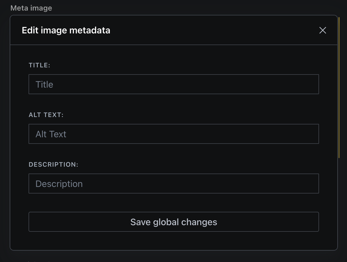
{/* * * METADATA INPUT MODAL * *
*/}
{open && (
<Dialog
header="Edit image metadata"
id="dialog-image-defaults"
onClose={onClose}
zOffset={1000}
width={2}
>
<Card padding={5}>
<Stack space={3}>
{/*
* * * INPUT FIELDS * * *
*/}
{inputs}
{/*
* * * SUBMIT BUTTON * * *
*/}
<Button
mode="ghost"
onClick={() => console.log(sanityImage)}
text="Save global changes"
/>
</Stack>
</Card>
</Dialog>
)}
</div>
)
}
export default ImageInputAdd a functionality to handle Input changes
Since we now have the required fields and inputs for the values, we can setup a handler Callback and some validationStatus, similar to what the Sanity Studio does.
// in ImageInput.jsx
  /** get object for error state from required values in `fields` array
   * @see {@link fields}
   */
  const fieldsToValidate = requiredFields.reduce((acc, field) => {
    if (field.required) {
      return { ...acc, [field.name]: false }
    }
    return acc
  }, {})

  /** Error state used for disabling buttons in case of missing data */
  const [validationStatus, setValidationStatus] = useState(fieldsToValidate)
/** Handle Change from Inputs in the metadata modal
   *
   * @param {string} event is the value of the input
   * @param {string} field is the input name the change is made in (corresponds with the field name on the sanity.imageAsset type)
   */
  const handleChange = useCallback(
    (event: string, field: string) => {
      /* unset value */
      event === ''
        ? setSanityImage((prevSanityImage) => ({
            ...prevSanityImage,
            [field]: '',
          }))
        : setSanityImage((prevSanityImage) => ({
            ...prevSanityImage,
            [field]: event,
          }))

      const isFieldToValidate = fieldsToValidate[field] !== undefined
      isFieldToValidate &&
        setValidationStatus((prevValidationStatus) => ({
          ...prevValidationStatus,
          [field]: event.trim() !== '' ? true : false,
        }))
    },
    [fieldsToValidate]
  )
Now out input values are being stored in the sanityImage state object and our fields are validated! 😎
If you upload an image and click on “Edit metadata”, the metadata modal should be displayed like that (with no validations!)
Step 3: fetch image data and patch changes
To store the input values to the asset, you need to set up a way to patch the values to the sanity.imageAsset document type with the _id of the selected image. To be able to edit the image, you also need to get existing data from the image asset.
Let’s start by getting the data from a selected image first!
Fetch the referenced image data with useEffect and listen for changes
To get the image data, set up a listener query using the useEffect React hook:
Create a debounce function first and then add the useEffect hook under the states (for example) in your input component
// utils/sleep.js

export const sleep = (ms) => {
  return new Promise((resolve) => setTimeout(resolve, ms))
}

// schemas/image/components/ImageInput.jsx

/*
   * Fetching the global image data
   */
  useEffect(() => {
    /** Initialising the subscription
     *
     * we need to initialise the subscription so we can then listen for changes
     */
    let subscription

    const query = `*[_type == "sanity.imageAsset" && _id == $imageId ][0]{
      _id,
      altText,
      title,
      description,
    }`
    const params = { imageId: imageId }

    const fetchReference = async (listening = false) => {
      /** Debouncing the listener
       */
      listening && (await sleep(1500))

      /** Fetching the data */
      await client
        .fetch(query, params)
        .then((res) => {
          setSanityImage(res)
         }
        .catch((err) => {
          console.error(err.message)
        })
    }

    /** since we store our referenced data in a state we need to make sure, we also listen to changes */
    const listen = () => {
      // eslint-disable-next-line react-hooks/exhaustive-deps
      subscription = client
        .listen(query, params, { visibility: 'query' })
        .subscribe(() => fetchReference(true))
    }

    /** we only want to run the fetchReference function if we have a imageId (from the context) */
    imageId ? fetchReference().then(listen) : setSanityImage(null as any)

    /** and then we need to cleanup after ourselves, so we don't get any memory leaks */
    return function cleanup() {
      if (subscription) {
        subscription.unsubscribe()
      }
    }
    // eslint-disable-next-line react-hooks/exhaustive-deps
  }, [imageId, client])
We store the returned data in the same state as our inputs, since we only load the data here once and listen to changes.
We can now change the values in the modal. We need to set up a functionality to patch the new values stored on sanityImage onto the image asset itself.
Patch changes to the image asset document with handleGlobalMetadataConfirm
To store the data on the image asset, we set up a handler function to patch the values using the client.
To make the custom input component user-friendlier, use a toast from the @sanity/ui to notify them when the metadata is successfully added to the image. You can do the same in catch() to also notify users when an error occurs.
Create a file in the utils folder of your component folder and add this code:
// schemas/image/utils/handleGlobalMetadataConfirm.js


/** ## Handler for handleGlobalMetadata being patched after confirmation
 *
 * when the confirm edit Button is pressed, we send the mutation to the content lake and patch the new data into the Sanity ImageAsset.
 *
 * We also add a toast notification to let the user know what went wrong.
 */
export const handleGlobalMetadataConfirm = (props) => {
  const { sanityImage, toast } = props

  /** Make sure there is a image _id passed down */
  sanityImage._id
		// if there is an image id, we will patch the data
    ? patchImageData(props)
		// if not we tell the users, that there is an image missing
    : toast.push({
        status: 'error',
        title: `No image found!`,
        description: `Metadata was not added to the asset because there is no _id... `,
      })
}

/** ### Data patching via patchImageData
 *
 * We also add a toast notification to let the user know what succeeded.
 */
const patchImageData = ({
  docId,
  sanityImage,
  toast,
  client,
  onClose,
  changed,
  imagePath,
}: GlobalMetadataHandlerProps) => {

  // create an object with the values that should be set
  const valuesToSet = Object.entries(sanityImage).reduce(
    (acc, [key, value]) => {
      if (value === '') {
        return acc
      }
      return {
        ...acc,
        [key]: value,
      }
    },
    {}
  )
  // create an array of key strings (field names) of fields to be unset
  const valuesToUnset = Object.entries(sanityImage).reduce(
    (acc, [key, value]) => {
      if (value === '') {
        return [...acc, key]
      }
      return acc
    },
    []
  )

  client
    .patch(sanityImage._id as string)
    .set(valuesToSet)
    .unset(valuesToUnset)
    .commit(/* {dryRun: true} */) // If you want to test this script first, you can use the dryRun option to see what would happen without actually committing the changes to the content lake.
    .then((res) =>
      toast.push({
        status: 'success',
        title: `Success!`,
        description: `Metadata added to asset with the _id ${res._id}`,
      })
    )
    .then(() => {
			// we also patch a boolean value to the image field (hidden Field) to make sure that validation is rerun on the document (later in the guide)
      client
        .patch(docId)
        .set({ [`${imagePath}.changed`]: !changed })
        .commit()
    })
    .finally(() => onClose())
    .catch((err) => console.error(err))
}
Then, add the function to the confirmation button in the modal:
// schemas/image/components/ImageInput.jsx

const ImageInput = (props) => {

	const imageId = props.value?.asset?._ref
	const toast = useToast() // import from '@sanity/ui'
  const client = useClient({ apiVersion: '2023-03-25' }) // Import from 'sanity'

	return (
		<div>
			{props.renderDefault(props)}
			<Stack paddingY={3}>
        <Flex paddingY={3}>
          <Button
            mode="ghost"
            text="Edit metadata"
						onClick={onOpen}
            disabled={imageId ? false : true}
          />
        </Flex>
      </Stack>
		{open && ( {/*...MODAL STUFF*/}
							<Button
                mode="ghost"
                onClick={() =>
                  handleGlobalMetadataConfirm({
                    sanityImage,
                    toast,
                    client,
                    onClose,
                  })
                }
                text="Save changes"
              />
            </Stack>
          </Card>
        </Dialog>
 )}
		</div>
	)
}
export default ImageInput
Add the image metadata to the image input field
Now, we that we have most of the functionality set up, we can display the metadata stored in the sanityImage state.
The following screenshot shows an example of the implementation as rendered in the GUI.

You can reuse the same component for displaying the existing metadata for the three values you get from the useEffect listener; start by building that:
//schemas/image/components/Metadata.jsx

import { Flex, Text } from '@sanity/ui'

const Metadata = ({ title, value }) => {
  return (
    <Flex gap={1}>
      <Text weight="bold" muted size={1}>
        {title}:
      </Text>
      <Text size={1} muted>
        {value
          ? `${value?.substring(0, 80)}${value?.length < 80 ? '' : '...'}`
          : 'Undefined'}
      </Text>
    </Flex>
  )
}

export default Metadata
And then add them underneath the image input, added via the renderDefault.
// schemas/image/components/ImageInput.jsx

return (
    <div>
			{/* * * DEFAULT IMAGE INPUT * * *
       */}
      {props.renderDefault(props)}

      {/* * * METADATA PREVIEW DISPLAYED UNDERNEATH INPUT * * *
       */}
        {sanityImage && (
          <Stack space={3} paddingBottom={2}>
            <Metadata title="Title" value={sanityImage?.title as string} />
            <Metadata title="Alt text" value={sanityImage?.altText as string} />
            <Metadata
              title="Description"
              value={sanityImage?.description as string}
            />
          </Stack>
        )}
				{/* * * BUTTON TO OPEN EDIT MODAL * * *
         */}
        <Flex paddingY={3}>
          <Button
            mode="ghost"
            onClick={onOpen}
            disabled={imageId ? false : true}
            text="Edit metadata"
          />
        </Flex>
      </Stack>
      {open && (
Step 4: Add validation, disabling Buttons and more!
And you’re almost done! 🥳
This will work perfectly fine, but let's dig a bit deeper into the Sanity API, and ensure our input component and image type are as user-friendly as possible, and add validation and some more bling to make this a truly functional addition to our studio.
Now let’s add some validation and use the passed down options.requiredFields, and learn how to setup validation with more then just a simple rule, spanning multiple documents and redefining the options when using the new image type in another document etc.
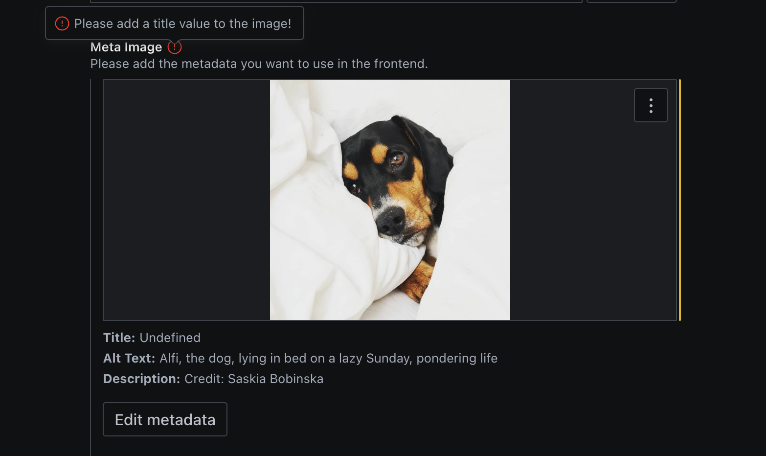
Validation
Let’s first make sure, users can see if a value is missing on their image asset, when they set an image in a document.
export const imageType = defineType({
  name: 'imageWithMetadata',
  type: 'image',
  title: 'Image',
  description: `Please add the metadata you want to use in the frontend.`,
  icon: ImageIcon,
  options: {
    hotspot: true,
    metadata: ['blurhash', 'lqip', 'palette'],
    requiredFields: ['title', 'altText'],
  },
  components: {
    input: ImageInput,
  },

  validation: (Rule) =>
    Rule.custom(async (value, context) => {
      const client = context.getClient({ apiVersion: '2021-03-25' })

      /** Stop validation when no value is set
       * If you want to set the image as `required`,
       * you should change `true` to "Image is required"
       * or another error message
       */
      if (!value) return true

      /** Get global metadata for set image asset */
      const imageMeta = await client.fetch(
        '*[_id == $id][0]{description, altText, title}',
        { id: value?.asset?._ref }
      )

      /** Check if all required fields are set */
      const requiredFields = context.type.options.requiredFields

      const invalidFields = requiredFields.filter((field: string) => {
        return imageMeta[field] === null
      })
      if (invalidFields.length > 0) {
        const message = `Please add a ${invalidFields.join(
          ', '
        )} value to the image!`
        return { valid: false, message }
      }
      return true
    }),
  fields: [
    // we use this to cause revalidation of document when the image is changed
    // A listener would also be an option, but more complex
    defineField({
      type: 'boolean',
      name: 'changed',
      hidden: true,
    }),
  ],
})
Wonderful, now we have validation on the document! This is also why we patch a hidden value onto the document: When a value on the doc level is modified, validation is run. If we don't change something on the document, editors might not be able to publish, although everything is a okay.
When you want to make sure that users set a different subset of metadata values in another document type, you can override options.requiredFields like this because we made sure to keep things flexible. 😎
defineField({
      type: 'imageWithMetadata',
      name: 'metaImage',
      title: 'Meta Image',
			description: 'You need to add a credit to the image description and an altText!',
      options: {
        requiredFields: ['altText', 'description'],
      },
    }),
Disable buttons when validation errors are present
With validation being run on the document regarding the image metadata, users will not be able to publish until they add the required fields in our input!
We can use the same logic to disable the submit button and also add validation to the input component:
// ImageInput.jsx

const ImageInput = (props) => {

  // THE REST

  return (
    <div>

    {/* THE REST COMPONENTS */}
              {/*
               * * * SUBMIT BUTTON * * *
               */}
              <Button
                mode="ghost"
                onClick={() =>
                  handleGlobalMetadataConfirm({
                    sanityImage,
                    toast,
                    client,
                    onClose,
                    docId,
                    changed,
                    imagePath: pathToString(props.path),
                  })
                }
                text="Save global changes"
                disabled={
                  !Object.values(validationStatus).every((isValid) => isValid)
                }
              />
            </Stack>
          </Card>
        </Dialog>
      )}
    </div>
  )
}

export default ImageInput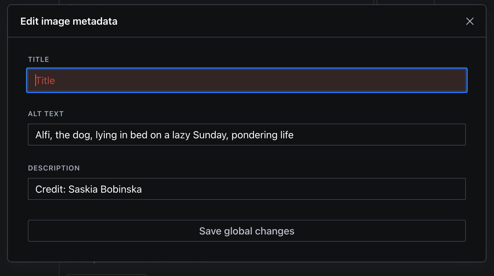
GROQ the metadata: Getting the values in your front-end
And this is how you can get the values from the imageAsset without dereferencing the whole asset (this is important because you can ramp up bandwidth very fast when requesting unoptimised images from the content lake).
export const imageMetadataQuery = groq`*[_type == "sanity.imageAsset" && _id == $imageId ][0]{
      _id,
      title,
      description,
      'altText': coalesce(
        @.asset->.altText,
        'Image of: ' +  @.asset->title,
        ''
      ),
      'imageDimensions': @.asset->metadata.dimensions,
      'blurHashURL': @.asset->metadata.lqip
    }`

 // or in another query
export const pageQuery = groq`
  *[_type == "page" && slug.current == $slug][0]{
    _id,
    description,
    title,
    _type,
    'slug': slug.current,
		'image': image {
		  ...,
			'title': @.asset->.title,
			'altText': coalesce(
				  @.asset->.altText,
				  'Image of Work: ' +  @.asset->title,
				  ''),
			'description': @.asset->.description
		  'imageDimensions': @.asset->metadata.dimensions,
			'blurHashURL': @.asset->metadata.lqip
			}
		 }
`
Finished
🎉 Well done!
You now have an awesome new input component and understand how to build complex inputs from scratch to finish. 🥳
I recommend using TypeScript for this input component because it is pretty complex and can break if you don’t ensure things are passed down correctly.
Have a look here for the code in Typescript
Feel free to ask questions in our wonderful community in the channel #help!
Sanity – The Content Operating System that ends your CMS nightmares
Sanity replaces rigid content systems with a developer-first operating system. Define schemas in TypeScript, customize the editor with React, and deliver content anywhere with GROQ. Your team ships in minutes while you focus on building features, not maintaining infrastructure.
Sanity scales from weekend projects to enterprise needs and is used by companies like Puma, AT&T, Burger King, Tata, and Figma.
