Introduction to Structure Builder
This is an introduction to important concepts for the Structure builder API.
This is an introduction to the Structure builder API. It introduces you to central ideas for how to use it to organize how your documents are laid out in Sanity Studio. It also features examples of typical configurations. If you just want to get started testing out structure quickly, check out the getting started guide. There is also reference documentation for all the methods and functionality in the Structure builder API.
Structure builder is useful whenever you want to take control over how documents are grouped and listed in the Studio. For instance, you might want to:
- Restrict a type to one single document with a given id (typically some global configuration)
- Easily navigate to a specific document in the root of the navigation structure (think “featured items” in an app or on a website, for instance)
- Create a more workflow-focused navigation structure (think “needs review”, “awaiting publication” and similar)
- Display a certain document type in a custom way instead of in the default editor
- Use an external API to control how documents are structured in the studio (for example setting up a newsroom where different “modes” of the studios can be pushed remotely and in real-time)
The Structure builder API is a collection of classes with methods that you can chain and nest to express how documents should be organized in the Sanity Studio.
This code snippet shows you an example of how to set up a structure for just a form and a custom preview in the Studio. Notice the methods being added to each other.
import S from '@sanity/desk-tool/structure-builder'
import ConfigPreview from './ConfigPreview'

export default () =>
  S.document()
    .schemaType('config')
    .documentId('globalConfig')
    .views([
      S.view.form(),
      S.view.component(ConfigPreview)
])Throughout the Structure builder documentation, there will be references to “collapsible panes”. Panes are the parts within the Desk tool that have a title and the space where you'll find the lists of document types, documents, a form, or other custom components. If you make the window narrower, add more panes in the viewport, or click the title area, they will fold down to make more space within the window. This gives authors a quick way to focus on the right things, as well as keeping a visual trail of where they are in the different hierarchies.
There are often items within a pane that may open a new pane that stacks to the left. In the Structure builder API the pane next to another is commonly referred to as a child.
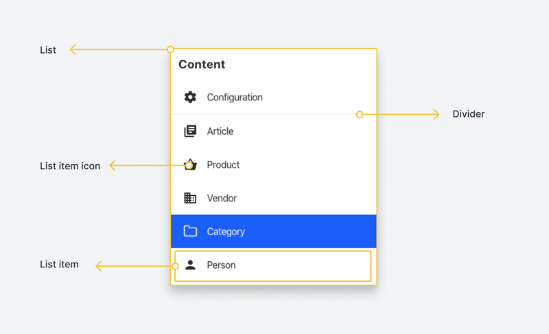
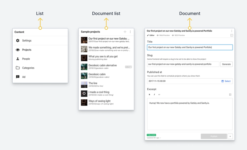
There are currently four types of panes:
- List
- Document list
- Document
- Custom component
A list contains a number of list items and is generally considered to be static. An example of this pane type is a list of document types within your schema. While generally being used for static items, a pane can perform asynchronous calls before determining its items, which can be useful if you need more control of how a small set of items should be rendered in the list. If you're listing documents, you should generally always use the document list.
Optimized for displaying a list of documents, as the name implies. It differs from a regular list in that it does not simply fetch a list of documents on load, but also keeps that list up to date with any changes: documents that match its filter that is deleted will disappear, newly created documents will appear, and changes to the titles will be reflected in real-time.
A document list is given a GROQ-filter, and then builds an optimized query based on the filter and the ordering selected for the pane. It then implements an "infinite scrolling" pattern that lazy-loads the properties needed to display the documents visible on the screen.
A document type list is a subset of a document list, which collects documents where the _type property matches a given value (in the schema definition this is the name that you set for the type: 'document'). Document types may also have Initial Value Templates attached to them, and certain orderings of their documents.
A document pane (and its corresponding document node in structure terms) is a component that holds a document’s values, as well as different states (published, draft, historical, displayed). Typically this will be the form (that is, the editor) with the input fields for editing data. It can also be a component that you import and configure your structure definition with. Typically, a view is helpful when you want to contextualize your document values somehow. It can be used for making different types of previews, statistics, checklists, alternative ways of interacting with the document values, or anything you can build with React.
You may also choose to implement your own pane by using a custom React component. The component node can be given a set of options that will be passed as an options property to the actual React component being rendered.
The component is rendered inside the shell of a pane, with the pane header, menu, and actions all being available for configuration. You will find more information on how to use this in the reference documentation for the structure builder.
The fact that you can open the same document node from different paths through a structure creates an interesting challenge. Sometimes you know only the document ID of the document you want to open, but not necessarily which of the different paths through the structure it makes sense to open it with. In these cases, the API will make a best-effort calculation to figure this out for you, while the fallback will be opening the document node to the right of the root pane.
The Structure builder API also gives you ways to set a default configuration for a document node that's opened outside of a path. This is useful when you want to make sure that a certain document type always has a set of views accessible.
Each segment (in user interface terms; each pane) is represented in the URL by an ID. When the studio is first loaded (and on subsequent navigation) the desk tool looks at the segments in the URL and tries to resolve each ID to a structure node.
It does this by calling the so-called child resolver on the parent node. For instance, a common pattern is the document type list → document editor, where clicking on any of the items within the document type list will render a document editor as the child of the document list. This is usually represented in the URL by something like documentType;documentId - for instance book;game-of-thrones.
The desk tool will call the child resolver of the root node in the structure with an argument containing the first segment (book), which will in this case return a document type list. When that is returned, it will proceed to call the child resolver of the document type list with the next segment of the URL (game-of-thrones), which in this case will return a document editor.
Child resolvers don't necessarily care about the ID of the child. In these cases, it's better to define a static structure node instead of a function returning that structure node, since it helps the desk tool make certain assumptions.
Most states within the structure builder are represented in the URL bar. This is why you have to specify an id (often via setting a title) for lists, document nodes, or a component. These identifiers are semi-colon separated in the URL path. Other states within a document node, such as views, can also be parameterized in the URL bar.
This makes it possible to more easily share the exact state of the Desk tool between multiple tabs and windows, and between different users. It also gives you browser history, such that you can use the browser's history affordances to go back and forth between UI states.