Custom input components
This article will explore the pieces and steps necessary to create a custom input component from scratch in V2.
Sanity Studio's default fields work well for many use cases. However, custom input components can create polished editor experiences around any type of data. You can use React components to create and adapt new editing experiences. You can replace the default field across any type or just in specific contexts. This article will introduce you to central concepts by showing you how to customize the string input.
What is a custom input component?
A custom input component is defined by three parts.
- A custom user interface (UI) for editors to view and edit data
- A way to patch the data into the dataset
- A connection to the studio's schema
1. A custom UI
The custom UI is built using React components. This component receives a props argument and a ref argument. The props object contains most of the data needed to create, edit, and patch the data for an input.
Protip
Custom input components use React.forwardRef in order to make use of the studio's focus handling. This is important for accessibility and user experience. You can learn more about React's refs and forwardRef in their official documentation.
2. Patching data
An input component needs a way to send changes back to the Sanity Content Lake. This is accomplished using patches. In the Studio, patches can be created using a set of helper functions that can be imported from @sanity/form-builder/PatchEvent.
3. Connect the custom input component to the schema
After the component is created, it still needs to be added to the schema to be accessed. These components often live in a directory named src or components that lives at the root of the project and can be imported into individual schema documents.
Tools for creating a custom component
The studio codebase brings a few tools that aim to make it easier to make custom UI that's consistent with its design system, as well as taking care of complex functionality like presence, patching, and diff-views.
Sanity UI
Sanity UI is a design library built to allow developers to keep new components, layouts, and dashboards consistent with the studio design. There are components for many needs in building an editor experience such as TextInput, Radio, Select, and Autocomplete, as well as general layout needs such as Card, Grid, and Stack.
The FormField component
The FormField component is useful when you want a single standard form field without recreating all the necessary editor experience affordances like Presence and field validation.
The FormBuilder API
The FormBuilder API allows a developer to create complex form systems for objects, arrays, and more without having to build the inputs themselves. This is helpful when an editing experience needs a small augmentation, but you want to keep most inputs in the default setup.
The PatchEvent API
The PatchEvent API is a set of methods that allow a developer to quickly set up patches to a Sanity dataset. PatchEvent creates an event that the studio's event handler recognizes as a patch and has helper methods to set and unset data from specific fields.
Recreating the standard string input with custom input components
In order to understand how all these systems work together, let's create a custom component that recreates the default functionality of a string field.
Setting up the component file
In order to get started, you need a directory to house the custom input components. In a standard studio project, you can create this location in the root and call it src.
Inside this directory, you'll create a new file to house an individual custom component. In this case, you'll call that file MyCustomString.js. Inside this file, you need to create the initial setup.
// /src/MyCustomString.js

import React from 'react'
// These are react components

const MyCustomString = React.forwardRef((props, ref) => {
    // A function that returns JSX
  }
)

// Create the default export to import into our schema
export default MyCustomString
Creating the custom UI
Next, you can return the custom UI out of the component. At this stage, the component won't be functional but showcases how to build the UI.
In the props passed to the component, you have information about the field stored in the type object. This includes the field title specified in the schema, as well as other information, such as the description or validation markers. You can also access the current value of the field with the value property – value will return either undefined or a string value in the current instance.
// /src/MyCustomString.js

import React from 'react'

// Import UI components from Sanity UI
import { TextInput, Stack, Label } from '@sanity/ui'

export const MyCustomString = React.forwardRef((props, ref) => {
    return (
      <Stack space={2}>
        <Label>{props.type.title}</Label>
        <TextInput ref={ref} value={props.value} />
      </Stack>
    )
  }
)

// Create the default export to import into our schema
export default MyCustomString
Adding the custom component to a field
As it stands, this code does nothing. It needs to be attached to a field in a schema. In this case, you add it as an inputComponent property on any string type field.
// /schemas/document.js
// import the custom string
import MyCustomString from '../src/MyCustomString'

export default {
  name: 'documentSchema',
  title: 'A document',
  type: 'document',
  fields: [
    {
      name: 'customString',
      title: 'This is a cool custom string',
      type: 'string',
      inputComponent: MyCustomString
    },
    // ... All other inputs
  ]
}
After you save this change, you should see a field that is an approximation of the typical studio string field. At this stage, though, it's completely non-functional, as you haven't provided any information on how to patch data and don't take advantage of editor affordances, such as validation or presence.
Using <FormField> to recreate editor affordances
From here, you need to make sure things like validation, presence, and changes are registered properly. To do that, you can use the <FormField> component. You start by importing it from @sanity/base/components and then pass the information from props that it needs to recreate the overall experience.
You no longer need a <Label> or a <Stack>, but you still need an input component from Sanity UI. The description and title of the field are both included as properties on FormField. In order to get presence markers and field validation, you need to tell the FormField where that information lives and provide the custom <TextInput> with focus and blur management. For additional connection to the schema, the input should also accept the readOnly boolean and placeholder string.
// /src/MyCustomString.js

import React from 'react'
import { FormField } from '@sanity/base/components'
import { TextInput } from '@sanity/ui'

const MyCustomString = React.forwardRef((props, ref) => {

    const {
            type,         // Schema information
            value,        // Current field value
            readOnly,     // Boolean if field is not editable
            placeholder,  // Placeholder text from the schema
            markers,      // Markers including validation rules
            presence,     // Presence information for collaborative avatars
            onFocus,      // Method to handle focus state
            onBlur,       // Method to handle blur state
          } = props

    return (
      <FormField
        description={type.description}  // Creates description from schema
        title={type.title}              // Creates label from schema title
        __unstable_markers={markers}    // Handles all markers including validation
        __unstable_presence={presence}  // Handles presence avatars
      >
        <TextInput
          value={value || ''}                 // Current field value
          readOnly={readOnly}           // If "readOnly" is defined make this field read only
          placeholder={placeholder}     // If placeholder is defined, display placeholder text
          onFocus={onFocus}             // Handles focus events
          onBlur={onBlur}               // Handles blur events
          ref={ref}
        />
      </FormField>
    )
  }
)

// Create the default export to import into our schema
export default MyCustomString
Gotcha
Notice that the presence and validation markers props are prepended by __unstable_. This is to signal that the data structures of these props can change. You can safely use them and keep an eye on the changelog to see whether you need to update any code when these are stabilized. Most likely you'll only need to remove the prefix.
Accessible and connected labels
In order to keep the component accessible and the label clickable, the FormField component needs to know the id of the new input. To do this, a dynamic id needs to be generated. Any id-generation techniques are fine, however, for this example, the NPM package @reach/auto-id will be used. Run npm install @reach/auto-id and add the following code to your component.
// /src/MyCustomString.js

import React from 'react'
import { FormField } from '@sanity/base/components'
import { TextInput } from '@sanity/ui'

import { useId } from "@reach/auto-id" // hook to generate unique IDs

const MyCustomString = React.forwardRef((props, ref) => {
    const {
            type,         // Schema information
            value,        // Current field value
            readOnly,     // Boolean if field is not editable
            placeholder,  // Placeholder text from the schema
            markers,      // Markers including validation rules
            presence,     // Presence information for collaborative avatars
            onFocus,      // Method to handle focus state
            onBlur,       // Method to handle blur state
            onChange      // Method to handle patch events
          } = props

    // Creates a unique ID for our input
    const inputId = useId()

    return (
      <FormField
        description={type.description}  // Creates description from schema
        title={type.title}              // Creates label from schema title
        __unstable_markers={markers}    // Handles all markers including validation
        __unstable_presence={presence}  // Handles presence avatars
        inputId={inputId}               // Allows the label to connect to the input field
      >
        <TextInput
          id={inputId}                  // A unique ID for this input

          value={value || ''}                 // Current field value
          readOnly={readOnly}           // If "readOnly" is defined make this field read only
          placeholder={placeholder}     // If placeholder is defined, display placeholder text
          onFocus={onFocus}             // Handles focus events
          onBlur={onBlur}               // Handles blur events
          ref={ref}
        />
      </FormField>
    )
  }
)

// Create the default export to import into our schema
export default MyCustomString
Patching data changes
Now that the editor affordances are in place, you need to allow the editors to submit the data back into the dataset. To do this, you'll set up an event handler (handleChange()) and use the convenience methods in the PatchEvent API. You'll pass the patch event into the onChange prop provided by your component.
// /src/MyCustomString.js

import React from 'react'
import { FormField } from '@sanity/base/components'
import { TextInput } from '@sanity/ui'
import PatchEvent, {set, unset} from '@sanity/form-builder/PatchEvent'
import { useId } from "@reach/auto-id" // hook to generate unique IDs

const MyCustomString = React.forwardRef((props, ref) => {
    const {
            type,         // Schema information
            value,        // Current field value
            readOnly,     // Boolean if field is not editable
            placeholder,  // Placeholder text from the schema
            markers,      // Markers including validation rules
            presence,     // Presence information for collaborative avatars
            onFocus,      // Method to handle focus state
            onBlur,       // Method to handle blur state
            onChange      // Method to handle patch events
          } = props

    // Creates a unique ID for our input
    const inputId = useId()

    // Creates a change handler for patching data
    const handleChange = React.useCallback(
      // useCallback will help with performance
      (event) => {
        const inputValue = event.currentTarget.value // get current value
        // if the value exists, set the data, if not, unset the data
        onChange(PatchEvent.from(inputValue ? set(inputValue) : unset()))
      },
      [onChange]
    )

    return (
      <FormField
        description={type.description}  // Creates description from schema
        title={type.title}              // Creates label from schema title
        __unstable_markers={markers}    // Handles all markers including validation
        __unstable_presence={presence}  // Handles presence avatars
        inputId={inputId}               // Allows the label to connect to the input field
      >
        <TextInput
          id={inputId}                  // A unique ID for this input
          onChange={handleChange}       // A function to call when the input value changes

          value={value || ''}                 // Current field value
          readOnly={readOnly}           // If "readOnly" is defined make this field read only
          placeholder={placeholder}     // If placeholder is defined, display placeholder text
          onFocus={onFocus}             // Handles focus events
          onBlur={onBlur}               // Handles blur events
          ref={ref}
      />
      </FormField>
    )
  }
)

// Create the default export to import into our schema
export default MyCustomString
Protip
We use the React.useCallback hook around the patch function to prevent it from running if there haven't been any changes. You can learn more about this hook in the official React docs.
At this point, You've accomplished all three items needed to make a custom input component: a "custom" UI, a way to patch data, and a hook back into your schema.
Creating a character count
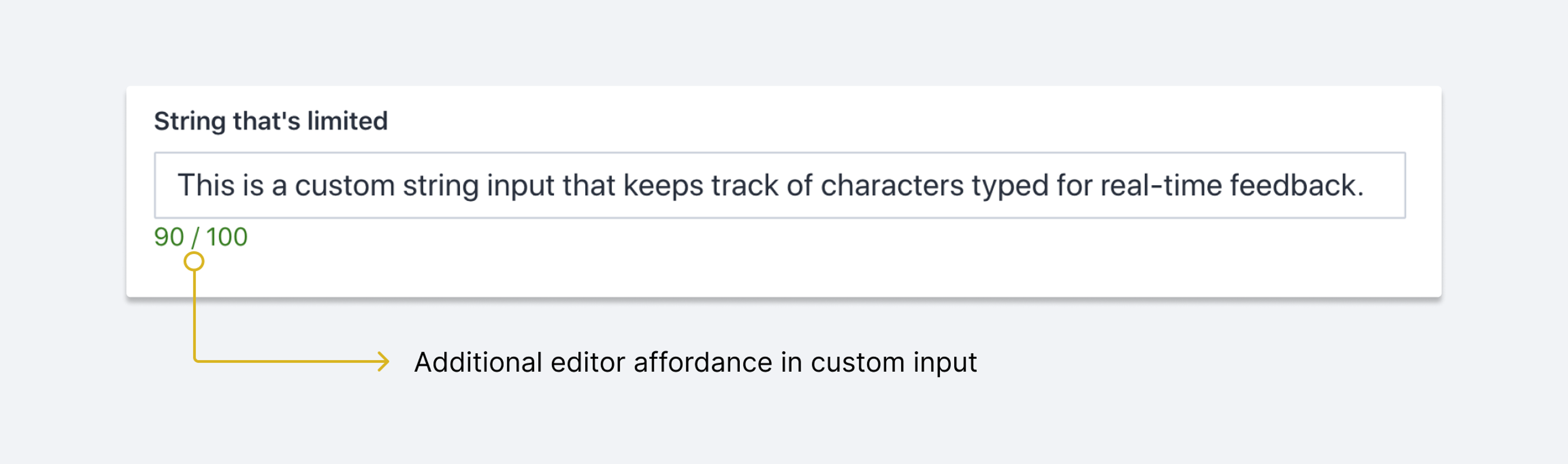
Let's take the theoretical knowledge from the beginning of this document and put it to work in a real-life situation.
The string schema type has a validation rule to set a max value on the length of a string. The typical validation rules work to let an editor know when they can or can't submit a value and why, but what if you could give the editor real-time feedback while they are writing?
{
  name: 'limited',
  title: 'String that is limited',
  type: 'string',
  // prevent publishing if character count is over 100
  validation: Rule => Rule.max(100)
}
Take the string implementation example above and extend it to show a character count and the limit for the field. You'll start from the code you just wrote and add a section directly beneath the input to show the numbers. You'll create the space using Sanity UI's <Stack> component and create an area for text with the <Text> component.
import React from 'react'
import { FormField } from '@sanity/base/components'
import { TextInput, Stack, Text } from '@sanity/ui'
import PatchEvent, { set, unset } from '@sanity/form-builder/PatchEvent'
import { useId } from "@reach/auto-id" // hook to generate unique IDs

const StringWithLimits = React.forwardRef((props, ref) => {
  const {
      type,         // Schema information
      value,        // Current field value
      readOnly,     // Boolean if field is not editable
      placeholder,  // Placeholder text from the schema
      markers,      // Markers including validation rules
      presence,     // Presence information for collaborative avatars
      onFocus,      // Method to handle focus state
      onBlur,       // Method to handle blur state
      onChange      // Method to handle patch events
    } = props

    // Creates a unique ID for our input
    const inputId = useId()
    const handleChange = React.useCallback(
      (event) => {
        const inputValue = event.currentTarget.value
        onChange(PatchEvent.from(inputValue ? set(inputValue) : unset()))
      },
      [onChange]
    )
    return (
      <Stack space={1}>

        <FormField
          description={type.description}  // Creates description from schema
          title={type.title}              // Creates label from schema title
          __unstable_markers={markers}    // Handles all markers including validation
          __unstable_presence={presence}  // Handles presence avatars
          inputId={inputId}               // Allows the label to connect to the input field
        >
          <TextInput
            id={inputId}                  // A unique ID for this input
            onChange={handleChange}       // A function to call when the input value changes

            value={value || ''}                 // Current field value
            readOnly={readOnly}           // If "readOnly" is defined make this field read only
            placeholder={placeholder}     // If placeholder is defined, display placeholder text
            onFocus={onFocus}             // Handles focus events
            onBlur={onBlur}               // Handles blur events
            ref={ref}
        />
        </FormField>
        <Text muted size={1}>Where the counter will exist</Text>
      </Stack>
    )
  }
)

export default StringWithLimits
From here, you need to do two things, find the current character count and then match it against the validation rule you can create in your schema.
In order to check the length, you need to write a small conditional to check if a value exists. If it doesn't, you'll apply a string of 0, and if it exists, you'll display the length of the string.
import React from 'react'
import { FormField } from '@sanity/base/components'
import { TextInput, Stack, Text } from '@sanity/ui'
import PatchEvent, { set, unset } from '@sanity/form-builder/PatchEvent'
import { useId } from "@reach/auto-id" // hook to generate unique IDs

const StringWithLimits = React.forwardRef((props, ref) => {
  const {
      type,         // Schema information
      value,        // Current field value
      readOnly,     // Boolean if field is not editable
      placeholder,  // Placeholder text from the schema
      markers,      // Markers including validation rules
      presence,     // Presence information for collaborative avatars
      onFocus,      // Method to handle focus state
      onBlur,       // Method to handle blur state
      onChange      // Method to handle patch events
    } = props

    // Creates a unique ID for our input
    const inputId = useId()

    const handleChange = React.useCallback(
      (event) => {
        const inputValue = event.currentTarget.value
        onChange(PatchEvent.from(inputValue ? set(inputValue) : unset()))
      },
      [onChange]
    )
    return (
      <Stack space={1}>

      <FormField
        description={type.description}  // Creates description from schema
        title={type.title}              // Creates label from schema title
        __unstable_markers={markers}    // Handles all markers including validation
        __unstable_presence={presence}  // Handles presence avatars
        inputId={inputId}               // Allows the label to connect to the input field
      >
        <TextInput
          id={inputId}                  // A unique ID for this input
          onChange={handleChange}       // A function to call when the input value changes

          value={value || ''}                // Current field value
          readOnly={readOnly}           // If "readOnly" is defined make this field read only
          placeholder={placeholder}     // If placeholder is defined, display placeholder text
          onFocus={onFocus}             // Handles focus events
          onBlur={onBlur}               // Handles blur events
          ref={ref}
        />
        </FormField>
        <Text muted size={1}>{value ? value.length : '0'} / MAX CHAR COUNT</Text>
      </Stack>
    )
  }
)

export default StringWithLimits
To get the maximum character count settings from the schema configuration, you need to take a deeper dive into validation rules. Each field in your schema can have multiple types of validation. In this case, you need to check through the rules and find a flag value that corresponds to the 'max' value. When you find that, you can return the constraint value from the rule and use that as your maximum length value.
import React from 'react'
import { FormField } from '@sanity/base/components'
import { TextInput, Stack, Text } from '@sanity/ui'
import PatchEvent, { set, unset } from '@sanity/form-builder/PatchEvent'
import { useId } from "@reach/auto-id" // hook to generate unique IDs

const StringWithLimits = React.forwardRef((props, ref) => {
  const {
      type,         // Schema information
      value,        // Current field value
      readOnly,     // Boolean if field is not editable
      placeholder,  // Placeholder text from the schema
      markers,      // Markers including validation rules
      presence,     // Presence information for collaborative avatars
      onFocus,      // Method to handle focus state
      onBlur,       // Method to handle blur state
      onChange      // Method to handle patch events
    } = props

    // Creates a unique ID for our input
    const inputId = useId()

    const MaxConstraint = type.validation[0]._rules.filter(rule => rule.flag == 'max')[0].constraint


    const handleChange = React.useCallback(
      (event) => {
        const inputValue = event.currentTarget.value
        onChange(PatchEvent.from(inputValue ? set(inputValue) : unset()))
      },
      [onChange]
    )
    return (
      <Stack space={1}>

      <FormField
        description={type.description}  // Creates description from schema
        title={type.title}              // Creates label from schema title
        __unstable_markers={markers}    // Handles all markers including validation
        __unstable_presence={presence}  // Handles presence avatars
        inputId={inputId}               // Allows the label to connect to the input field
      >
        <TextInput
          id={inputId}                  // A unique ID for this input
          onChange={handleChange}       // A function to call when the input value changes

          value={value || ''}                 // Current field value
          readOnly={readOnly}           // If "readOnly" is defined make this field read only
          placeholder={placeholder}     // If placeholder is defined, display placeholder text
          onFocus={onFocus}             // Handles focus events
          onBlur={onBlur}               // Handles blur events
          ref={ref}
        />
        </FormField>
        <Text muted size={1}>{value ? value.length : '0'} / {MaxConstraint}</Text>
      </Stack>
    )
  }
)

export default StringWithLimits
This will create a real-time counter and showcase the maximum number of characters as defined by the validation rules. To get that max count, you need to define it in your schema.
// /schemas/document.js
import StringWithLimits from '../src/StringWithLimits'

export default {
  name: 'document',
  title: 'A Document',
  type: 'document',
  fields: [
    {
      name: 'limited',
      title: 'String that is limited',
      type: 'string',
      inputComponent: StringWithLimits,
      validation: Rule => Rule.max(100)
    },
  ]
}
Working with objects and FormBuilderInput
What about more complex data like an object field? You can certainly build out a brand new object UI, but most objects are built from other field types and may not need to be overridden. If that's the case, it's best to delegate the building of the form fields to the default form builder in the studio API.
In the following example, you create a custom object that follows the same rules as a default object. The <Fieldset> component is used to group the fields and provide overall schema information. Within the Fieldset you can then loop through the type's fields array. Each field then can return a <FormBuilderInput> component to handle building all the fields.
Protip
FormBuilderInput will also work for custom inputs. As you work through building a custom object, try adding the limited string custom input created earlier in this document.
The FormBuilderInput accepts many of the same props the FormField component does, but instead of building a single form field, it helps build any type and helps keep track of keys, paths, and more.
// /src/MyCustomObject.js
import React from 'react'
import { FormBuilderInput } from '@sanity/form-builder/lib/FormBuilderInput'
import Fieldset from 'part:@sanity/components/fieldsets/default'
// Utilities for patching
import { setIfMissing } from '@sanity/form-builder/PatchEvent'


export const MyCustomObject = React.forwardRef((props, ref) => {
    // destructure props for easier use
    const {
      compareValue,
      focusPath,
      markers,
      onBlur,
      onChange,
      onFocus,
      presence,
      type,
      value,
      level
    } = props

    const handleFieldChange = React.useCallback(
      (field, fieldPatchEvent) => {
        // fieldPatchEvent is an array of patches
        // Patches look like this:
        /*
            {
                type: "set|unset|setIfMissing",
                path: ["fieldName"], // An array of fields
                value: "Some value" // a value to change to
            }
        */
        onChange(fieldPatchEvent.prefixAll(field.name).prepend(setIfMissing({ _type: type.name })))
      },
      [onChange]
    )

    // Get an array of field names for use in a few instances in the code
    const fieldNames = type.fields.map((f) => f.name)

    // If Presence exist, get the presence as an array for the children of this field
    const childPresence =
      presence.length === 0
        ? presence
        : presence.filter((item) => fieldNames.includes(item.path[0]))

    // If Markers exist, get the markers as an array for the children of this field
    const childMarkers =
      markers.length === 0
        ? markers
        : markers.filter((item) => fieldNames.includes(item.path[0]))

    return (
      <Fieldset
        legend={type.title} // schema title
        description={type.description} // schema description
        markers={childMarkers} // markers built above
        presence={childPresence} // presence built above
      >
        {type.fields.map((field, i) => {
          return (
            // Delegate to the generic FormBuilderInput. It will resolve and insert the actual input component
            // for the given field type
            <FormBuilderInput
              level={level + 1}
              ref={i === 0 ? ref : null}
              key={field.name}
              type={field.type}
              value={value && value[field.name]}
              onChange={(patchEvent) => handleFieldChange(field, patchEvent)}
              path={[field.name]}
              markers={markers}
              focusPath={focusPath}
              readOnly={field.type.readOnly}
              presence={presence}
              onFocus={onFocus}
              onBlur={onBlur}
              compareValue={compareValue}
            />
          )
        })}
      </Fieldset>
    )
  }
)
Behind the scenes, the FormBuilderInput component will fetch the proper field based on the type property and provide it all the information you pass in as props to handle all the editor affordances.
In order for some affordance to work properly, you need to separate certain items out from the overall object information. Markers (for validation) and Presence need to be arrays for FieldSet to parse them. The value for each form field in an object is stored in the overall object's value. To use that on the individual field, you need to access it by the field's name from the overall value object.
Access the document from your custom input
It's sometimes useful to access the whole document from within your custom input component, not just the value of the current field. You can achieve this by wrapping your component in a Higher-Order Component, like so:
import {withDocument} from 'part:@sanity/form-builder'

function MyInput(props) {
  return (
    <div>
      Document title: {props.document.title}
      {/* ... */}
    </div>
  )
}

export default withDocument(MyInput)