Theming Sanity Studio
Learn how to customize the styling and branding of your studio
The top-level theme config property sets the color palette of the Studio. The @sanity/themer package generates a complete palette from a handful of colors, so you can brand the Studio without picking every token by hand. It runs locally, in your own project.
The package requires Studio 6 or later and React 19. Studios on Studio 5 or React 18 need to upgrade before they can install it.
URL imports from themer.sanity.build are deprecated
If your Studio config imports a theme from a https://themer.sanity.build/api/hues URL, migrate to @sanity/themer/legacy now. The hosted Themer service is deprecated and the ESM URL import method it relies on will stop working when the service goes offline. The package generates the same colors from the same URL, with no network request at build time. See the migration steps below.
Generate a theme with the Themer tool
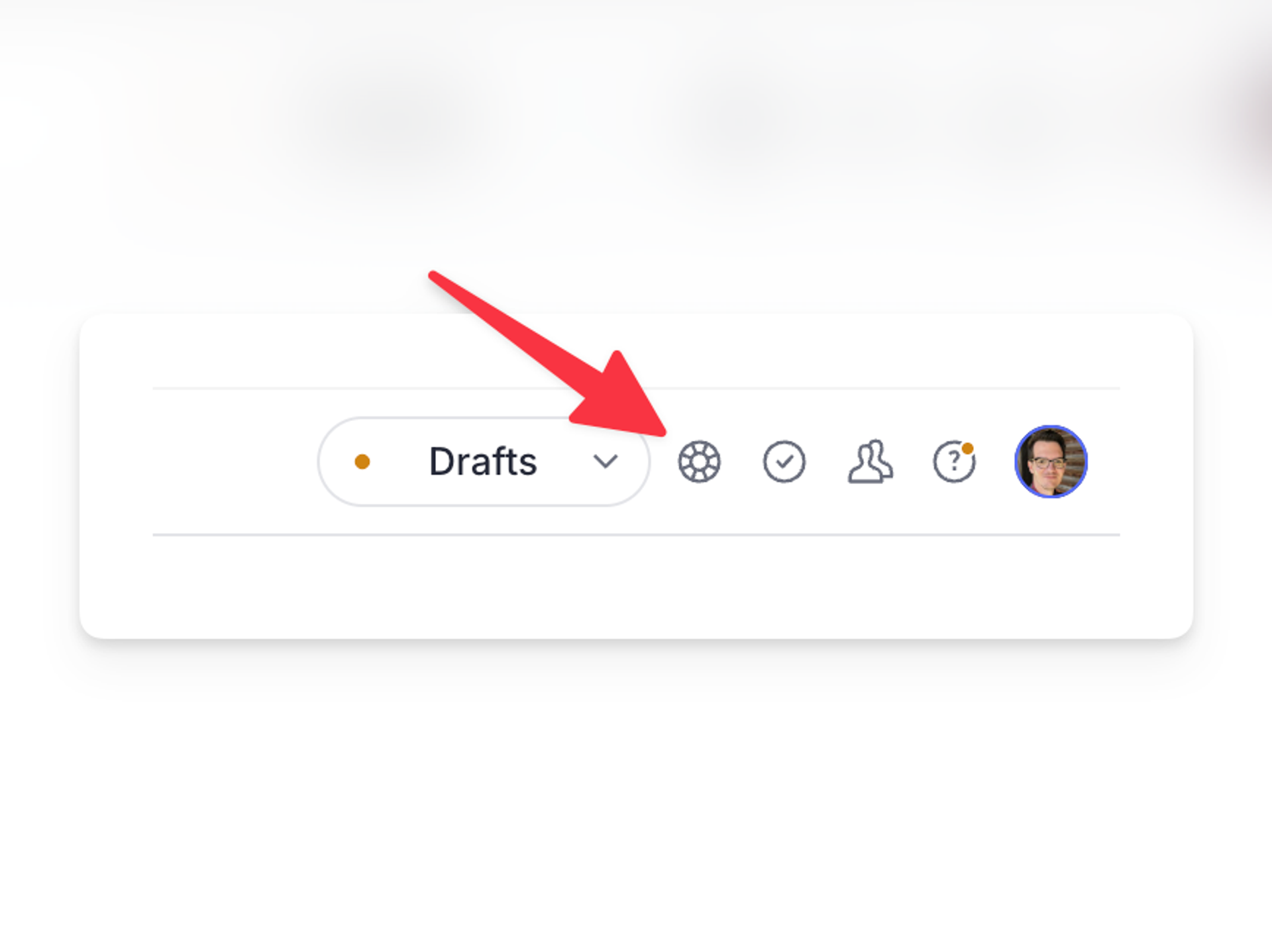
@sanity/themer/tool adds a themer sidebar to the Studio. Presets, the accent, text, and background pickers, and a contrast slider preview a theme live across the whole Studio while you browse it, and the sidebar hands you the snippet that makes the theme permanent. Toggle light and dark mode with the regular appearance menu, and the preview follows.
npm install @sanity/themerpnpm add @sanity/themeryarn add @sanity/themerbun add @sanity/themerimport {themerTool} from '@sanity/themer/tool'
import {defineConfig} from 'sanity'
export default defineConfig({
plugins: [themerTool()],
// ...rest of the config
})The tool appears in the top-right, alongside the perspective selection and Studio’s help menu.
If the Studio already uses a buildTheme theme, pass the same options so the tool starts editing from them: themerTool({config: {accent: '#1cb485'}}).
Experimental
themerTool is marked alpha: it may change or be removed in any release without notice. The buildTheme and @sanity/themer/legacy APIs below are stable.
Apply a theme in your config
buildTheme returns a theme ready for the theme property of a Studio config. It builds the same type of theme as buildTheme from @sanity/ui/theme, but takes colors instead of design tokens.
import {buildTheme} from '@sanity/themer'
import {defineConfig} from 'sanity'

export const theme = buildTheme({
  accent: '#f00', // required
  text: '#727892', // optional
  background: {dark: '#0d0e12', light: '#ffffff'}, // optional
  contrast: 85, // optional, 15-100
})

export default defineConfig({
  theme,
  // ...rest of the config
})accentreplaces thebluescale, which Sanity UI uses for primary buttons, focus rings, and links.textreplaces thegrayscale: text, icons, borders, and neutral surfaces. When omitted, it is derived fromaccentas a mostly desaturated version of it, the way the stock gray carries a hint of the stock blue.background.darkreplacesblackandbackground.lightreplaceswhite, the backgrounds that every other color in the two color schemes blends onto.contrastcontrols how strongly text and borders separate from the accent. The default85uses the text color as-is,100removes its tint entirely, and lower values blend more of the accent into the text scale.
The root export also provides buildPalette, which returns the generated palette without building a theme from it, and presets, which ships the hosted Themer service presets translated to buildTheme options.
Migrate from a themer.sanity.build URL import
@sanity/themer/legacy generates the same colors as the hosted service, with the same createTheme, hues, and theme exports that https://themer.sanity.build/api/hues served. Replace the URL import with buildThemeFromUrl and pass the same URL as a string.
// Before:
import {theme} from 'https://themer.sanity.build/api/hues?preset=verdant&primary=22fca8'

// After:
import {buildThemeFromUrl} from '@sanity/themer/legacy'

const theme = buildThemeFromUrl(
  'https://themer.sanity.build/api/hues?preset=verdant&primary=22fca8',
)
Configs that pulled createTheme and hues from the URL import work the same way with parseHuesFromUrl:
import {createTheme, parseHuesFromUrl} from '@sanity/themer/legacy'
import {defineConfig} from 'sanity'

const hues = parseHuesFromUrl('https://themer.sanity.build/api/hues?preset=verdant')

export default defineConfig({
  theme: createTheme({...hues, primary: {...hues.primary, mid: '#22fca8'}}),
  // ...rest of the config
})
The hosted presets are addressed by query, exactly like the service: buildThemeFromUrl('?preset=verdant').
Once migrated, remove the two pieces of setup the URL imports needed:
- Any
themer.d.tsmodule declarations. - The
urlImportsconfig that allowed the URL import.
One behavioral difference
The generated theme carries no __themer flag. The Studio used that flag to discard the fonts the hosted module bundled, because they had drifted from the Studio's own. With the package, fonts come from the @sanity/ui installed next to the Studio, so there is nothing to discard.
Using buildLegacyTheme
Studios carrying a Studio v2 theme can keep it with the buildLegacyTheme helper function exported from the sanity package.
Deprecated
The buildLegacyTheme function is deprecated and will be removed in an upcoming major version of Sanity Studio. Use buildTheme from @sanity/themer instead.
import {buildLegacyTheme, defineConfig} from 'sanity'

const props = {
  '--my-white': '#fff',
  '--my-black': '#1a1a1a',
  '--my-blue': '#4285f4',
  '--my-red': '#db4437',
  '--my-yellow': '#f4b400',
  '--my-green': '#0f9d58',
}

export const myTheme = buildLegacyTheme({
  /* Base theme colors */
  '--black': props['--my-black'],
  '--white': props['--my-white'],

  '--gray': '#666',
  '--gray-base': '#666',

  '--component-bg': props['--my-white'],
  '--component-text-color': props['--my-black'],

  /* Brand */
  '--brand-primary': props['--my-blue'],

  // Default button
  '--default-button-color': '#666',
  '--default-button-primary-color': props['--my-blue'],
  '--default-button-success-color': props['--my-green'],
  '--default-button-warning-color': props['--my-yellow'],
  '--default-button-danger-color': props['--my-red'],

  /* State */
  '--state-info-color': props['--my-blue'],
  '--state-success-color': props['--my-green'],
  '--state-warning-color': props['--my-yellow'],
  '--state-danger-color': props['--my-red'],

  /* Navbar */
  '--main-navigation-color': props['--my-black'],
  '--main-navigation-color--inverted': props['--my-white'],

  '--focus-color': props['--my-blue'],
})

export default defineConfig({
  // rest of config...,

  theme: myTheme,
})